
Looker vs. Tableau vs. Dot: Which One Is Better?
Weighing up Looker vs. Tableau as your next BI tool for data visualization and not sure which way to go?
I'll cover what each one does well, how it handles your data, and what it costs, so you can choose with your eyes open.
➡️ I'll also put a third name in front of you: Dot (that's us), an AI data analyst that does the work itself and sends the answer to wherever your team already is, whether that's Slack, Teams, email, or the web app.
TL;DR
- Looker is Google's BI platform, built around a modeling layer called LookML. You define each metric once, and that single definition flows through every dashboard and report, and now through the Gemini assistant too.
It suits data teams that want governed, consistent numbers across a Google Cloud setup.
➡️ Choose Looker if you're committed to Google Cloud with BigQuery underneath, and you want one semantic layer governing every number.
- Tableau is the visualization heavyweight of the three. Its VizQL engine gives analysts more freedom to explore by hand and a wider chart library than anything else here, and it pays off for people who like their dashboards polished and ready to present.
➡️ Choose Tableau if hands-on visual analysis is core to how your team works and per-seat licensing won't strain the budget as you scale.
- Dot works from the opposite end of the problem. It doesn't hand you a canvas to read. It connects to your existing warehouse and runs the analysis for you, then writes back the answer with the reasoning included, wherever your team already talks: Slack, Teams, email, or the web app.
➡️ Choose Dot if your data is already in a data warehouse and your bottleneck is analyst capacity, plus the grind of translating charts into decisions.
Looker vs. Tableau vs. Dot: features
Here is the short version of how the three stack up on features:
- Looker leads on governance: one modeled definition per metric, wired deep into Google Cloud.
- Tableau wins on visual range and depth; if exploring data by eye is the priority, it's the one to beat.
- Dot is different in kind, delivering a finished answer to chat or inbox, with nothing left to interpret yourself.
We'll start with Looker. 👇
Looker's features
Conversational analytics with Gemini
Looker's conversational layer takes a question typed in plain English and hands back a governed answer, with Gemini translating between the two underneath.
The aim is to get past dashboards that merely show numbers and toward ones that read them for you and tee up the next step.
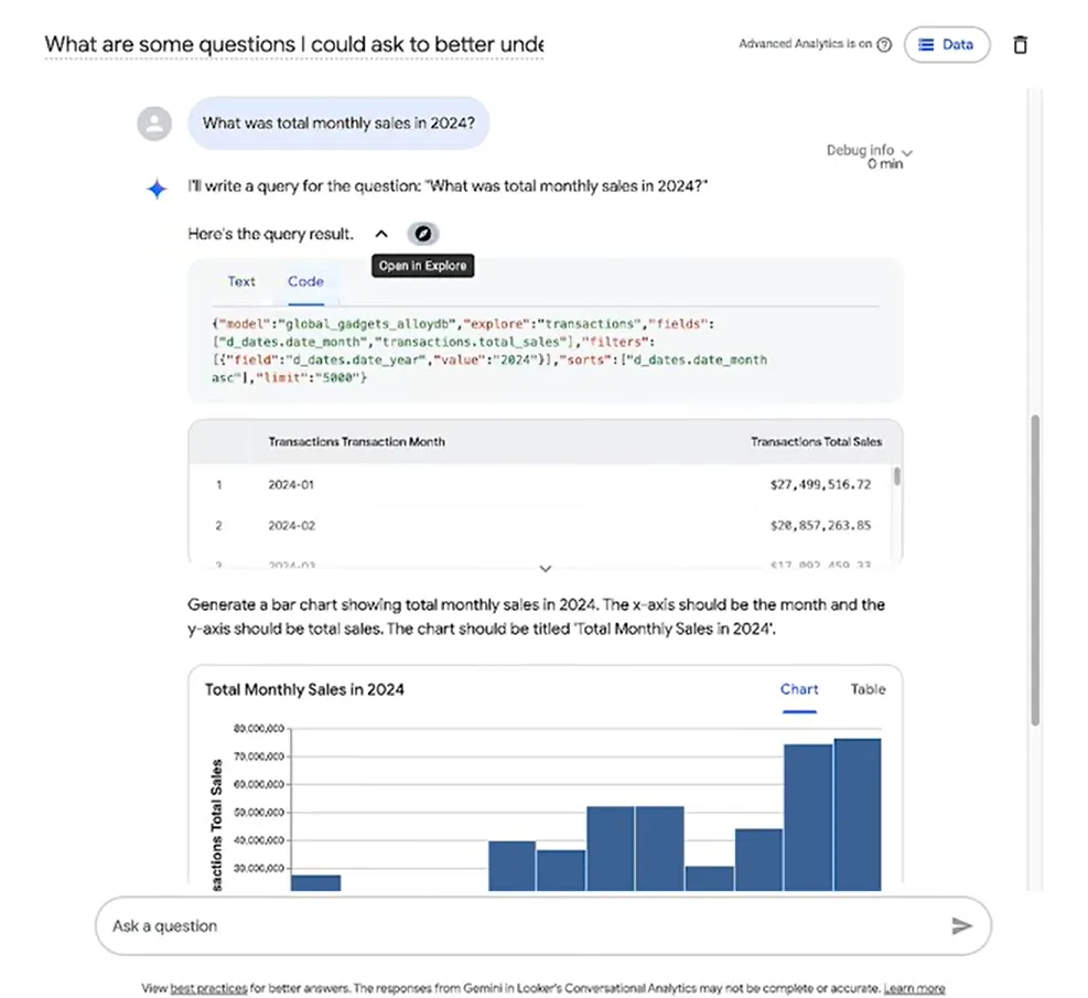
Google also lets you pin specialized agents directly onto a dashboard (in preview), so someone on the business side can pull an instant summary or dig deeper without collaring an analyst.
As you’ll expect, the quality of what comes back depends on how carefully the model beneath it was built.
The LookML semantic layer
LookML is Looker's data modeling language: you define each metric and business rule once, and every query after that resolves against that single definition.
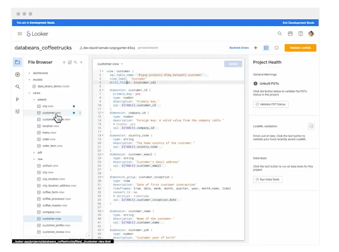
Feed a chart or feed an LLM, the number comes from the same place.
That's what stops a company from ending up with four rival versions of "active user," and it's also what gives Gemini reliable ground to stand on.
Note: LookML is a modeling language, and someone has to learn it and keep it current.
Embedded analytics and the Looker API
Looker's API and Embed SDK let a developer drop dashboards, and even conversational querying, straight into a company's own app, styled to match the product.
That turns it from an internal reporting tool into a way to ship data products other people use.
There's a lighter path too, a low-code iframe for teams that want something running quickly, and the newer Conversational Analytics API opens the door to multi-turn agent workflows inside a customer-facing product.
It's a capable embedding story, on the condition that you have engineering time to spend on it.
Built for the Google Cloud stack
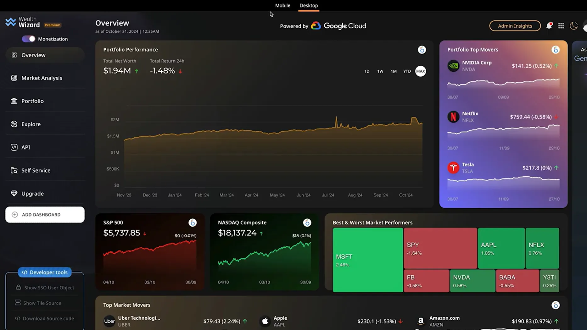
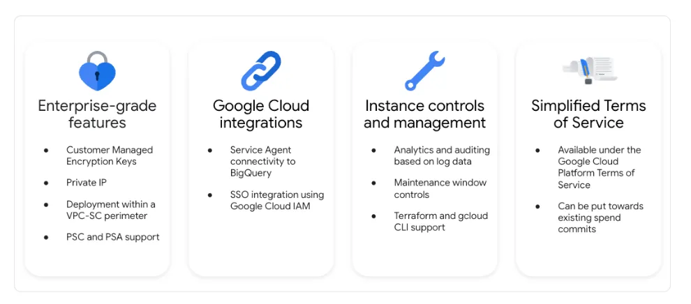
As Looker runs natively on Google Cloud, it comes with single sign-on through Cloud IAM, private networking, direct BigQuery access, and one shared contract with the rest of Google Cloud.
Those are the pieces teams already expect from a Google product.
So if BigQuery is already your warehouse and the company runs on Google Workspace, Looker fits into that world with very little friction.
Looker is best suited if:
✅ Your warehouse is BigQuery and the wider company already runs on Google Cloud.
✅ You want a single governed semantic layer behind every report and every AI answer.
✅ You have engineers who can write and maintain LookML.
✅ You're embedding analytics into a product and want Google's API and SDK doing the heavy lifting.
Looker may not be ideal since:
❌ Looker assumes a production cloud warehouse and an analytics engineer already in place, so teams without either stall before launch.
❌ Only Developer users can touch the Looker API, so Standard and Viewer seats cannot be wired into automated workflows.
❌ Platform and seat pricing are both custom-quoted, so budgeting means a sales call.
❌ The Gemini layer bills separately from seats once quotas start enforcing on October 1, 2026.
Tableau's features
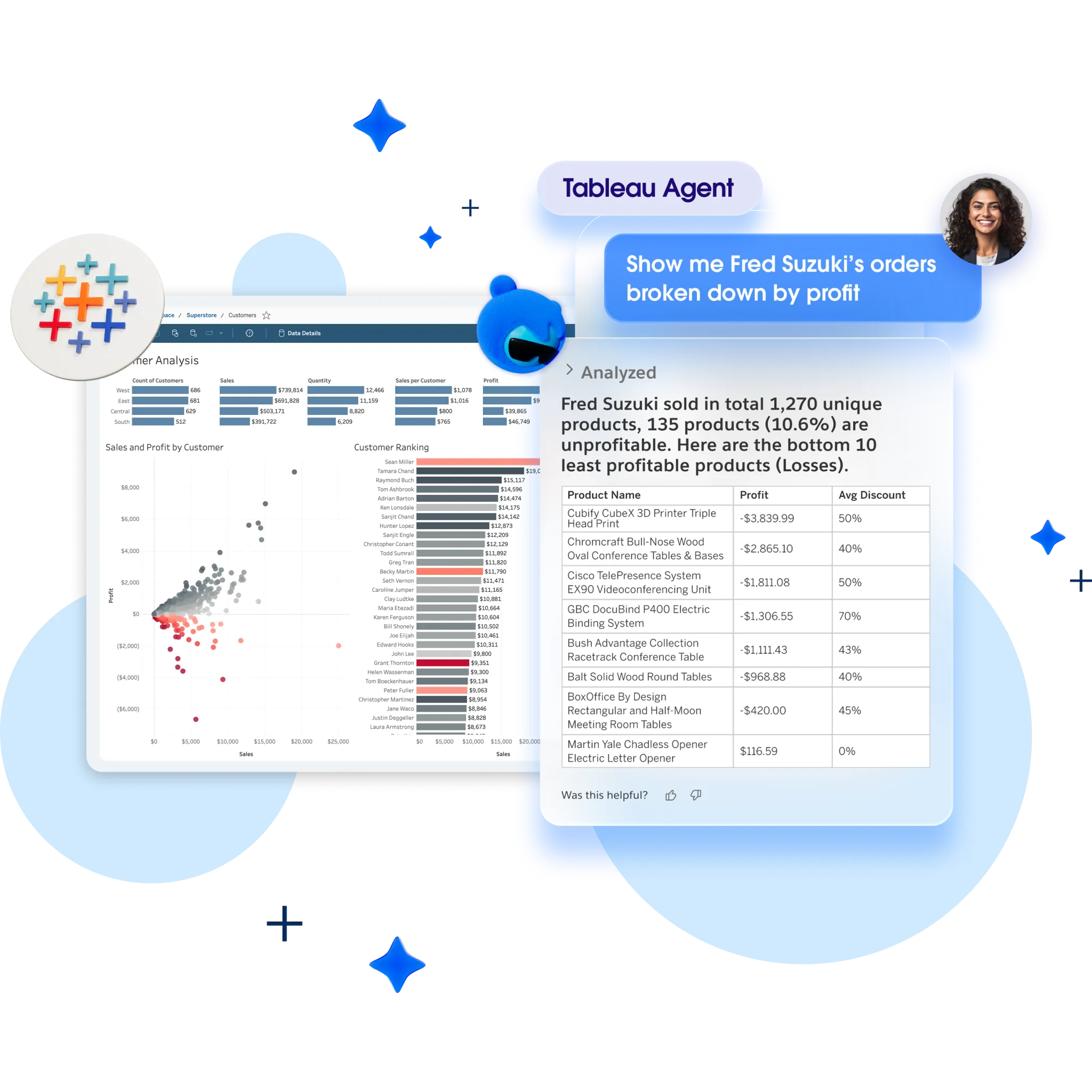
The VizQL engine
VizQL turns every drag-and-drop action into a live query and a rendered chart in a single motion.
Drag a field onto a shelf, and the result appears at once, so you're never far from the next question.
That immediacy is what analysts stay for.
You can interrogate a dataset by feel and change direction halfway through a thought, then still walk away with a dashboard that looks built for a boardroom.
On sheer catalogue of chart types, nothing else in this comparison is close.
➡️ Check out our comparison between Microsoft Power BI and Tableau.
Tableau Pulse for proactive monitoring
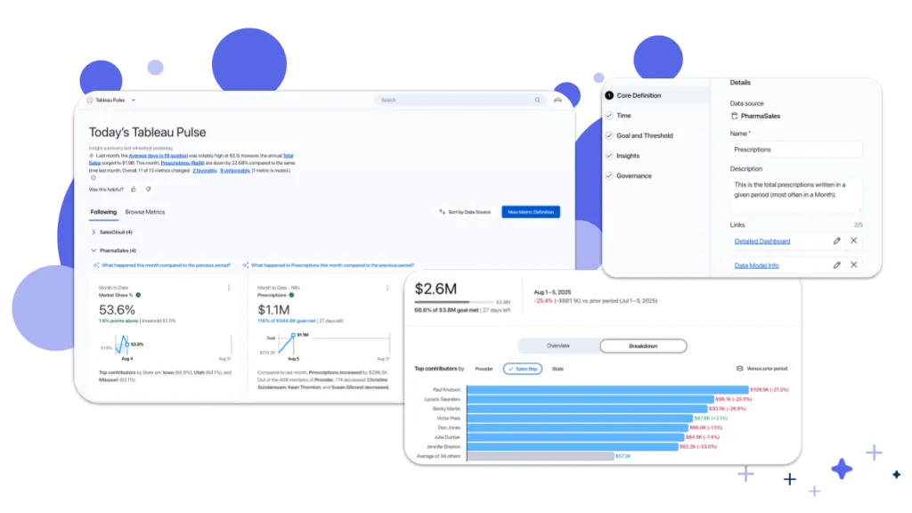
Pulse watches the metrics you nominate and sends a short written recap or an alert the moment a trend moves unexpectedly.
That turns Tableau from something you open into something that reaches out to you.
For teams where dashboards quietly go stale between check-ins, being notified is the big pro here.
One catch: Pulse only exists on Tableau Cloud. You can host Tableau Server yourself, and you pay the same per-seat rate without getting it.
Agentic analysis via Tableau Next
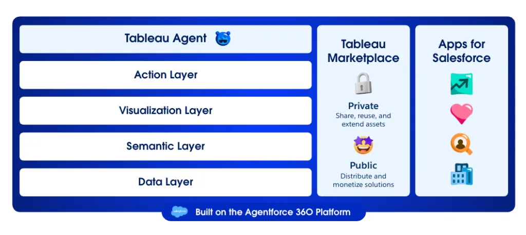
Tableau Next is Tableau's agent layer: ask a question in conversation, and it can carry the request through to an action, firing off a workflow in Salesforce or another connected system.
It's the Salesforce-era bet on agents doing the analysis, not just the charting.
Preparing and governing data
Tableau Prep cleans and reshapes data before it reaches a dashboard, letting analysts join and restructure sources without dropping into SQL.
Once analytics spreads across teams, governance becomes the concern, and Data Management handles it with cataloging and lineage tracking.
One thing to know up front: Data Management and Advanced Management only come with Enterprise or Tableau+, not Standard. Moving up for them roughly doubles your Viewer rate, from $15 to $35.
Tableau is best suited if:
✅ Your analysts want freedom to explore visually and won't tolerate a rigid, templated tool.
✅ Presentation-ready dashboards are central to how your team communicates findings.
✅ You already run on Salesforce and want analytics feeding off the same platform.
✅ Your stack is mostly non-Microsoft, so Power BI's ecosystem pull works against you rather than for you..
Tableau may not be ideal if:
❌ Your budget is tight, as role-based Creator and Viewer seats, with an Explorer tier in between, can climb quickly at scale.
❌ Your team is new to data analytics, as some advanced features are not very easy to understand at first, according to a G2 review.
❌ You push very large or live datasets, where dashboards can slow without careful extract tuning.
❌ You want the newest AI features, which sit behind the premium Tableau+ bundle at custom pricing.
Dot's features
Both Looker and Tableau are, at their core, presentation tools.
They fetch your data and render it well, and the work of reading it falls to you.
Dot takes that work on itself.
You ask a question the way you'd ask a teammate, and it runs the analysis and writes back an answer, plus the evidence for it and the move it would make next.
It can still build you a board when a board is genuinely the right output, but that is the exception rather than the point.
We didn't set out to add another dashboard product to a crowded shelf.
The ambition was smaller and more specific: a decision intelligence software for teams whose data is already in a warehouse, one that can tell you what changed and why it happened.
How the parts fit together: 👇
Answers where your team already works
Dot answers data questions right inside Slack and Teams, plus email and its own web app, so nobody has to break off and log into a separate BI tool.
That matters because the questions get raised in a chat thread anyway, usually as an aside in the middle of something else.
Tag it with something like "why did conversion drop in the DACH region last week" and a written answer comes back, not just a number sitting on its own.
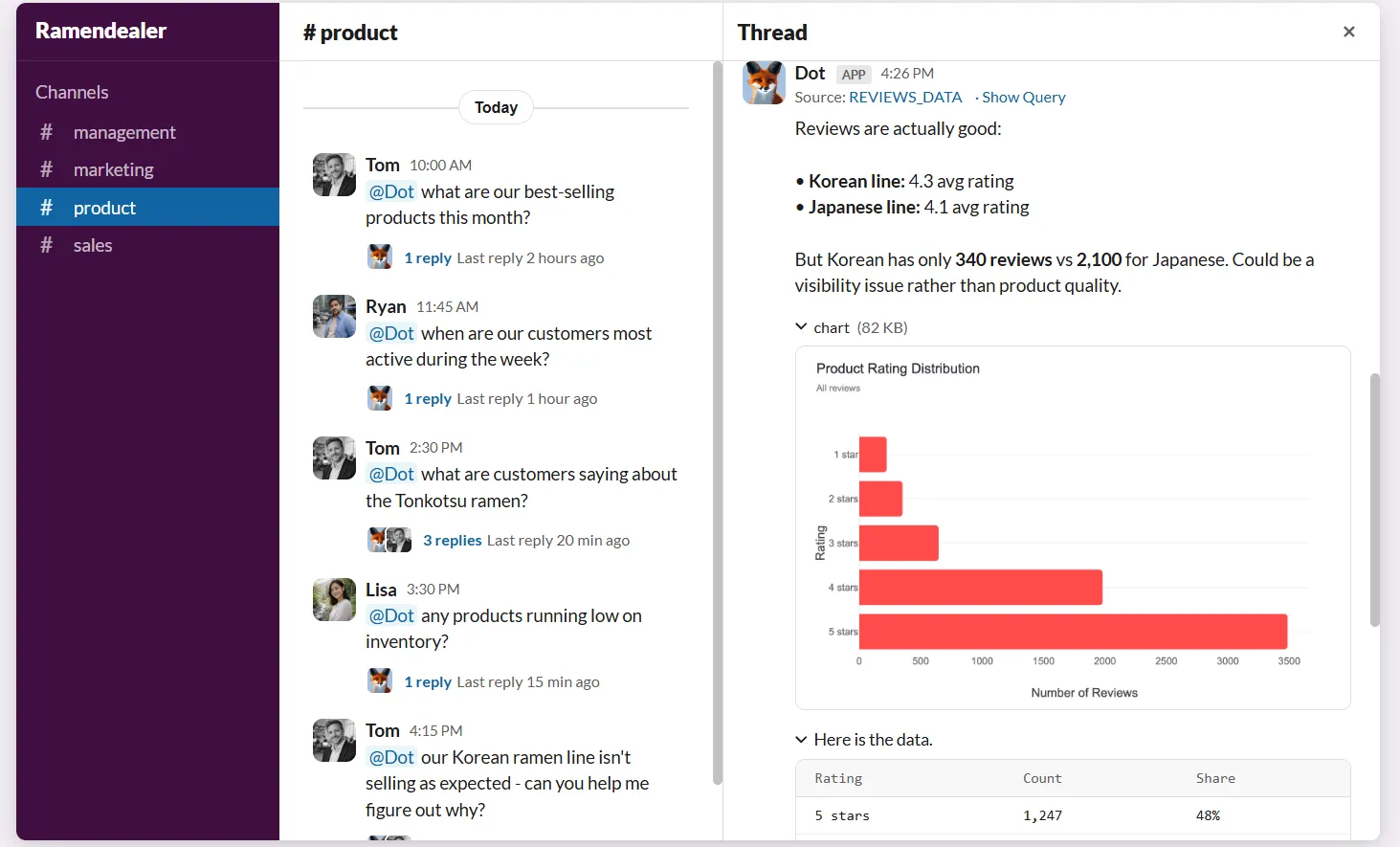
Straight lookups land in seconds, and a full investigation takes two to ten minutes. It reports the size of the move and the segment most responsible for it, with the query behind every figure one click away.
The knock-on effect: that trickle of one-off asks stops landing on the analytics team, and they get their time back for work that needs a human.
Deep Analysis for the "why"
Deep Analysis is the mode Dot uses for questions a single query can't settle, working through possible causes the way an analyst would until the numbers point somewhere solid.
When something has moved and the cause isn't obvious, it forms a hypothesis, tests it against the data, drops it, and tries the next.
It combs through combinations of dimensions a manual check would never have time to reach, and it grades how sure it is about each factor it turns up.
As the whole chain of queries stays visible, you can follow its logic step by step and don't have to take the conclusion on trust.
What lands at the finish is a tidy report: one clear figure up top, a short summary, the supporting charts, and the actions it recommends, with every number traceable to the query that produced it.
When you need to present it, the report exports to PowerPoint.
Hands-off business reviews
Dot writes recurring leadership reviews on its own, pulling from your warehouse on a set cadence and drafting each one as a narrative that walks through what changed and where attention should go.
Normally that ritual burns real hours a cycle, gathering the numbers and turning them into something readable.
It runs as a background agent, and you get two separate switches over it.
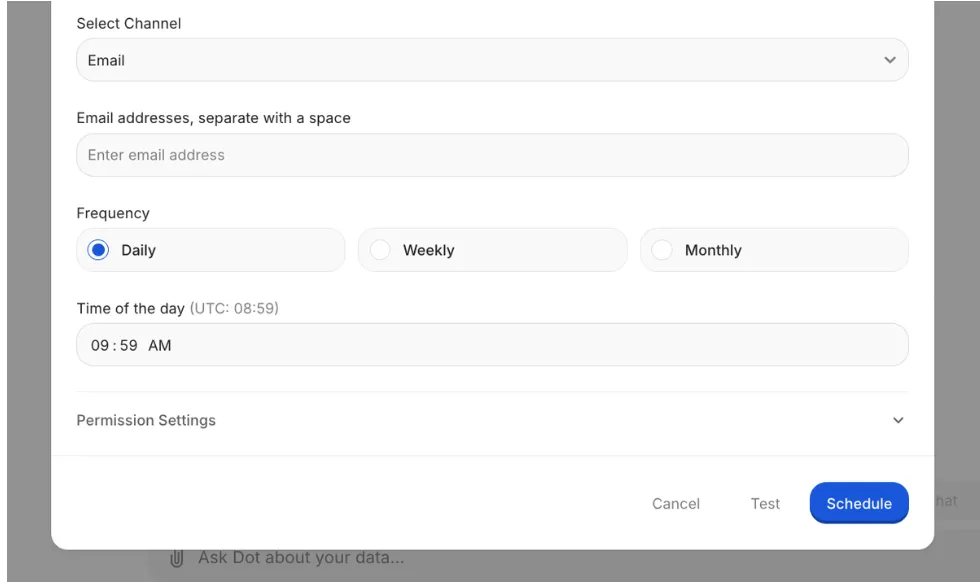
The first governs whether the review even runs, tied to movement in the underlying data.
The second governs whether it gets delivered, tied to whether the findings clear a bar you set.
So it can stay dormant for weeks, then land in your inbox at the exact moment something is finally worth reading.
Keeping metric definitions consistent
The Context Agent keeps every metric definition consistent, holding the company's agreed KPIs in one place on the DotML semantic layer and checking every query against them, so the same question resolves to the same number whoever's asking.
That drift is a real problem past a certain size, when finance has one definition of "active user" and product has another, and half a review meeting evaporates into arguing over whose figure is right.
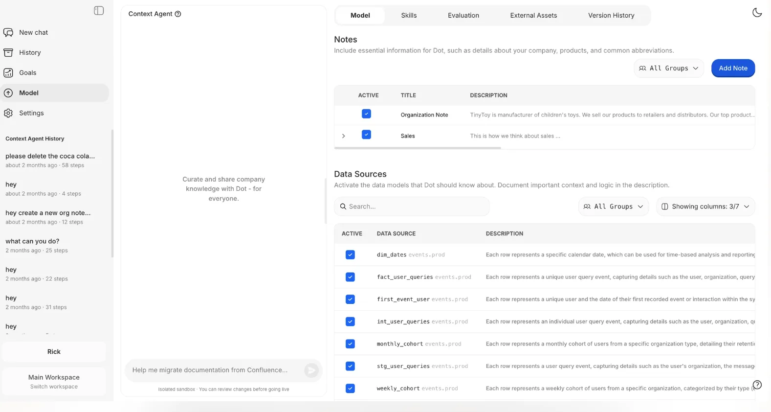
And when a definition needs to change, or a table shifts beneath one, Dot won't quietly edit the model.
It writes up the proposed change and routes it to an admin, who sees the full diff and signs off before anything goes live.
Building a dashboard from a description
Dot builds a working dashboard straight from a short written description, for the times a board really is the right output.
Say what you want tracked in a line or two, and it produces the board itself, charts, tables, KPI tiles, filters and all, that you can rearrange before you publish it and pass round the link.
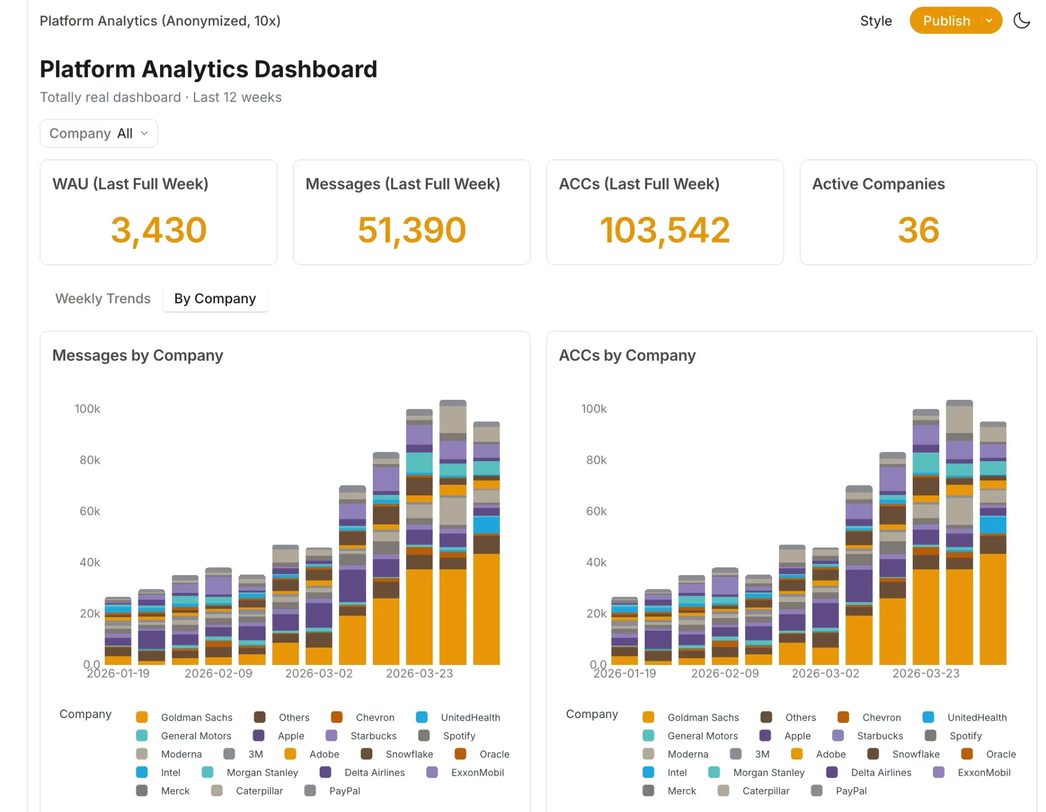
Every view refreshes when it's opened and resolves relative date ranges by itself, so the thing stays current with no manual wiring on your part.
Dot is the right choice if you:
✅ Run a warehouse like Snowflake or BigQuery and would rather have answers than another dashboard to maintain.
✅ Keep seeing the same handful of questions resurface in Slack and want them answered at analyst quality within minutes.
✅ Watch every reporting cycle vanish into building the executive review by hand.
✅ Need answers you can audit, every one tied back to the SQL that produced it.
Dot isn't the best fit if you:
❌ Haven't set up a cloud warehouse yet, since Dot connects to one and isn't a replacement for one.
❌ Want a heavy, pixel-perfect visualization suite as your main deliverable, which isn't what Dot is for.
Integrations: Looker vs. Tableau vs. Dot
Looker integrations
Looker talks to a broad range of SQL databases and warehouses, but its real advantage is how tightly it knits into the rest of Google.
A sample of what it connects to:
- BigQuery and Cloud SQL.
- Snowflake and Redshift.
- Spanner and PostgreSQL.
- Google Sheets and Drive.
- Google Ads and Analytics.
- Slack, through the Looker Action Hub.
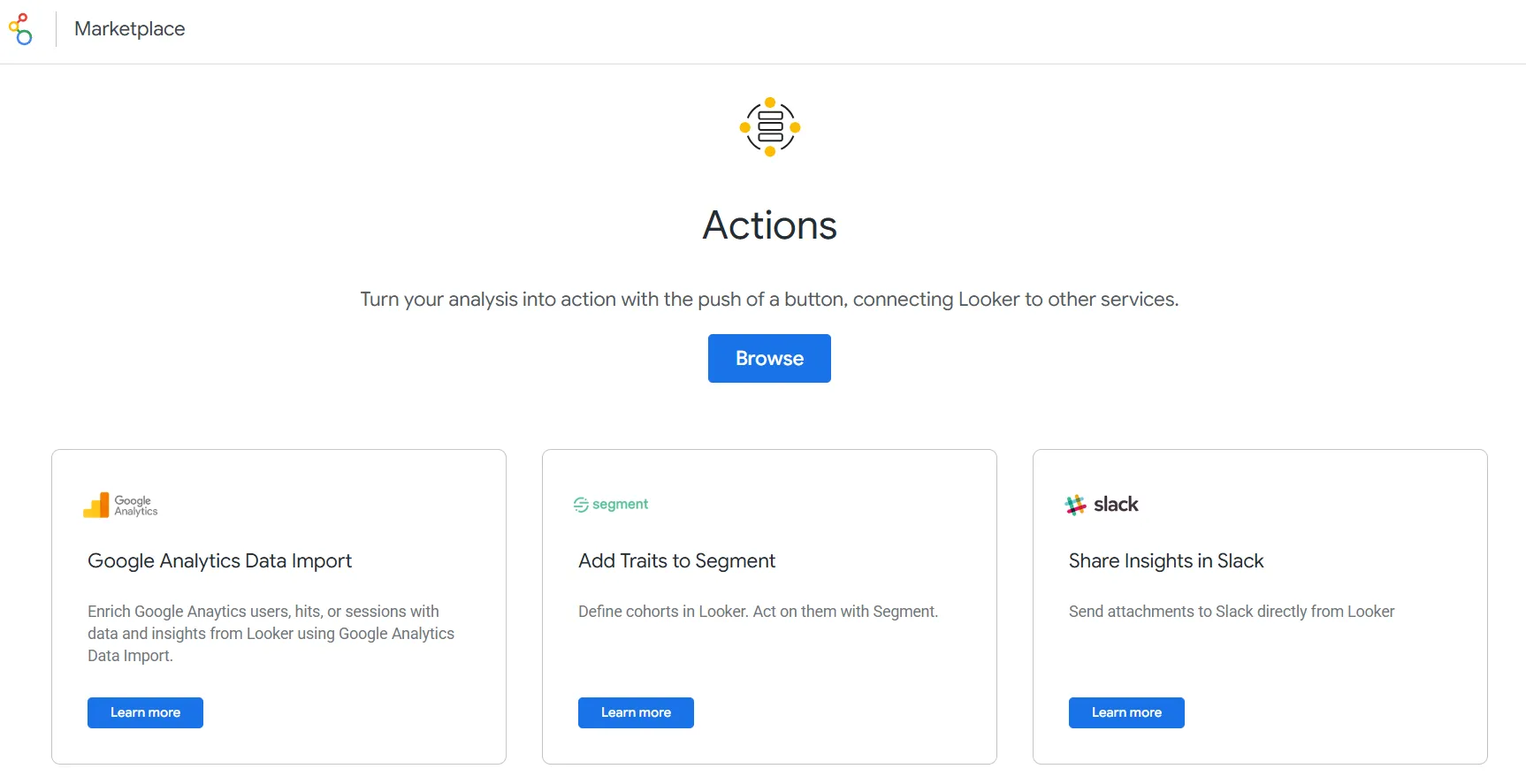
Tableau integrations
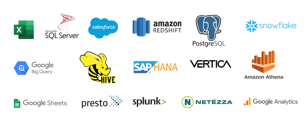
Tableau's connector list is long, reaching from local files all the way out to cloud apps, and its Salesforce ties have grown closer since the acquisition.
Some of the connectors worth flagging:
- Excel and CSV files.
- SQL Server and Oracle.
- Snowflake and BigQuery.
- Salesforce CRM.
- Google Analytics.
- Redshift.
Dot integrations
Dot runs against the warehouse you're already using, and it inherits any modeling you've done in dbt or Looker, so none of that needs rebuilding.
It reaches your everyday tools over MCP as well, the mechanism behind its links to Claude and ChatGPT.
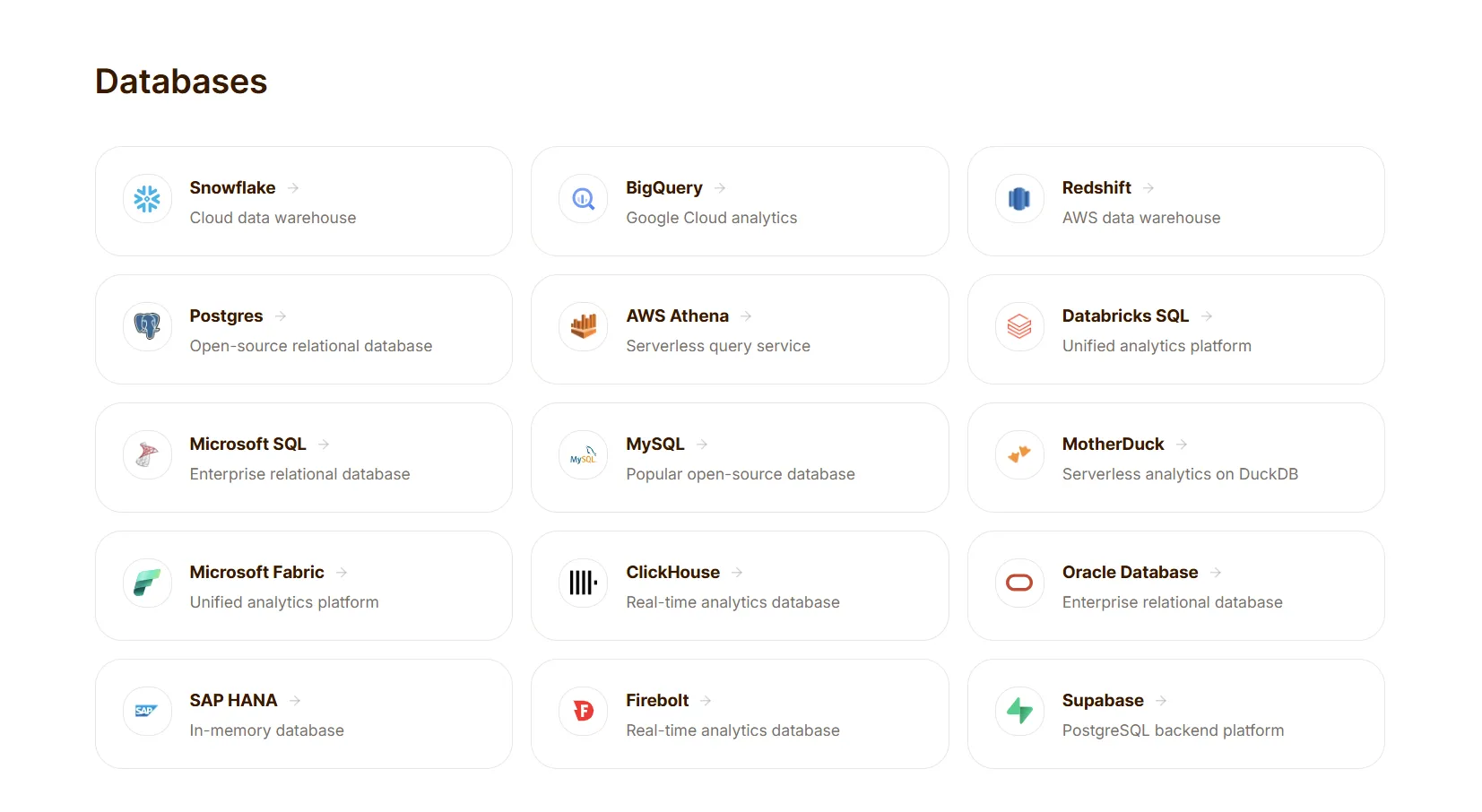
The connections that come up most:
- Snowflake and BigQuery.
- Redshift and Databricks.
- Postgres and MySQL.
- dbt and Looker.
- Slack and Microsoft Teams.
Pricing: Looker vs. Tableau vs. Dot
Looker pricing
Looker keeps its numbers off the page.
Pricing has two components, and neither is published: platform pricing, which covers running a Looker instance, and user licensing, charged per person by role.
Both are annual commitments quoted through sales.
The one part with public numbers is Conversational Analytics, metered in Gemini data tokens: free through September 30, 2026, then charged on overage.
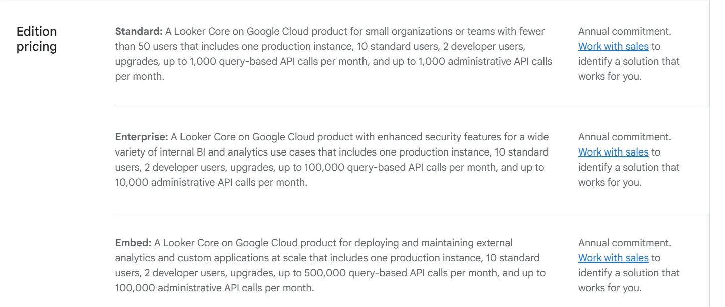
The platform editions:
- Standard: aimed at teams under 50 users, with one production instance, 10 standard and 2 developer users, and up to 1,000 query-based and 1,000 admin API calls a month.
- Enterprise: adds stronger security for wider internal BI, with up to 100,000 query-based and 10,000 admin API calls a month.
- Embed: built for putting analytics into external apps at scale, with up to 500,000 query-based and 100,000 admin API calls a month.
And the user types:
- Developer: full access, including LookML development, administration, and the API interfaces.
- Standard: can explore data, build dashboards and Looks, run SQL, and schedule content.
- Viewer: read-only access to dashboards and Looks, with filtering and drill-down.
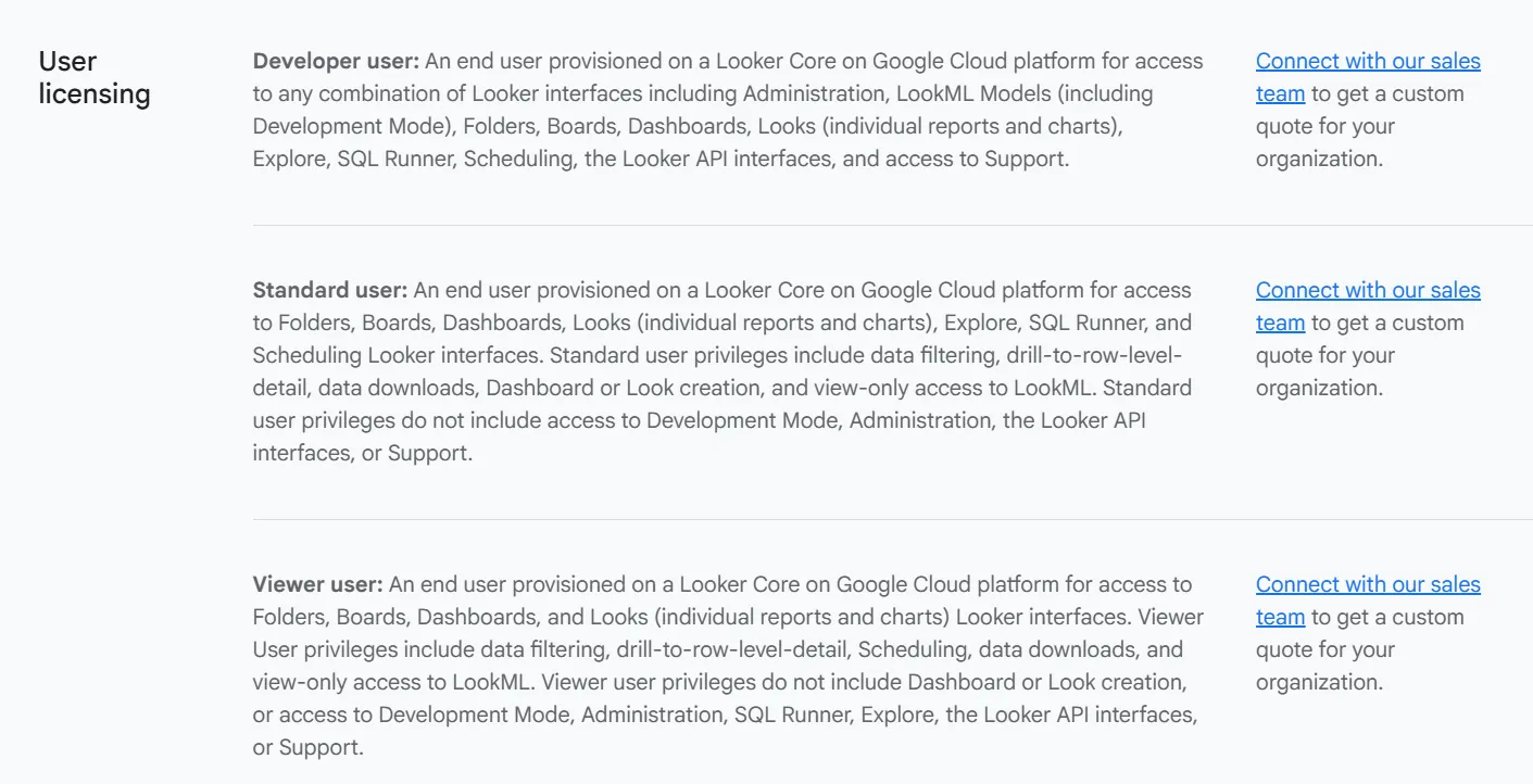
Tableau pricing
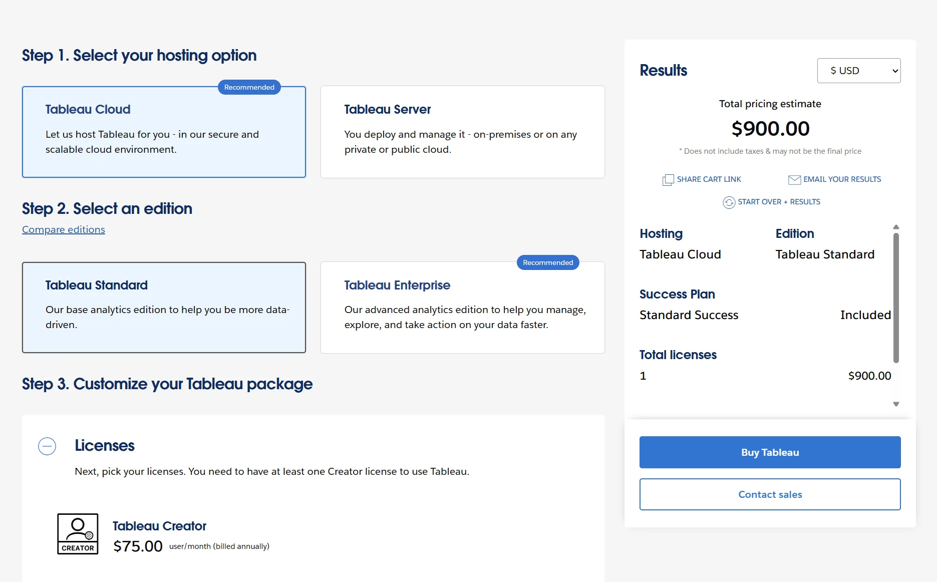
Tableau has a real free option, Tableau Public, alongside a free Desktop edition.
Paid usage is licensed per person per year and priced by role, so your bill tracks the mix of Creators, Explorers, and Viewers you actually need.
At least one Creator is mandatory.
Whether you run it on Tableau Cloud or host Tableau Server yourself, the per-seat rates come out the same.
- Free: Tableau Public and the Tableau Desktop free edition, for local analysis with no sharing.
- Tableau Standard: seats run from $15/user/month for a Viewer up to $75/user/month for a Creator, with Explorer at $42 in between, covering the Tableau Desktop and Prep Builder apps, plus Pulse.
- Tableau Enterprise: seats run from $35/user/month for a Viewer up to $115/user/month for a Creator, with Explorer at $70 in between, adding Advanced Management and Data Management.
- Tableau+: AI-powered agentic analytics for the whole organization, at custom pricing (contact sales).
Dot pricing
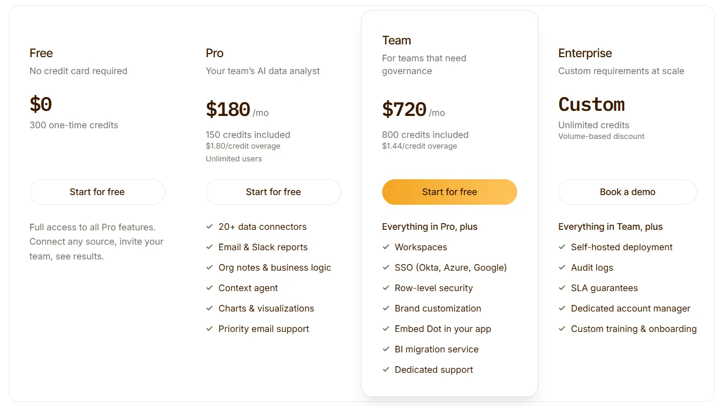
Getting started costs nothing.
The free tier ships with 300 one-time credits and every Pro capability switched on, enough to point Dot at your own data and judge it properly before any money changes hands.
Above that, three paid plans:
- Pro: $180/month gets you 150 credits, unlimited users, and a $1.80 charge on any credit past that.
- Team: $720/month lifts the allowance to 800 credits with a lower $1.44 overage, and adds the governance layer, so SSO, row-level security, embedding, a BI migration service, and dedicated support.
- Enterprise: a custom quote that unlocks unlimited credits and volume discounts, plus self-hosted deployment, audit logs, an SLA, and a dedicated account manager.
Looker, Tableau, or Dot: summary
Here's how the 3 platforms stack up:
Looker | Tableau | Dot | |
Best for | Data teams standardizing metrics across a Google Cloud and BigQuery stack | Teams doing heavy, hands-on visual analysis who care about polished dashboards | Warehouse-backed teams that want the answer itself, not a chart to work through |
Standout feature | LookML semantic layer feeding dashboards and Gemini alike | VizQL, its drag-to-build visual engine | AI analysis delivered as written answers in Slack, Teams, email, and the web app |
Integrations | Google-native, wide SQL database support | Large connector catalogue, especially strong with Salesforce | Runs on your warehouse, reuses dbt and Looker models, supports MCP |
Free tier? | No (free trial) | Yes (Tableau Public and free Desktop edition) | Yes (300 credits, full Pro features) |
Starts from | Custom (contact sales) | $15/user/month | $180/month, unlimited users |
Get started with Dot for free today
All Dot needs is for you to give it access to the warehouse you've already got, put your question in normal words, and the reply arrives in Slack, Teams, email, or the web app without anybody having to go and fetch it.
Here’s what you get with Dot:
- A free plan with 300 credits and the full Pro feature set, open to as many users as you like.
- Self-service analytics: Answers that come to you in Slack, Microsoft Teams, email, and the web app.
- Deep Analysis that chases down why a number moved and returns with recommendations attached.
- Executive reviews that write themselves on the cadence you choose.
- A Context Agent that keeps every metric definition consistent and surfaces conflicts early.
- A complete audit trail behind each answer, traceable to the SQL and source data it came from.
➡️ Get started for free with Dot's free plan, or schedule a demo to see how it works with your data.
⚠️ Disclaimer: This article was last updated on July 29, 2026. If you spot any inaccuracies, contact us, and we'll fact-check it.
Read More
Microsoft Power BI Pricing: Is It Worth It In 2026?
10 Best Hex Alternatives & Competitors In 2026
10 Best Sisense Alternatives & Competitors In 2026
10 Best Skopx Alternatives & Competitors In 2026
10 Best Mode Alternatives & Competitors In 2026
Theo Tortorici
Theo writes about AI-powered analytics, data tools, and the future of business intelligence at Dot.