
10 Best BI Tools For Data Visualization In 2026
In this article, I'll review the 10 best BI tools for data visualization in 2026 across AI-powered analytics platforms, enterprise BI tools, and warehouse-native or open-source solutions, covering their features, pricing, and pros and cons.
TL;DR
- Dot offers the best BI tool for data visualization with its AI-powered narrative analysis, automated business review reports, full audit trail on every insight, and credit-based pricing with unlimited users.
- If you want traditional dashboarding and visual exploration at scale, Tableau, Microsoft Power BI, and Qlik Sense are the enterprise-grade platforms most teams already know.
- For warehouse-native querying, governed metrics, or open-source simplicity, Looker, Sigma, and Metabase give data teams more control over how analytics are modeled and delivered.
What are the best BI tools for data visualization In 2026 (comparison)?
The best data visualization tools in 2026 are Dot with its AI data analyst that delivers narrative insights, Tableau, and Microsoft Power BI.
Here's a breakdown:
Tool | Use Case | Price |
Dot | An AI data analyst that delivers narrative insights, recommendations, and automated executive reports instead of static dashboards. | Free plan; Paid from $180/month. |
Tableau | Advanced visual analytics and exploratory data storytelling for large, complex datasets. | From $15/creator/month. |
Microsoft Power BI | Standardized dashboards and self-service reporting inside the Microsoft ecosystem. | Free plan; Pro from $10/user/month. |
Looker | Governed, warehouse-native BI with a centralized semantic layer for consistent metrics. | Custom pricing (annual contract). |
Qlik Sense | Associative analytics engine for exploring complex data relationships beyond traditional queries. | Custom pricing. |
ThoughtSpot | AI-driven analytics with natural-language search for fast self-service data exploration. | From $25/user/month (annual). |
Sigma | Spreadsheet-style analytics on live warehouse data for finance and ops teams. | Custom pricing. |
Metabase | Open-source BI for simple dashboards and self-service analytics with minimal setup. | Free (Open Source); Cloud from $100/month. |
Domo | All-in-one cloud BI with data ingestion, dashboards, automation, and alerts. | Custom pricing (30-day free trial). |
Zoho Analytics | Budget-friendly BI with dashboards, AI, and 50 visualization types, especially for Zoho users. | From $60/month (Standard). |
What are the best AI-powered BI tools for data visualization?
If your team's bottleneck isn't building dashboards but actually getting answers from data, AI-powered analytics platforms take a different approach.
Instead of asking users to explore charts and draw conclusions themselves, these tools use natural language, machine learning, or full AI agents to surface insights, explain what changed, and in some cases tell you what to do about it.
Here are the best AI-powered BI tools for data visualization in 2026:
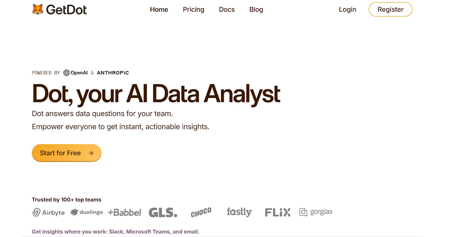
#1: Dot
Dot offers the best AI-powered business intelligence tool on the market that lets you go from raw warehouse data to explained, decision-ready insights without building a single dashboard.
We're not trying to compete with tools that give you prettier charts or more drag-and-drop options.
Our platform is built around a different idea entirely: that the analysis itself should be automated, so the people who need answers can get them in minutes, and the people who normally produce those answers can spend their time on work that actually moves the business forward.
Here's what that looks like in practice: 👇
Ask business questions and get a full analysis back in minutes
Picture this: your VP of Marketing asks why paid acquisition costs jumped 22% last week.
In a traditional BI setup, that question becomes a ticket. An analyst picks it up, digs through two dashboards, writes a SQL query, cross-references it with campaign data, and sends back a summary two days later.
With Dot, that same VP types the question into Slack.
Two minutes later, they get a structured response that breaks down the cost increase by channel, identifies which campaigns drove the spike, and flags that one audience segment accounted for most of the overspend.
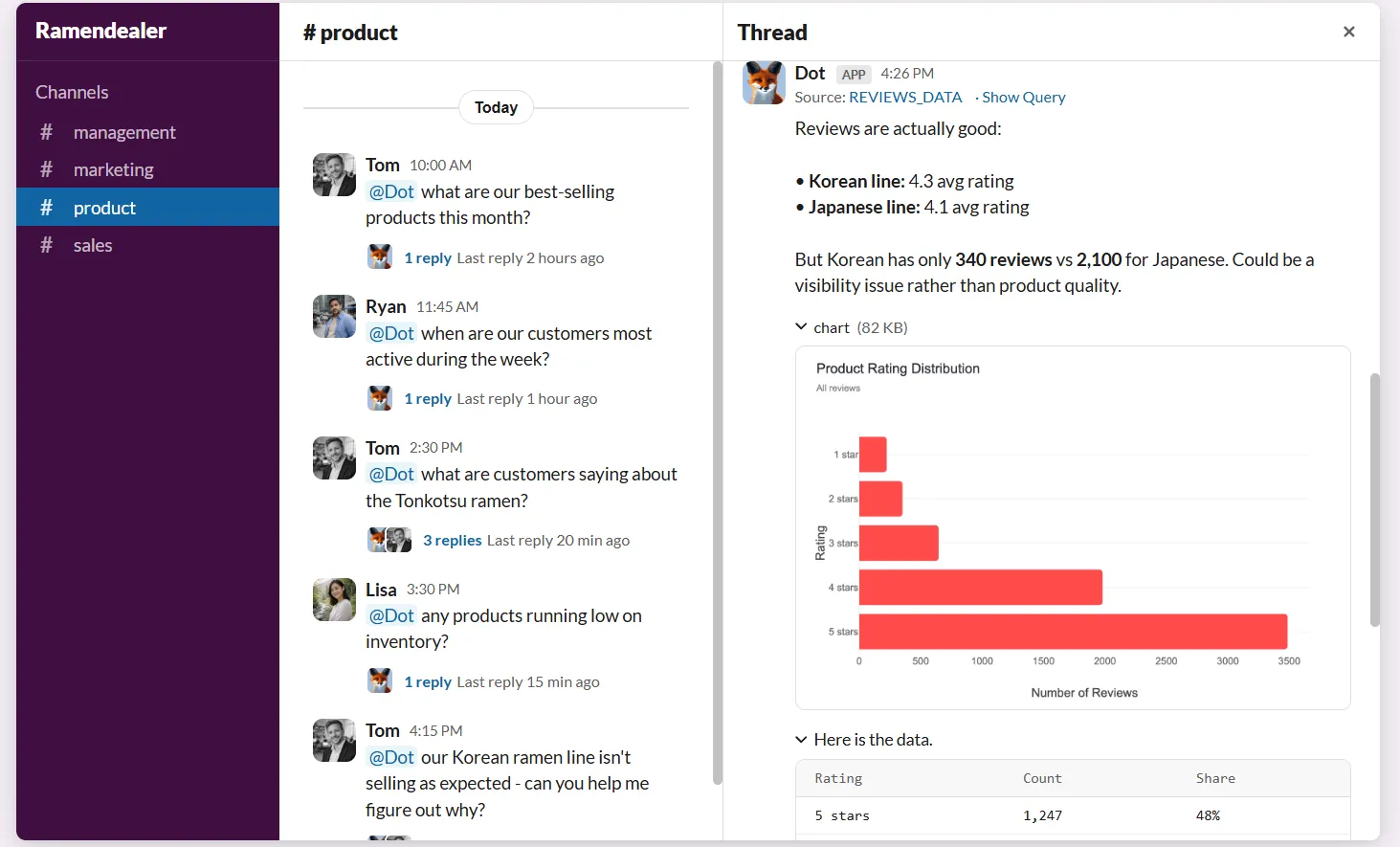
The analyst never gets interrupted and the VP never had to wait.
And the response isn't just a number in a chat window. It includes the full reasoning, the data behind it, and specific recommendations on what to look at next.
Automated executive-ready business reports
Every data team I've talked to has the same complaint about recurring reports.
They take hours to compile, the format barely changes week to week, and half the time, leadership skims them in two minutes before moving on.
Dot handles this by generating scheduled PowerPoint reports that pull live data from your warehouse and write the narrative for you.
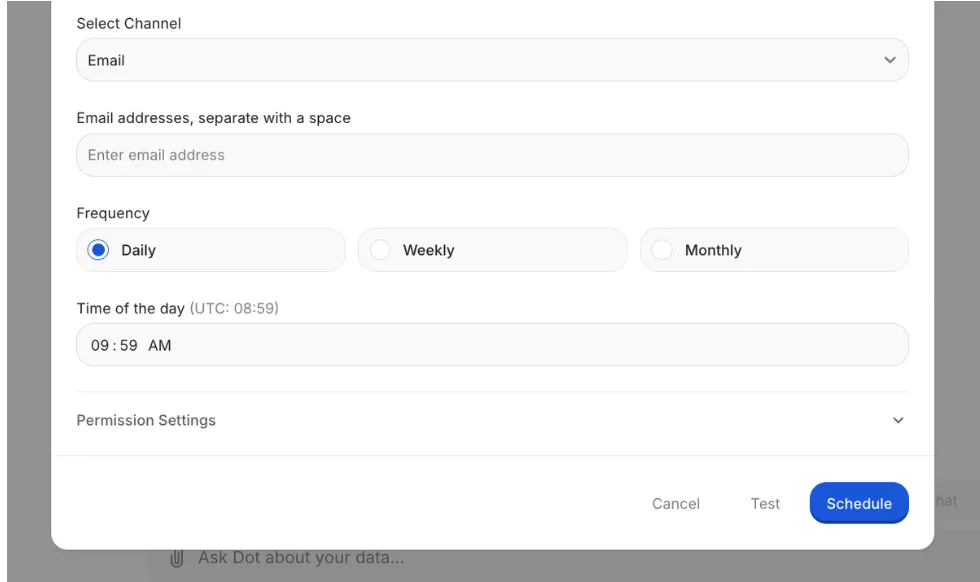
Not a dashboard screenshot pasted into a slide: an actual written analysis that covers what happened, how it compares to the previous period, where the numbers are trending, and what deserves attention.
Data teams reclaim the hours they used to spend copying charts into slide decks, while leadership gets a report they can actually read without asking someone to explain what the bar chart means.
Persistent business context and shared definitions
Here's a scenario that plays out at almost every company with more than one BI dashboard: marketing defines "active user" one way, product defines it another, and finance uses a third version that nobody can trace back to a source.
Three teams, three numbers, one meeting that goes nowhere.
Dot's Context Agent exists specifically to stop this from happening.
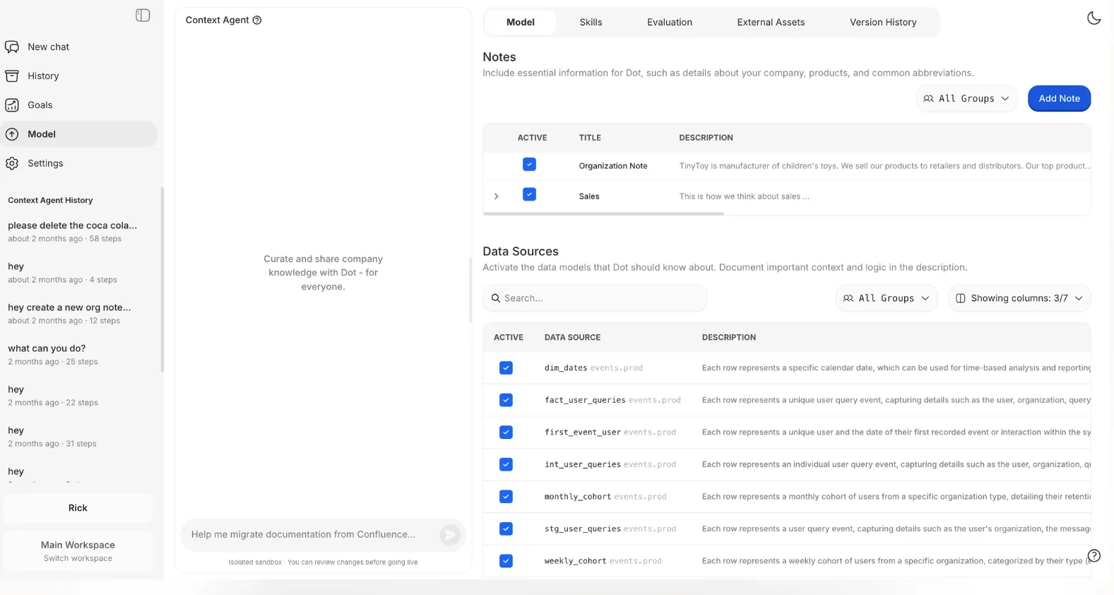
It crawls your existing documentation, dbt models, data catalog, and Confluence pages, then builds a unified layer of business definitions that every query and report references.
When something's missing, it creates the documentation. When something conflicts, it flags it.
The result is that every answer Dot produces is grounded in the same definitions, no matter who asks the question or when they ask it.
Full audit trail on every insight
Trust is the quiet problem in analytics.
A dashboard can show you that churn went up 8%, but if your CFO asks "where did that number come from?" and nobody can trace it back to the exact query, table, and filter logic, the insight loses its weight.
Every answer Dot produces comes with footnotes.
Not vague citations. Actual links to the SQL query it ran, the Python code it used for calculations, and the specific datasets it pulled from.
If something looks wrong, anyone on the team can click through, inspect the logic, and validate it in minutes.
That kind of transparency changes how teams treat data, because it's no longer "the dashboard says so." It's "here's exactly how we got to this number."
Dot's integrations
Dot is designed to plug into the stack your team already has, rather than asking you to rip anything out.
On the data side, it connects to Snowflake, BigQuery, Redshift, Databricks, Postgres, MySQL, and SQL Server.
It also works with semantic layers like dbt, Looker, Power BI models, and Cube, so it picks up whatever metric definitions and business logic you've already built.
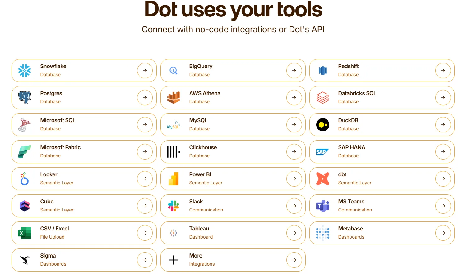
On the delivery side, insights land in Slack, Microsoft Teams, email, or the Dot web app.
And it can run alongside your existing BI tools. If your team still wants Tableau for certain visual reports or Metabase for embedded dashboards, Dot doesn't ask you to choose.
What makes Dot different from other BI visualization tools
Most BI tools start with a canvas.
You connect data, drag fields into a chart builder, tweak colors, set up filters, publish the dashboard, and then cross your fingers that someone opens it and draws the right conclusion.
Dot starts with a question.
You ask what happened, and it goes and finds out. It queries the warehouse, runs the analysis across multiple angles, writes up the findings, and tells you what to pay attention to.
That's a fundamentally different product.
The output isn't a chart you have to interpret. It's a written explanation with supporting data, clear recommendations, and an audit trail so you can verify every claim.
And because Dot maintains shared business context across your entire data environment, the answer your CEO gets at 7 AM is grounded in the same logic as the answer your analyst validated at 3 PM yesterday.
No more dashboard sprawl, no more conflicting metrics, and no more "can someone explain what this chart is showing?"
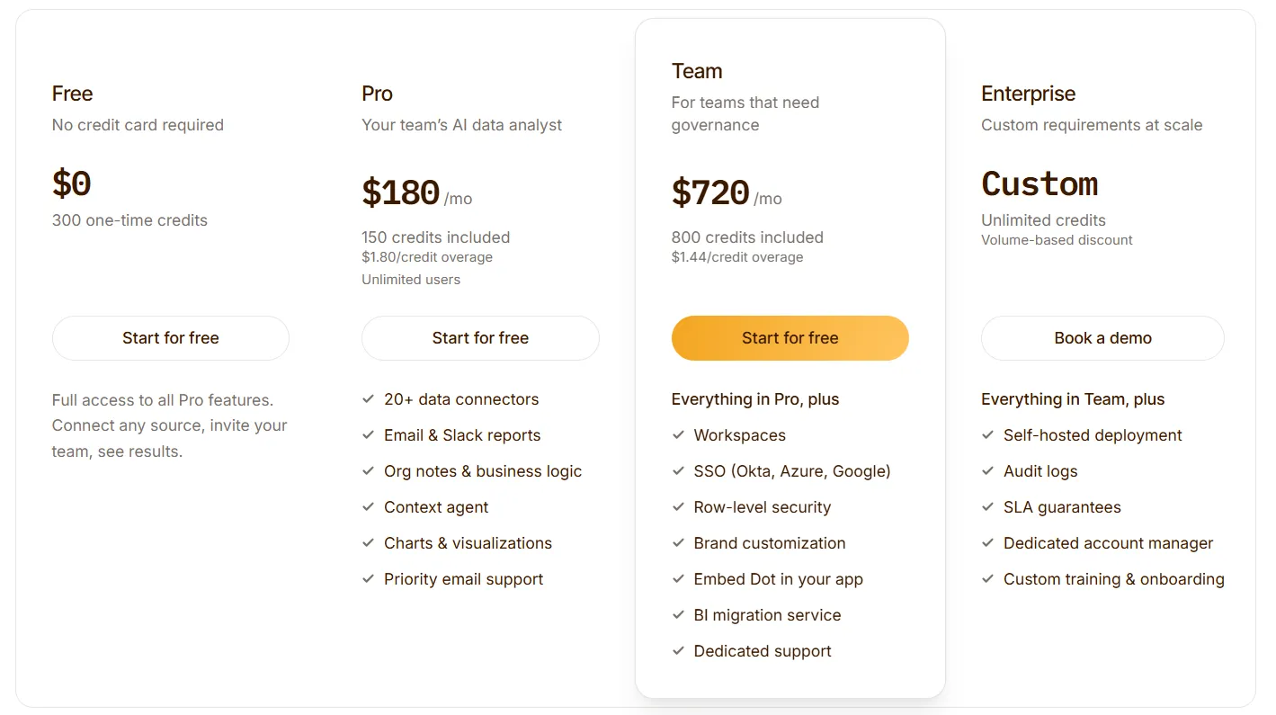
Dot pricing
Dot offers a free plan with 300 one-time credits and full access to Pro features, so you can test the platform without committing.
There are three paid plans:
- Pro: $180/month, includes 150 credits per month, $1.80 per credit overage, and unlimited users.
- Team: $720/month, includes 800 credits per month, $1.44 per credit overage, SSO, row-level security, embedded analytics, BI migration support, and dedicated support.
- Enterprise: Custom pricing, includes unlimited credits, volume discounts, self-hosted deployment, audit logs, SLA, and a dedicated account manager.
➡️ Annual billing saves 10% across all paid plans.
Dot pros and cons
✅ Turns raw data into written analysis with recommendations, not just visuals.
✅ Scheduled executive reports that replace hours of manual slide-building each week.
✅ Every insight comes with traceable footnotes linking to SQL, Python, and source datasets.
✅ Works on top of your existing warehouse and semantic layer without replacing anything.
✅ Credit-based pricing with unlimited users.
❌ Not a traditional dashboarding tool, so teams that need heavy custom visuals will want to pair it with a traditional BI layer.
❌ Needs a connected data warehouse to function, which means teams without proper data infrastructure aren't the right fit yet.
#2: ThoughtSpot
Best for: Business teams that want fast, natural-language access to data without relying on analysts or learning SQL.
Similar to: Dot, Supaboard.
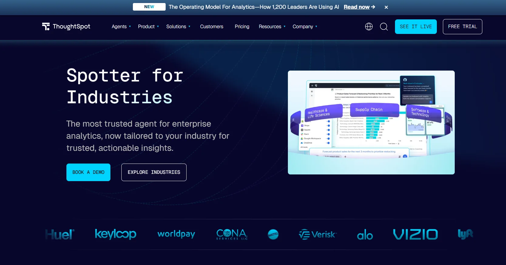
ThoughtSpot is an AI-driven analytics platform where users type questions in a search bar and get instant charts and answers.
It's a solid pick for teams exploring alternatives to lighter AI tools likeJulius AI.
ThoughtSpot's Top Features
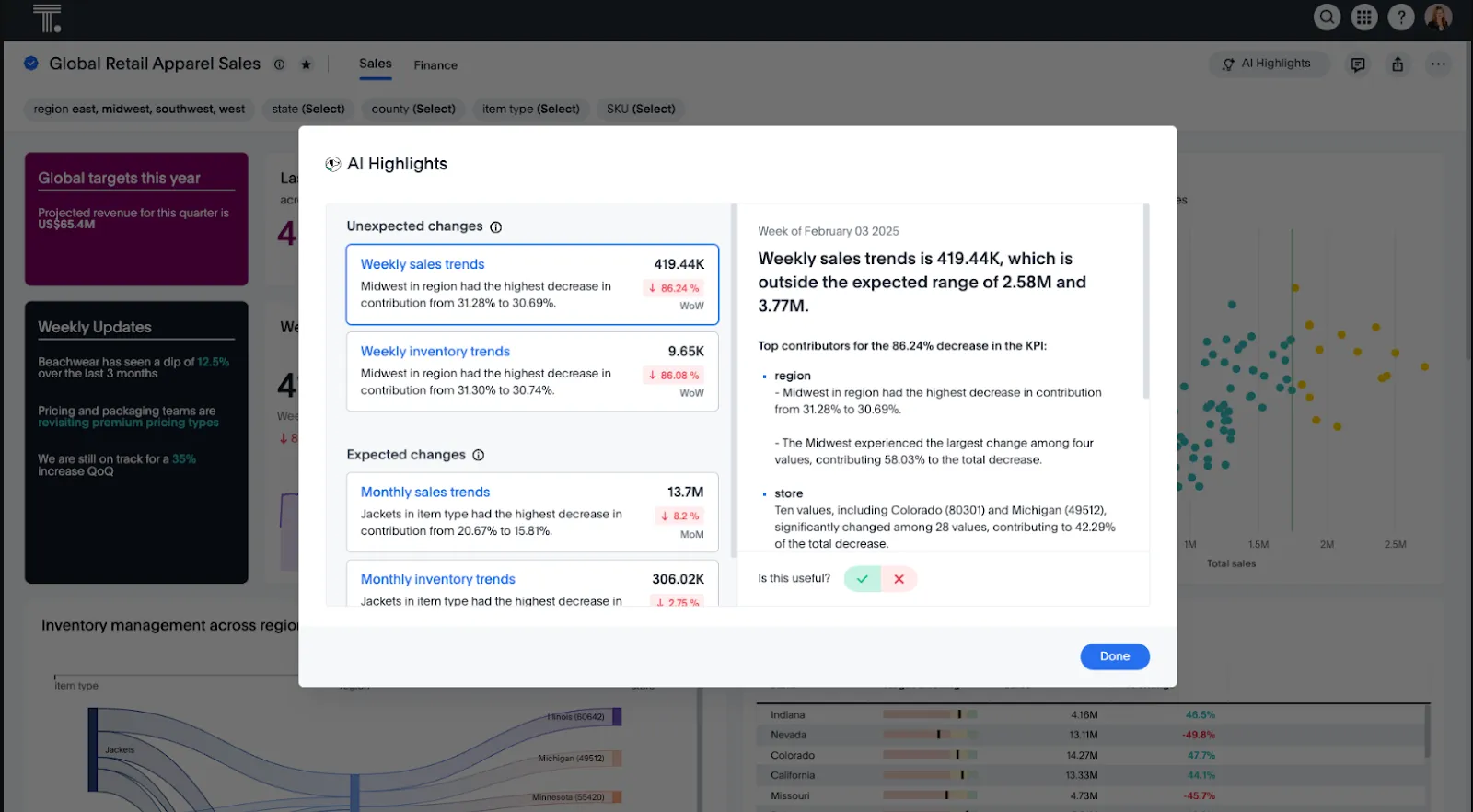
- Natural-language search: Type questions in plain English and get instant visual answers without writing queries or navigating complex dashboards.
- AI-powered insights with Spotter: Spotter acts as an AI analyst that proactively surfaces trends, anomalies, and explanations across your data.
- Embedded analytics: Embed search-driven analytics into your own products or internal tools with full customization.
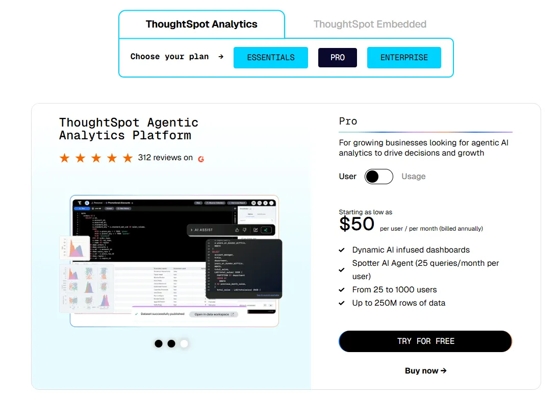
ThoughtSpot Pricing
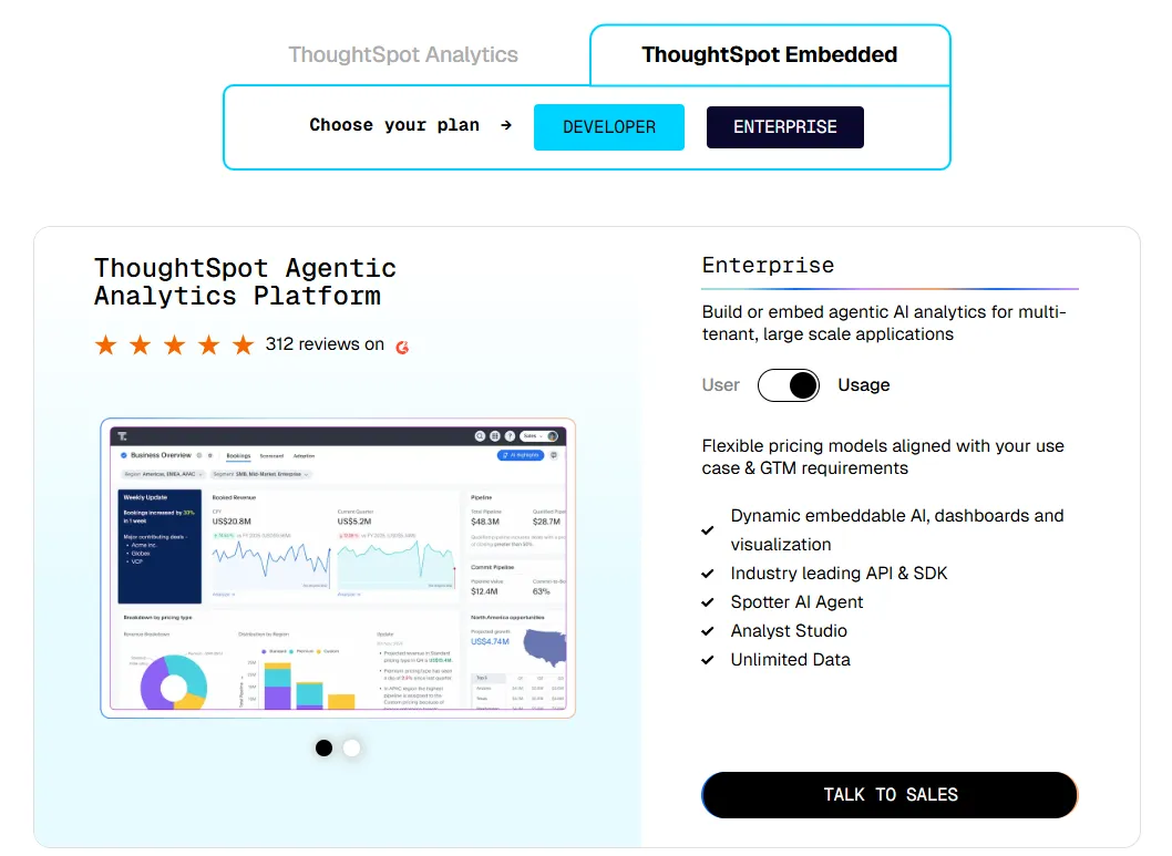
ThoughtSpot offers two separate products - ThoughtSpot Analytics for internal BI and ThoughtSpot Embedded for building analytics into applications - each with flexible pricing depending on scale and usage:
- ThoughtSpot Analytics:
- Essentials: From $25 per user per month (billed annually), for teams of 5-50 users, includes dynamic interactive dashboards and AI-powered insights and supports up to 25M rows of data.
- Pro (per user pricing): From $50 per user per month (billed annually), for 25–1,000 users, includes everything in Essentials, plus AI-infused dashboards and Spotter AI Agent (25 queries per user/month), and supports up to 250M rows of data.
- Pro (usage-based): From $0.10 per query, includes everything in Pro per user, and adds Analyst Studio.
- Enterprise (user or usage-based): Custom pricing, includes everything in Pro, plus unlimited users and data.
- ThoughtSpot Embedded:
- Developer: Free for 1 year, includes embeddable AI analytics, dashboards, and visualizations, APIs and SDKs, up to 10 users and 25M rows of data.
- Enterprise (user-based): Custom pricing, includes everything in Developer, plus unlimited data.
- Enterprise (usage-based): Custom pricing, everything in Enterprise, plus Spotter AI Agent and Analyst Studio.
ThoughtSpot Pros and Cons
✅ Very easy for non-technical users.
✅ Built-in AI surfaces patterns and trends faster than manual dashboard exploration.
❌ Two pricing structures (per user vs. usage-based) can get confusing at scale.
#3: Domo
Best for: Mid-to-large teams that want an all-in-one BI platform combining data integration, dashboards, automation, and AI-driven actions.
Similar to: Qlik Sense, Power BI.
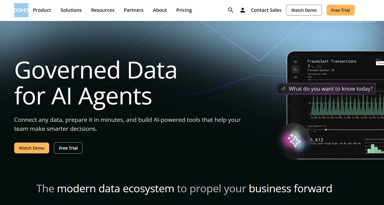
Domo is an end-to-end analytics platform that connects data from virtually any source and turns it into interactive, real-time dashboards.
It goes beyond reporting by combining automation and built-in AI to help teams act on insights directly, which sets it apart from more narrowly focused tools likeMindsDB orTextQL.
Domo's Top Features
- Interactive dashboards and sharing: Build real-time dashboards that are easy to explore, share, and embed across teams or customer-facing apps.
- No-code analytics apps: Create custom, data-driven apps tailored to business workflows without writing code.
- AI-powered insights and chat: Ask questions in natural language, surface hidden trends, and use AI agents to automate decisions directly from dashboards.
Domo Pricing
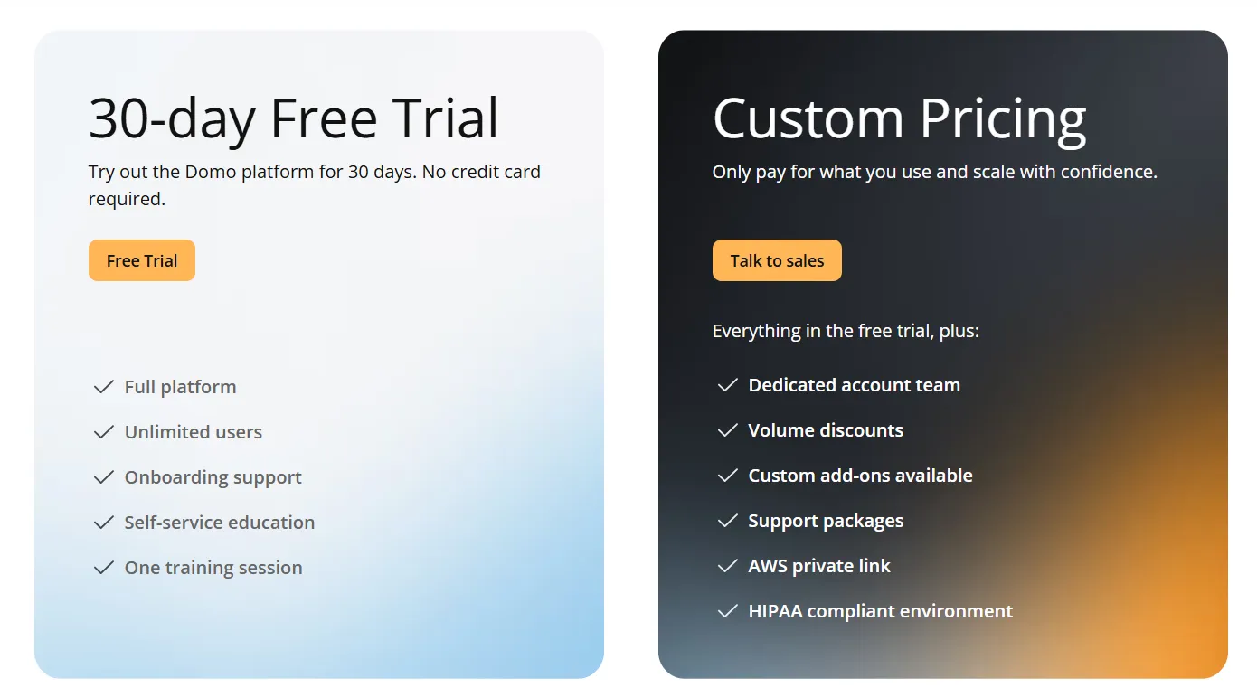
Domo offers a 30-day free trial with full platform access, unlimited users, onboarding support, and one guided training session.
The paid tier is usage-based and includes a dedicated account team, volume discounts, custom add-ons, and support packages.
For pricing details, you have to contact sales.
Domo Pros and Cons
✅ Very easy to use for non-technical teams.
✅ Strong connector library for centralizing data from many tools.
#4: Zoho Analytics
Best for: Teams that want a budget-friendly BI platform with strong AI features, lots of connectors, and an interface that both analysts and business users can work with.
Similar to: Metabase, Power BI.
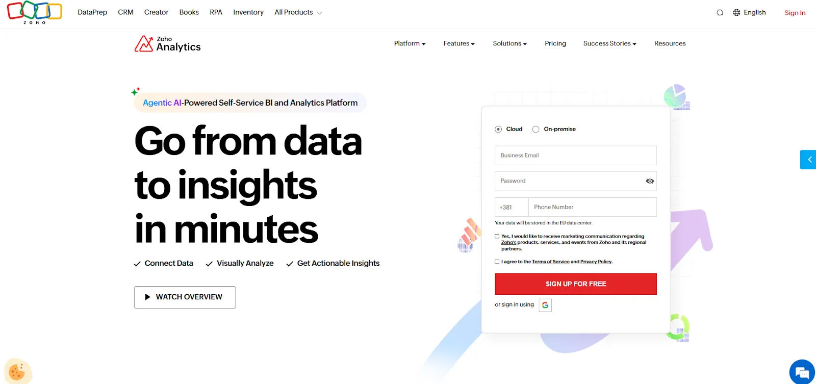
Zoho Analytics is an AI-powered business intelligence solution that helps teams integrate data, prepare it, and turn it into interactive dashboards and insights.
It balances self-service reporting with predictive AI and embedded BI in one platform.
Zoho Analytics' Top Features
- Ask Zia: Use natural language to analyze data, build reports, get insights, predictions, and recommendations through Zoho's conversational AI agent.
- Data preparation and metrics layer: Clean, transform, and model data with 250 or more no-code transformations while managing business metrics centrally.
- Flexible dashboards and embedded BI: Create interactive dashboards with 50 visualization types and embed analytics into apps, portals, or customer-facing products.
Zoho Analytics Pricing
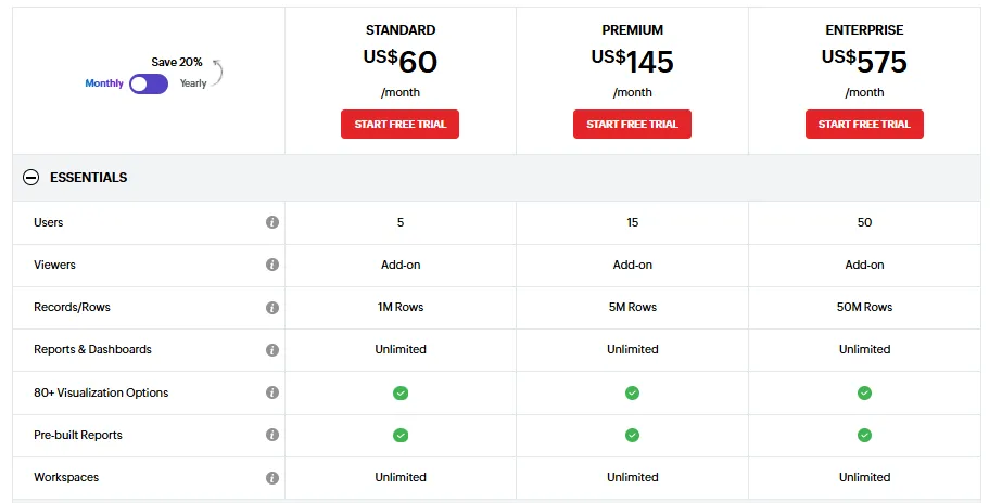
Zoho Analytics has three pricing plans:
- Standard: $60/month, includes up to 5 users, 1M rows, unlimited workspaces, reports and dashboards, and basic AI features.
- Premium: $145/month, includes up to 15 users, 5M rows, advanced data integration, and all AI features except AI Studio.
- Enterprise: $575/month, includes up to 50 users, 50M rows, advanced governance and security, and AI Studio.
Zoho Analytics Pros and Cons
✅ Great value for money.
✅ Intuitive dashboards and strong visualizations.
✅ Deep integration with Zoho apps and popular third-party tools.
❌ The user interface is not top-notch, according to a G2 review.
What are the best enterprise BI tools for data visualization?
If your organization needs established, battle-tested dashboarding and visual exploration that works at scale, these are the platforms most teams already know.
They've been around the longest, have the largest user communities, and handle the kind of complex, multi-department reporting that smaller tools can't always match.
Here are the best enterprise BI tools for data visualization in 2026:
#1: Tableau
Best for: Data teams and enterprises that need advanced visual analytics, exploratory analysis, and flexible deployment across cloud and self-hosted environments.
Similar to: Looker, Qlik Sense.
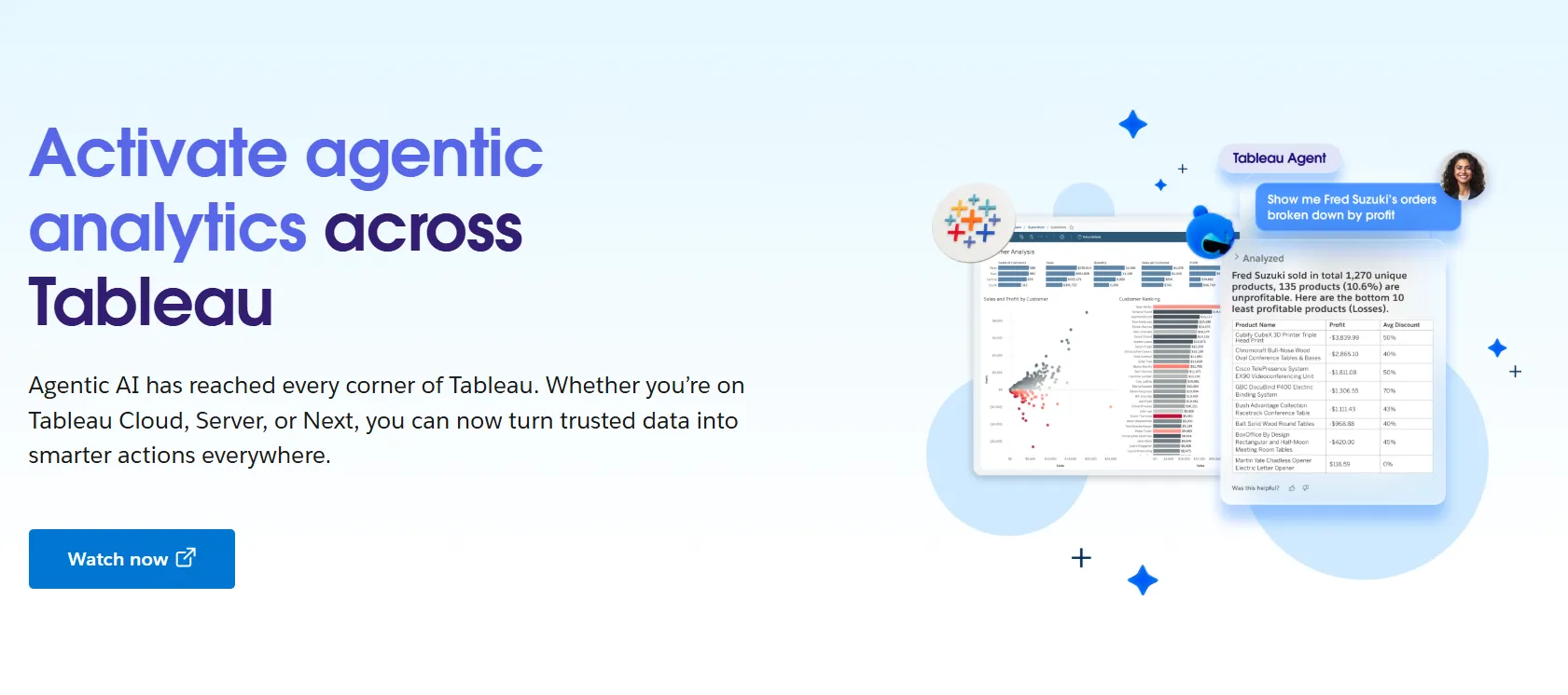
Tableau is one of the most established BI platforms on the market, best known for its drag-and-drop visual analytics and interactive dashboards.
It's now also rolling out Tableau Next, which adds agentic analytics and Gemini-powered natural-language access on top of the classic exploration experience.
Tableau's Top Features
- Advanced visual analytics and exploration: Build interactive dashboards using VizQL drag-and-drop analysis with rich visualizations and drill-downs to explore patterns across complex datasets.
- Agentic analytics with Tableau Next: AI-powered, agent-based analytics that deliver personalized insights, let users ask natural-language questions, and trigger actions directly within Slack and Salesforce workflows.
- Strong security and governance: Centralized data governance, reusable metrics through Tableau Pulse, and security controls that make it easier to scale analytics across large organizations.
- Flexible deployment: Available as Tableau Cloud, Tableau Server (self-hosted), or the newer Tableau Next offering, giving teams options depending on their infrastructure needs.
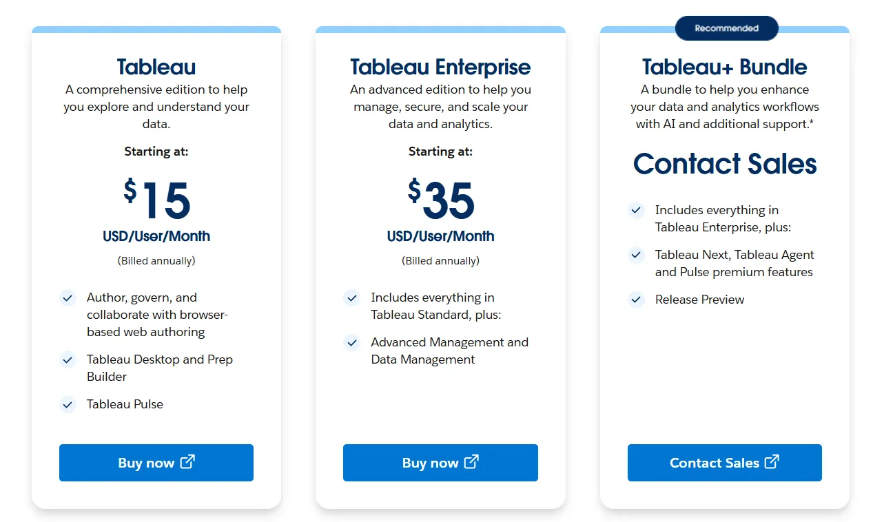
Tableau Pricing
Tableau uses per-user, per-month pricing, with separate plans depending on whether you deploy Tableau in the cloud, on your own servers, or as part of its newer AI-driven offering:
- Tableau Cloud has three pricing plans:
- Tableau Standard: Starts at $15/user/month, which includes browser-based authoring and collaboration, Tableau Desktop and Prep Builder, Tableau Pulse for metrics and insights.
- Tableau Enterprise: Starts at $35/user/month and includes everything in Standard, plus Advanced Management and Data Management for governance and scale.
- Tableau+ Bundle (Cloud + AI): Custom pricing, includes everything in Tableau Enterprise, plus Tableau Next, Tableau Agent, and Pulse premium features, with access to release previews and early AI capabilities.
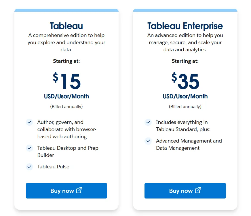
- Tableau Server has two pricing plans:
- Tableau Standard: Starts from $15 per user/month, which includes authoring, governance, and collaboration and Tableau Desktop and Prep Builder.
- Tableau Enterprise: Starts from $35 per user/month, which includes everything in Standard, plus Advanced Management, Data Management, and eLearning.
- Tableau Next (agentic analytics) has 2 plans:
- Tableau Next: Starts from $40/month/seat, and includes Agentforce Tableau, Tableau Semantics, and its Native Slack integration.
- Tableau + Bundle: Custom pricing, which includes everything in Tableau Enterprise, plus Tableau Next, Tableau Agent and Pulse premium features.
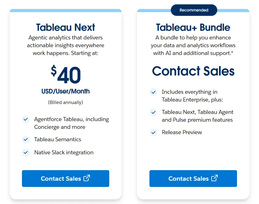
Tableau Pros and Cons
✅ Excellent data visualization and storytelling.
✅ Intuitive drag-and-drop interface that lets users explore data and iterate quickly without heavy code.
✅ Large community and extensive learning resources.
❌ Per-user pricing can scale fast for organizations rolling out broadly.
#2: Microsoft Power BI
Best for: Organizations already invested in the Microsoft ecosystem that want standardized dashboards, reporting, and self-service analytics at scale.
Similar to: Tableau, Looker.
Power BI is Microsoft's business intelligence platform for creating interactive dashboards, reports, and visualizations on top of structured data sources.
It integrates deeply with Excel, Teams, SharePoint, and the broader Microsoft stack.
Power BI's Top Features
- Interactive dashboards and reports: Combine multiple visuals, filters, and drill-downs to explore data across teams and departments.
- Enterprise governance and security: Role-based access control, row-level security, data sensitivity labels, and Microsoft Entra ID integration for managing access at scale.
- AI-assisted insights: Copilot, quick insights, forecasting, and anomaly detection help surface patterns and trends within reports.
Power BI Pricing
Power BI uses a per-user and capacity-based pricing model:
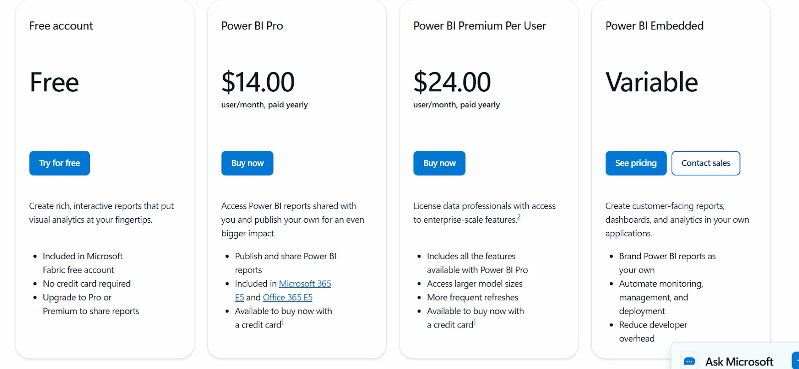
- Free: Build reports and dashboards for personal use, but no sharing or collaboration.
- Power BI Pro: $14/user/month, includes report publishing, sharing, workspace collaboration, and embedding in Teams and SharePoint.
- Power BI Premium Per User: $24/user/month, adds larger model sizes, more frequent refreshes, paginated reports, and advanced AI.
- Power BI Embedded: Custom pricing for customer-facing analytics in your own applications.
Power BI Pros and Cons
✅ Strong dashboarding and visualization.
✅ Deep Microsoft ecosystem integration.
✅ Very affordable entry point at $14/user/month.
❌ For beginners, the learning curve can feel steep, particularly when you start working with data modeling and DAX formulas, according to a G2 review.
#3: Qlik Sense
Best for: Organizations that want powerful, interactive analytics for exploring complex data, especially teams in governed industries that prefer on-prem deployments.
Similar to: Tableau, Power BI.
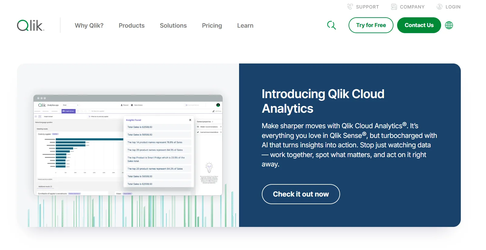
Qlik Sense is built around an associative analytics engine that lets users explore data in any direction without being locked into predefined queries or dashboard paths.
It's a strong choice for teams that want unrestricted exploration across large, complex datasets.
Qlik Sense's Top Features
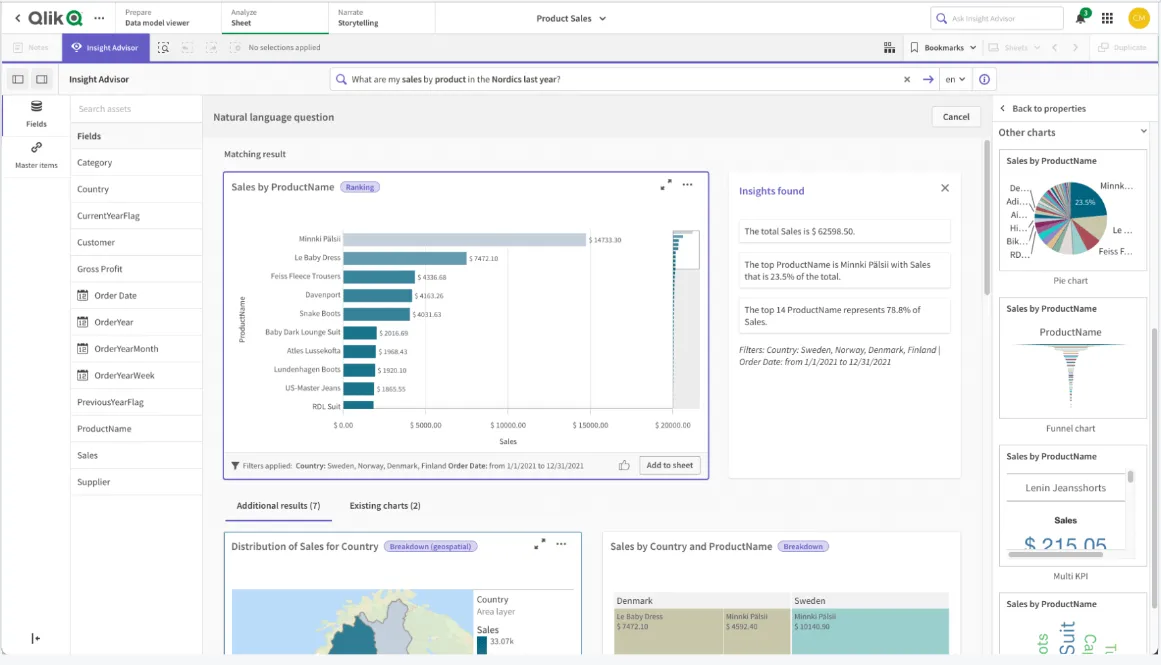
- Associative analytics engine: Explore data freely by selecting values across charts and tables, with instant recalculations that keep everything in context.
- AI-powered augmented analytics: Built-in AI and machine learning generate insights automatically, support natural language search, and enable predictive analytics without heavy data science work.
- Real-time alerts and automation: Monitor data changes with intelligent alerts and trigger automated actions when thresholds or events occur.
Qlik Sense Pricing
Qlik doesn't publish pricing for Qlik Sense. You have to contact their sales team for a custom quote.

Qlik Sense Pros and Cons
✅ Highly flexible and customizable.
✅ Scales well for enterprise use with large data volumes.
❌ One user on G2 mentions that sometimes there are loading issues, especially when business intelligence is running updates.
What are the best warehouse-native and open-source BI tools for data visualization?
We know that some teams want a tool that connects directly to their warehouse, keeps metrics consistent through a semantic layer or governed model, and gives analysts and business users a way to explore data without heavy overhead.
Here are the best warehouse-native and open-source BI tools for data visualization in 2026:
#1: Looker
Best for: Data teams that want a governed, warehouse-native BI platform with consistent metrics, strong data modeling, and tight Google Cloud integration.
Similar to: Omni, Holistics.
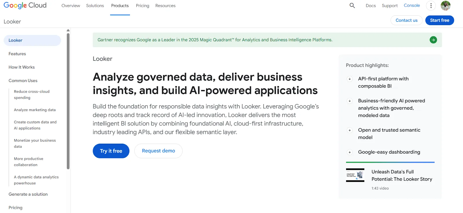
Looker is a BI platform organized around a centralized modeling language called LookML that defines metrics and business rules in one place.
It also includes Gemini-powered conversational analytics for natural-language access to data.
Looker's Top Features
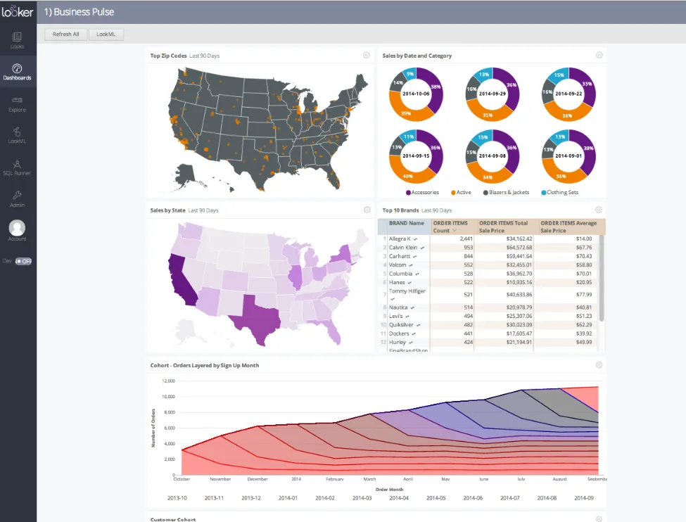
- Centralized semantic modeling with LookML: Define metrics and business rules once, so everyone across the company sees the same numbers in every report and dashboard.
- Conversational analytics powered by Gemini: Ask questions about data in natural language and get answers without navigating dashboards.
- Real-time, governed dashboards: Dashboards pull data live from the warehouse, letting users explore and filter trusted metrics without relying on outdated extracts.
Looker Pricing
Looker uses a custom, contract-based pricing model made up of two parts: platform pricing (the cost of running a Looker instance) and user licensing (the cost per user type).
Pricing is annual for all plans.
- Platform editions:
- Standard: Designed for small teams or organizations with fewer than 50 users, includes 1 production instance, 10 standard users + 2 developer users, up to 1,000 query-based API calls/month, and up to 1,000 admin API calls/month.
- Enterprise: Built for larger internal BI and analytics use cases, includes everything in Standard, plus enhanced security features, up to 100,000 query-based API calls/month, and up to 10,000 admin API calls/month.
- Embed: Designed for embedding analytics into external products or applications, includes everything in Standard, plus up to 500,000 query-based API calls/month and up to 100,000 admin API calls/month.
- User licensing:
- Developer users: Full access to Looker, including LookML development, administration, APIs, and advanced tooling.
- Standard users: Can explore data, build dashboards and reports, run SQL, and schedule content.
- Viewer users: Read-only access to dashboards and reports, with filtering and drill-down.
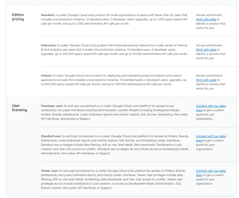
Pricing is custom on all plans and varies based on scale, permissions, and usage.
Looker Pros and Cons
✅ Keeps metrics consistent across the entire organization.
✅ Strong embedding capabilities.
❌ There's a bit of a learning curve at first, which can require a bit more education upfront to maximize all of its capabilities, according to a G2 review.
#2: Sigma
Best for: Finance and ops teams that want spreadsheet-style analytics directly on live warehouse data without exporting to Excel.
Similar to: Omni, Metabase.
Sigma is a cloud-native analytics platform that lets business users analyze live warehouse data through a familiar Excel-like interface.
It connects directly to Snowflake, BigQuery, and Databricks without data duplication, which is a strong fit for teams that outgrew tools likeBasedash and want proper warehouse-native analytics.
Sigma's Top Features
- Spreadsheet-style interface: Analyze billions of rows directly in your cloud warehouse using formulas, tables, and logic that feel like Excel.
- AI-powered dashboards and apps: Use natural language and AI to build dashboards, reports, and AI-powered data apps that support real business workflows.
- Collaborative workbooks: Build interactive dashboards in shared workbooks where teams can comment, version, and iterate together.
Sigma Pricing
Sigma doesn't publish its pricing. You can contact their sales team directly to get a custom quote.
Sigma Pros and Cons
✅ Spreadsheet-like interface makes warehouse data accessible to non-technical users.
✅ Queries data directly from the warehouse, so insights are always current.
✅ AI features like Ask Sigma accelerate analysis.
#3: Metabase
Best for: Startups, product teams, and data-lean organizations that want fast, self-serve analytics and flexible embedding without enterprise BI complexity.
Similar to: Apache Superset, Zoho Analytics.
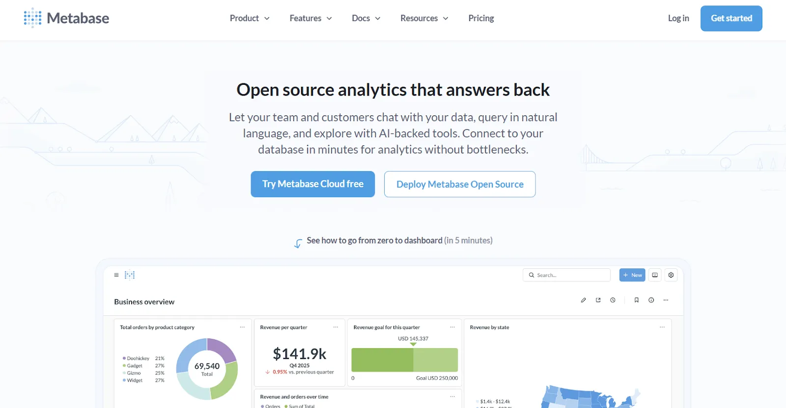
Metabase is an open-source analytics platform designed to help teams explore data, ask questions in plain English, and share insights without bottlenecks.
It's especially popular with SaaS companies that want production-ready analytics without heavy setup, and a practical alternative for teams evaluating simpler tools likeVanna AI.
Metabase's Top Features
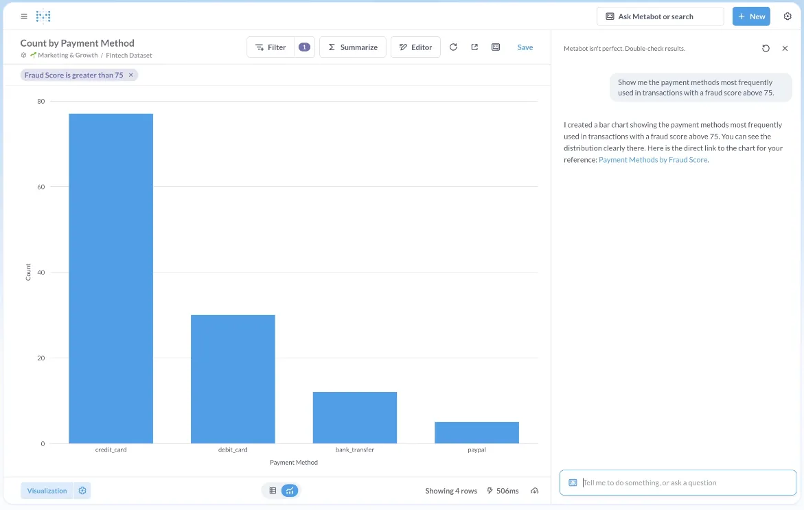
- Natural language analytics with Metabot AI: Ask questions in plain English and let AI generate queries and visualizations on top of live database data.
- Visual query builder: Non-technical users can build queries through a step-by-step interface, while advanced users can drop into raw SQL.
- Drill-through exploration: Click directly on charts to zoom in, filter, break out data, or auto-generate follow-up reports.
Metabase Pricing
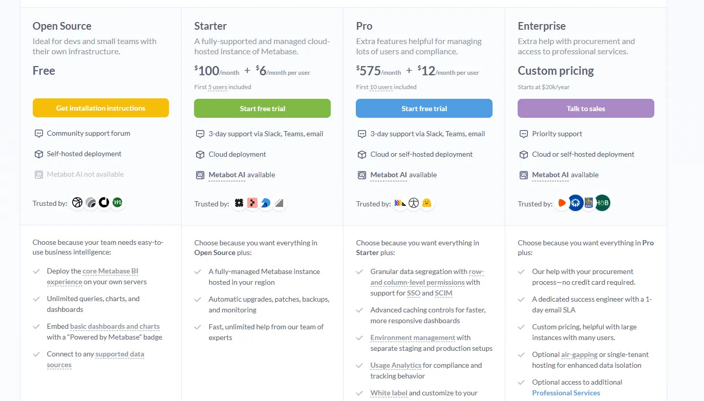
Metabase offers two pricing options depending on how you use the product: internal business intelligence or customer-facing embedded analytics.
- Business Intelligence:
- Open Source (Self-hosted): Free, self-hosted deployment, includes unlimited queries, charts, and dashboards, connects to all supported data sources, basic embedding with “Powered by Metabase” branding, community support only.
- Starter (Cloud-hosted): $100/month + $6/user/month, first 5 users included, includes everything in Open Source, plus option to include Metabot AI (charged extra), automatic upgrades, backups, and monitoring, support via Slack, Teams, and email (3-day SLA).
- Pro: $575/month + $12/user/month, first 10 users included, cloud or self-hosted deployment, includes everything in Starter, plus row- and column-level permissions, SSO and SCIM support, advanced caching and performance controls, staging + production environments, usage analytics and audit visibility, white-labeling, and embedded analytics capabilities.
- Enterprise: Custom pricing (starts at $20k/year), includes everything in Pro, plus priority support, dedicated success engineer (1-day email SLA), optional single-tenant or air-gapped deployment, and optional professional services.
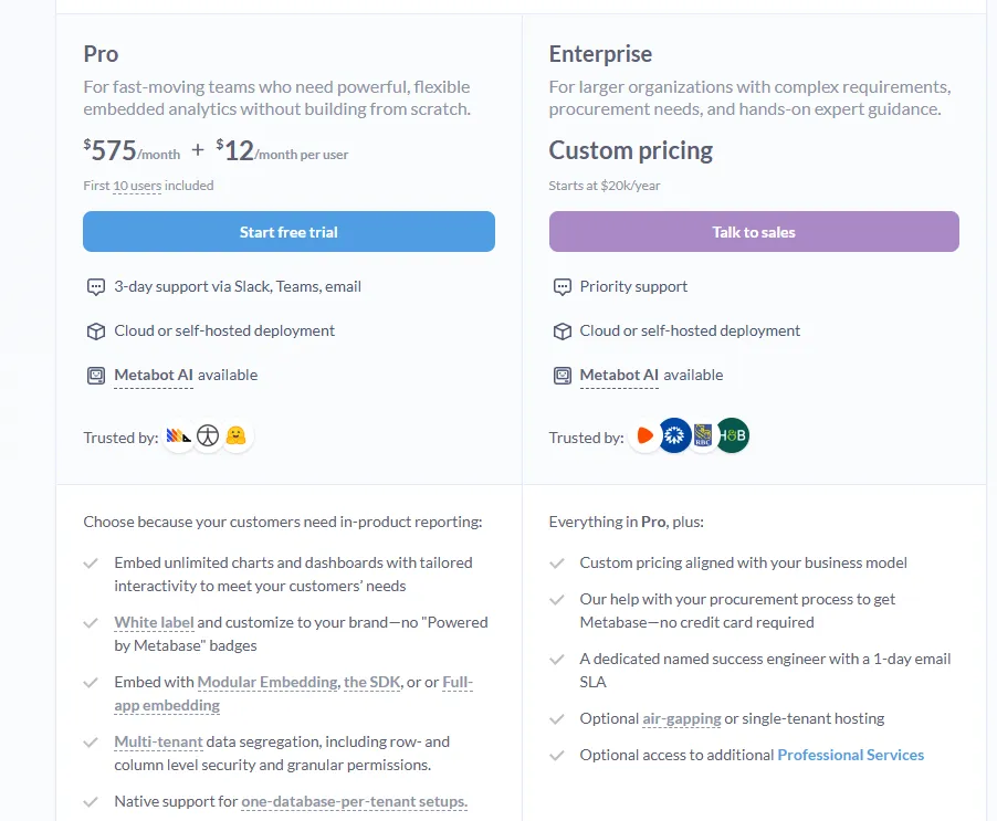
- Embedded Analytics pricing:
- Pro: $575/month + $12/user/month, first 10 users included, includes unlimited embedded dashboards and charts, full white-labeling, modular embedding, SDK, or full-app embedding, multi-tenant security (row- and column-level), one-database-per-tenant support, staging + production environments, usage analytics, internal BI for your team, and option to include Metabot AI (charged extra).
- Enterprise: Custom pricing (starts at $20k/year), includes everything in Pro, plus a dedicated success engineer, priority support, optional single-tenant or air-gapped hosting, and optional professional services.
Metabase Pros and Cons
✅ Easy to use for both technical and non-technical users.
✅ Fast setup and lightweight.
✅ Cost-effective open-source option.
❌ A user on G2 believes that Metabase could benefit from having an AI assistant that understands the databases and assists in building queries
Which BI visualization tool actually fits how your team works?
That's it from our list of the 10 best BI tools for data visualization for data teams that want to build dashboards, explore datasets visually, and turn raw numbers into clear business answers.
Some of these tools focus on drag-and-drop dashboards. Others prioritize governed metrics, spreadsheet-style analysis, or all-in-one data integration.
But most of them still follow the same model: build a dashboard, maintain it, and hope someone reads it.
Dot takes a different approach.
Instead of asking your team to build and interpret dashboards, Dot does the analysis for you.
You ask a business question, and Dot investigates the data, explains what changed and why, delivers a clear narrative with recommendations, and shows its work with a full audit trail.
If your team is serious about getting faster answers without adding more dashboards to maintain, Dot is one of the most analysis-driven BI platforms available today.
Here's what you'll get by signing up for Dot:
- Ask any business question in Slack or Teams and get a full analysis back in minutes, not days.
- Automated executive-ready business review reports delivered on schedule with live data and recommendations.
- A Context Agent that maintains shared business definitions and flags inconsistencies across your data environment.
- Full audit trail on every insight, linking back to exact SQL queries, Python logic, and datasets.
- Direct connections to Snowflake, BigQuery, Redshift, Databricks, and 30 or more data sources.
- Reuse existing dbt, Looker, and Power BI metric definitions without rebuilding anything.
- SOC 2 Type II compliance and enterprise-grade security.
- Credit-based pricing, so costs don't scale with headcount.
➡️ Get started for free with Dot's Starter plan, or schedule a demo to see how it works with your data.
FAQs
What browser-based business intelligence tools let users view interactive reports without installing desktop software?
Dot is the best browser-based BI tool for accessing interactive reports and analysis without any desktop software.
The entire platform runs in the browser or directly inside Slack and Microsoft Teams, so users can ask business questions, drill into the source data behind every answer, and ask follow-up questions without installing anything locally.
Scheduled executive reports, audit trails linking back to SQL queries, and ongoing analysis stay accessible through the web app, which makes onboarding new users as simple as sending them a link.
What are the best enterprise BI platforms for large organizations?
Tableau is the best enterprise BI platform for large organizations.
It handles complex, multi-department reporting at scale, offers flexible deployment across cloud and self-hosted environments, and includes centralized governance through Tableau Pulse.
The platform also has the largest user community of any enterprise BI tool, which makes hiring, training, and rolling out analytics broadly much easier than with smaller competitors.
What are the best business intelligence dashboard tools?
Microsoft Power BI is the best business intelligence dashboard tool for most teams.
It combines interactive dashboards, role-based access control, AI-assisted insights through Copilot, and deep integration with Excel, Teams, and SharePoint.
At $14 per user per month for Power BI Pro, it's also one of the most affordable dashboarding platforms with enterprise-grade governance built in.
What are the best self-service BI tools?
Dot is the best self-service BI tool for teams that want non-technical users to get answers from data without involving an analyst.
Anyone on the team can type a business question through Slack, Teams, or the web app and get back a full analysis with charts, written explanations, and clear recommendations.
Instead of stopping at a chart that the user still has to interpret, Dot delivers the full reasoning and the next steps, which is what most non-technical users actually need to make a decision.
What are the best BI tools for small business?
Dot is the best BI tool for small businesses that want enterprise-grade analytics without enterprise pricing or headcount.
Its credit-based pricing means costs don't scale with headcount, so a small team can have unlimited users on a single plan without paying per seat.
The free plan includes 300 one-time credits with full Pro features, and the AI data analyst replaces the need to hire a dedicated analyst to build and maintain dashboards.
Theo Tortorici
Theo writes about AI-powered analytics, data tools, and the future of business intelligence at Dot.