
10 Best Mode Alternatives & Competitors In 2026
In this article, I'll review the 10 best Mode alternatives and competitors in 2026 across AI-native analytics platforms, warehouse-native BI for analytics teams, and enterprise BI platforms, covering their features, pricing, and pros and cons.
TL;DR
- Dot offers the best Mode alternative in 2026, with AI-driven business analysis delivered in Slack and Teams, automated executive reports, a Context Agent for shared metric definitions, and a full audit trail behind every answer.
- If your team wants AI-native analytics with natural-language access and broad coverage of business workflows, Domo and Zoho Analytics are well-known platforms with deep feature sets.
- For warehouse-native BI that gives analytics teams direct access to live data with governed metrics, Metabase, Sigma, and Looker are popular picks for both technical and business users.
- For traditional enterprise dashboarding at scale, Tableau, Microsoft Power BI, and Qlik Sense are the platforms most large organizations already know and trust.
What are the best Mode alternatives in 2026?
The best Mode alternatives are: Dot, with its decision intelligence software that non-technical users can use, Tellius, and Domo.
Here's a breakdown:
Tool | Use Case | Price |
Dot | An AI data analyst that delivers narrative insights, recommendations, and automated executive reports. | Free plan; Paid from $180/month. |
Tellius | AI-powered analytics with a conversational interface and automated root cause analysis. | Custom pricing. |
Domo | All-in-one cloud BI with data ingestion, dashboards, automation, and AI-driven actions. | Custom pricing (30-day free trial). |
Zoho Analytics | Budget-friendly BI with dashboards, AI, and 50 visualization types, especially for Zoho users. | From $60/month (Standard). |
Metabase | Open-source BI for simple dashboards and self-service analytics with minimal setup. | Free (Open Source); Cloud from $100/month. |
Sigma | Spreadsheet-style analytics on live warehouse data for finance and ops teams. | Custom pricing. |
Looker | Governed BI built around a centralized LookML semantic model for consistent metrics. | Custom pricing. |
Tableau | Advanced visual analytics and exploratory data storytelling for large, complex datasets. | From $15/creator/month. |
Microsoft Power BI | Standardized dashboards and self-service reporting inside the Microsoft ecosystem. | Free plan; Pro from $14/user/month. |
Qlik Sense | Associative analytics engine for exploring complex data relationships beyond traditional queries. | From $300/month (Starter). |
What are the best AI-native analytics platforms?
Below are the AI-native analytics platforms most often shortlisted in 2026.
What ties them together is the bet that getting an answer out of the data shouldn't require a SQL query, a notebook environment, or a wait in the analyst queue:
#1: Dot
Dot is the best Mode alternative in 2026 because it shifts the work of business analysis away from the analyst's queue and onto an AI agent that connects directly to your warehouse, writes the SQL, runs the calculation, and returns a written explanation.
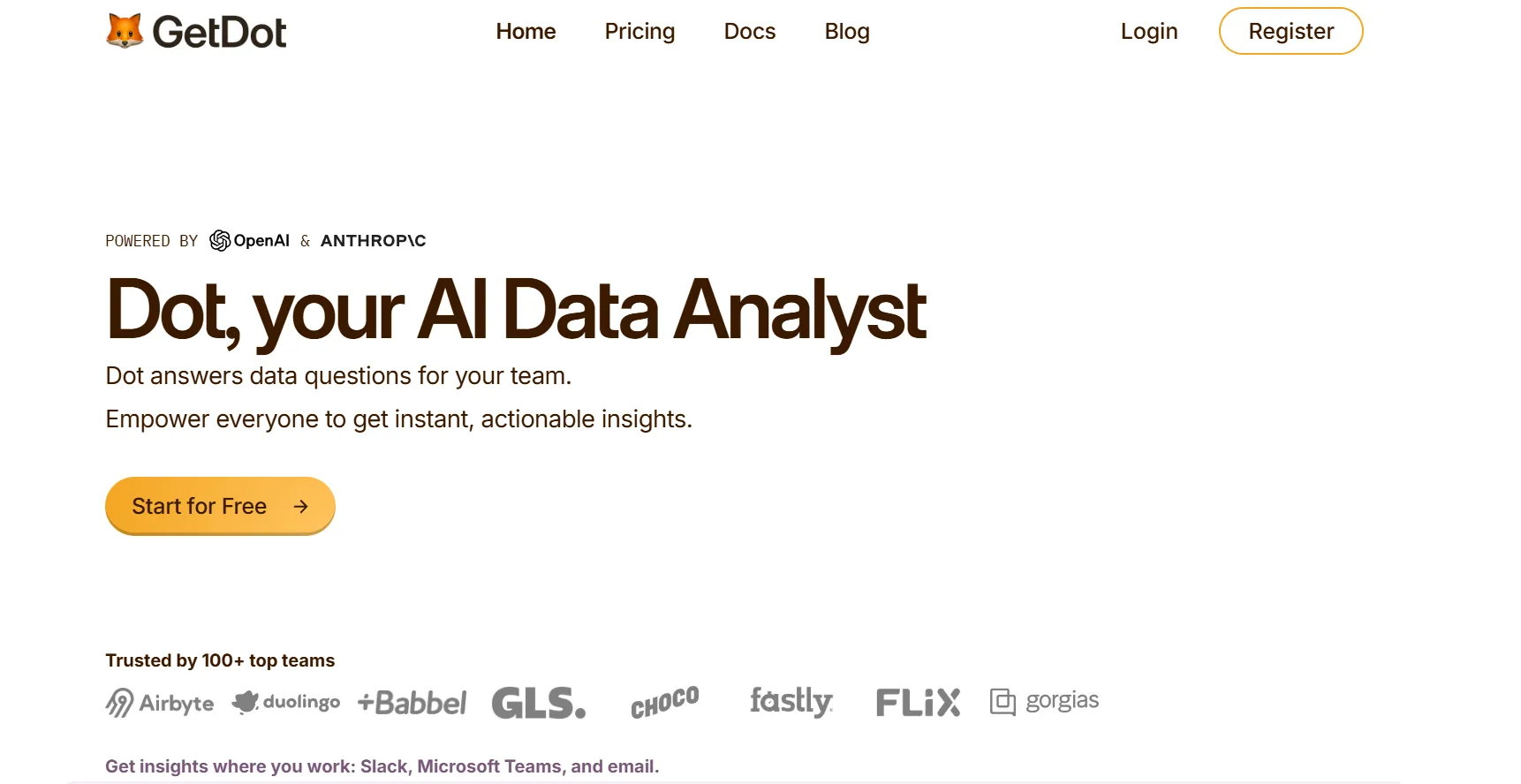
Our platform reads from the same warehouse Mode would read from, but it operates at a different layer of the workflow.
What that means in practice is that most routine business questions get a finished answer back in minutes without an analyst writing the query, building the chart, or assembling the report.
There are four parts of the platform that do most of that work, plus how it integrates with the stack you already have: 👇
Ask business questions in Slack or Teams and get a complete analysis back
A typical question that surfaces in a Monday revenue review: why did trial-to-paid conversion drop on the self-serve plan in the last week?
In a Mode-style workflow, that question lands in the analytics queue.
An analyst opens the warehouse, writes the SQL to break down the funnel by acquisition source and plan tier, cross-references the numbers against product analytics, and gets back to the asker once their current sprint allows.
Dot handles the same question through Slack or Microsoft Teams.
The response comes back in minutes, structured as a written analysis instead of a dashboard link.
It covers which signup cohorts converted at lower rates, which acquisition channels had the steepest drop, where in the onboarding flow the fall-off happened, and how the week compared to the prior period's baseline.
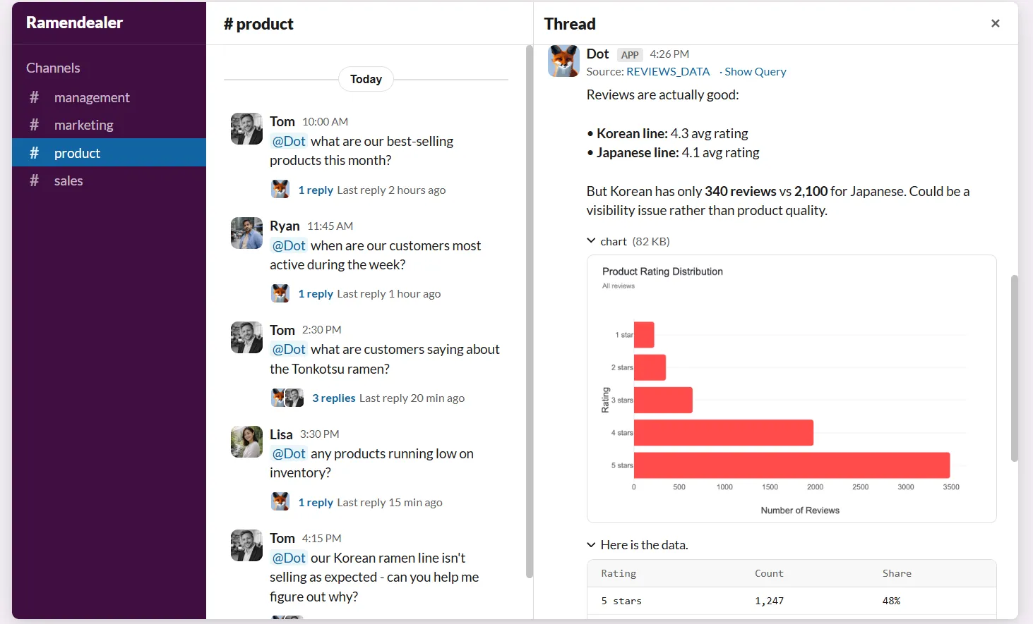
The output isn't a chart you have to interpret on your own.
It's the chart paired with the written reasoning around it, so the asker can act on the answer without needing the analyst to explain what it means.
Recurring executive reports that build themselves
Recurring reports sit on most data teams' calendars as the work that never quite gets automated.
Board packs, monthly business reviews, weekly pipeline updates, and quarterly retros all show up on a fixed cadence and follow the same shape each cycle.
Someone on the team spends a few hours pulling the latest numbers, assembling the slides, and writing commentary that the executive will glance at for two minutes before the meeting.
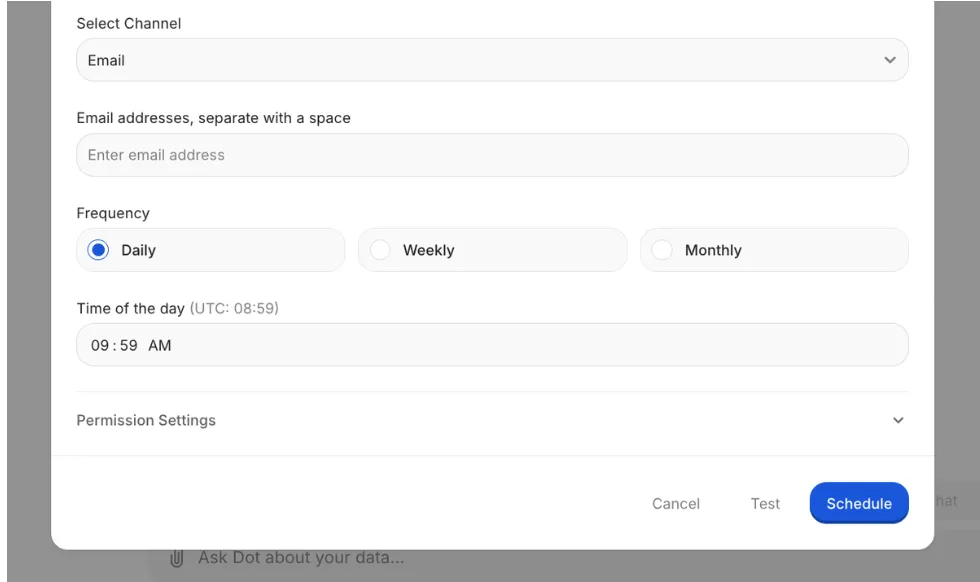
Dot turns that work into a scheduled job that runs without anyone touching it.
You configure the report once by choosing which warehouse to query, which metrics to track, which slide layouts to use, and which cadence to run on.
From there, the platform pulls live data on each cycle, runs the analysis, and delivers a finished PowerPoint to whoever needs it.
Each delivery includes the period-over-period numbers with callouts for any anomalies the platform flagged during the run, plus a written narrative explaining what changed and why it likely happened.
Persistent business context shared across every team
Most growing companies run into the same metric-definition problem.
"Active customer" can mean a different thing to product, marketing, finance, and the customer success team, with each function having a legitimate reason for their version based on the metrics they own.
None of those definitions are wrong on their own.
The cost shows up at quarter-end, when somebody has to reconcile the different numbers before the leadership meeting and explain why each team's dashboards tell a slightly different story.
Dot's Context Agent operates at the layer beneath every question that hits the platform.
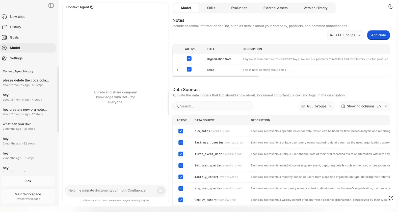
It pulls from dbt, your data catalog, Confluence, Notion, your warehouse schema, and any other documentation surfaces it can reach, then builds a single definition layer that every Dot answer references when it runs a query.
When a metric isn't documented anywhere, the agent drafts the documentation for the data team to review.
When two systems define the same metric differently, the agent surfaces the conflict for resolution instead of silently picking one version.
The practical result is that the answer product gets to "how many active customers do we have" matches the answer finance gets to the same question.
Inspectable audit trail under every answer
Unexpected numbers always trigger the same follow-up: Where did that come from?
When an AI tool can't show its work, the answer rarely makes it into a decision.
Someone asks for verification, the data team digs back through the underlying model, and a 30-second question turns into a 30-minute investigation that defeats the point of the automation.
Every Dot answer ships with footnotes that link back to the work behind it.
Each output includes the SQL query Dot ran with parameters substituted in, any Python code used in the calculation, references to the specific source tables and columns the data came from, and a timestamp for when the query was executed against the warehouse.
Open the trail, read the query, and verify the math without leaving the answer.
The number stops being something the asker has to trust and starts being something they can independently verify.
Dot's integrations
Dot is built to read from the analytics stack your team has already invested in and write into the channels where they already spend their working day, so the deployment process doesn't require migrating anything to a new system.
On the warehouse side, Dot connects directly to Snowflake, BigQuery, Redshift, Databricks, Postgres, MySQL, and SQL Server. On the semantic-layer side, it reads from dbt, Looker, Power BI models, and Cube, which means any modeling work your analytics engineers have already shipped in those tools gets inherited by Dot when it runs queries, with no need to rebuild metric logic in a separate environment.
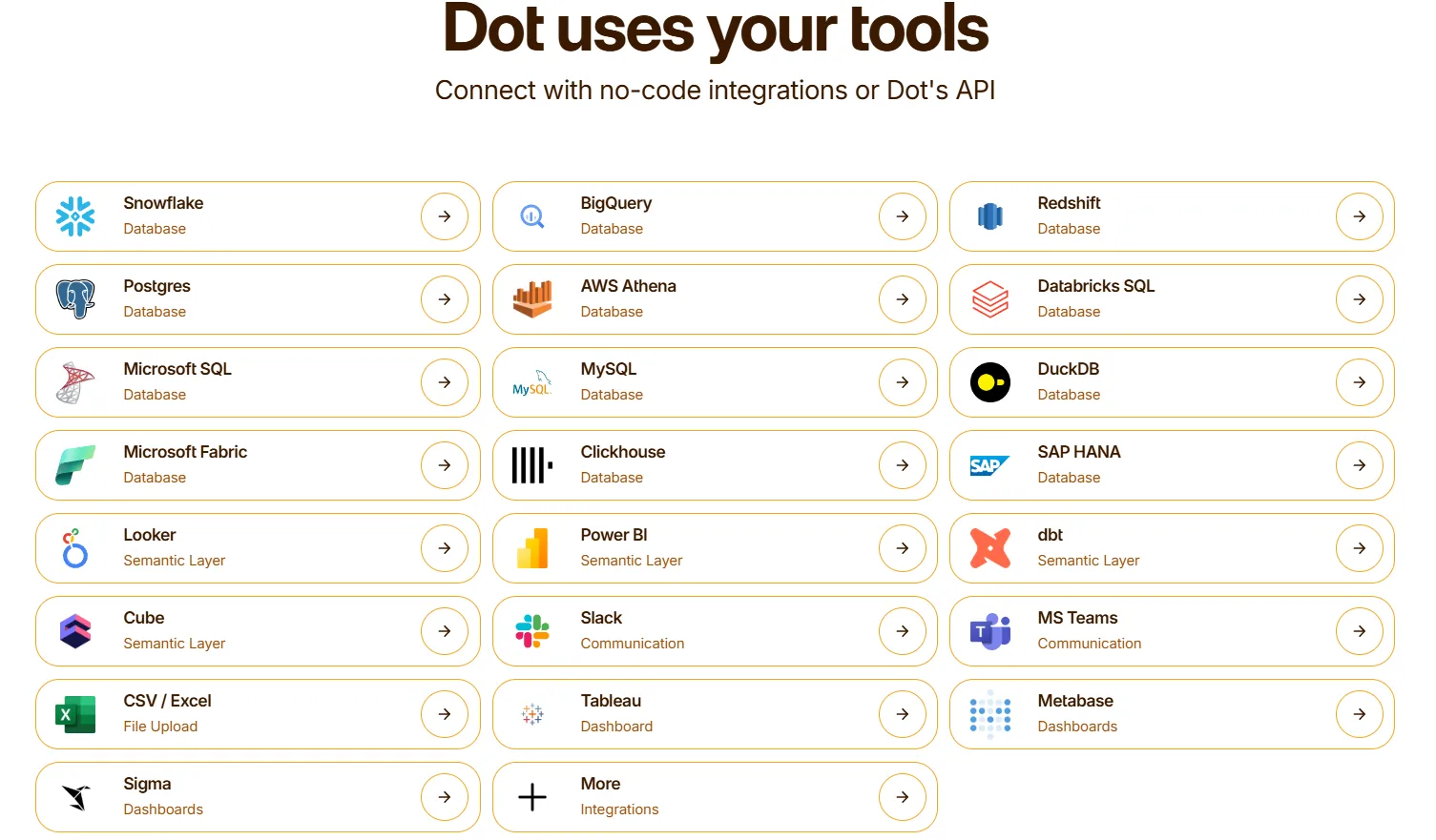
On the delivery side, Dot's answers and scheduled reports go out through Slack, Microsoft Teams, email, or the Dot web app, depending on where the asker spends most of their working day.
And if your team is already running Mode, Tableau, Looker, or Metabase for specific pieces of your analytics stack today, Dot operates alongside those tools without asking you to deprecate any of them, because the integration model assumes none of the work your team has already invested in gets thrown away.
What makes Dot different from Mode?
Most teams comparing Dot to Mode are weighing two different jobs that look adjacent on the surface but solve different parts of the analytics problem inside a company.
Mode is built for the analyst's workflow, with a SQL editor, Python and R notebooks, a place to develop reusable datasets, and dashboards to share results with the rest of the company.
If your day involves writing queries and exploring data, Mode is one of the more capable workspaces on the market, and we're not going to pretend otherwise.
Dot is built for the question that arrives from outside the data team, where a stakeholder needs an answer, the answer requires data, and historically, that meant routing the request through an analyst who would write the SQL, run the analysis, build the chart, and explain what it showed.
In a Dot deployment, most of those routed questions get a written answer back in minutes without an analyst touching them, which leaves the data team free to focus on the deeper modeling and investigation work that actually needs their expertise.
The practical difference is that Mode makes the analyst more productive at the job they're already doing, while Dot reduces the number of questions that need to reach the analyst in the first place.
There's a governance piece worth calling out as well.
Mode keeps numbers consistent within Mode reports through datasets and dbt Semantic Layer support, which is a real strength for analysis happening inside the Mode workspace itself.
Dot's Context Agent operates at a layer above that, pulling definitions from dbt, the warehouse, Confluence, and any other documentation it can reach, then applying that combined context to every question that comes through, whether the asker is working in Mode, in Slack, or anywhere else Dot is connected.
The result is shared definitions that hold across the whole company, not just within the data team's primary workspace.
Dot pricing
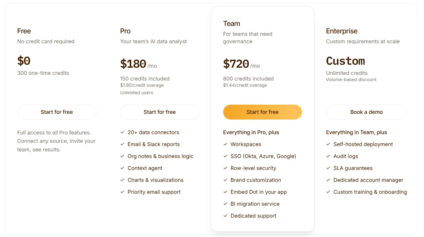
Dot offers a free plan with 300 one-time credits and full access to Pro features, so teams can run real analyses against their own data before deciding whether to commit to a paid plan.
There are three paid plans:
- Pro: $180/month, includes 150 credits per month, $1.80 per credit overage, and unlimited users.
- Team: $720/month, includes 800 credits per month, $1.44 per credit overage, SSO, row-level security, embedded analytics, and dedicated support.
- Enterprise: Custom pricing, includes unlimited credits, volume discounts, self-hosted deployment, audit logs, SLA, and a dedicated account manager.
➡️ Annual billing saves 10% across all paid plans.
Dot pros and cons
✅ Written analysis as the default output, not just charts.
✅ Recurring decks build themselves on a schedule.
✅ SQL and Python audit trail under every answer.
✅ Context Agent enforces shared definitions across teams.
✅ Connects to existing warehouses and semantic layers.
✅ Usage-based pricing, not seat-based.
❌ Not a dashboarding tool replacement.
❌ A connected warehouse is required.
#2: Tellius
Best for: Business and analytics teams that need fast, explainable answers to complex "why" questions.
Similar to: Dot, DataGPT.
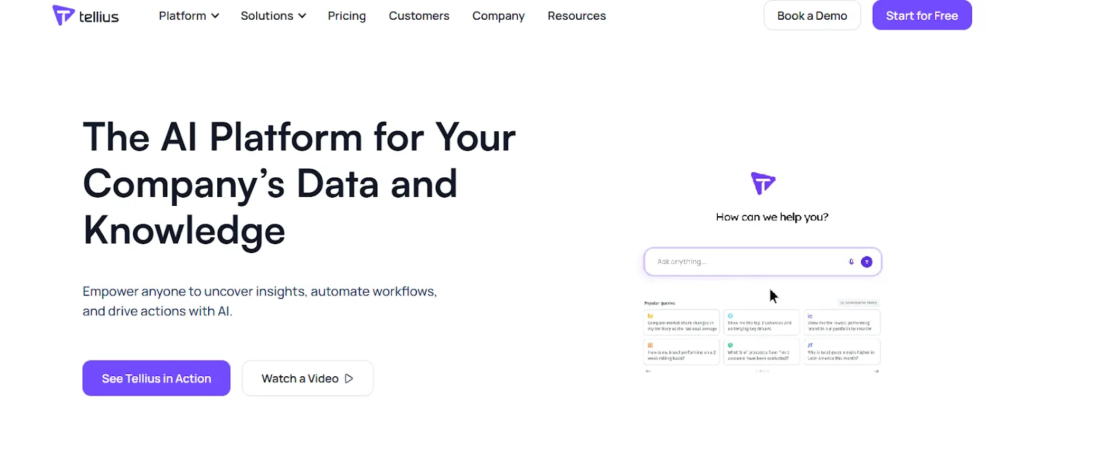
Tellius is an AI-powered analytics platform that lets anyone ask natural-language questions across enterprise data and get instant answers backed by automated root cause and key driver analysis.
Tellius's Top Features
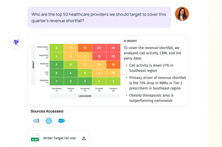
- Conversational interface: A ChatGPT-style chat layer that sits on top of governed enterprise data, letting users ask complex business questions in natural language and receive context-aware answers.
- AI insights and root cause analysis: Automatically uncovers root causes, key drivers, trends, cohorts, and anomalies across billions of data points, with explainable insights and proactive alerts that surface what changed and why.
- Visualizations and AI-generated narratives: Turns complex analyses into interactive visualizations and GenAI-written narratives so teams can explore findings and share them without rebuilding dashboards.
Tellius Pricing
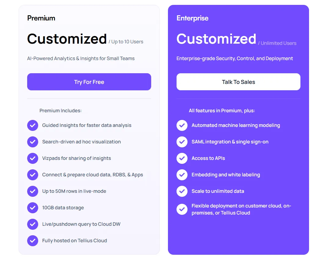
Tellius has two pricing plans, both with custom pricing that requires contacting their sales team for a quote:
- Premium: Custom pricing for up to 10 users, includes conversational analytics, guided insights, search-driven ad-hoc visualizations, Vizpads for sharing insights, live and pushdown queries to cloud data warehouses, data prep across cloud apps and databases, up to 50M rows in live mode, 10GB of storage, and fully hosted deployment on Tellius Cloud.
- Enterprise: Custom pricing for unlimited users, includes everything in Premium, plus automated machine learning modeling, SAML and SSO, API access, embedding and white-labeling, unlimited data scale, and flexible deployment across Tellius Cloud, customer cloud, or on-prem.
Tellius Pros And Cons
✅ Intuitive, visual-first interface for business users.
✅ Strong AI-driven root cause and driver analysis.
#3: Domo
Best for: Mid-to-large teams that want an all-in-one BI platform combining data integration, dashboards, automation, and AI-driven actions.
Similar to: Power BI, TextQL.
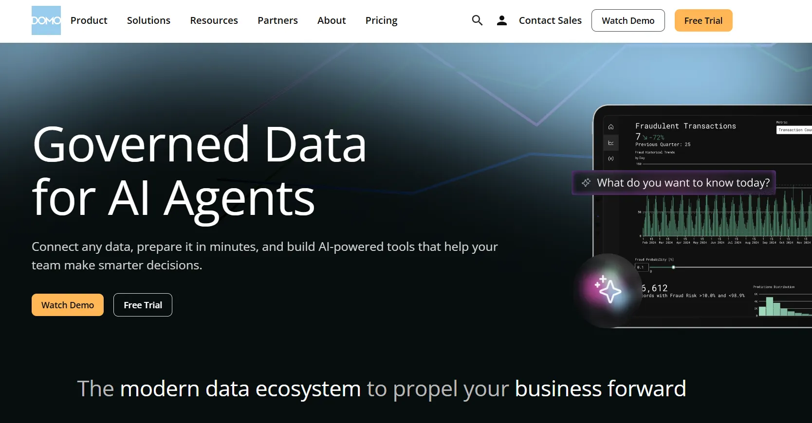
Combining ingestion, modeling, dashboards, automation, and embedded AI in a single workspace, Domo lands most often at mid-market and enterprise teams that want one product instead of a stack.
The reach into downstream actions is what sets it apart from more focused AI tools like MindsDB.
Domo's Top Features
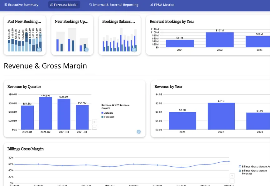
- Cards and dashboards: Domo organizes reports into modular Cards that snap into dashboards, get embedded into apps, or shared across departments.
- Drag-and-drop app builder: Build custom data apps for forecasting, planning, or monitoring without writing code.
- AI Chat and agents: Ask questions in natural language, get explanations of trends, and route AI agents to take downstream actions like alerts or system updates.
Domo Pricing
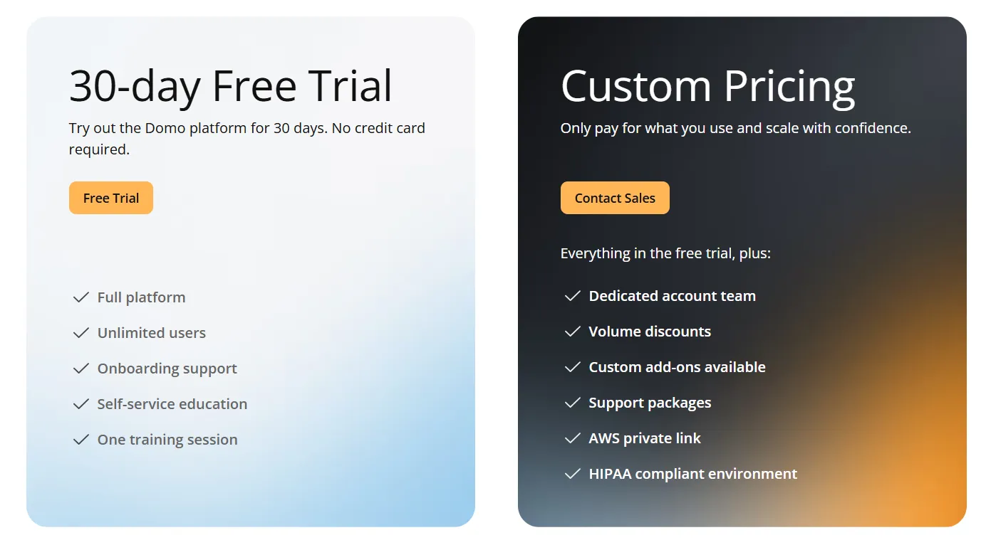
Domo has one paid plan and a free trial:
- Free trial: 30 days, no credit card required, includes unlimited users, full platform access, onboarding support, self-service education, and one guided training session.
- Paid plan: Usage-based pricing designed to scale as your analytics needs grow, includes everything in the trial and adds a dedicated account team, volume discounts, custom add-ons, and support packages.
Domo Pros And Cons
✅ One platform handles ETL, modeling, dashboards, and automation.
✅ Big connector library.
❌ Pricing is not disclosed. We covered affordable options in our Domo alternatives breakdown.
#4: Zoho Analytics
Best for: Teams that want a budget-friendly BI platform with strong AI features, lots of connectors, and an interface that both analysts and business users can work in.
Similar to: Metabase, Power BI.
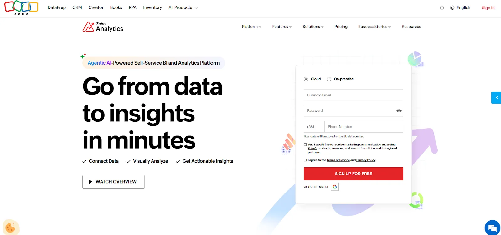
Self-service data preparation, dashboards, and a conversational AI assistant called Zia anchor what Zoho Analytics offers, all wrapped inside a friendlier price band than most enterprise BI tools.
Teams already inside the Zoho ecosystem use it heavily, and it's a popular pick for buyers who want a full BI suite without enterprise-level pricing.
Zoho Analytics' Top Features
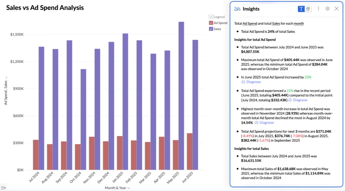
- Zia conversational AI: Ask Zia questions about your data and get charts, predictions, and written explanations back without writing a query.
- Self-service data prep: Clean and reshape data with 250 or more no-code transformations, then maintain a central metrics layer for cross-report consistency.
- Visualization library and embedding: Pick from 50 or more chart types and embed dashboards, AI assistants, or full reports into customer-facing products.
Zoho Analytics Pricing
Zoho Analytics has three pricing plans:
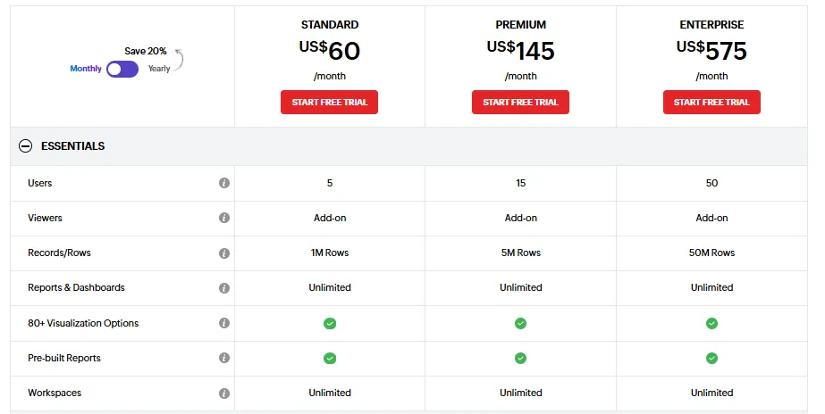
- Standard: $60/month, includes up to 5 users, 1M rows, unlimited workspaces, reports and dashboards, and basic AI features.
- Premium: $145/month, includes up to 15 users, 5M rows, advanced data integration, and all AI features except AI Studio.
- Enterprise: $575/month, includes up to 50 users, 50M rows, advanced governance and security, and AI Studio.
Zoho Analytics Pros And Cons
✅ Approachable pricing for small and mid-sized teams.
✅ Tight integration with Zoho's CRM, finance, and ops products.
❌ The user interface is not top-notch, according to a G2 review.
What Are The Best Warehouse-Native BI Tools For Analytics Teams?
Teams that don't want a separate copy of their data, or a heavy modeling rebuild above it, tend to land in this group.
The platforms here run queries directly against the warehouse and give analytics teams a governed way to share that data out to the business:
#1: Metabase
Best for: Startups, product teams, and data-lean organizations that want fast, self-serve analytics and flexible embedding without enterprise BI complexity.
Similar to: Lightdash, Basedash.
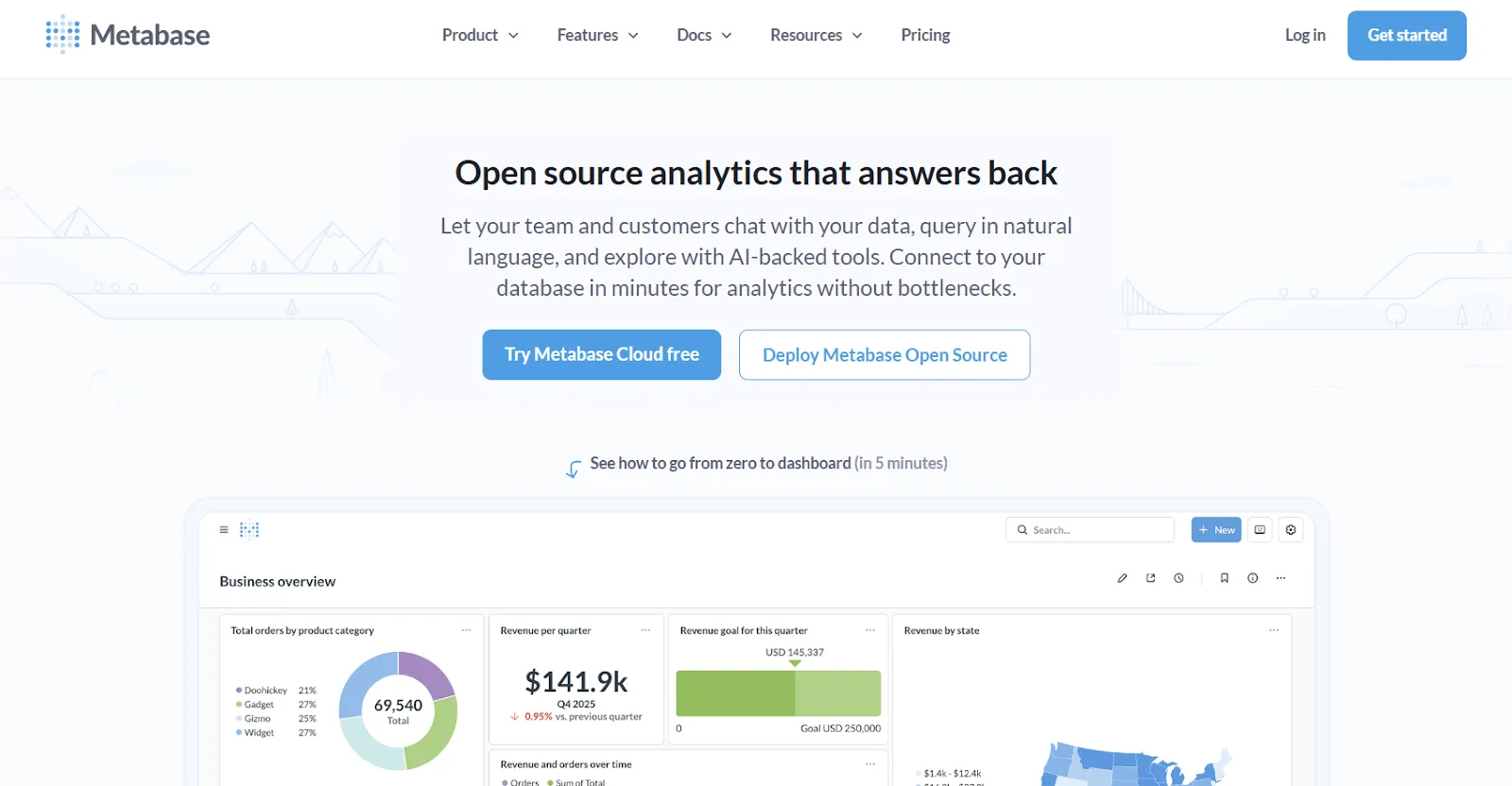
Many SaaS companies treat Metabase as the default when they need fast, embeddable analytics without the cost of enterprise tooling.
Open source at its core, the platform supports SQL, a no-code question builder, and Metabot AI for natural-language querying, putting it on shortlists alongside lighter SQL-generation tools like Vanna AI.
Metabase's Top Features
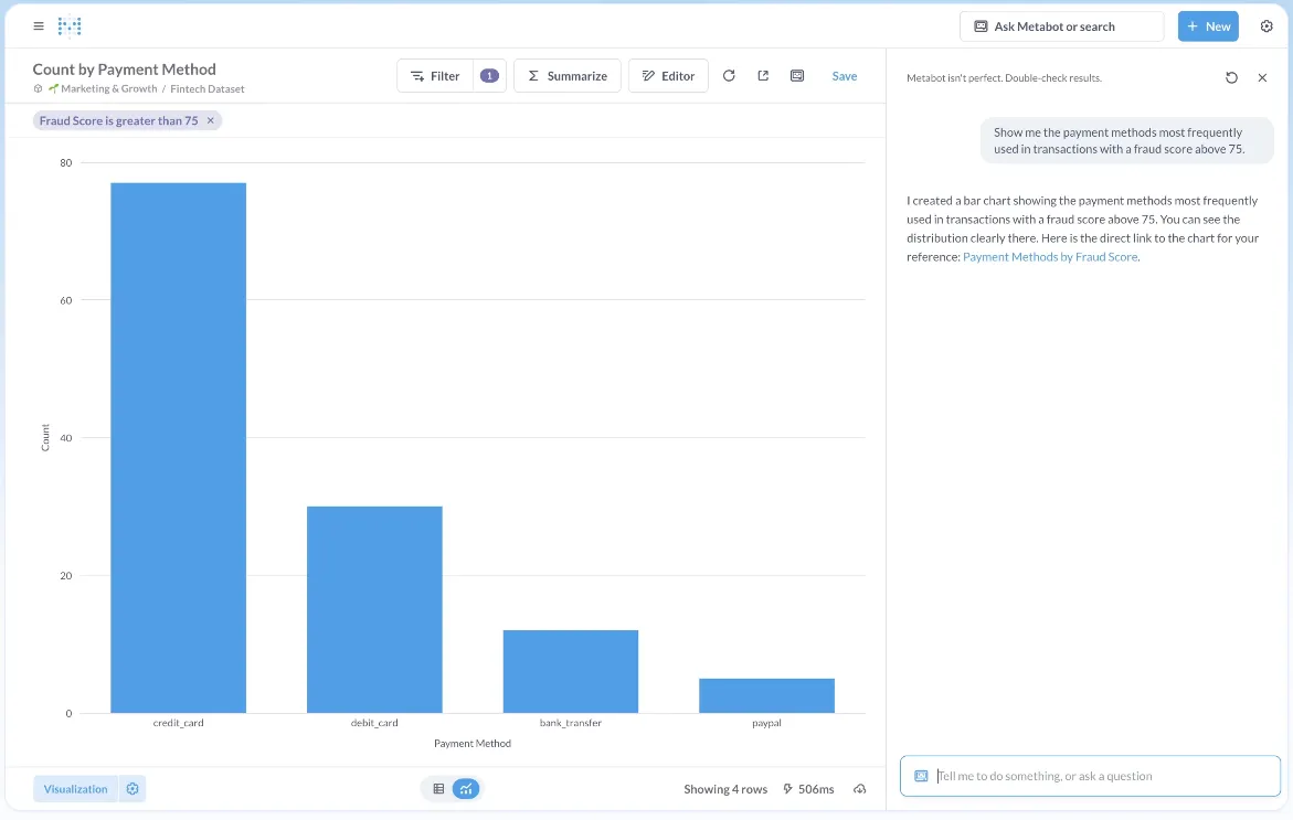
- Metabot AI: Ask data questions in plain English, and Metabot generates the underlying query and visualization for you.
- No-code question builder: Walk through joins, filters, and aggregations through a step-by-step UI, with the option to drop into raw SQL whenever you want.
- Click-to-drill exploration: Click any chart to filter, segment, or pivot the data without rebuilding the question from scratch.
Metabase Pricing
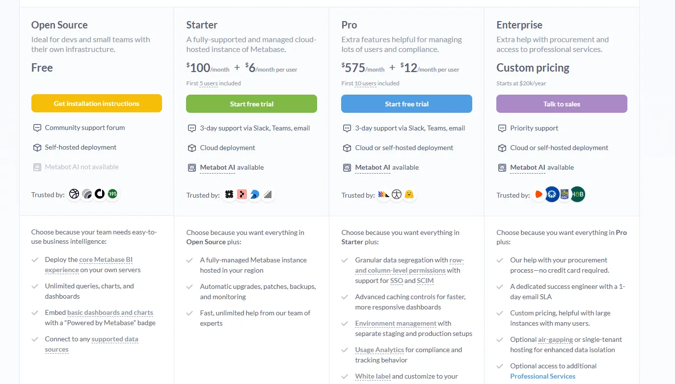
Metabase offers two pricing options depending on how you use the product: internal business intelligence or customer-facing embedded analytics.
- Business Intelligence:
- Open Source (Self-hosted): Free, self-hosted deployment, includes unlimited queries, charts, and dashboards, connects to all supported data sources, basic embedding with “Powered by Metabase” branding, community support only.
- Starter (Cloud-hosted): $100/month + $6/user/month, first 5 users included, includes everything in Open Source, plus option to include Metabot AI (charged extra), automatic upgrades, backups, and monitoring, support via Slack, Teams, and email (3-day SLA).
- Pro: $575/month + $12/user/month, first 10 users included, cloud or self-hosted deployment, includes everything in Starter, plus row- and column-level permissions, SSO and SCIM support, advanced caching and performance controls, staging + production environments, usage analytics and audit visibility, white-labeling, and embedded analytics capabilities.
- Enterprise: Custom pricing (starts at $20k/year), includes everything in Pro, plus priority support, dedicated success engineer (1-day email SLA), optional single-tenant or air-gapped deployment, and optional professional services.
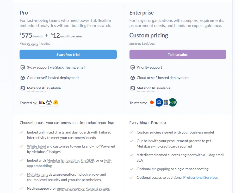
- Embedded Analytics pricing:
- Pro: $575/month + $12/user/month, first 10 users included, includes unlimited embedded dashboards and charts, full white-labeling, modular embedding, SDK, or full-app embedding, multi-tenant security (row- and column-level), one-database-per-tenant support, staging + production environments, usage analytics, internal BI for your team, and option to include Metabot AI (charged extra).
- Enterprise: Custom pricing (starts at $20k/year), includes everything in Pro, plus a dedicated success engineer, priority support, optional single-tenant or air-gapped hosting, and optional professional services.
Metabase Pros And Cons
✅ Self-host the open-source version for free.
✅ Quick to set up on a new database.
❌ A user on G2 believes that Metabase could benefit from having an AI assistant that understands the databases and assists in building queries.
#2: Sigma
Best for: Finance and ops teams that want spreadsheet-style analytics directly on live warehouse data without exporting to Excel.
Similar to: Omni, Metabase.
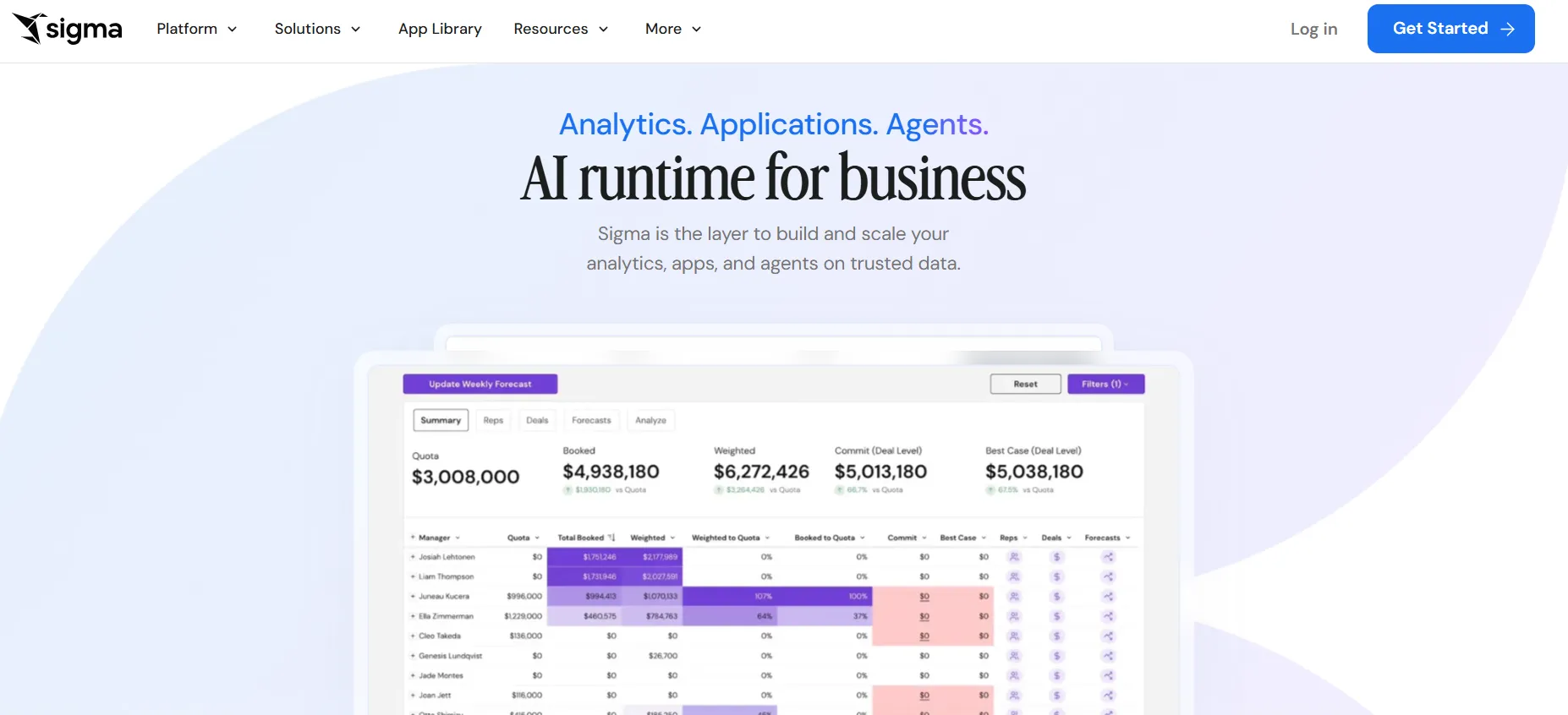
Built around a spreadsheet-style interface, Sigma fits teams that prefer working in formulas and pivots over chart builders.
Connections to Snowflake, BigQuery, Databricks, and Redshift mean queries run directly against the warehouse, so no duplicate data layer is needed.
Sigma's Top Features
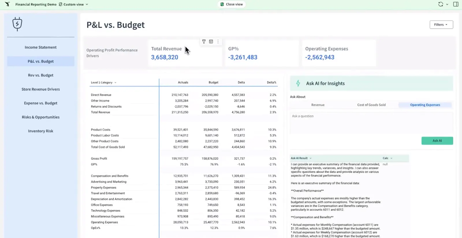
- Workbook interface: Build pivots, formulas, and grouped tables on top of warehouse-scale data using a UI that maps closely to Excel.
- Ask Sigma and AI workflows: Generate dashboards, summaries, and analytics apps from natural-language prompts inside a workbook.
- Team workbooks: Build, comment on, and version analyses in a shared file without emailing CSVs around.
Sigma Pricing
Sigma doesn't publish its pricing. You can contact their sales team directly to get a custom quote.
Sigma Pros And Cons
✅ Warehouse-native, so data stays current and governed.
✅ Excel-like interface fits finance and ops teams well.
#3: Looker
Best for: Data teams and organizations that want a governed, warehouse-native BI platform with consistent metrics, strong data modeling, and tight integration with Google Cloud.
Similar to: Omni, Sigma.
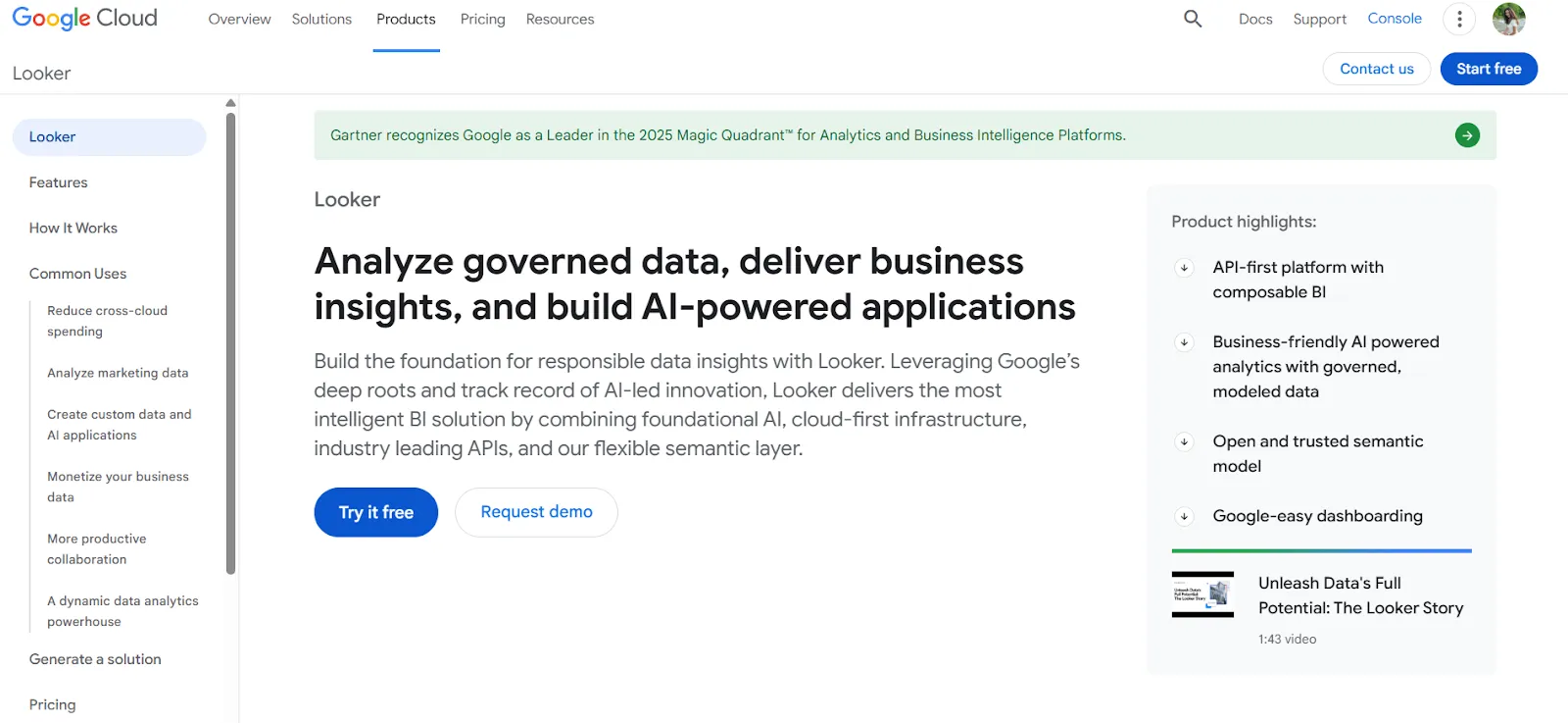
Looker is built around LookML, a centralized modeling layer that defines metrics once and reuses them across every dashboard and report.
It's a frequent pick for data teams that want consistent business logic everywhere, especially when paired with Google Cloud and BigQuery, and the closest in spirit to Mode for teams who want a code-first analytics environment alongside tools like Hex.
Looker's Top Features
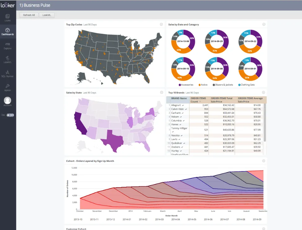
- LookML semantic model: Define dimensions, measures, and business rules once in code, then surface them consistently across every dashboard and report.
- Gemini conversational analytics: Ask questions about your data in natural language and get answers without navigating dashboards.
- Live warehouse queries: Dashboards run on live data from the warehouse, so users explore current numbers, not stale extracts.
Looker Pricing
Looker uses a custom, contract-based pricing model made up of two parts: platform pricing (the cost of running a Looker instance) and user licensing (the cost per user type).
Pricing is annual for all plans.
- Platform editions:
- Standard: Designed for small teams or organizations with fewer than 50 users, includes 1 production instance, 10 standard users + 2 developer users, up to 1,000 query-based API calls/month, and up to 1,000 admin API calls/month.
- Enterprise: Built for larger internal BI and analytics use cases, includes everything in Standard, plus enhanced security features, up to 100,000 query-based API calls/month, and up to 10,000 admin API calls/month.
- Embed: Designed for embedding analytics into external products or applications, includes everything in Standard, plus up to 500,000 query-based API calls/month and up to 100,000 admin API calls/month.
- User licensing:
- Developer users: Full access to Looker, including LookML development, administration, APIs, and advanced tooling.
- Standard users: Can explore data, build dashboards and reports, run SQL, and schedule content.
- Viewer users: Read-only access to dashboards and reports, with filtering and drill-down.
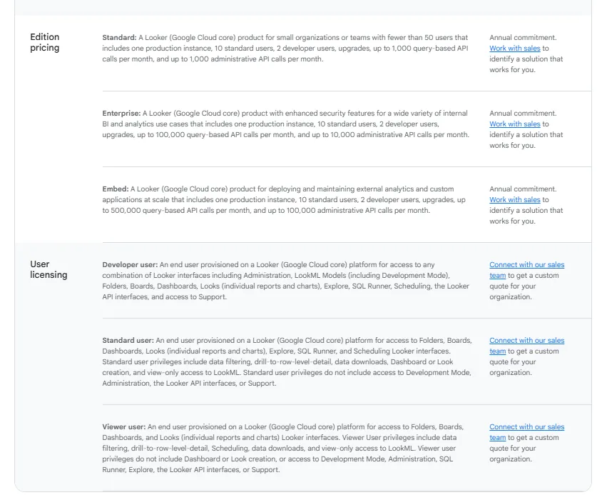
Pricing is custom on all plans and varies based on scale, permissions, and usage.
Looker Pros And Cons
✅ LookML keeps metrics consistent across the company.
✅ Strong fit for teams already on Google Cloud and BigQuery.
❌ There's a bit of a learning curve at first, which can require a bit more education upfront to maximize all of its capabilities, according to a G2 review.
What are the best enterprise BI platforms?
At the department or company scale, three names tend to dominate the BI shortlist.
These are the platforms with the largest communities, deepest ecosystems, and the multi-department reporting capability that newer entrants are still building toward.
#1: Tableau
Best for: Data teams and enterprises that need advanced visual analytics, exploratory analysis, and flexible deployment across cloud and self-hosted environments.
Similar to: Power BI, Qlik Sense.
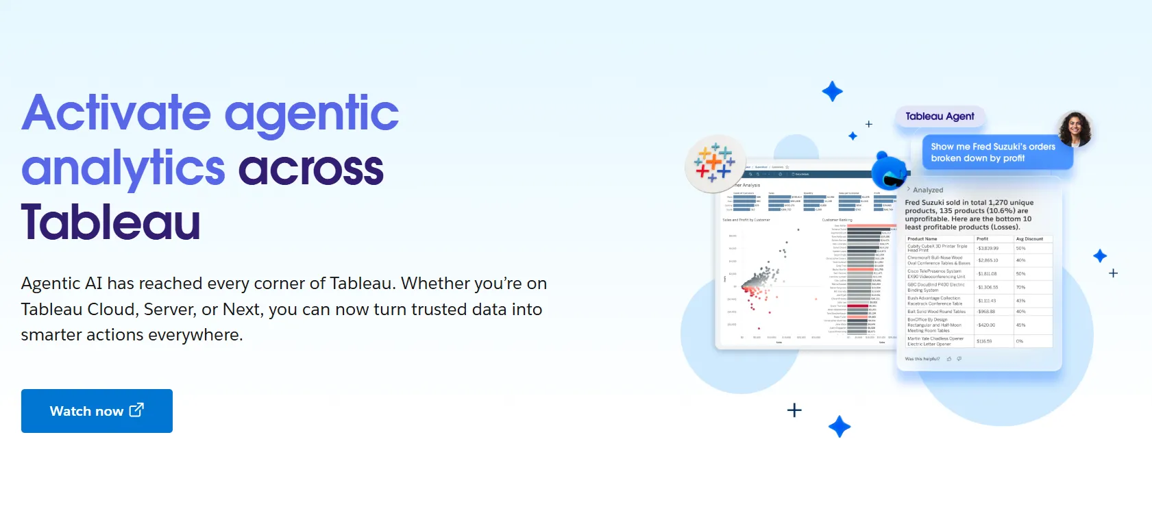
Few BI platforms have the analytics power of Tableau, which built its reputation on drag-and-drop visual analytics and dashboard storytelling for analysts.
With Tableau Next, the company is now layering agentic analytics and Agentforce-powered natural language on top of that exploration experience.
Tableau's Top Features
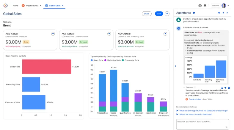
- Visual exploration: Drag fields onto a canvas to build interactive dashboards, with a wide range of chart types and inline filtering.
- Tableau Next agents: Ask natural-language questions of your data and receive AI-generated answers and recommended next steps inside Slack or Salesforce.
- Tableau Pulse and governance: Centralize metric definitions, set role-based permissions, and manage data sensitivity across larger deployments.
- Cloud, server, or Tableau Next: Choose between hosted Tableau Cloud, self-hosted Tableau Server, or the agentic Tableau Next offering.
Tableau Pricing
Tableau uses per-user, per-month pricing, with separate plans depending on whether you deploy Tableau in the cloud, on your own servers, or as part of its newer AI-driven offering:
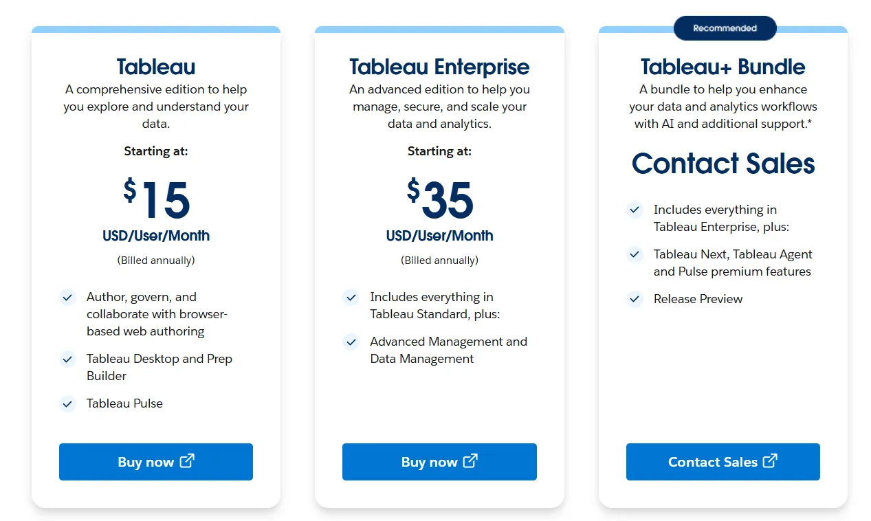
- Tableau Cloud has three pricing plans:
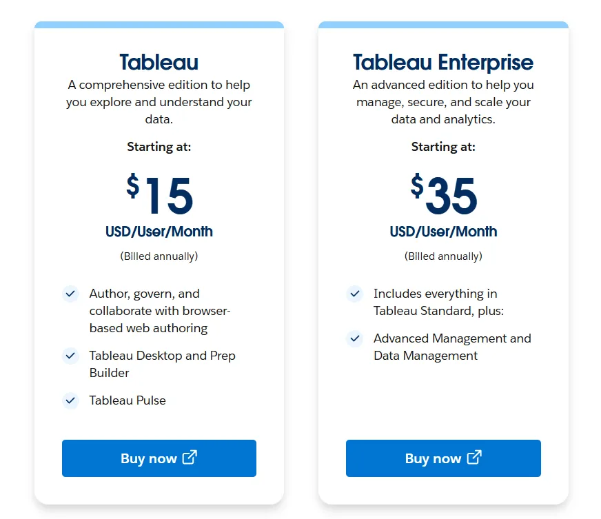
- Tableau Standard: Starts at $15/user/month, which includes browser-based authoring and collaboration, Tableau Desktop and Prep Builder, Tableau Pulse for metrics and insights.
- Tableau Enterprise: Starts at $35/user/month and includes everything in Standard, plus Advanced Management and Data Management for governance and scale.
- Tableau+ Bundle (Cloud + AI): Custom pricing, includes everything in Tableau Enterprise, plus Tableau Next, Tableau Agent, and Pulse premium features, with access to release previews and early AI capabilities.
- Tableau Server has two pricing plans:
- Tableau Standard: Starts from $15 per user/month, which includes authoring, governance, and collaboration and Tableau Desktop and Prep Builder.
- Tableau Enterprise: Starts from $35 per user/month, which includes everything in Standard, plus Advanced Management, Data Management, and eLearning.
- Tableau Next (agentic analytics) has 2 plans:
- Tableau Next: Starts from $40/month/seat, and includes Agentforce Tableau, Tableau Semantics, and its Native Slack integration.
- Tableau + Bundle: Custom pricing, which includes everything in Tableau Enterprise, plus Tableau Next, Tableau Agent and Pulse premium features.
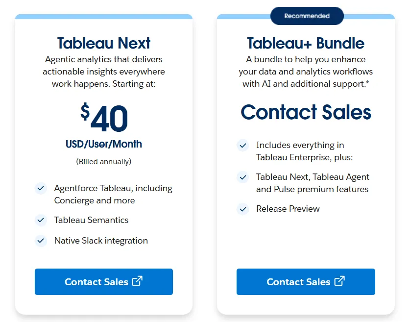
Tableau Pros And Cons
✅ Still the visualization leader.
✅ Tableau Next is a real move toward agentic analytics, not just a chat layer.
✅ Governance holds up at enterprise scale.
❌ Per-user pricing can scale fast for organizations rolling out broadly.
#2: Microsoft Power BI
Best for: Organizations already invested in the Microsoft ecosystem that want standardized dashboards, reporting, and self-service analytics at scale.
Similar to: Tableau, Domo.
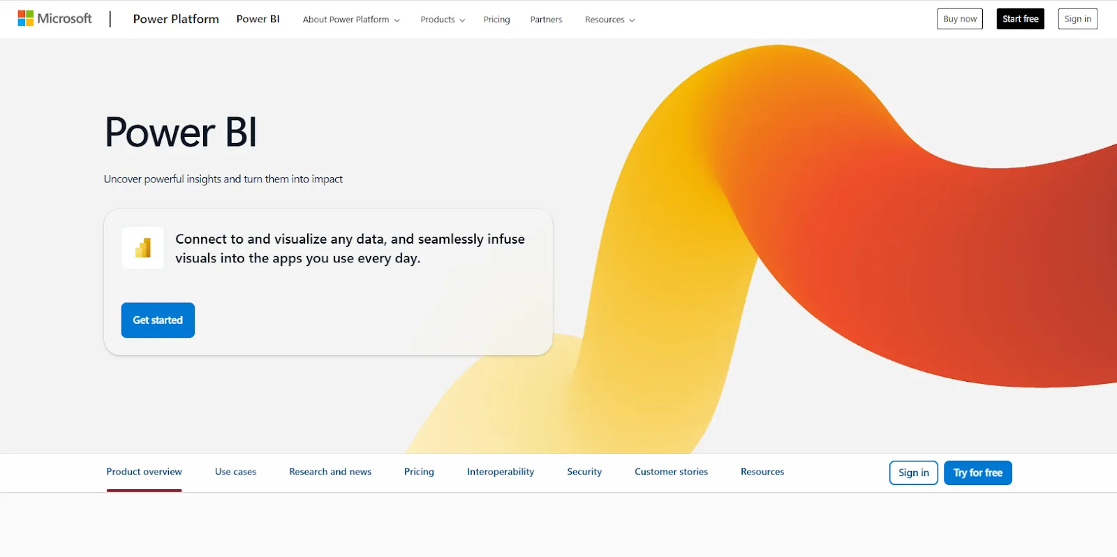
Designed for organizations already running on Microsoft 365, Power BI handles modeling, interactive dashboards, paginated reports, and AI-assisted insights.
The deep ties into Excel, Teams, and SharePoint are what make it the default across most Microsoft-first stacks.
Power BI's Top Features
- Reports and dashboards: Combine multiple visuals, filters, and drill-throughs to publish interactive reports across an organization.
- Enterprise governance: Apply row-level security, sensitivity labels, and Microsoft Entra ID controls to lock down access at scale.
- Copilot and quick insights: Use AI to surface unusual patterns, generate forecasts, and write summary commentary for reports.
Power BI Pricing
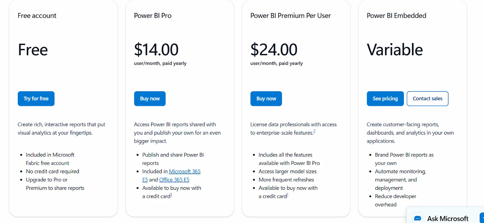
Power BI has a free tier for individual use (no sharing) and three paid options:
- Power BI Pro: $14 per user per month. Publishing, dashboard sharing, workspace collaboration, and embedding into Teams and SharePoint.
- Power BI Premium Per User: $24 per user per month. Larger model sizes, faster refreshes, paginated reports, and advanced AI features.
- Power BI Embedded: Custom pricing. For embedding reports, dashboards, and analytics into your own customer-facing applications.
Power BI Pros And Cons
✅ Affordable entry point at $14/user/month.
✅ Native Excel and Teams integration.
❌ For beginners, the learning curve can feel steep, particularly when you start working with data modeling and DAX formulas, according to a G2 review.
#3: Qlik Sense
Best for: Organizations that want interactive analytics for exploring complex data relationships, with flexibility around cloud or on-prem deployment.
Similar to: Tableau, Power BI.
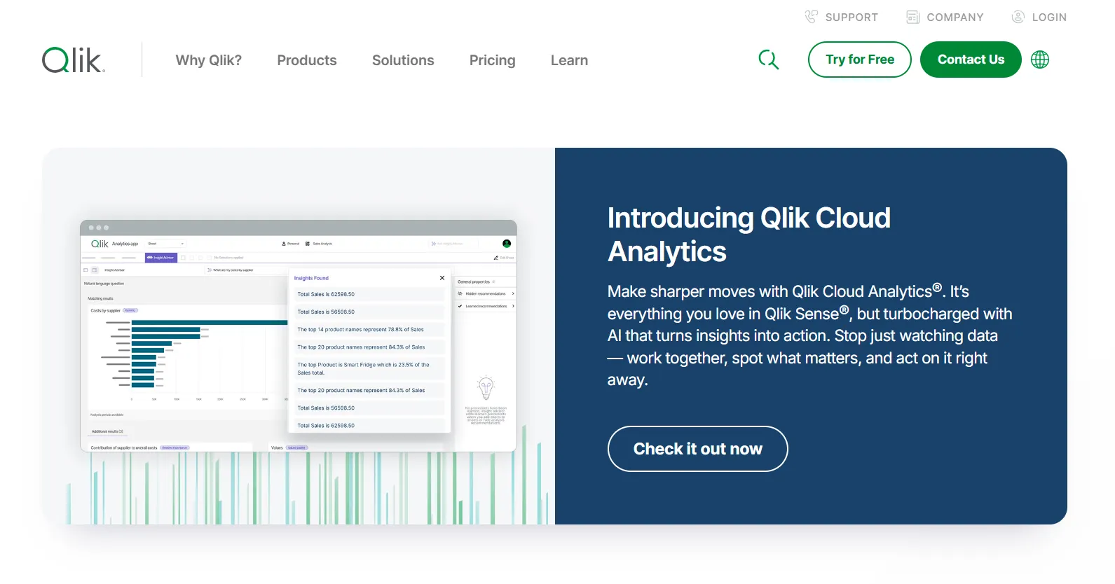
Qlik Sense runs on the company's associative engine, which lets users move across any combination of dimensions without being confined to predefined drill paths.
The platform comes in both a SaaS version (Qlik Cloud Analytics) and an on-prem version (Qlik Sense Enterprise), which makes it a frequent pick in regulated industries that need flexibility on where their analytics stack runs.
Qlik Sense's Top Features
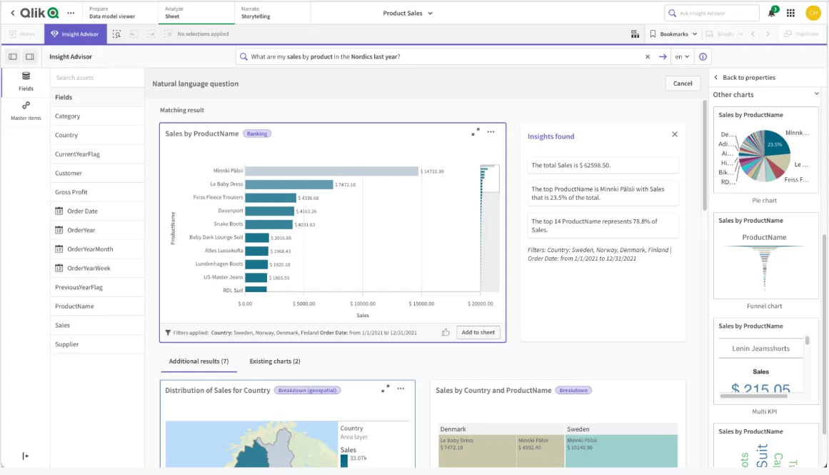
- Associative engine: Selecting a value in one chart updates everything else on screen in real time, opening exploration paths that traditional drill-downs don't expose.
- Qlik Answers and Insight Advisor: A GenAI assistant for answering questions across structured and unstructured data, alongside Qlik's augmented analytics layer for natural-language search and automated insight generation.
- Qlik Predict and Qlik Automate: Predictive analytics built on AutoML for forecasting and machine learning use cases, plus a no-code automation builder that triggers actions across connected systems.
Qlik Sense Pricing
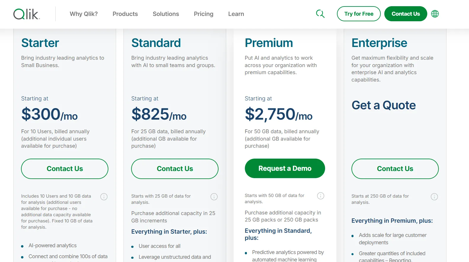
Qlik Cloud Analytics (the SaaS version of Qlik Sense) has four pricing tiers, all billed annually:
- Starter: $300/month, includes 10 users, 10 GB of data for analysis (fixed), AI-powered analytics, 100s of standard data source connectors, interactive dashboards, 5 GB max app size, and Qlik Community Support.
- Standard: $825/month, starts with 25 GB of data for analysis (additional capacity available in 25 GB increments), includes everything in Starter, plus user access for all, GenAI for unstructured data, managed and shared spaces, 1 GB of Personal Space, augmented advanced analytics, and 24x7 critical support.
- Premium: $2,750/month, starts with 50 GB of data for analysis (additional capacity in 25 GB or 250 GB packs), includes everything in Standard, plus predictive analytics powered by automated machine learning, additional GenAI capacity, anonymous access, SAP and Mainframe connectors, data lineage, 10 GB max app size, and guided customer success onboarding.
- Enterprise: Custom pricing, starts at 250 GB of data for analysis, includes everything in Premium, plus greater capacity for reporting, automations, machine learning models, and dataset size, 15 GB apps as standard (up to 50 GB per app available), 3 GB of Personal Space, multi-region tenants, and a personalized customer success plan.
Qlik Sense Pros And Cons
✅ Associative engine handles complex, multi-dimensional exploration well.
✅ Public pricing on the SaaS tier, with on-prem still available for regulated deployments.
❌ Capacity-based pricing can scale up quickly as data volume grows.
Get Started With Dot For Free
If your team spends more time writing notebooks and assembling decks than acting on the findings, Dot takes a different approach. The analysis happens before someone has to write it up.
What you get with Dot:
- Slack and Teams for asking questions, with answers and scheduled reports delivered there, in email, or in the web app.
- Recurring business reviews automated end-to-end and delivered as scheduled PowerPoints.
- A persistent Context Agent that keeps metric definitions consistent across teams.
- Inspectable audit trails on every output, with one click back to the query and the data.
- Native connections to Snowflake, BigQuery, Redshift, Databricks, and a range of other warehouses, databases, and SaaS sources.
- Compatibility with existing dbt, Looker, and Power BI modeling work, no migration required.
- SOC 2 Type II compliance and enterprise-grade access controls.
- Usage-based pricing that scales with usage, not seats.
➡️ Get started for free with Dot's free plan, or schedule a demo to see how it works with your data.
⚠️ Disclaimer: This article was last updated on May 27, 2026. If you spot any inaccuracies, contact us and we'll fact-check it.
Theo Tortorici
Theo writes about AI-powered analytics, data tools, and the future of business intelligence at Dot.