
10 Best Looker Alternatives & Competitors In 2026
Most teams start searching for Looker alternatives when dashboards stop being the bottleneck, and analyst time becomes the real constraint.
I’ve seen companies invest heavily in Looker’s modeling layer, only to realize stakeholders still wait days for answers or export screenshots into slide decks.
This is why in this guide, I’ll break down the best Looker competitors in 2026, where Looker performs well, and which platforms are better suited for teams that want deeper insights.
TL;DR
- Looker is powerful but heavy. Its governed semantic layer (LookML) delivers consistency, yet setup, maintenance, and performance tuning can slow teams down as usage expands beyond the data function.
- Dot is the optimal alternative when speed and analyst bandwidth matter most. Instead of building more dashboards, teams can ask complex business questions and receive structured, executive-ready answers with full SQL transparency.
- Other alternatives solve adjacent problems. Tableau prioritizes advanced visualization, Power BI excels in Microsoft-native environments, and open-source tools like Metabase or Superset reduce cost.
Why do teams switch to Looker alternatives?
After spending time inside Looker and digging through dozens of recent user reviews, one thing is clear: Looker is excellent at governed, warehouse-native analytics.
When it’s set up properly, you get consistent metric definitions through LookML, real-time drill-downs, embedded analytics inside your product, and dashboards that feel tightly connected to your data warehouse.
But the same strengths that make Looker powerful also introduce friction, especially as usage expands beyond the data team.
Here are the most common complaints I’ve seen (and experienced).
1. The LookML learning curve is real
Nearly every reviewer mentions this.
Looker’s semantic layer (LookML) is powerful, but it’s not beginner-friendly.
Even though business users don’t need SQL to explore dashboards, someone still needs to define views, explores, joins, and relationships correctly.
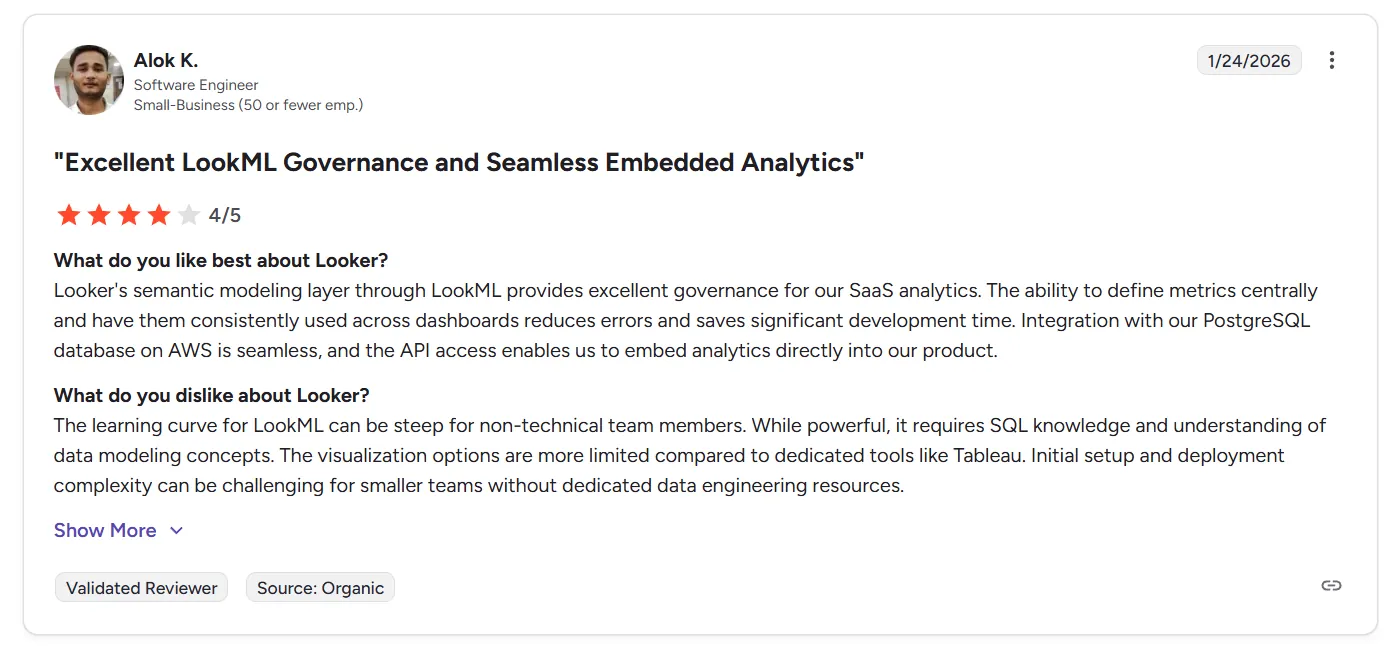
“The learning curve for LookML can be steep for non-technical team members. While powerful, it requires SQL knowledge and understanding of data modeling concepts. The visualization options are more limited compared to dedicated tools like Tableau. Initial setup and deployment complexity can be challenging for smaller teams without dedicated data engineering resources.” - G2 Review
And for non-technical stakeholders, all those concepts can feel abstract.
In practice, onboarding usually requires formal training. Smaller teams without dedicated analytics engineers often struggle during setup.
2. Visualization flexibility is limited
While Looker handles charts, dashboards, and branding themes well, multiple reviewers note that visualization options feel constrained compared to tools like Tableau.
Common themes include:
- Limited advanced chart types.
- Custom visuals require extra effort.
- Some UI customization gaps.
- Not ideal for highly design-driven reporting.
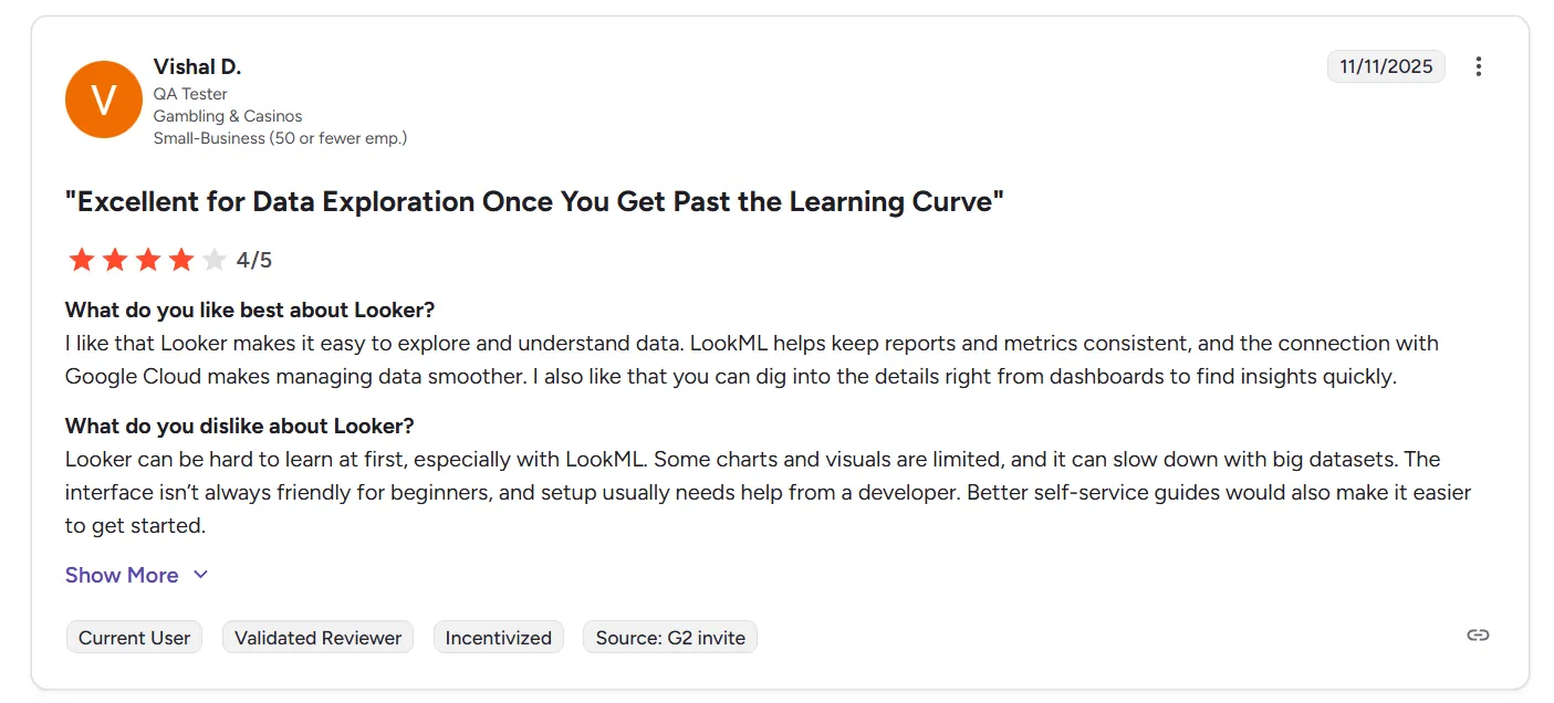
“Looker can be hard to learn at first, especially with LookML. Some charts and visuals are limited, and it can slow down with big datasets. The interface isn’t always friendly for beginners, and setup usually needs help from a developer. Better self-service guides would also make it easier to get started.” - G2 Review
It works well for operational dashboards, but teams wanting richer, presentation-level visuals sometimes feel boxed in.
3. Performance can lag on large datasets
Another recurring issue: speed.
Several users mention:
- Slow dashboard loads with large datasets.
- Occasional technical glitches.
- Performance tuning is not always intuitive.
- Explores becoming overwhelming at scale.
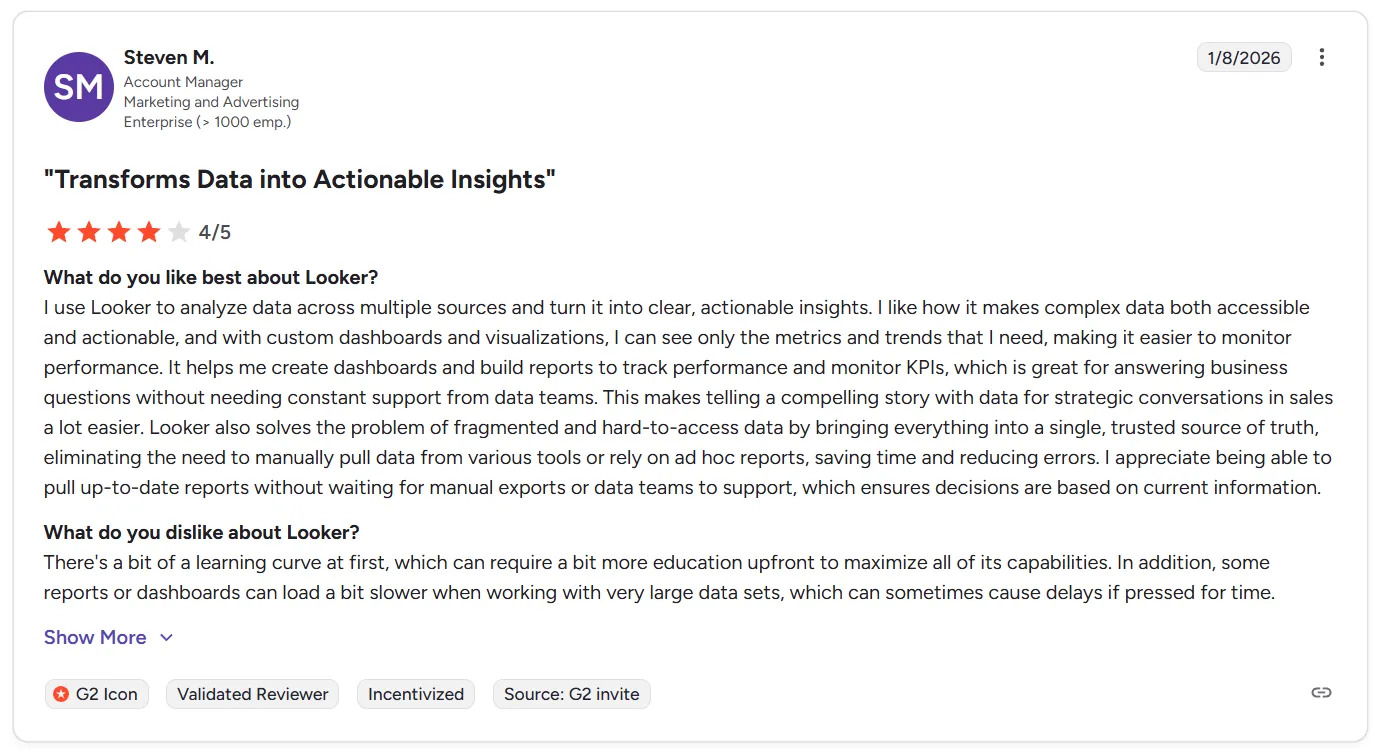
“There's a bit of a learning curve at first, which can require a bit more education upfront to maximize all of its capabilities. In addition, some reports or dashboards can load a bit slower when working with very large data sets, which can sometimes cause delays if pressed for time.” - G2 Review
Looker performs best when models are clean and optimized.
But once data complexity increases, query performance can become a pain point, especially for executives expecting instant answers.
What are the 10 best Looker alternatives & competitors in 2026?
The top three Looker alternatives are Dot, Microsoft Power BI and Tableau.
Here’s the complete list of tools that modern teams are choosing instead of Looker for analytics, BI, and embedded insights:
| Tool | What It’s Best For | Pricing |
|---|---|---|
| Dot | AI analytics agent that delivers full business analysis, explanations, and granular, executive-ready reports directly from your warehouse. | Free plan available; paid plans start at $799/month |
| Microsoft Power BI | Widely adopted enterprise BI tool with deep Microsoft integration, interactive dashboards, and AI-assisted insights. | Free plan; paid plans start at $14/user/month |
| Tableau | Industry-standard for rich data visualization and interactive reporting across large, diverse datasets. | From $75/user/month |
| Supaboard | Modern analytics platform with AI-powered dashboards, natural-language queries, and scalable self-service insights. | From $85/month (Individual) |
| Omni | Semantic layer–focused BI built for flexible metric definitions and faster decision-making without heavy upfront modeling. | Custom pricing (free trial available) |
| Holistics | BI tool with strong governance and a “dashboard as code” approach for teams that want Looker-style control without LookML complexity. | From $960/month |
| Sigma | Spreadsheet-like analytics directly on the data warehouse, ideal for analysts wanting Excel-style exploration at scale. | Custom pricing |
| Qlik Sense | Associative analytics engine with advanced exploration and AI-augmented insights across data relationships. | Custom pricing |
| Metabase | Open-source, user-friendly BI with simple dashboards and self-serve reporting for teams without heavy technical overhead. | Free (Open Source); paid plans start at $100/month + $6/user |
| Apache Superset | Open-source BI platform offering customizable visualizations and scalable analytics for tech-savvy teams. | Free (Open Source); infrastructure and hosting costs apply |
#1: Dot
While Looker is built around dashboards and semantic modeling, Dot takes a different starting point: answers, not charts.
Dot is an AI-native analytics agent that connects directly to your data warehouse (Snowflake, BigQuery, Redshift, Databricks) and delivers full business analysis, including explanations, root-cause breakdowns, and recommendations.
Instead of asking stakeholders to navigate explores or build dashboards, Dot lets them ask complex business questions in Slack, Teams, or the web app and get structured, executive-ready responses in minutes.
For teams stretched thin by ad-hoc requests, reporting cycles, or endless metric debates, Dot shifts analytics from “infrastructure first” to “decision first”, while keeping governance, lineage, and warehouse-native architecture intact.
Here are some of Dot’s standout features:
1. Deep Analysis mode for complex questions
Where Looker excels at building dashboards and enabling exploration, Dot goes further by handling the question dashboards usually can’t answer on their own: “Why?”
Instead of stopping at filtered charts or drill-downs, Dot’s Deep Analysis mode runs multi-step investigations autonomously.
So, when someone asks “Why did revenue drop in Q3?”, or “Why did CAC increase last month?”, Dot doesn’t just return a table. It:
- Runs multiple queries across relevant tables.
- Segments performance by channel, cohort, geography, or product.
- Identifies anomalies and statistical shifts.
- Validates assumptions.
- Structures findings into a narrative.
- Recommends next steps.
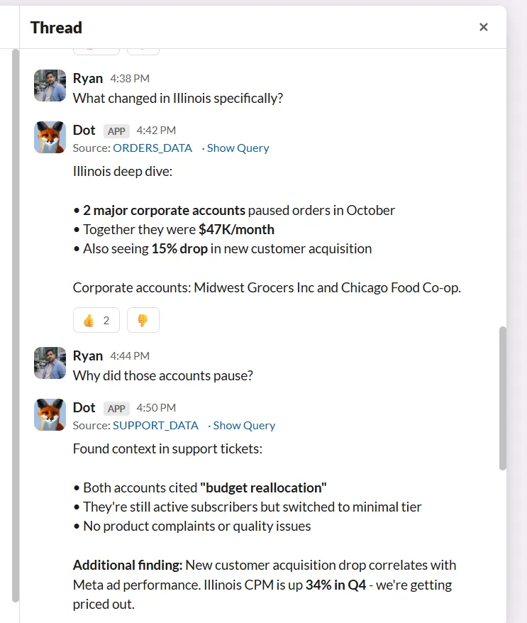
The output isn’t a dashboard snapshot, but a structured, executive-ready report with a clear headline, supporting charts, assumptions, and recommendations.
Importantly, every claim in a Deep Analysis report includes a complete audit trail. Each insight links directly to the underlying SQL queries, datasets, and logic used to generate it.
That means stakeholders don’t have to “trust the AI” blindly, as they can trace every number back to its source.
For data leaders concerned about governance, reproducibility, and compliance, this transparency is critical.
2. Ad-hoc Q&A in Slack and Teams
One of the most consistent frustrations I’ve seen with Looker is this: even with self-service dashboards, stakeholders still end up pinging the data team with a wide range of questions.
This is because dashboards reduce friction, but don’t eliminate the analyst bottleneck.
Dot tackles this by allowing stakeholders to ask business questions directly in Slack or Microsoft Teams and receive structured answers in minutes.
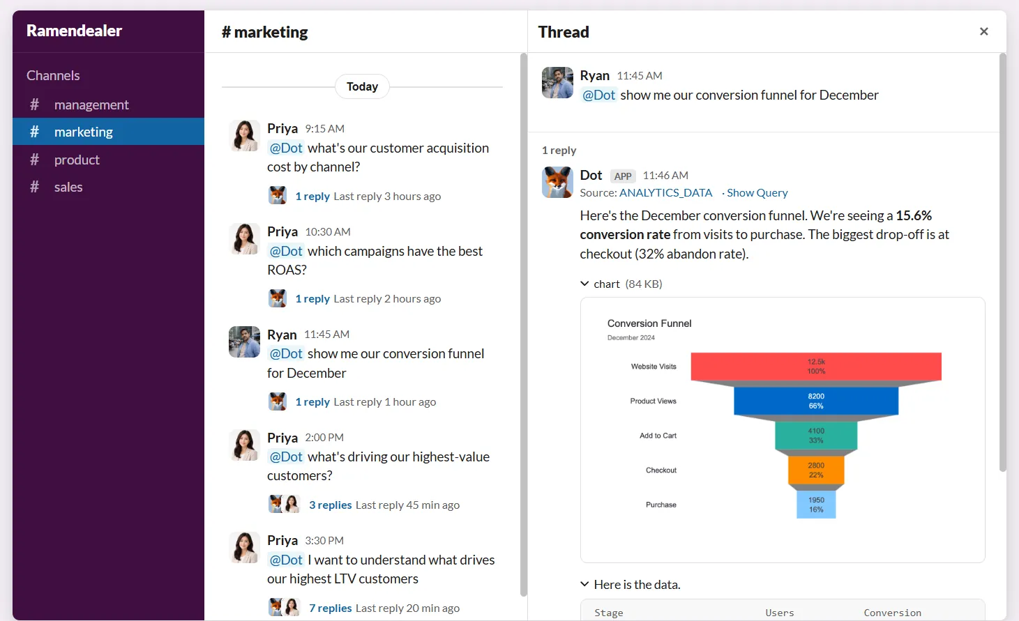
No switching tools. No building temporary dashboards. No waiting days for someone to write SQL.
And since Dot understands your governed warehouse data and references your business context, it returns full explanations instead of just raw tables, and can include charts when relevant.
This way, analysts can focus on deeper strategic work while business teams still get answers fast enough to make decisions.
3. Context Agent
One of Looker’s biggest strengths is its semantic layer.
LookML allows teams to define metrics once and reuse them consistently across dashboards, which is powerful.
But it also requires ongoing modeling work, SQL knowledge, and careful maintenance.
That’s where Dot’s Context Agent steps in.
Instead of requiring teams to manually define and maintain a modeling layer from scratch, the Context Agent pulls context from your existing systems, such as your warehouse schema, BI dashboards, dbt models, query history, and documentation, and builds a structured knowledge layer automatically.
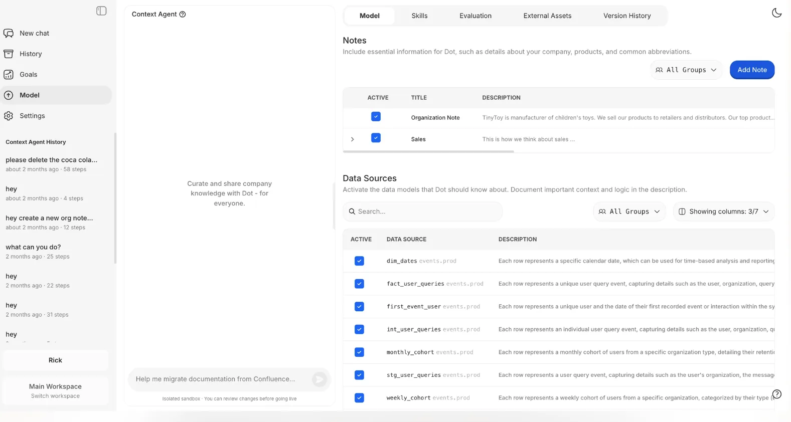
It can:
- Extract metric logic from trusted dashboards.
- Document tables and columns at scale.
- Identify inconsistencies between documentation and live data.
- Capture company knowledge through guided interviews.
- Maintain version-controlled changes before merging them live.
As a result, you still get consistent definitions and shared understanding, but without needing to manage a heavy semantic modeling workflow.
4. Business reviews that build themselves
Even in organizations that use Looker extensively, I’ve seen the same pattern repeat: dashboards exist, metrics are defined, but someone still has to prepare the weekly business review or board deck.
Dot removes that manual reporting cycle.
With scheduled Deep Analysis, teams can automate recurring business reports that include not just updated numbers, but structured narrative analysis and recommendations.
And instead of sending static dashboard links, Dot delivers executive-ready summaries directly via Slack, Teams, email, or exports them as PowerPoint presentations on a daily, weekly, or monthly basis.
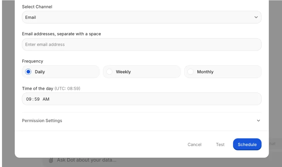
Each report includes:
- A clear headline (what changed).
- Key insights.
- Supporting charts.
- Root-cause breakdown.
- Recommendations.
- Assumptions and definitions.
In other words, Dot moves reporting from “dashboard updates” to “decision-ready briefings”, which is a practical step beyond traditional BI workflows.
Dot’s integrations
Dot is designed specifically for modern data environments, as it connects directly to your existing warehouse, semantic layer, BI tools, and communication platforms through no-code integrations or its API.
On the data side, Dot works with major warehouses and databases, including Snowflake, BigQuery, PostgreSQL, Microsoft SQL, etc.
For teams that already use semantic layers or modeling tools, Dot integrates with Looker, Power BI, dbt, and Cube.
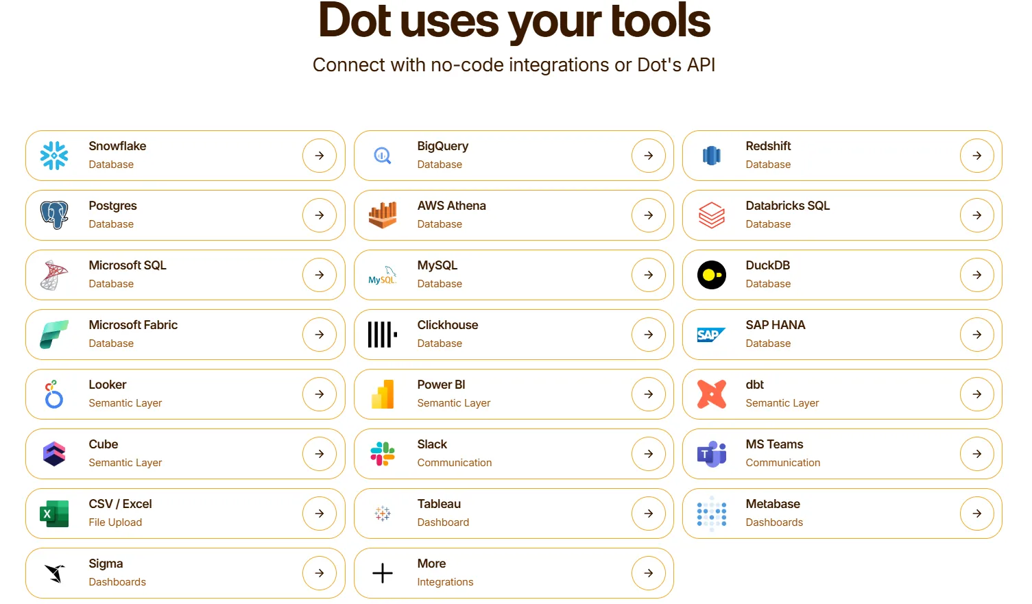
It can also learn from and reference logic inside dashboards from tools like Tableau, Metabase, and others.
And since Dot is built for real-world team workflows, it delivers insights directly into Slack, Microsoft Teams, and email.
It also supports CSV/Excel uploads when needed and provides API access for embedding or automation use cases.
The practical takeaway is that Dot doesn’t replace your warehouse or BI ecosystem. Instead, it layers on top of it.
That makes it particularly well-suited for mid-market and growth-stage companies that have already invested in modern data infrastructure but want to unlock more value from it without adding another heavy system to maintain.
Pricing
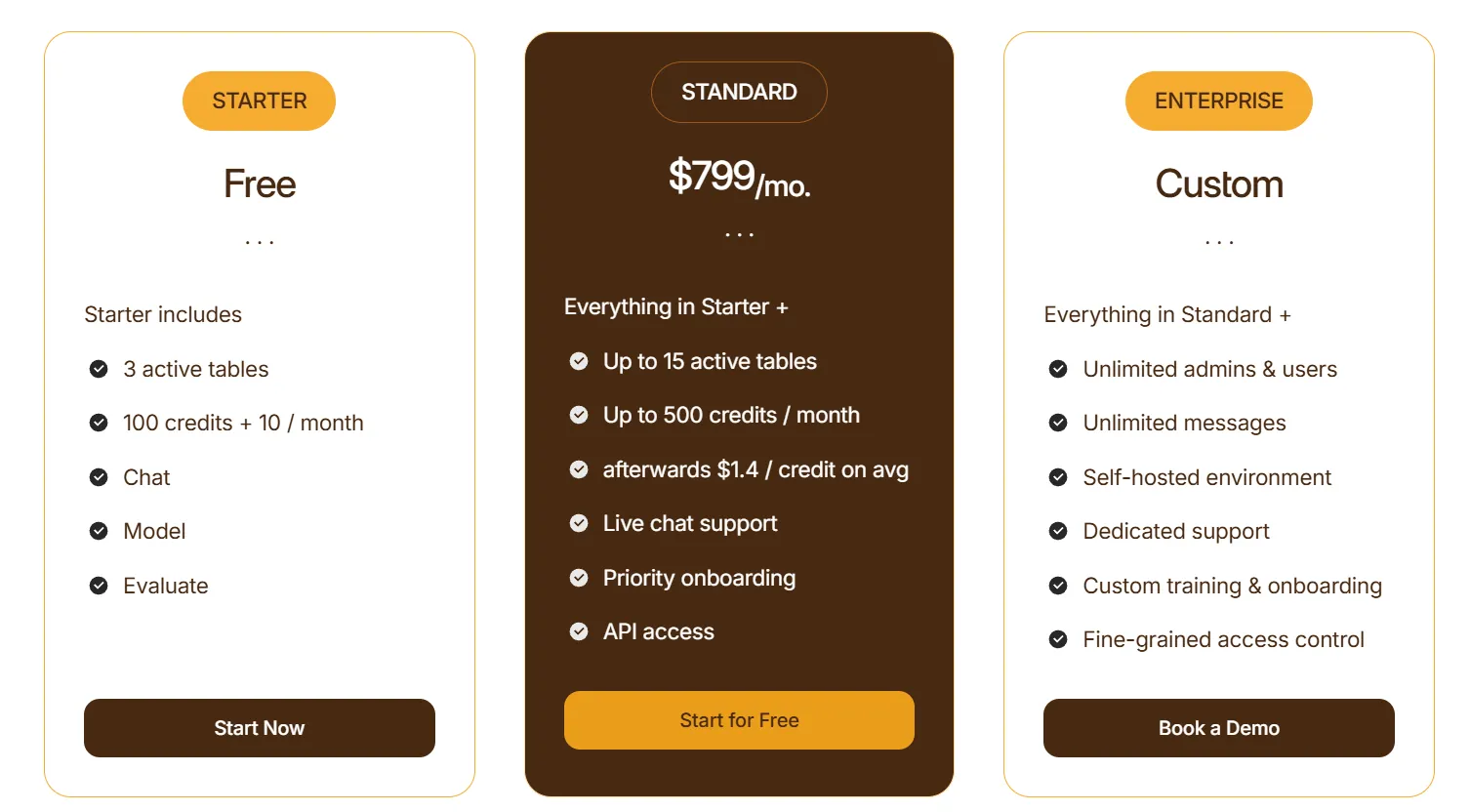
Dot uses a credit-based pricing model, with plans designed to scale from early experimentation to enterprise-wide usage:
- Starter: Free plan that lets you get started without committing, includes 3 active tables, 100 credits + 10 credits per month, chat-based analysis, and model & evaluation access.
- Standard: $799/month, includes everything in Starter, up to 15 active tables, up to 500 credits per month, additional credits at $1.40 per credit, live chat support, priority onboarding, and API access.
- Enterprise: Custom pricing, includes everything in Standard, unlimited users and admins, unlimited messages, self-hosted environment, dedicated support, custom onboarding and training, and fine-grained access controls.
How is Dot different from Looker?
Simply put, Looker is built around dashboards and semantic modeling, and Dot is built around answers and analysis.
Here’s how that difference extends to various areas:
- Dashboards vs. direct answers: With Looker, you build dashboards and explore data. In Dot, you ask a question in Slack or Teams and get a structured answer in minutes, explanation, charts, and recommendations included.
- LookML vs. context automation: Looker requires LookML modeling and ongoing maintenance. Dot uses a Context Agent to pull definitions from your warehouse, dbt, and dashboards automatically, so you get enterprise-grade governance without heavy modeling work.
- Exploration vs. root cause analysis: Looker is strong for manual drill-downs. Dot runs multi-step investigations and delivers executive-ready reports with a full SQL audit trail for every insight.
- Manual reporting vs. automated business reports: With Looker dashboards, still need to be exported and explained. Dot generates recurring, narrative business reviews and sends them directly to Slack, email, or PowerPoint.
So, if your main goal is governed dashboards and embedded analytics, Looker does that well.
On the other hand, if your main constraint is analyst time, ad-hoc overload, reporting cycles, and executive explanations, Dot is built to tackle that problem head-on.
Pros & Cons
✅ Highly user-friendly for both technical and non-technical teams because you can ask questions in natural language directly in Slack or Microsoft Teams with no dashboards or SQL required.
✅ Delivers decision-ready output by providing structured explanations with context and recommendations, which is exactly what executives actually need.
✅ Transparent and auditable AI, with every answer linking back to the underlying SQL and data sources, which builds trust with data leaders and avoids “black box” concerns.
✅ Works on top of your existing stack, so there’s no need for infrastructural changes.
✅ Automates recurring business reports, removing the need for manual dashboards.
✅ Ensures metric definitions stay consistent as companies scale without requiring semantic layer modelling.
✅ Provides full query transparency, so every insight can be verified by the data team.
✅ Works on top of your existing warehouse.
✅ Flexible, transparent pricing.
❌ If your primary need is highly customized, design-heavy dashboards, Dot isn’t built to replace tools like Tableau or Power BI.
#2: Microsoft Power BI
Best for: Organizations deeply embedded in the Microsoft ecosystem that want enterprise-grade dashboards, reporting, and tight integration with Excel, Azure, and Microsoft 365.
Microsoft Power BI is a leading business intelligence platform developed by Microsoft that enables teams to build interactive dashboards, create data models, and share reports across the organization.
It combines data preparation, visualization, and AI-assisted insights in a single platform, with strong integration across Azure, Excel, Teams, and other Microsoft products.
Features
- Semantic data modeling (DAX-based datasets): Create centralized, reusable data models with defined relationships, calculated measures, and row-level security to ensure consistent metrics across reports.
- Interactive dashboards & data exploration: Build customizable dashboards and explore data through filters, drill-downs, cross-highlighting, and real-time queries powered by governed datasets.
- Natural language Q&A: Ask business questions in plain language and generate instant visuals and answers from your data model.
Pricing
Power BI uses a per-user and capacity-based pricing model, with different tiers depending on how reports are created, shared, and scaled across the organization.
There’s a Free plan, best for individual users exploring data on their own, that includes building reports and dashboards for personal use, but no sharing or collaboration features.
The paid options include the following:
- Power BI Pro: $14/user/month, includes report publishing, sharing dashboards, collaboration in workspaces, and embedding in Microsoft Teams and SharePoint.
- Power BI Premium Per User: $24/user/month, includes everything in Pro, plus larger model sizes, more frequent refreshes, paginated reports, and advanced AI features.
- Power BI Embedded: Custom pricing, which lets you create customer-facing reports, dashboards, and analytics in your own applications.
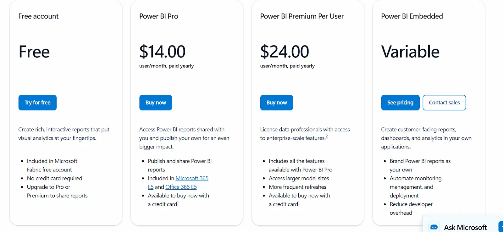
All plans are annual.
Pros & Cons
✅ Seamless integration with Excel, Azure, Teams, and the broader Microsoft ecosystem.
✅ Interactive dashboards with powerful drill-down and real-time refresh features.
❌ DAX formulas and advanced data modeling come with a steep learning curve.
#3: Tableau
Best for: Teams that prioritize advanced data visualization and interactive analytics across complex, large-scale datasets.
Tableau is a leading analytics and business intelligence platform developed by Salesforce that focuses on turning raw data into highly interactive, visually rich dashboards.
It enables users to explore data through drag-and-drop visual analysis, connect to a wide range of data sources, and share insights securely across the organization.
Features
- Advanced interactive dashboards & visual analytics: Build highly customizable dashboards with drag-and-drop visual exploration, deep drill-downs, filters, and cross-data highlighting.
- Semantic modeling with Tableau Data Model: Define relationships between tables, create calculated fields, and centralize metrics for consistent reporting.
- Data blending & multi-source analysis: Combine multiple datasets across different systems without heavy preprocessing.
Pricing
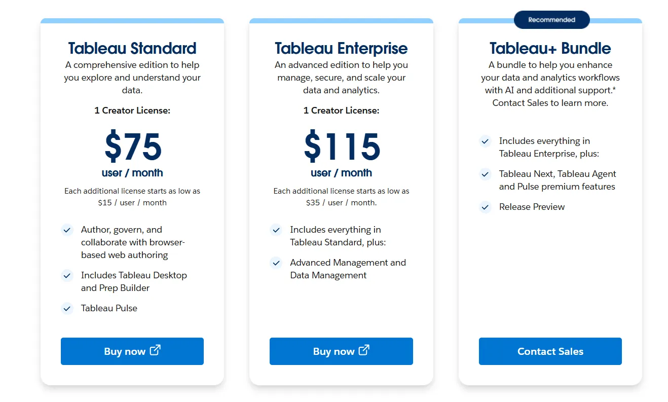
Tableau uses per-user, per-month pricing, with separate plans depending on whether you deploy Tableau in the cloud, on your own servers, or as part of its newer AI-driven offering:
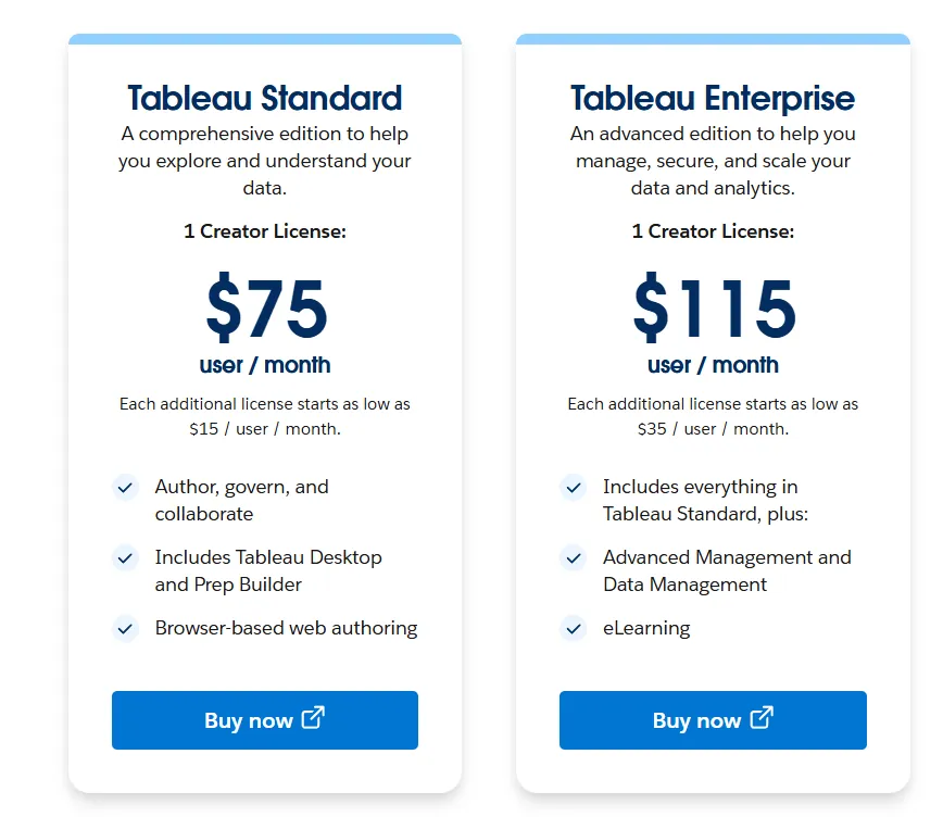
- Tableau Cloud has three pricing plans:
- Tableau Standard: $75 per 1 creator per month, with each additional license from $15 per user/month, includes browser-based authoring and collaboration, Tableau Desktop and Prep Builder, Tableau Pulse for metrics and insights.
- Tableau Enterprise: $115 per 1 creator per month, with each additional license from $35 per user/month, includes everything in Standard, plus Advanced Management and Data Management for governance and scale.
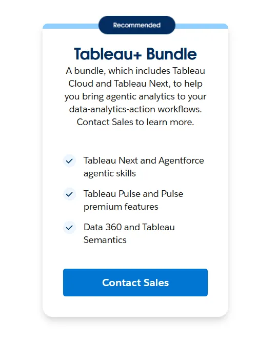
- Tableau+ Bundle (Cloud + AI): Custom pricing, includes everything in Tableau Enterprise, plus Tableau Next, Tableau Agent, and Pulse premium features, with access to release previews and early AI capabilities.
- Tableau Server has two pricing plans:
- Tableau Standard: $75 per 1 creator per month, with each additional license from $15 per user/month, includes authoring, governance, and collaboration and Tableau Desktop and Prep Builder.
- Tableau Enterprise: $115 per 1 creator per month, with each additional license from $35 per user/month, includes everything in Standard, plus Advanced Management, Data Management, and eLearning.
- Tableau Next (agentic analytics): Requires an annual contract, includes agentic analytics via Agentforce, Tableau Semantics, Tableau Pulse (including premium), and Data 360.
Pros & Cons
✅ Excellent data visualization capabilities with highly interactive, polished dashboards.
✅ Drag-and-drop interface makes building dashboards fast and intuitive.
❌ Advanced features (LOD expressions, parameters, calculations) have a steep learning curve.
#4: Supaboard
Best for: Teams that want AI-powered business intelligence with no-code dashboards and natural-language analytics instead of traditional BI modeling workflows.
Supaboard is an AI-driven analytics platform that connects to your data sources and automatically generates dashboards, insights, and reports without requiring SQL or complex setup.
It focuses on speed and simplicity, allowing business users to ask questions in plain English and get instant visual answers without depending on a data team.
Features
- Trainable AI agents: Create AI agents trained on your business logic, rules, SLAs, and definitions to deliver context-aware insights without building or maintaining data models.
- Natural language data chat: Ask questions in natural language and instantly receive metrics, charts, explanations, and recommended actions.
- AI-generated real-time dashboards: Describe what you need and Supaboard automatically builds interactive dashboards, KPIs, and tables that update live.
Pricing
Supaboard offers three main pricing tiers designed to scale from individual users to large enterprises:
- Individual: $85/month, includes a single user, default AI agent, advanced AI models, static embeddings, unlimited dashboards, and email support.
- Business: $229/month, includes everything in Individual, plus multiple users, custom agents, AI embeddings, Slack and team bot integration, and dedicated support.
- Enterprise: Custom pricing, includes everything in Business, plus unlimited users and agents, AI embeddings with white-labeling, custom Slack and team bot integrations, a dedicated account manager, reports, and bespoke onboarding and support.
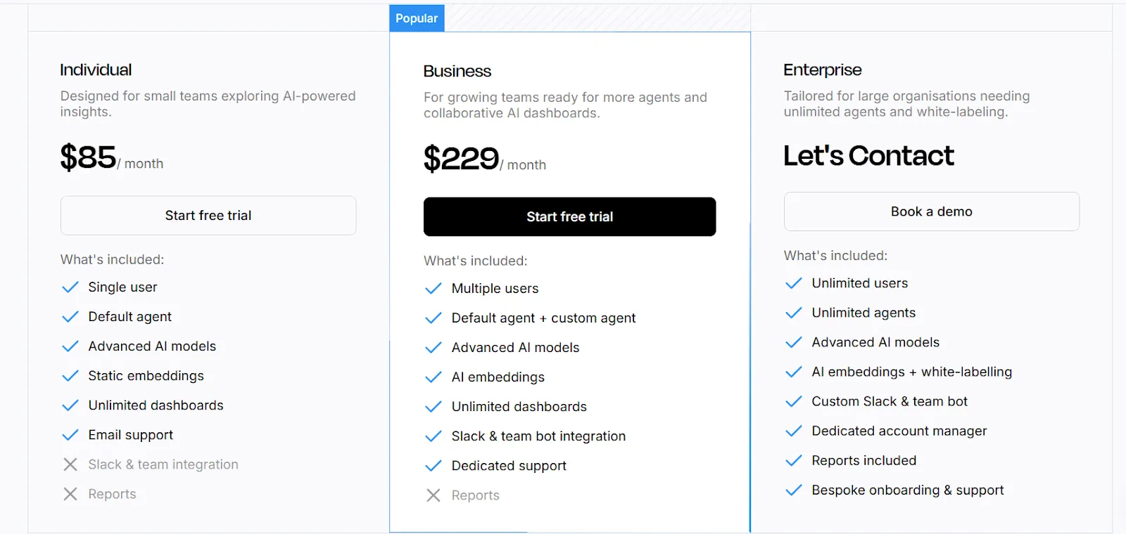
The first two plans have a 14-day free trial.
Pros & Cons
✅ Extremely easy to connect data sources, including large CSV and KPI files.
✅ Natural-language querying makes data analysis fast and accessible.
❌ Limited dashboard customization compared to traditional BI tools.
#5: Omni
Best for: Data-driven teams that want a flexible semantic layer with powerful self-service analytics without the rigidity and complexity of traditional BI modeling.
Omni is a modern business intelligence platform built around a centralized semantic model that keeps metrics consistent while enabling fast, self-service exploration.
It connects directly to cloud data warehouses and allows both technical and business users to analyze data, build dashboards, and collaborate without heavy upfront BI engineering.
Features
- Metrics-first modeling: Define metrics once in a centralized model that supports governed, reusable calculations without the rigidity of traditional LookML workflows.
- AI in dashboards & workbooks: Use AI directly inside dashboards and workbooks to summarize charts, generate queries, explain trends, and recommend next steps.
- Spreadsheet-like exploration: Analyze live warehouse data in a familiar spreadsheet interface while maintaining governed metrics and real-time connections.
Pricing
Omni doesn’t publish subscription fees.
You can request a free trial on its website and inquire about pricing details.
Pros & Cons
✅ Intuitive drag-and-drop interface.
✅ Powerful dbt integration and direct warehouse querying for modern data stacks.
❌ Still evolving as a product, with occasional rough edges and missing features.
#6: Holistics
Best for: Teams that need governed self-service analytics with a flexible semantic layer and strong collaboration between analysts and business users.
Holistics is a cloud-native business intelligence platform that centralizes metric definitions and data modeling while enabling non-technical users to build reports, dashboards, and insights without constantly asking the data team.
It combines SQL-based modeling, automated reporting, and natural-language AI to unlock analytics for the whole organization.
Features
- Self-service exploration for business users: Let non-technical teams build their own reports and dashboards through a visual, drag-and-drop interface using pre-defined metrics and governed data models.
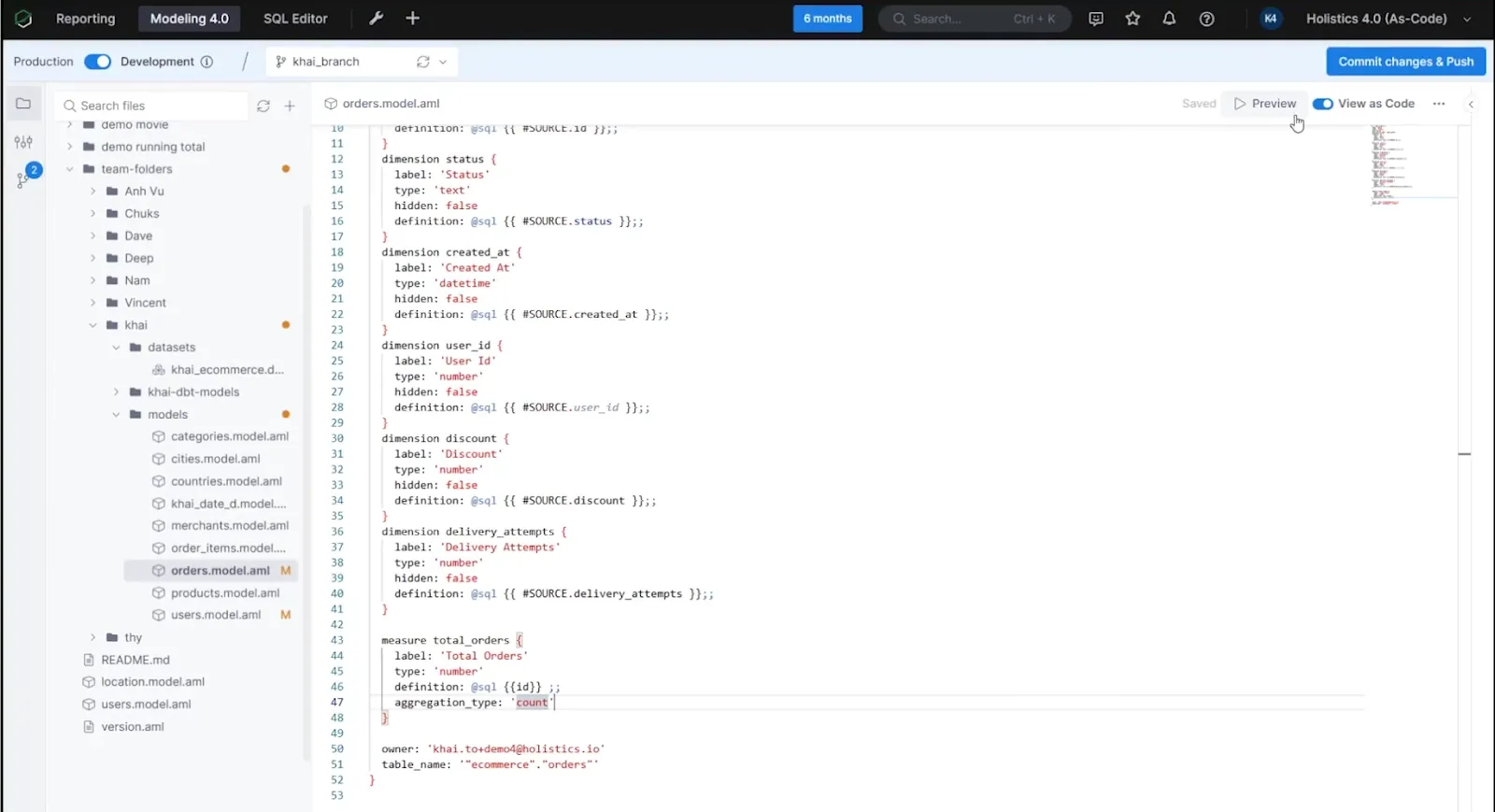
- Analytics As-Code: Define business logic, datasets, and metrics using Holistics’ declarative DSL or SQL and commit everything to Git for full version control, branching, and code reviews, bringing true software engineering practices into BI.
- Centralized data modeling: Define metrics, joins, derived tables, and transformations once in Holistics’ model layer to enforce consistency across dashboards and reports.
Pricing
Holistics uses a tiered pricing model based on reports and users, with add-ons for security and scale:
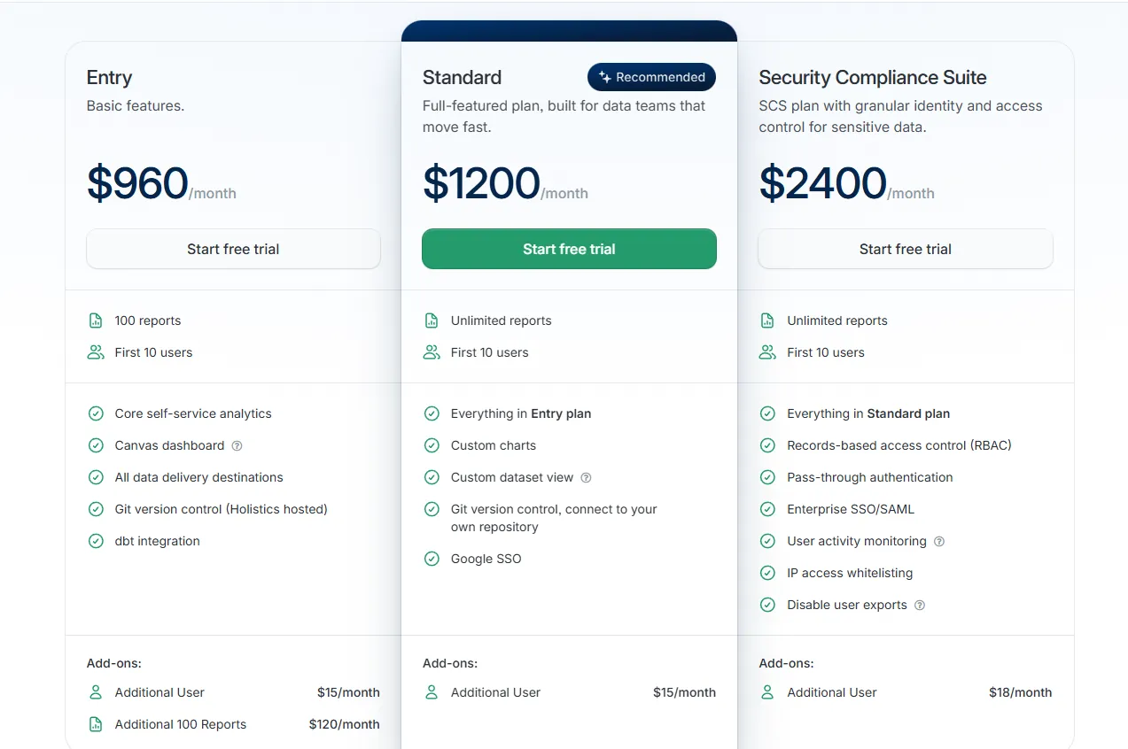
- Entry: $960/month, includes 100 reports, 10 users, core self-service analytics, Canvas dashboards, all data delivery destinations, Holistics-hosted Git version control, and dbt integration, with add-ons including additional users ($15/month) and extra 100 reports ($120/month).
- Standard: $1,200/month, includes everything in Entry, plus unlimited reports, 10 users, custom charts, custom dataset views, Git connected to your own repository, and Google SSO, with additional users at $15/month.
- Security Compliance Suite: $2,400/month, includes everything in Standard, plus RBAC, pass-through authentication, Enterprise SSO/SAML, user activity monitoring, IP whitelisting, and export controls, with additional users at $18/month.
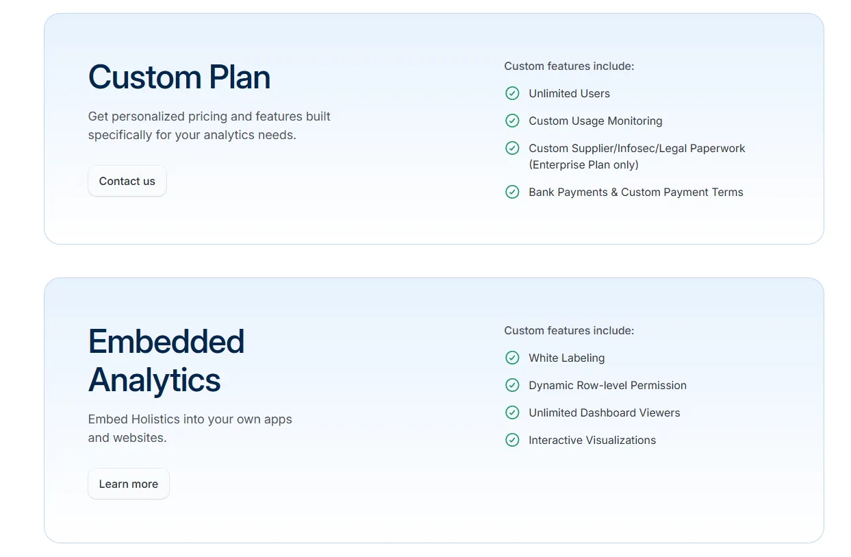
- Custom Plan: Tailored pricing for enterprise needs such as unlimited users, custom usage monitoring, and advanced compliance requirements.
- Embedded Analytics: Custom pricing, includes white labeling, dynamic row-level permissions, unlimited viewers, and interactive embedded dashboards.
Pros & Cons
✅ Strong semantic layer with “analytics as code” and Git version control for governed, scalable BI.
✅ Powerful dashboards (AQL + Canvas + AI assistant) with deep drill-down capabilities.
❌ Performance can feel slow with certain warehouses (e.g., Snowflake) or complex datasets.
#7: Sigma
Best for: Teams that want spreadsheet-style analytics directly on top of their cloud data warehouse without exporting data to Excel.
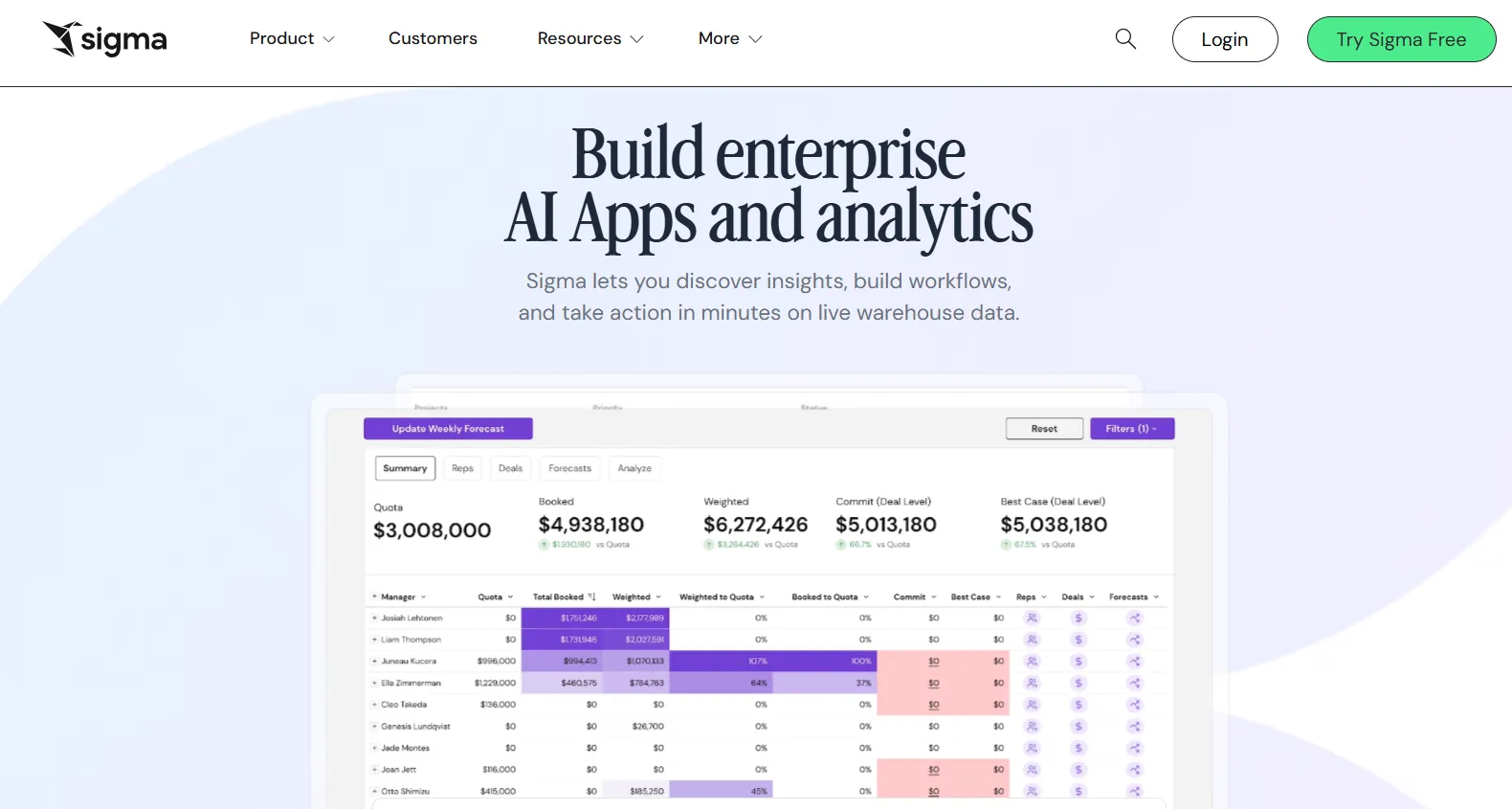
Sigma is a cloud-native analytics platform that lets business users explore live warehouse data through a familiar spreadsheet interface.
Instead of building complex semantic layers or writing heavy SQL, teams can analyze, pivot, model, and collaborate on data in real time, directly on Snowflake, BigQuery, Databricks, and other cloud warehouses.
Features
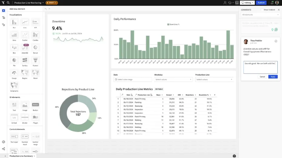
- Spreadsheet interface on live warehouse data: Analyze billions of rows directly in your cloud data warehouse using a familiar Excel-like interface, with no extracts or data duplication.
- No-code data modeling & transformations: Create joins, calculations, and reusable datasets through a visual interface or SQL when needed, enabling both analysts and business users to work in the same environment.
- Collaborative workbooks: Build interactive dashboards and analysis in shared workbooks where teams can comment, version, and iterate together, similar to Google Sheets but powered by your warehouse.
Pricing
Sigma doesn’t publish its pricing.
You can contact its sales team directly to get a custom quote.
Pros & Cons
✅ Spreadsheet-like interface makes warehouse data accessible to non-technical users.
✅ AI features (Ask Sigma, chart explanations) accelerate analysis and reduce analyst load.
❌ Data modeling and complex workflows require careful backend optimization to avoid performance issues.
#8: Qlik Sense
Best for: Organizations that need associative analytics to explore complex data relationships beyond traditional dashboard filtering.
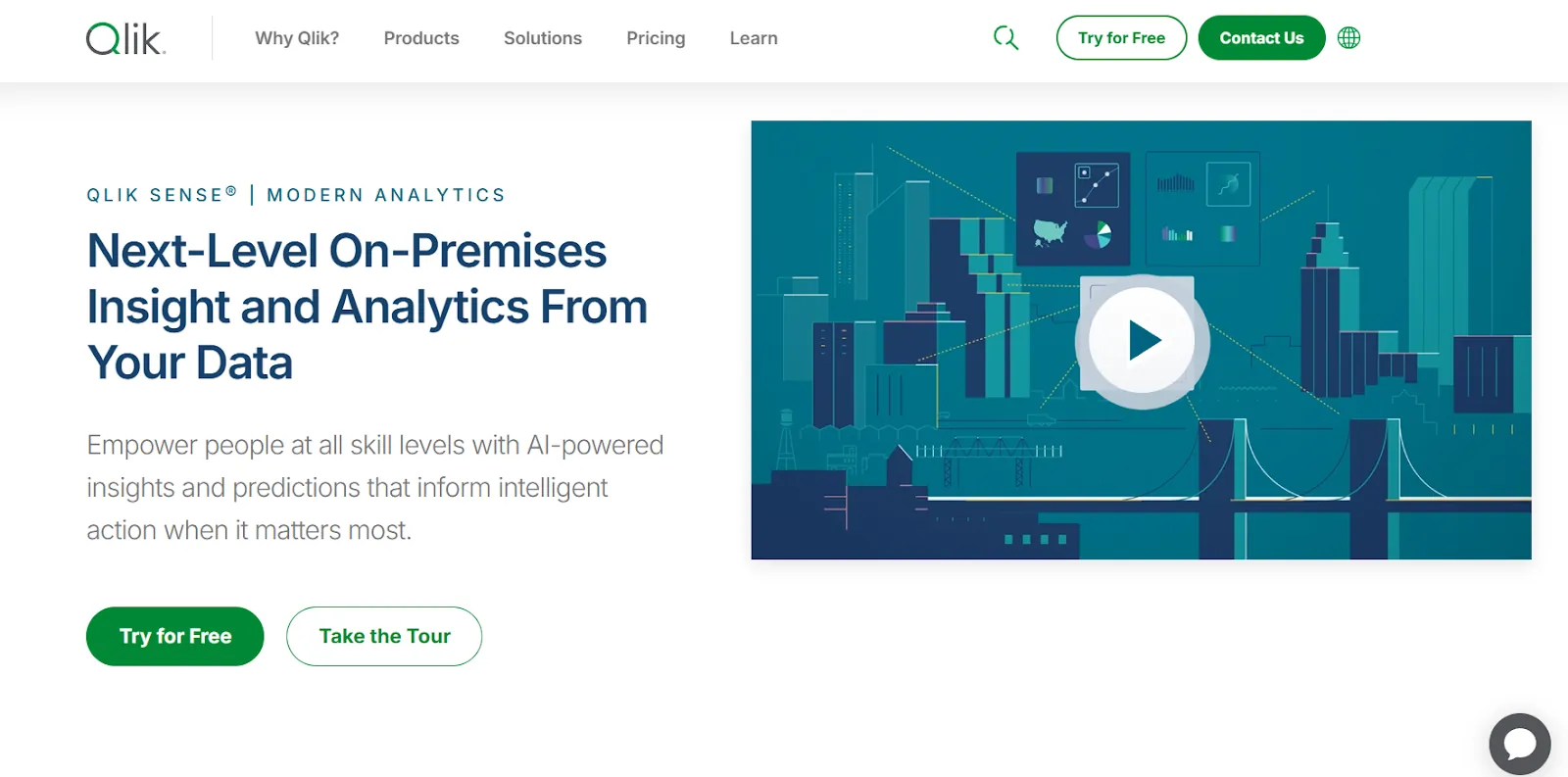
Qlik Sense is a modern data analytics platform built around Qlik’s associative engine, allowing users to freely explore data without being restricted by predefined queries or rigid drill paths.
It combines governed data models, AI-powered insights, and interactive dashboards to help teams uncover hidden relationships and patterns across large, complex datasets.
Features
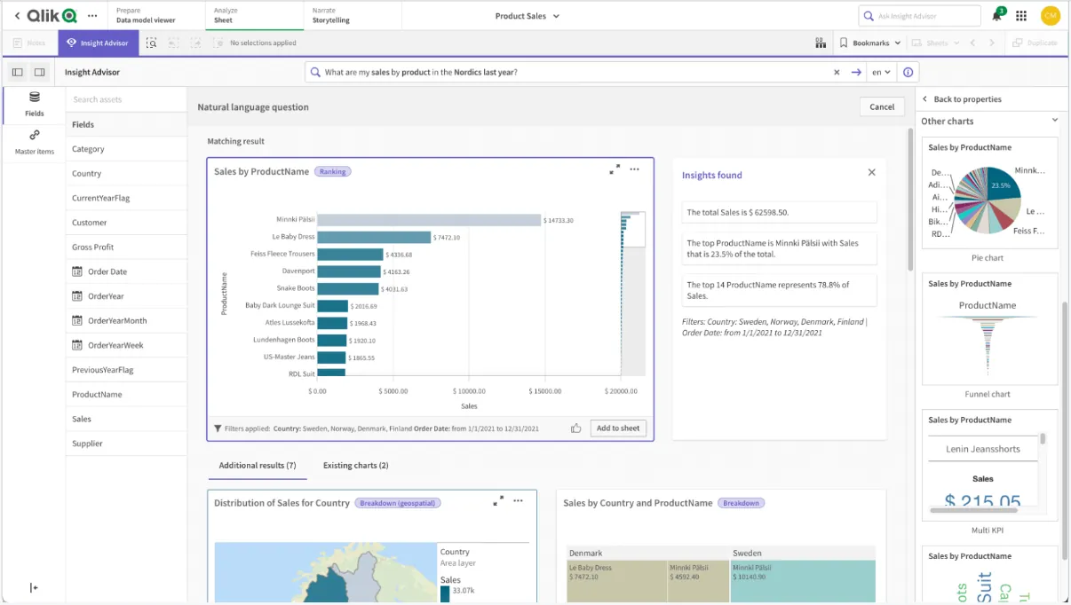
- Associative analytics engine: Explore data freely across all fields without being restricted to predefined drill paths, automatically highlighting related and unrelated data to uncover hidden relationships.
- Interactive dashboards & self-service analytics: Build responsive dashboards with drag-and-drop visualizations, filters, and dynamic selections for deeper data exploration.
- Augmented analytics & auto-generated insights: Automatically surface trends, anomalies, and key drivers within datasets to speed up analysis and decision-making.
Pricing
Qlik doesn’t publish pricing for its Qlik Sense product.
Its website states that you must contact sales for a custom quote.

Pros & Cons
✅ Flexible dashboards with drill-down and dynamic filtering.
✅ Scalable for large datasets with solid in-memory processing.
❌ Pricing is high compared to most other BI tools.
#9: Metabase
Best for: Teams that want a simple, open-source BI tool for self-service dashboards without heavy modeling overhead.
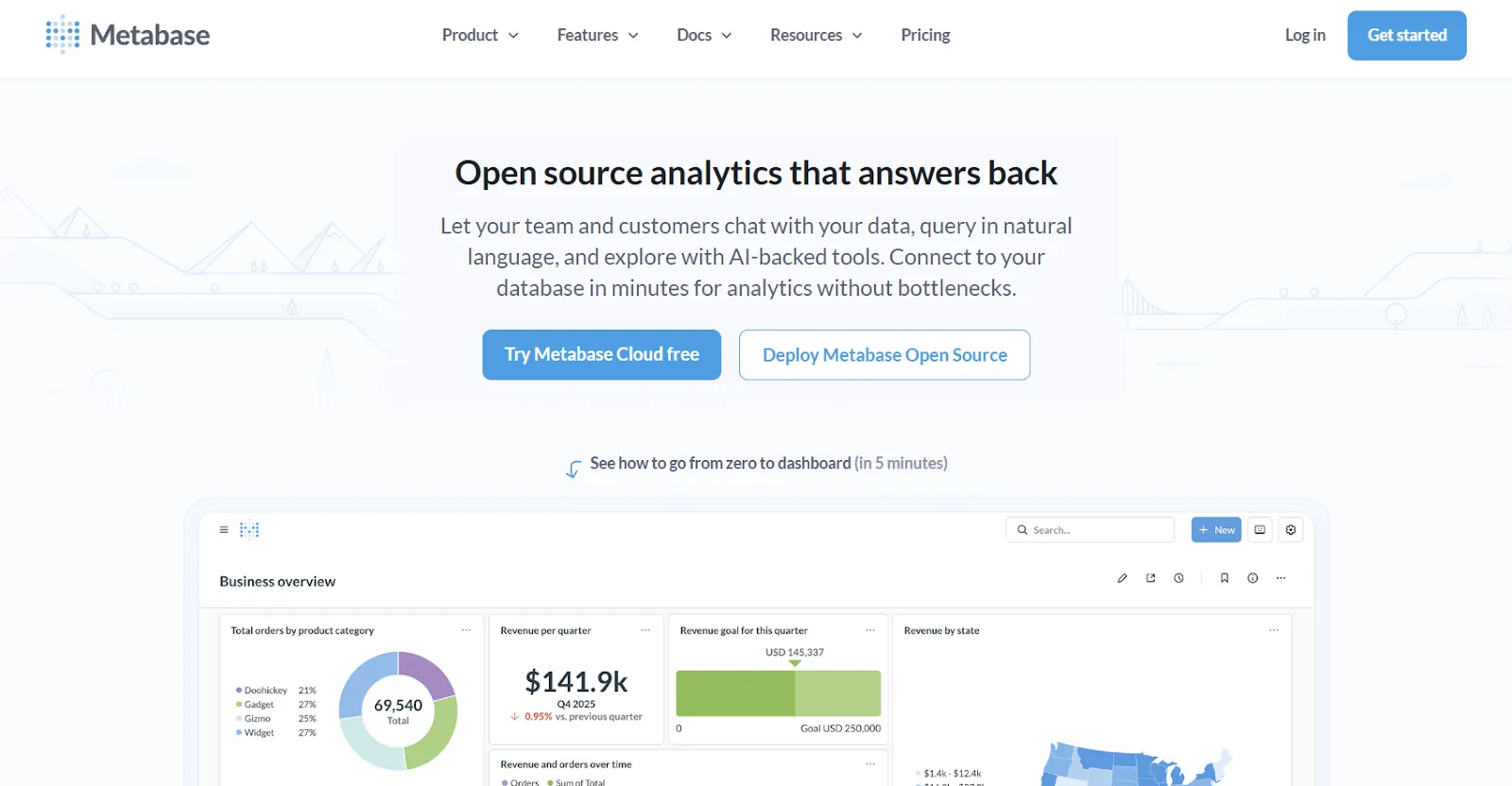
Metabase is an open-source business intelligence platform that makes it easy for teams to explore data, build dashboards, and share insights without deep technical expertise.
It supports both no-code query building and SQL for advanced users, making it accessible for business teams while still flexible enough for analysts.
Features
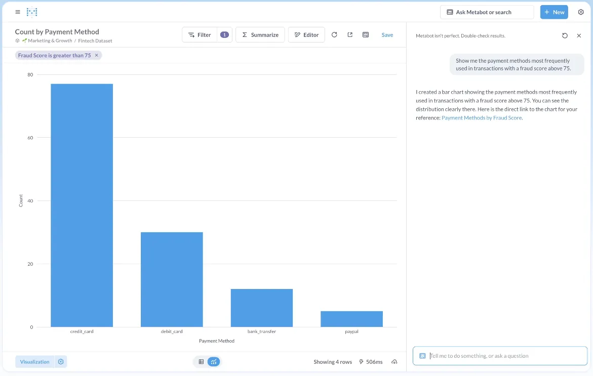
- Visual query builder: Explore data through a step-by-step visual interface that lets users filter, join, summarize, and visualize data without writing SQL.
- Interactive dashboards with drill-through: Build dashboards with global filters, click-to-drill functionality, and dynamic interactions that allow deeper exploration directly from charts.
- Embedded analytics (static & interactive): Embed dashboards and charts into internal tools or customer-facing apps with signed embedding and row-level permissions.
Pricing
Metabase offers two pricing options depending on how you use the product: internal business intelligence or customer-facing embedded analytics.
- Business Intelligence:
- Open Source (Self-hosted): Free, self-hosted deployment, includes unlimited queries, charts, and dashboards, connects to all supported data sources, basic embedding with “Powered by Metabase” branding, community support only.
- Starter (Cloud-hosted): $100/month + $6/user/month, first 5 users included, includes everything in Open Source, plus option to include Metabot AI (charged extra), automatic upgrades, backups, and monitoring, support via Slack, Teams, and email (3-day SLA).
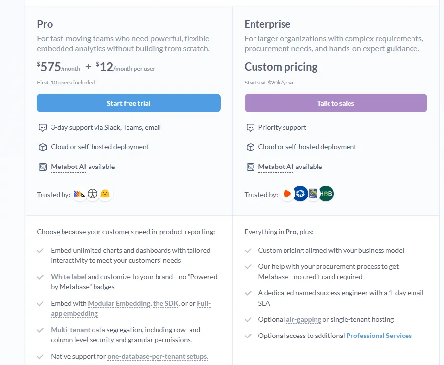
- Pro: $575/month + $12/user/month, first 10 users included, cloud or self-hosted deployment, includes everything in Starter, plus row- and column-level permissions, SSO and SCIM support, advanced caching and performance controls, staging + production environments, usage analytics and audit visibility, white-labeling, and embedded analytics capabilities.
- Enterprise: Custom pricing (starts at $20k/year), includes everything in Pro, plus priority support, dedicated success engineer (1-day email SLA), optional single-tenant or air-gapped deployment, and optional professional services.
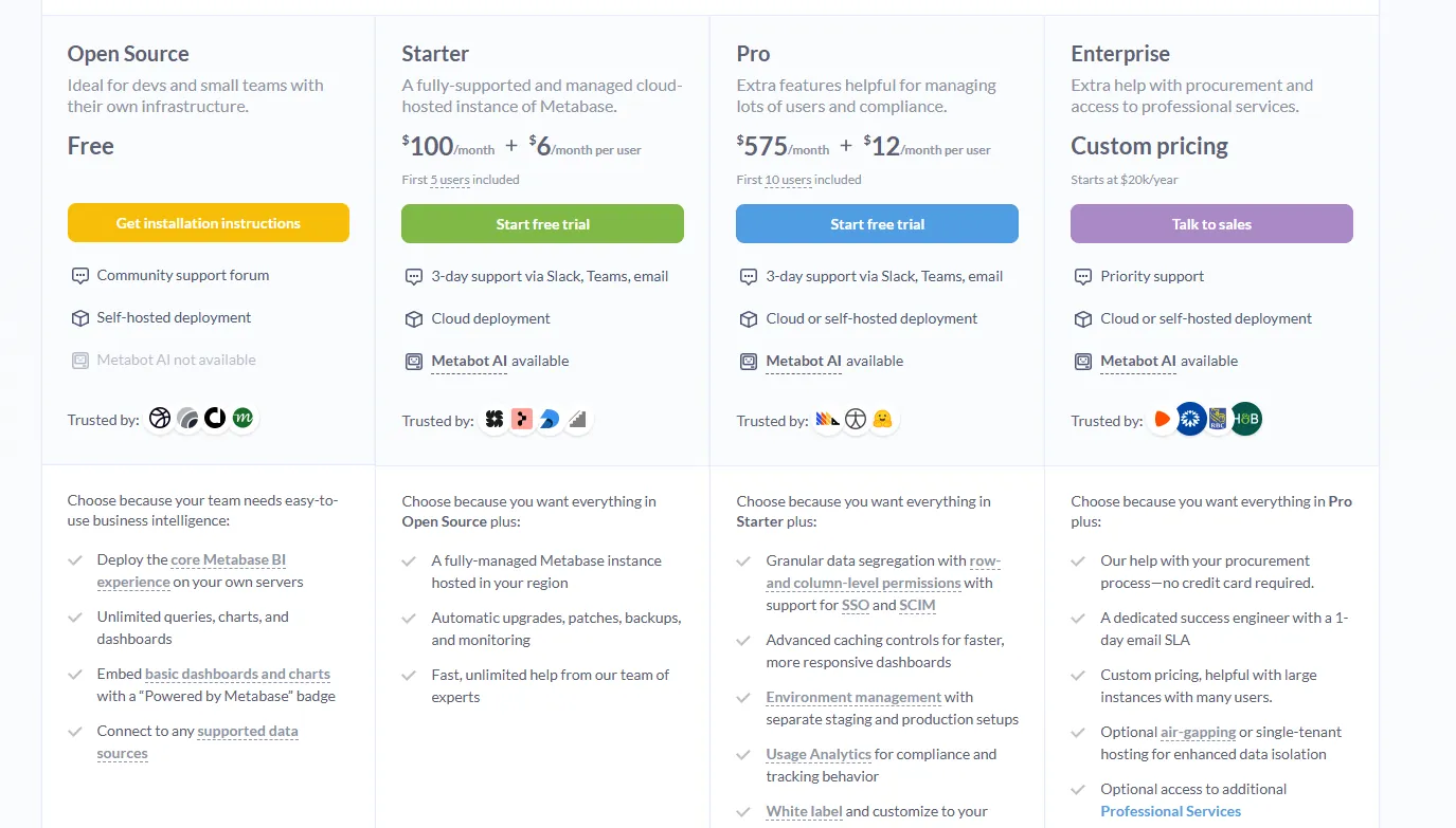
- Embedded Analytics pricing:
- Pro: $575/month + $12/user/month, first 10 users included, includes unlimited embedded dashboards and charts, full white-labeling, modular embedding, SDK, or full-app embedding, multi-tenant security (row- and column-level), one-database-per-tenant support, staging + production environments, usage analytics, internal BI for your team, and option to include Metabot AI (charged extra).
- Enterprise: Custom pricing (starts at $20k/year), includes everything in Pro, plus a dedicated success engineer, priority support, optional single-tenant or air-gapped hosting, and optional professional services.
Pros & Cons
✅ Extremely intuitive UI that lets non-technical users build dashboards without SQL.
✅ Cost-effective open-source option with solid scheduling and sharing features.
❌ Limited advanced visualizations (no native heatmaps, fewer complex chart options).
#10: Apache Superset
Best for: Data teams that want a highly customizable, open-source BI platform with full control over dashboards, SQL queries, and infrastructure.
Apache Superset is a modern, open-source data exploration and visualization platform designed for technically proficient teams.
It provides powerful SQL-based analysis, customizable dashboards, and scalable architecture, making it a flexible alternative to Looker for organizations that prefer full control over their analytics stack.
Features
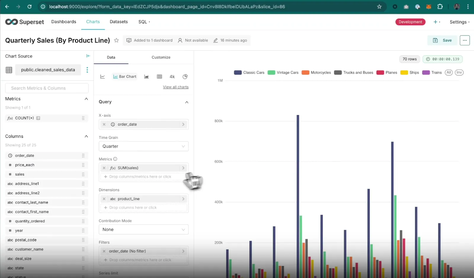
- Rich visualization library: Create interactive charts using a wide range of built-in visualization types (time-series, geospatial, pivot tables, heatmaps, etc.) powered by Apache ECharts.
- SQL IDE & advanced querying: Write, run, and save SQL queries directly in Superset’s built-in SQL Lab, with support for autocomplete, saved queries, and multi-database querying.
- Caching & performance optimization: Built-in caching layers help improve dashboard load times and reduce database strain in high-usage environments.
Pricing
Apache Superset is open-source and free to use under the Apache License 2.0.
That means that the software itself is free to download and deploy and that there are no licensing fees.
However, you are responsible for hosting, infrastructure, maintenance, and support.
So, while Superset has no direct software cost, you’ll typically pay for:
- Cloud infrastructure (AWS, GCP, Azure, etc.).
- Engineering time for setup and maintenance.
- DevOps support.
- Security configuration and monitoring.
- Upgrades and version management.
Pros & Cons
✅ Easy to build and share interactive dashboards across teams.
✅ Wide range of visualization types and flexible filtering options.
❌ Requires SQL knowledge for deeper customization and modeling.
Which Looker alternative is right for you in 2026?
Looker is a strong platform for governed, warehouse-native analytics, but for many teams, the real bottleneck isn’t dashboards.
It’s analyst bandwidth, slow ad-hoc turnaround, and the manual work required to translate charts into decisions.
The tools in this list solve that in different ways.
Some prioritize visualization flexibility. Others focus on open-source control. A few double down on semantic modeling. And then there are platforms that rethink the workflow entirely.
However, if your team already has a modern warehouse but still spends too much time answering repetitive questions, preparing business reviews, or explaining what changed and why, that’s where Dot stands out.
Instead of adding another dashboard layer, it delivers structured answers, root-cause analysis, and executive-ready reports directly in Slack, Teams, or email.
Want to see what “answers-first” looks like in practice?
Sign up for Dot's free plan or book a demo today.
Read more
- 10 Best Microsoft Power BI Alternatives & Competitors In 2026 - Discover the top Microsoft Power BI alternatives in 2026, comparing features, pricing, and real-world strengths to help you choose a BI platform that fits your data stack and decision-making needs.
- 10 Best MindsDB Alternatives & Competitors In 2026 - Explore the best MindsDB alternatives in 2026, including tools that simplify ML deployment, predictive analytics, and AI-driven data workflows without adding engineering complexity.
Theo Tortorici
Theo writes about AI-powered analytics, data tools, and the future of business intelligence at Dot.