
Domo vs. Tableau vs. Dot: Which One Is Better?
Are you looking to compare Domo vs. Tableau to make the right decision?
This guide covers what each BI tool does well, how each connects to your data, and what each costs, so you can make an informed decision.
➡️ I'll also bring in a third option that answers the question both of them leave on your plate, the bit where you've built the chart and still have to figure out what it means: Dot (that's us), an AI data analyst that just gives you the answer in Slack, Teams, email, or the web app.
TL;DR
- Domo bundles the entire analytics stack into one cloud product, from ingestion and transformation through to dashboards, automation, alerts, and its newer AI agents.
Its strength is speed for non-technical teams, supported by a no-code builder and a connector count north of a thousand.
➡️ Choose Domo if you'd sooner buy one platform that owns the full journey than stitch several tools together.
- Tableau built its name on visualization, with the VizQL engine and a chart library nothing else here matches.
It rewards analysts who enjoy working through data by hand and shaping it into something presentation-ready, and its latest AI now rides on Salesforce's Agentforce.
➡️ Choose Tableau if visual craft is the point and you can absorb a paid seat for everyone who needs access.
- Dot doesn't play the same game as either of them. It hooks into the warehouse you're already running, does the analysis on its own, and writes back the answer plus a recommended next step, right where your team is already chatting.
Nobody has to open a dashboard to get the answer, since it arrives as a written explanation in Slack, Teams, email, or the web app.
➡️ Choose Dot if the data's already in a warehouse and what's slowing you down is analyst capacity, not a lack of charts.
Domo vs. Tableau vs. Dot: features
Here’s the quick version of how they compare on features:
- Domo covers the most ground, all the way from raw ingestion to automated action, but that reach can come with a longer learning curve and a bill that can be tough to predict.
- Tableau owns the visualization end and gives you the finest control over how every chart looks, at the cost of analyst skill and a licence for each pair of eyes.
- Dot fits teams that already have a warehouse, as it drops the build-a-dashboard step and just returns the finding.
We'll take them in that order, Domo first: 👇
Domo's features
1,000+ data connectors
Domo's connector library pulls data in from over a thousand pre-built sources, from apps like Salesforce and Google Analytics to warehouses like Snowflake and Databricks, with a Workbench agent for anything on-prem.
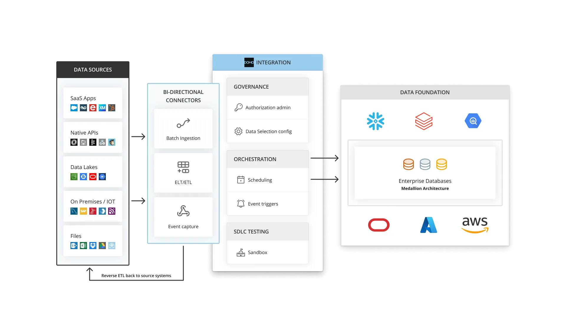
Breadth like that is the first thing most teams notice, and if your data is scattered across a dozen SaaS tools, few platforms pull it together as quickly.
No-code prep with Magic ETL
Magic ETL cleans and reshapes your data through a visual builder of drag-and-drop steps that most business users can pick up in an afternoon.
When a transformation needs real horsepower you can drop into SQL or Python, and Beast Mode lets people define calculated fields without filing a ticket to engineering.
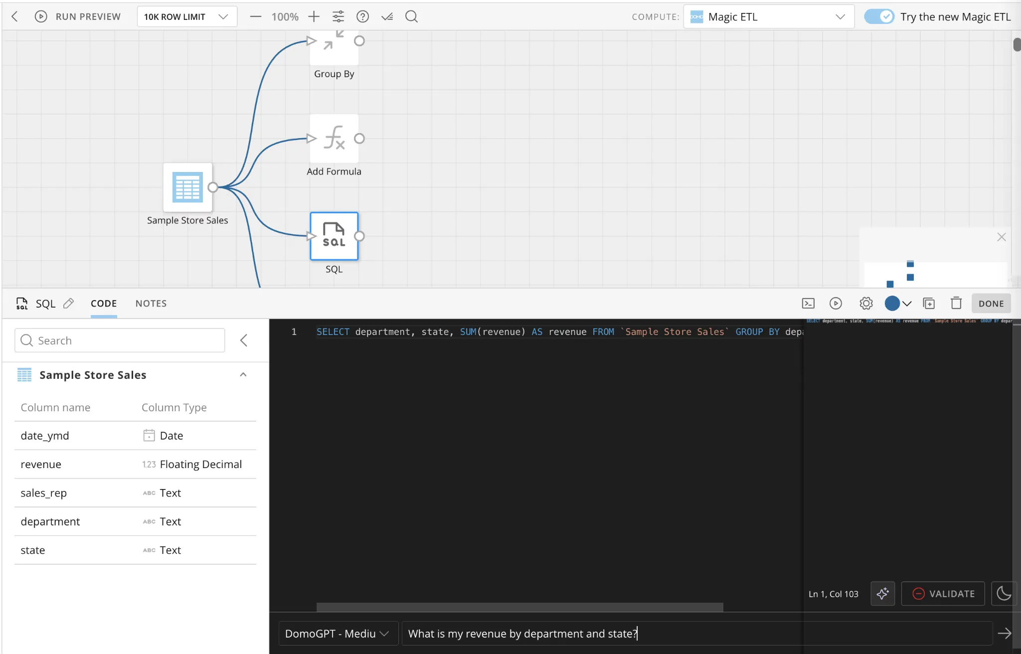
The point of it is fewer bottlenecks, so small changes stop depending on a data engineer's availability.
AI Chat and agents
Domo has layered an AI layer on top of its platform.
Its AI Chat lets people ask questions in plain language and get charts or recommendations back, while Agent Catalyst lets teams build and deploy custom AI agents against their data.
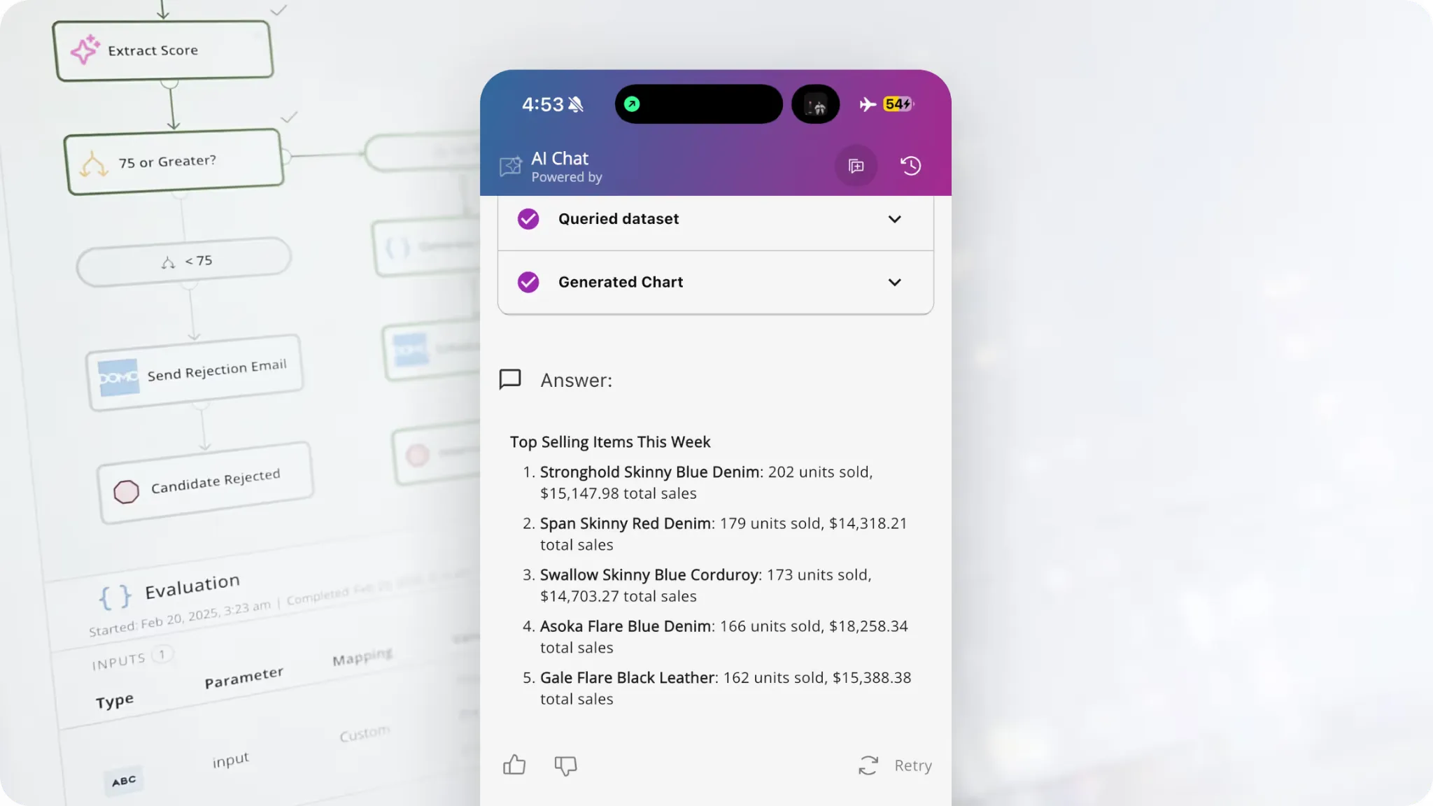
It is a capable addition, though it was added to the dashboard workflow more recently than the rest of the stack.
Domo is best suited if:
✅ You'd sooner own one platform end to end than integrate ingestion, prep, dashboards, and automation from separate vendors.
✅ Most of your reporting is built by business users, not a dedicated engineering team.
✅ Connector coverage is a deciding factor because your data is spread across many SaaS tools.
✅ Leadership consumes analytics on phones, and you want live cards and alerts on mobile.
Domo may not be ideal if:
❌ You need mature metric governance, since Domo's semantic layer and Data Models only landed in March 2026 and carry far less mileage than a modeling language like LookML.
❌ You run heavy or complex dashboards, which can lag even though the platform handles raw data volume well.
❌ You want deep visualization customization, since Domo's cards offer fewer chart types and less design control than tools like Tableau or Power BI.
Tableau's features
VizQL and manual exploration
VizQL is Tableau's engine for turning every drag-and-drop action into a chart the instant you make it.
That immediacy is what lets an analyst follow a hunch through the data and end up with a dense, interactive dashboard, mostly without writing code.

No competitor on this list gives you the same variety of chart types or the same freedom to poke at data by hand.
➡️ Check out our comparison between Microsoft Power BI and Tableau.
Proactive metrics through Tableau Pulse
Tableau Pulse keeps an eye on a metric for you and pushes the update out, so a change reaches you before you'd open a dashboard.
Point it at the numbers you care about, and it sends short written summaries, flagging anything that moves unexpectedly.
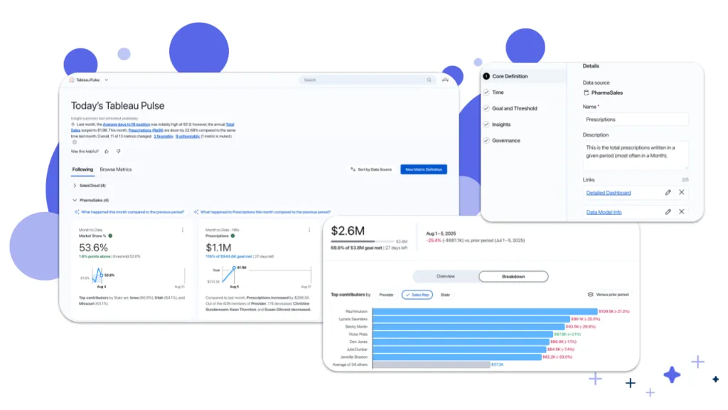
It's Tableau's answer to the awkward truth that most dashboards get built once and then ignored.
One catch: Pulse only exists on Tableau Cloud. You can host Tableau Server yourself, and you pay the same per-seat rate without getting it.
Agentic analytics with Tableau Next
Tableau Next is Tableau's agentic layer, letting people ask in everyday language and have an agent act on the answer.
Built on Agentforce and Tableau Semantics, that agent can go past answering to kicking off workflows in connected systems, Salesforce most of all.
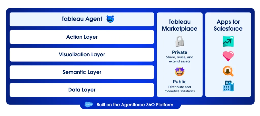
It's the clearest hint of where Salesforce is steering the product, though the agent layer is younger than the core and priced apart from it, at $40 per Creator seat each month on its own or folded into the Tableau+ bundle at a custom rate.
Tableau is best suited if:
✅ Presentation-grade dashboards are how decisions get communicated at your company, and somebody is paid to make them look right.
✅ You already run Salesforce and want the analytics layer reaching into it.
✅ Your analysts enjoy hands-on exploration and will actually use a chart library this deep.
✅ Your stack is mixed or mostly outside Microsoft, where an Azure-first tool would fight you.
Tableau may not be ideal if:
❌ Everyone who reads a dashboard needs a paid seat, so thirty people on Standard runs past $10,000 a year before hosting enters the conversation.
❌ Your team is new to data analytics, as some advanced features are not very easy to understand at first, according to a G2 review.
❌ Pulse, the piece most 2026 buyers actually want, exists on Tableau Cloud only, so a self-hosted Server deployment pays the same seat rate and goes without.
Dot's features
Line them up, and Domo and Tableau look like opposites, and on most counts they are.
Where they quietly agree is the deliverable: each hands you something to look at, a card or a chart, and leaves the interpreting to you.
That's the convention Dot breaks, and not by building a prettier dashboard than either one.
The goal is narrower and, I'd argue, more useful: give a team with a warehouse an analyst that figures out what moved, explains the reason, and tells you what to do about it, inside the tools you already have open.
Here's how the pieces fit together: 👇
Written answers in Slack and Teams
Dot answers data questions in natural language and sends the written reply through Slack, Microsoft Teams, email, or the web app.
You ask the way you'd ask a colleague, and the response comes back in a couple of minutes.
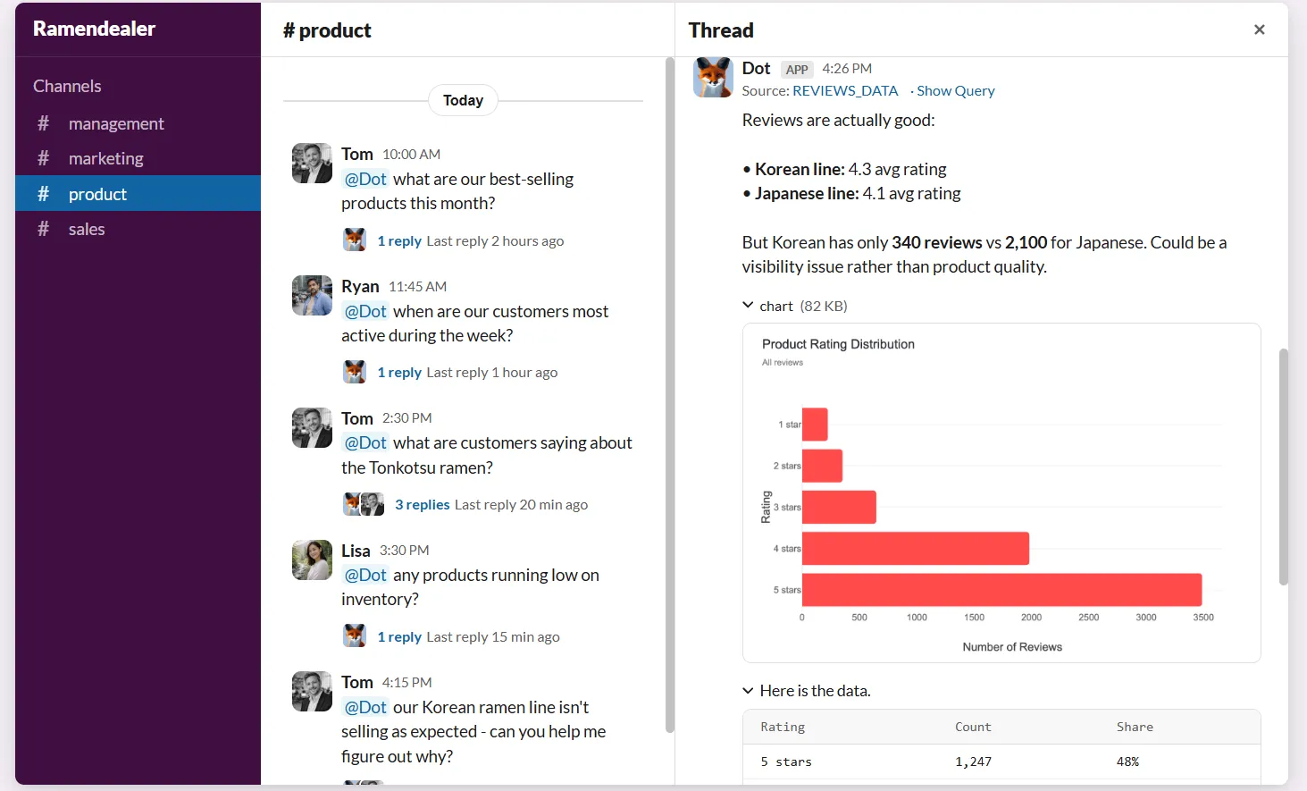
Maybe finance wants to know why collections slipped last month, or a product manager is trying to pin down which onboarding step loses the most new users.
The reply doesn't stop at a figure; it names what shifted and which segments are behind it.
The knock-on effect for the data team is real: the endless queue of quick questions clears itself, and analysts get their time back for the work only a person can do.
Deep Analysis when the question is "why"
Deep Analysis runs an autonomous, multi-step investigation for the questions one query won't close out.
Dot chains queries together and keeps testing angles against the numbers until it can name a cause and show the working behind it.
Say average order value has been sliding for a month with nothing obvious to blame.
Dot works through the detailed cuts a quick look would miss, then tests each candidate explanation against the data and discards the ones the numbers won't support.
The whole investigation is visible as it runs, and you finish with a clean report: one quantified takeaway at the top, a brief summary for execs, the charts that back it, and a shortlist of things to try.
Each number is footnoted to its source, and the finished report exports to a PowerPoint deck in a single click.
Business reviews that write themselves
Dot generates your recurring executive business review on its own, drawing straight off the warehouse on whatever schedule you pick and writing it up as prose that explains the movement and flags what deserves a second look.
That takes over the quiet time sink of someone on the data team pulling numbers and formatting a summary every week or month.
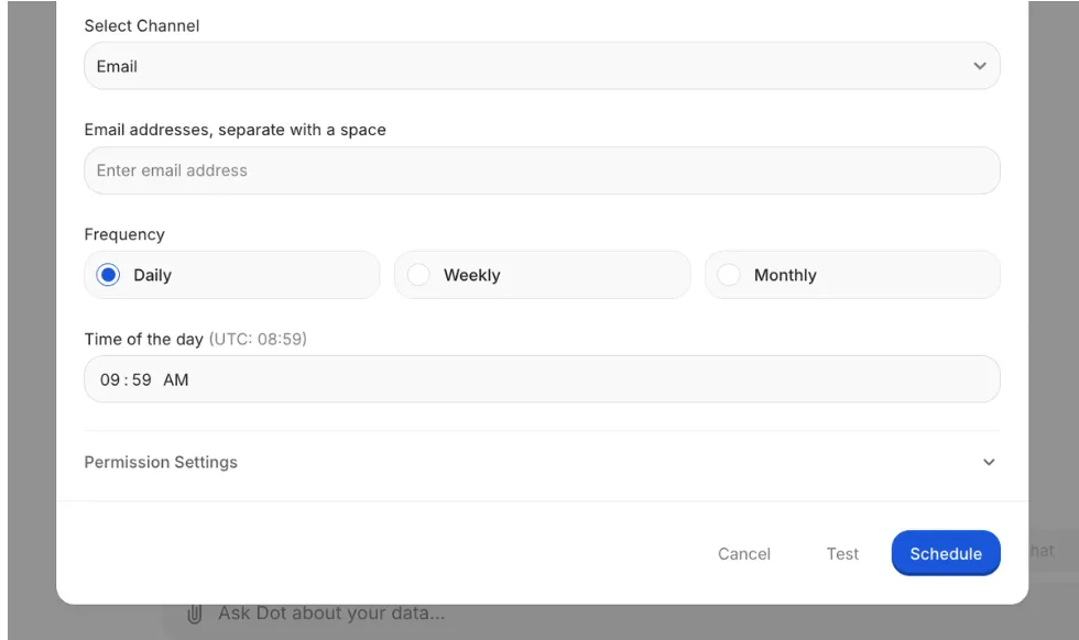
Lately these have turned into more of a standing agent than a scheduled export.
You can wrap them in two conditions, one that governs whether the review runs at all, tied to whether the data changed, and another that governs whether it's worth sending, tied to a threshold you define.
The upside here is an agent that can stay silent for weeks and then speak up exactly when, say, margin slips below the line you drew.
One set of definitions, via the Context Agent
The Context Agent, built on the DotML semantic layer, stores your agreed metric definitions once and enforces them on every query, so the same question always returns the same number.
That matters because every growing company hits the point where one metric means three or four different things depending on who's in the room, and the meeting turns into a fight over whose dashboard to believe.
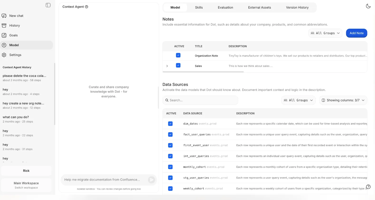
When you tell Dot in chat that something's changed (e.g., a renamed table or a definition that's gone stale), it doesn't just act on it.
It writes up the change for review, an admin gets to see exactly what would differ, and nothing merges until they approve it.
Dashboards from a short brief
Dot will produce a dashboard on request too, assembled from a written brief of a line or two, for the reporting that genuinely belongs on a screen.
Say what you want to keep an eye on, and it lays out KPI tiles, charts, tables, and filters you can rearrange before you publish and share the link.
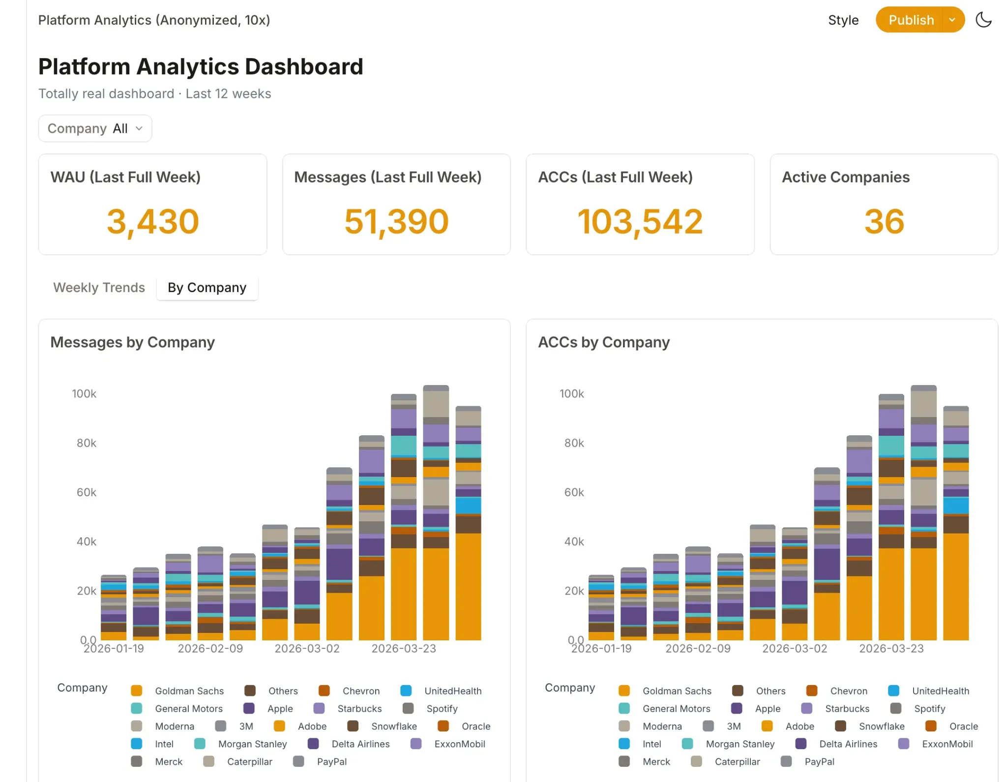
Data refreshes on every open and relative date ranges just work, so you skip the manual assembly that Domo and Tableau both still expect.
Dot is the right choice if you:
✅ Already keep a warehouse like Snowflake, BigQuery, Redshift, or Databricks and would take a straight answer over a new dashboard to babysit.
✅ Watch the same handful of questions land in Slack week after week and want an analyst-quality reply in minutes, not a spot in the queue.
✅ Lose hours each reporting cycle hand-assembling the leadership review.
✅ Need answers you can defend, governed and auditable, with a traceable path from any figure to its SQL.
Dot isn't the best option if you:
❌ Don't run a cloud warehouse yet, since Dot attaches to one and isn't meant to replace it.
❌ Need a dense, pixel-perfect visualization suite as your main deliverable, because Dot leads with the answer and keeps the dashboard secondary.
Integrations: Domo vs. Tableau vs. Dot
Domo integrations
Nothing here comes close to Domo on connector count, and the library runs past a thousand pre-built sources, with a Workbench agent for on-prem systems, open APIs for anything unusual, and an MCP server that hands governed Domo data to outside models.
A short list of notable connections:
- Snowflake and Redshift.
- Google BigQuery.
- Salesforce.
- Databricks.
- Amazon Web Services.
- Google Analytics.
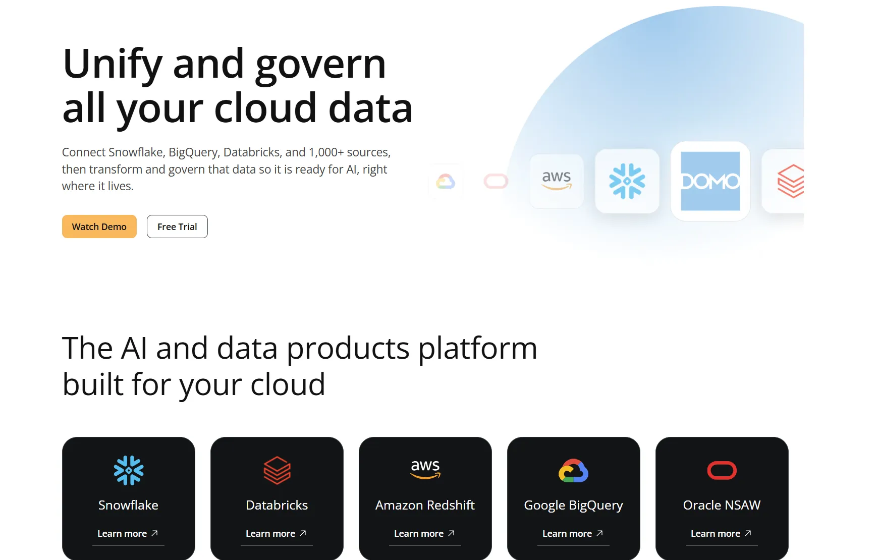
Tableau integrations
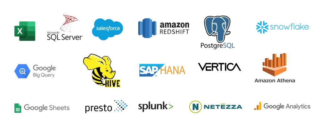
Tableau's connector set is wide as well, running from spreadsheets and local databases out to cloud services, and the Salesforce links have deepened since that acquisition.
A short list of notable connections:
- Salesforce CRM.
- Snowflake and BigQuery.
- SQL Server.
- Excel and CSV files.
- GA4.
Dot integrations
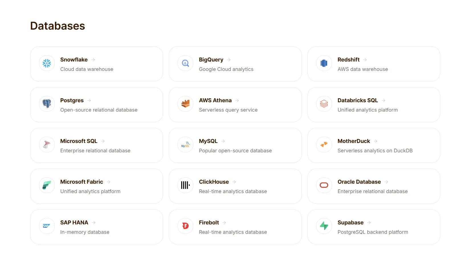
Dot counts integrations differently, because the warehouse you already operate is the integration, and the dbt and Looker models sitting in it get reused exactly as they are.
MCP covers the rest, which means Dot answers from inside Claude, ChatGPT, or Cursor without anyone opening a new tab.
A short list of notable connections:
- BigQuery and Snowflake.
- Databricks and Redshift.
- Postgres and MySQL.
- dbt and Looker models.
- Slack and Microsoft Teams.
Pricing: Domo vs. Tableau vs. Dot
Domo pricing
Domo opens with a 30-day free trial covering the whole platform, no card required and no cap on users, then shifts to a paid contract that runs on consumption credits.
- Free trial: full platform access for 30 days, unlimited users, onboarding support, self-service education, and one guided training session.
- Custom paid plan: everything in the trial, plus a dedicated account team, volume discounts, support packages, AWS PrivateLink, and a HIPAA-compliant environment.
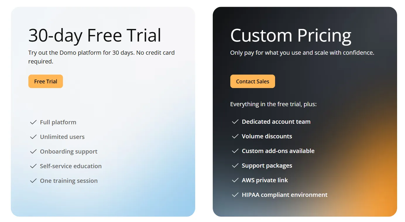
There are no public rates, so a quote means a conversation with sales.
Tableau pricing
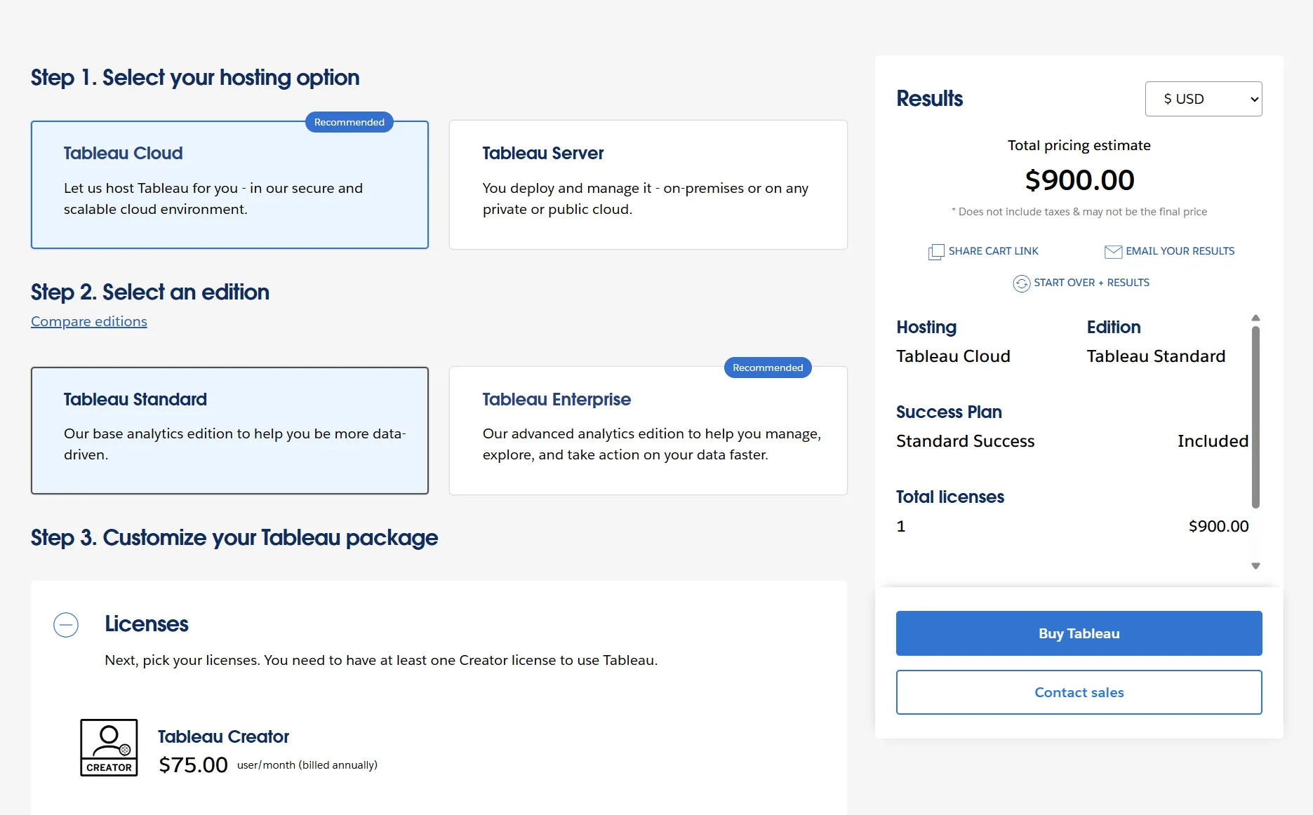
Tableau has a genuine free entry through Tableau Public and the free Tableau Desktop edition, and past that it's annual, role-based seats.
You pick Standard or Enterprise, then license people by what they'll actually do, with every deployment needing at least one Creator.
Host it as Tableau Cloud or run it yourself as Tableau Server, and the per-seat rates match either way, though Server piles on hosting costs of its own.
- Free: Tableau Public and the Tableau Desktop free edition, for local analysis with no sharing.
- Tableau Standard: seats run from $15/user/month for a Viewer up to $75/user/month for a Creator, with Explorer at $42 in between, covering the Tableau Desktop and Prep Builder apps, plus Pulse.
- Tableau Enterprise: seats run from $35/user/month for a Viewer up to $115/user/month for a Creator, with Explorer at $70 in between, adding Advanced Management and Data Management.
- Tableau+: AI-powered agentic analytics for the whole organization, at custom pricing (contact sales).
Dot pricing
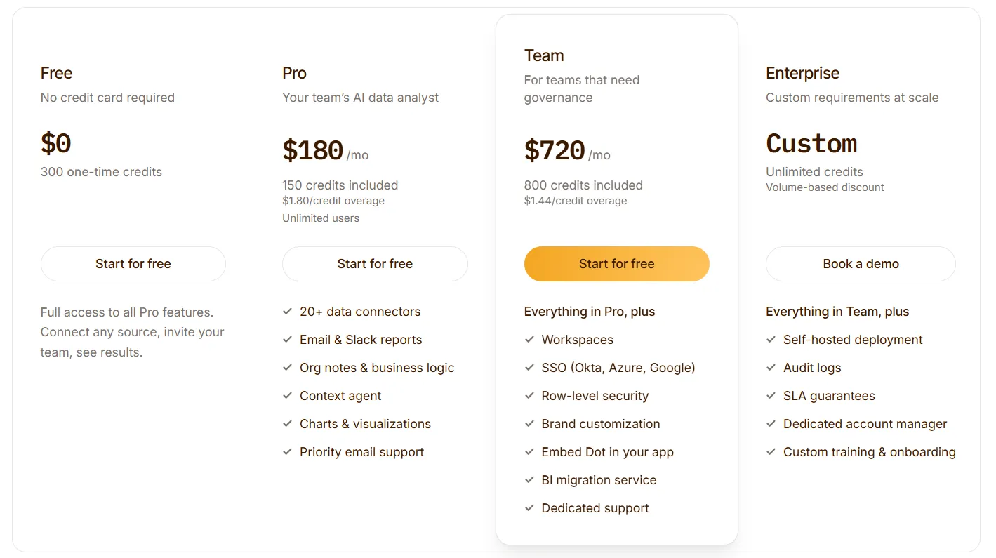
Dot's entry point is a free plan carrying 300 one-time credits and the full Pro feature set, which is enough to put it through its paces on real questions before you pay.
After that, there are three paid tiers, and paying annually shaves off 10%:
- Pro: $180/month for 150 credits, overage at $1.80 a credit, and no limit on users.
- Team: $720/month for 800 credits, overage at $1.44, adding SSO, row-level security, embedding, BI migration, and dedicated support.
- Enterprise: custom, with unlimited credits, volume discounts, self-hosted deployment, audit logs, an SLA, and a dedicated account manager.
Domo, Tableau, or Dot: summary
Here's how the 3 tools stack up:
Domo | Dot | Tableau | |
Best for: | One platform for the full pipeline, from ingestion to agents | Teams with a warehouse who need the findings, not another screen to interpret | Analysts who want the deepest visual exploration and storytelling |
Standout feature | Connector breadth feeding no-code Magic ETL prep | Answers-first AI analysis sent to Slack, Teams, email, and the web app | VizQL drag-and-drop visual analytics |
Integrations | Over a thousand pre-built connectors | Runs on your warehouse, reuses dbt and Looker models, reaches out through MCP | Broad connector library with deep Salesforce ties |
Free tier? | No (30-day trial only) | Yes (300 credits, full Pro features) | Limited (Public publishes your work publicly, Desktop free edition stays local) |
Starts from: | Custom (contact sales) | $180/month, unlimited users | $15/user/month billed annually, and one Creator seat at $75 is mandatory |
Get started with Dot for free today
Dot reads straight from the warehouse you're already running, takes the question in your own words, and drops the written answer into Slack, Teams, email, or the web app, so nothing needs chasing down.
Here's what your team gets with Dot:
- Access to a free plan with 300 credits and the full Pro feature set, on unlimited users.
- Natural language analysis across Slack, Microsoft Teams, email, and the web app.
- Deep Analysis that traces why a number moved and returns with clear recommendations.
- Automated executive business reviews on whatever schedule you set.
- Built-in monitoring that stays quiet until a metric crosses a line you care about.
- A Context Agent that holds definitions steady and catches conflicts before they spread.
- A full audit trail on every answer, back to the SQL and source data beneath it.
➡️ Get started for free with Dot's free plan, or schedule a demo to see how it works with your data.
⚠️ Disclaimer: This article was last updated on July 29, 2026. If you spot any inaccuracies, contact us, and we'll fact-check it.
Read More
Microsoft Power BI Pricing: Is It Worth It In 2026?
10 Best Hex Alternatives & Competitors In 2026
10 Best Sisense Alternatives & Competitors In 2026
10 Best Skopx Alternatives & Competitors In 2026
10 Best Mode Alternatives & Competitors In 2026
Theo Tortorici
Theo writes about AI-powered analytics, data tools, and the future of business intelligence at Dot.