
10 Best Tableau Alternatives & Competitors In 2026
If you're researching Tableau alternatives, you already have some idea of what Tableau does well.
In this guide, I'll cover 10 tools worth evaluating in 2026, based on where each one fits depending on your data stack, your team's technical depth, and what you actually need from analytics.
TL;DR
- The best alternative to Tableau on the market is Dot, because it replaces the build-a-dashboard-then-interpret workflow with direct, governed AI analysis delivered straight from your warehouse.
- Looker is the go-to for data teams that need consistent metric definitions, governed through a centralized semantic layer built for scale.
- Power BI fits teams already running on Microsoft infrastructure, with native Excel, Azure, and Teams integration at an accessible price point.
Why are some data teams looking to switch from Tableau
Tableau is a well-regarded platform and one of the most established names in BI.
But across thousands of G2 reviews, a few recurring themes come up again and again:
1. The learning curve gets steep, fast
Tableau's drag-and-drop interface is approachable for basic charts and dashboards.
But once teams move into calculated fields, LOD expressions, or more complex dashboard logic, the difficulty level jumps considerably.
Non-technical users often hit a wall early, and even experienced analysts report spending real time just figuring out how to configure what they need.
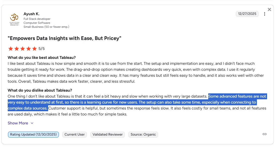
"Some advanced features are not very easy to understand at first, so there is a learning curve for new users. The setup can also take some time, especially when connecting to complex data sources." - G2 Review
2. Performance degrades with large or complex datasets
Tableau handles a lot well, but very large datasets and complex dashboards can expose its limits.
Heavy reports slow down, load times increase, and in some cases dashboards become unreliable enough that teams spend more time optimizing for performance than actually analyzing data.
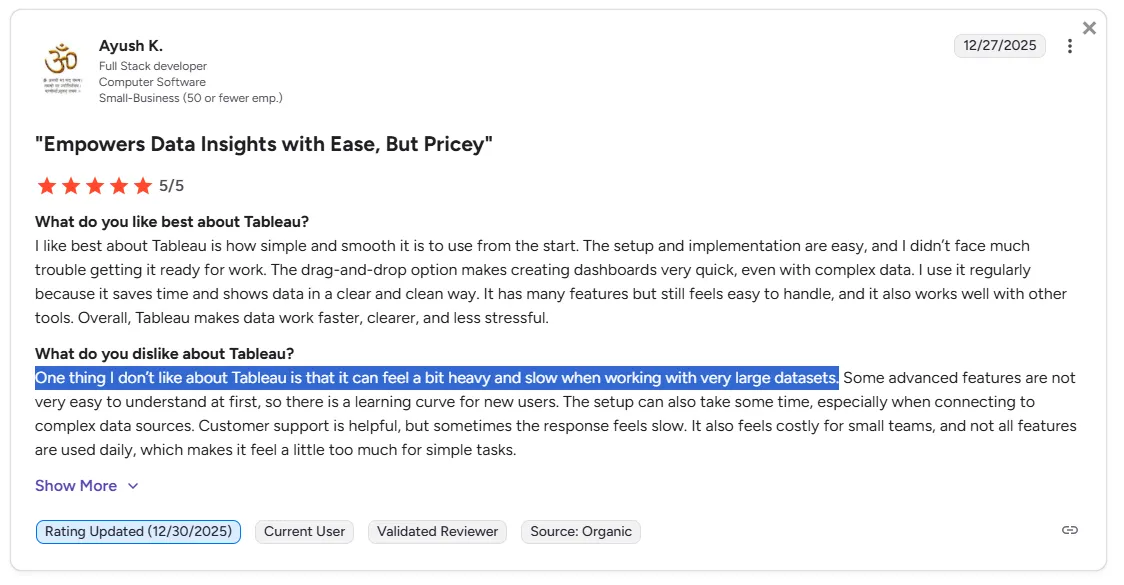
"One thing I don't like about Tableau is that it can feel a bit heavy and slow when working with very large datasets.’’ - G2 Review
This is a meaningful constraint for teams running analytics on warehouse-scale data, where query volumes and dataset sizes keep growing.
3. It's built around dashboards: not answers
Tableau's core model is build a dashboard, then interpret it yourself.
That works well for dedicated analysts.
But for business users who just need a quick answer to a specific question, navigating a dashboard, or waiting for one to be built, adds friction that slows decisions down.
Teams that want natural language querying, automated business reviews, or AI-generated analysis rather than static chart exploration tend to outgrow the dashboard model over time.
What Are The Best Tableau Alternatives In 2026?
The best Tableau alternatives in 2026 are Dot, Looker, and Microsoft Power BI.
Here's our breakdown:
Tool | Use Case | Price |
Dot | AI data analyst that connects directly to your warehouse and delivers governed, narrative answers - no dashboard required. | Free plan; Pro from $180/month |
Looker | Governed, warehouse-native BI built around a centralized semantic layer for consistent metric definitions at scale. | Custom pricing |
Power BI | Microsoft ecosystem BI with native Excel, Azure, and Teams integration at an accessible per-user price. | $10/user/month (Pro) |
ThoughtSpot | Natural language, AI-powered self-service analytics for teams that want to move away from traditional BI dashboards. | From $25/user/month (billed annually) |
Domo | All-in-one cloud BI combining data ingestion, real-time dashboards, automation, and AI in a single platform. | Custom pricing (30-day free trial) |
Metabase | Lightweight, fast-to-deploy open-source BI for teams that need simple self-service dashboards without heavy setup. | Free (open source); Cloud from $100/month |
Qlik Sense | Associative analytics platform for complex, multi-directional data exploration in enterprise environments. | Custom pricing |
Omni | Metrics-first BI with a flexible semantic layer for analytics engineers who want governance without rigid LookML workflows. | Custom pricing |
Holistics | Code-based, dbt-native BI with Git version control and governed self-service for non-technical teams. | From $960/month |
Mode | SQL-first analytics workspace combining notebooks, Python/R analysis, and team-facing dashboards in one place. | Free (Studio plan); Pro at custom pricing |
#1: Dot
Dot is the best alternative to Tableau for analytics teams looking for conversational, analyst-grade insights delivered directly where they work, with the flexibility to start on a free plan.
Our platform isn't a traditional BI dashboarding tool like Tableau.
It's an AI data analyst that connects directly to your data warehouse and does the analysis for you.
Where Tableau is designed for building and exploring visualizations, Dot is designed for answering questions:
- In natural language.
- With narrative results.
- Delivered where your team already works.
But we're not trying to add to the noise of other BI tools.
Our platform is built so that data teams and business users can both get what they need, without either group becoming a bottleneck for the other.
Here are the features that make Dot the right choice for teams evaluating Tableau alternatives: 👇
Natural language analysis, directly from your warehouse
Ask a question in plain English in Slack or Teams.
Get a governed, data-backed answer: with the underlying SQL, visualizations, and context attached.
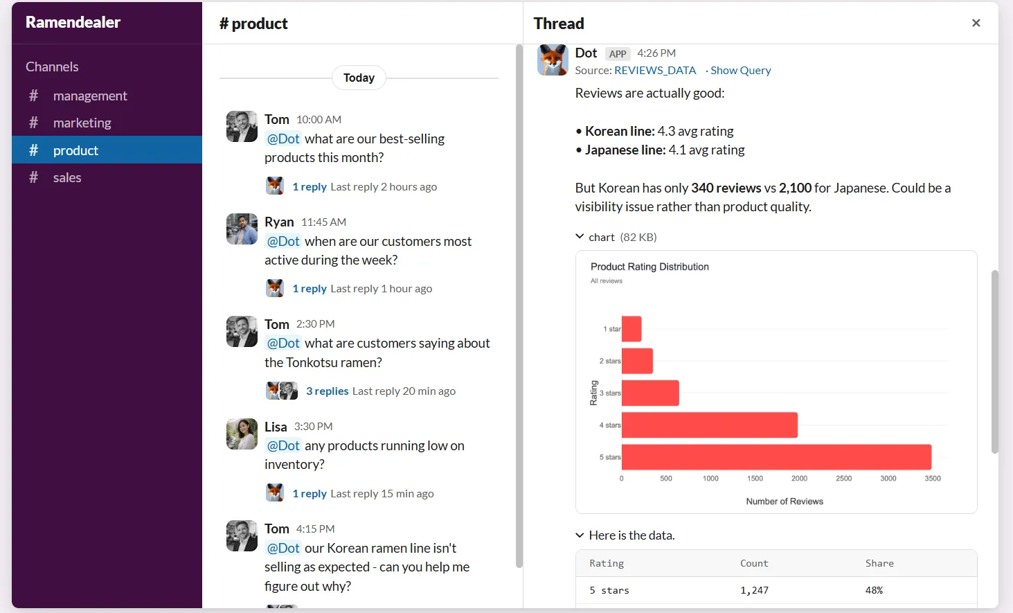
Unlike tools that require someone to build a chart before a business user can access an insight, Dot returns a direct answer the moment a question is asked.
No dashboard to configure, no drag-and-drop required, and no analyst needed to pull the numbers.
This makes analytics genuinely accessible to non-technical stakeholders, while keeping data teams out of the ad hoc request cycle entirely.
Context Agent for data governance
We know that one of the headaches in any analytics setup is inconsistent definitions.
When one team says "active user" and another team means something slightly different, you get conflicting dashboards and wasted time arguing over whose numbers are right.
Dot's Context Agent addresses this by pulling context from across your systems, creating missing documentation, flagging inconsistencies, and keeping everything aligned with a single source of truth.
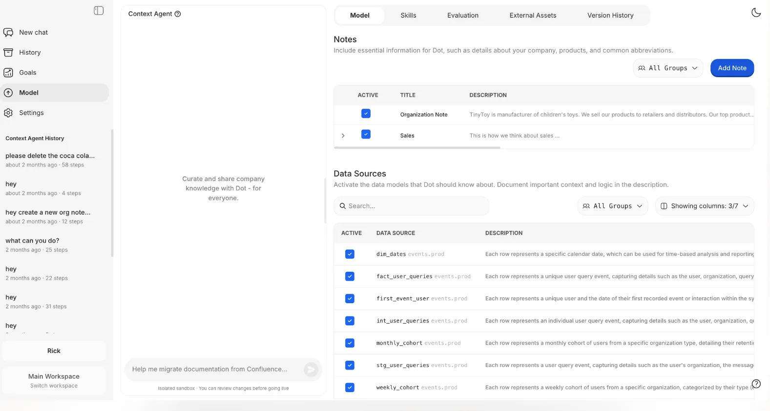
Once that shared context is set up, every answer Dot produces uses the same definitions.
The whole team ends up working from the same playbook.
Automated executive-ready business reports
Dot generates scheduled business review reports (daily, weekly, or monthly) directly from the data warehouse.
The tool turns raw metrics into a written narrative that explains what happened, what changed compared to previous periods, and where attention is needed.
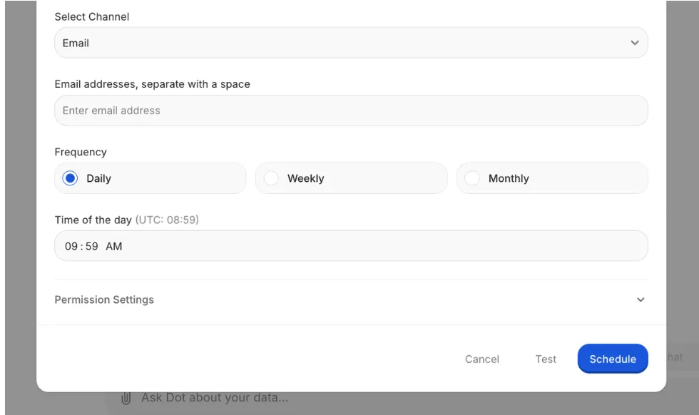
Your leadership will get a consistent, easy-to-read business update without needing to interpret dashboards.
And your data team will stop spending a large chunk of their time producing the same reports over and over again.
Full audit trail for every insight
Every answer or report Dot produces links directly back to the underlying SQL queries, Python logic, and datasets used.
There's no black box.
Everything in our solution is inspectable, which matters especially for data leaders and analysts who need to stand behind the numbers.
Instead of saying "the dashboard says so," you can trace insights back to the source of truth, validate them quickly, and move forward with confidence.
💡 Case Study: Learn how Emerge's team saved over 2,000 hours per year and achieved a 10x ROI with Dot.
As Jeff Albenberg, Director of Software Engineering at Emerge, put it: "Team members could just ask Dot a question in Slack and get the answer within seconds."
Dot's Integrations
Dot connects directly to modern data warehouses like Snowflake, BigQuery, Redshift, and Databricks, along with operational databases such as Postgres, MySQL, and SQL Server.
Our platform also integrates with semantic layers and transformation tools like dbt, Looker, Power BI models, and Cube.
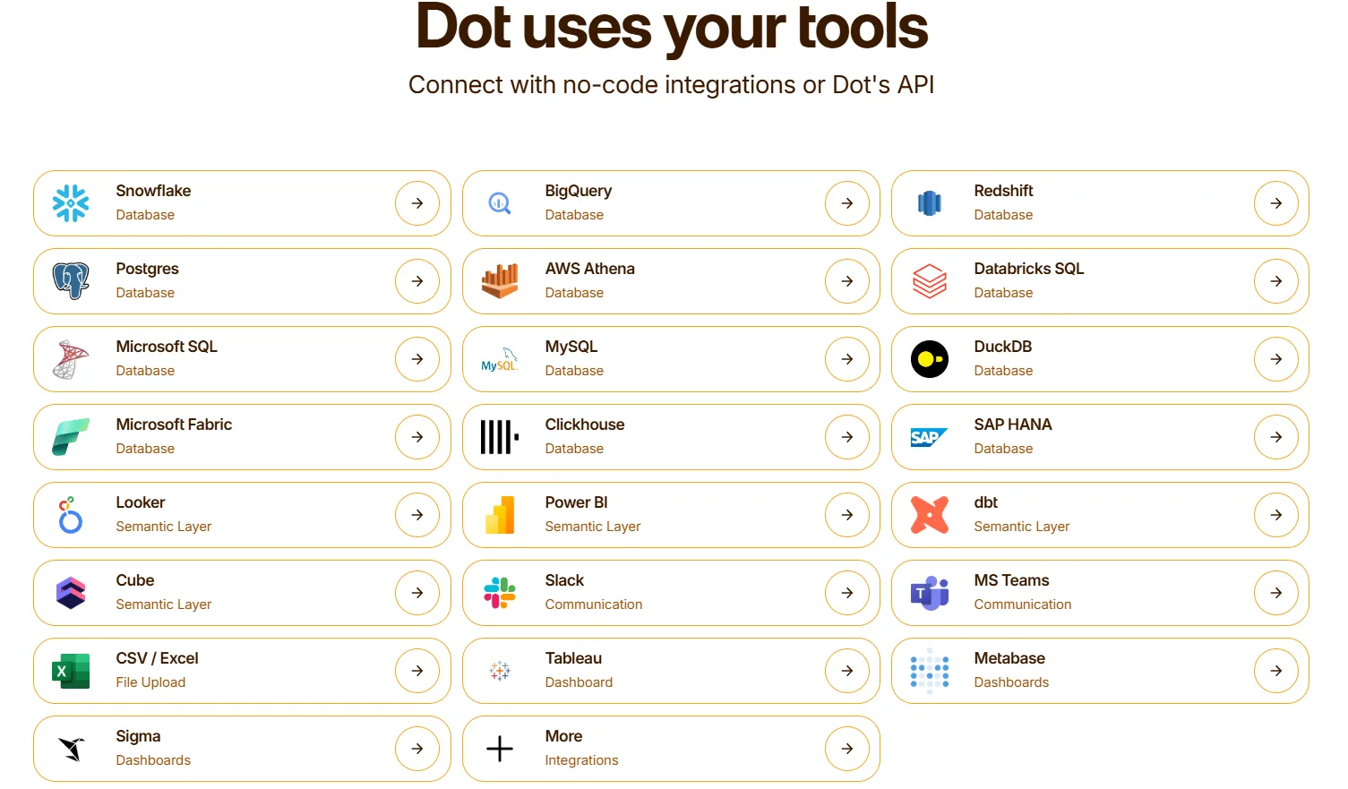
That means it can reuse existing business logic rather than recreating it inside yet another analytics tool.
Insights get delivered through Slack, Microsoft Teams, email, and the web app, so analytics show up where decisions actually happen.
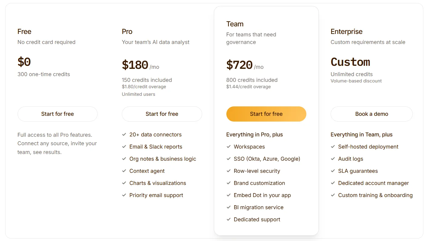
Pricing
Dot uses a credit-based pricing model, with plans designed to scale from early experimentation to enterprise-wide usage:
- Free: $0 with no credit card required, includes 300 one-time credits, full access to all Pro features, connect any source, and invite your team.
- Pro: $180/month, includes 150 credits with $1.80/credit overage, unlimited users, 20 or more data connectors, email and Slack reports, org notes and business logic, Context Agent, charts and visualizations, and priority email support.
- Team: $720/month, includes 800 credits with $1.44/credit overage, everything in Pro, workspaces, SSO (Okta, Azure, Google), row-level security, brand customization, the ability to embed Dot in your app, BI migration service, and dedicated support.
- Enterprise: Custom pricing, includes unlimited credits with volume-based discount, everything in Team, self-hosted deployment, audit logs, SLA guarantees, a dedicated account manager, and custom training and onboarding.
How Is Dot Different From Tableau?
The biggest difference between Dot and Tableau isn't features: it's what each tool is actually designed to do.
Tableau is built to help teams visualize data.
You connect a source, model your datasets, build dashboards, and then interpret the results yourself.
It's a powerful workflow for dedicated analysts who want to explore data visually and build charts that others can interact with.
Dot is built to answer questions.
You connect your warehouse, and instead of building a dashboard, you ask a question in plain English and get a governed, narrative answer back, with the SQL, the reasoning, and the data all attached.
There's no chart to configure before you can get an insight.
Tableau is designed around the analyst building for others.
Dot is designed around everyone on the team getting answers directly, without the analyst becoming a bottleneck in the middle.
The two tools also differ in how they handle reporting:
- Tableau delivers dashboards that users log into and interpret.
- Dot delivers automated business reviews, written narratives that explain what changed, why it changed, and what needs attention, on a schedule, through Slack, Teams, or email.
Dot's Pros and Cons
✅ Ask questions in plain English and get governed, data-backed answers with a full audit trail attached to every result.
✅ Automated business reviews replace manual reporting cycles - data teams stop rebuilding the same reports week after week.
✅ Context Agent builds a shared layer of business logic the whole organization works from, keeping metric definitions consistent.
✅ Sits alongside your existing BI stack rather than forcing an overnight replacement of everything already in place.
✅ Free plan available with no credit card required.
❌ Dot is an AI analyst, not a visual dashboard builder: teams whose primary need is drag-and-drop chart authoring will find Tableau better suited to that specific workflow.
❌ The credit-based model requires some planning for teams running very high-volume query workflows.
#2: Looker
Best for: Data teams that want a governed, warehouse-native BI platform with consistent metric definitions, strong data modeling, and tight integration with Google Cloud.
Similar to: Sigma, Holistics, Omni.
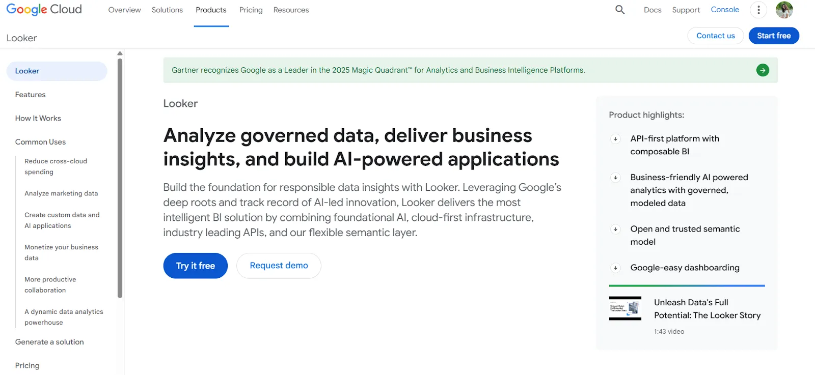
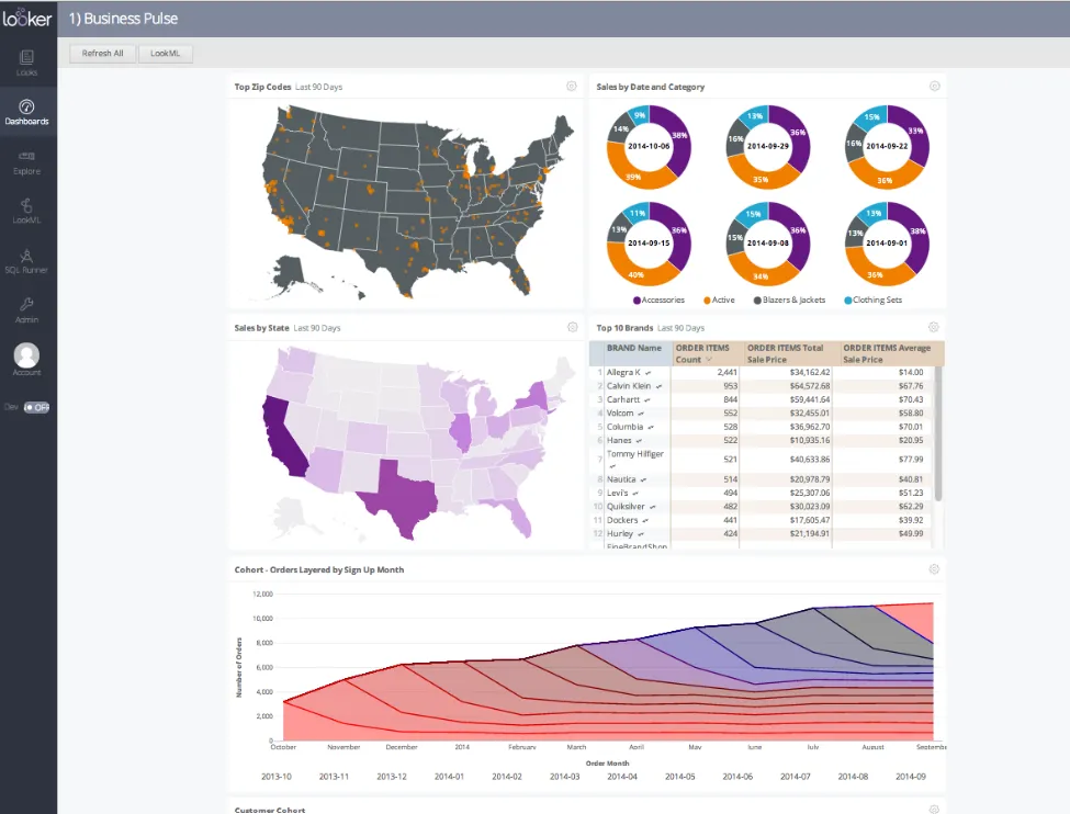
Looker is a business intelligence platform organized around a centralized semantic modeling language called LookML, where metrics and business logic are defined once and reused across every report, dashboard, and embedded view.
It's built for data teams that prioritize metric consistency and reusable business logic at scale.
Looker's Top Features
- Centralized semantic modeling with LookML: Define metrics and business rules once so every dashboard, report, and embedded view draws from the same source of truth: no more conflicting numbers across teams.
- Gemini-powered conversational analytics: Users can ask data questions in natural language and get governed answers without navigating dashboards or writing SQL manually.
- Real-time, governed dashboards: Dashboards pull live from the warehouse, letting users explore, filter, and drill into trusted metrics without relying on stale data extracts.
Looker's Pricing
Looker uses a custom, contract-based pricing model made up of two parts: platform pricing (the cost of running a Looker instance) and user licensing (the cost per user type).
Pricing is annual for all plans.
- Platform editions:
- Standard: Designed for small teams or organizations with fewer than 50 users, includes 1 production instance, 10 standard users + 2 developer users, up to 1,000 query-based API calls/month, and up to 1,000 admin API calls/month.
- Enterprise: Built for larger internal BI and analytics use cases, includes everything in Standard, plus enhanced security features, up to 100,000 query-based API calls/month, and up to 10,000 admin API calls/month.
- Embed: Designed for embedding analytics into external products or applications, includes everything in Standard, plus up to 500,000 query-based API calls/month and up to 100,000 admin API calls/month.
- User licensing:
- Developer users: Full access to Looker, including LookML development, administration, APIs, and advanced tooling.
- Standard users: Can explore data, build dashboards and reports, run SQL, and schedule content.
- Viewer users: Read-only access to dashboards and reports, with filtering and drill-down.
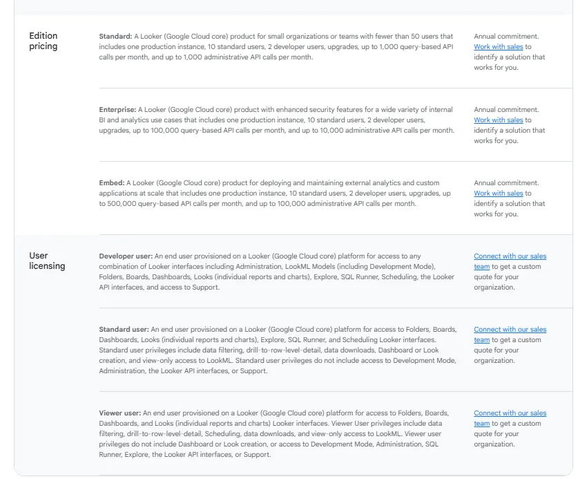
Pricing is custom on all plans and varies based on scale, permissions, and usage.
Looker's Pros and Cons
✅ Consistent metric definitions across the organization: define once, reuse everywhere, and eliminate conflicting numbers across teams.
✅ Strong embedded analytics for internal tools and customer-facing products.
❌ The LookML learning curve is steep, particularly for teams without dedicated analytics engineering resources.
❌ Implementation requires significant upfront time and budget investment, which is part of why many data teams start exploringLooker alternatives.
#3: Power BI
Best for: Teams already operating in the Microsoft ecosystem that want tightly integrated BI with native Excel, Azure, and Teams connectivity.
Similar to: Qlik Sense.
Power BI is Microsoft's business intelligence platform, combining data modeling, interactive dashboards, and self-service reporting within the Microsoft technology stack.
It's widely used across enterprise organizations already running on Azure, Office 365, or Excel.
Power BI's Top Features
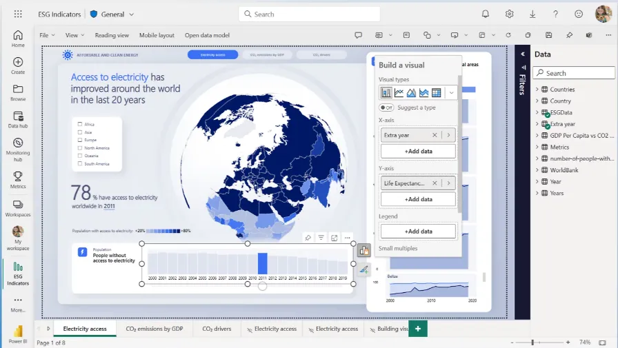
- Interactive dashboards and reports: You can build interactive dashboards and reports that combine multiple visuals, filters, and drill-downs to explore data across teams.
- Enterprise governance and security: Role-based access control, row-level security, data sensitivity labels, and Microsoft Entra ID integration help organizations manage access and compliance at scale.
- AI-assisted insights: Offers AI features such as Copilot, quick insights, forecasting, and anomaly detection to help surface patterns and trends within reports.
Power BI's Pricing
Power BI uses a per-user and capacity-based pricing model, with different tiers depending on how reports are created, shared, and scaled across the organization.
There’s a Free plan, best for individual users exploring data on their own, that includes building reports and dashboards for personal use, but no sharing or collaboration features.
The paid options include the following:
- Power BI Pro: $14/user/month, includes report publishing, sharing dashboards, collaboration in workspaces, and embedding in Microsoft Teams and SharePoint.
- Power BI Premium Per User: $24/user/month, includes everything in Pro, plus larger model sizes, more frequent refreshes, paginated reports, and advanced AI features.
- Power BI Embedded: Custom pricing, which lets you create customer-facing reports, dashboards, and analytics in your own applications.
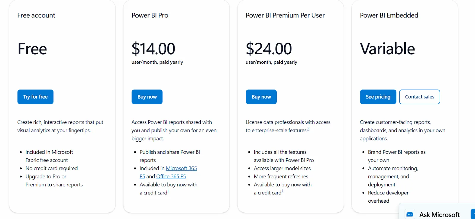
All plans are annual.
Power BI's Pros and Cons
✅ Affordable entry pricing makes it accessible for organizations with a large number of report consumers.
✅ Native Excel and Azure integration that feels built-in for Microsoft-first teams.
✅ Large community, extensive documentation, and a wide marketplace of custom visuals and connectors - unlike more niche tools likeMindsDB, which require more SQL and ML expertise to get value from.
❌ DAX can be difficult to learn and maintain as dashboards grow in complexity.
❌ Many advanced features sit behind Premium pricing tiers, which add up quickly, and it's part of why some teams start evaluatingMicrosoft Power BI alternatives.
#4: ThoughtSpot
Best for: Organizations that want AI-powered, self-service analytics with natural language querying and automated dashboards, without relying on traditional BI dashboard workflows.
Similar to: Dot, Power BI.
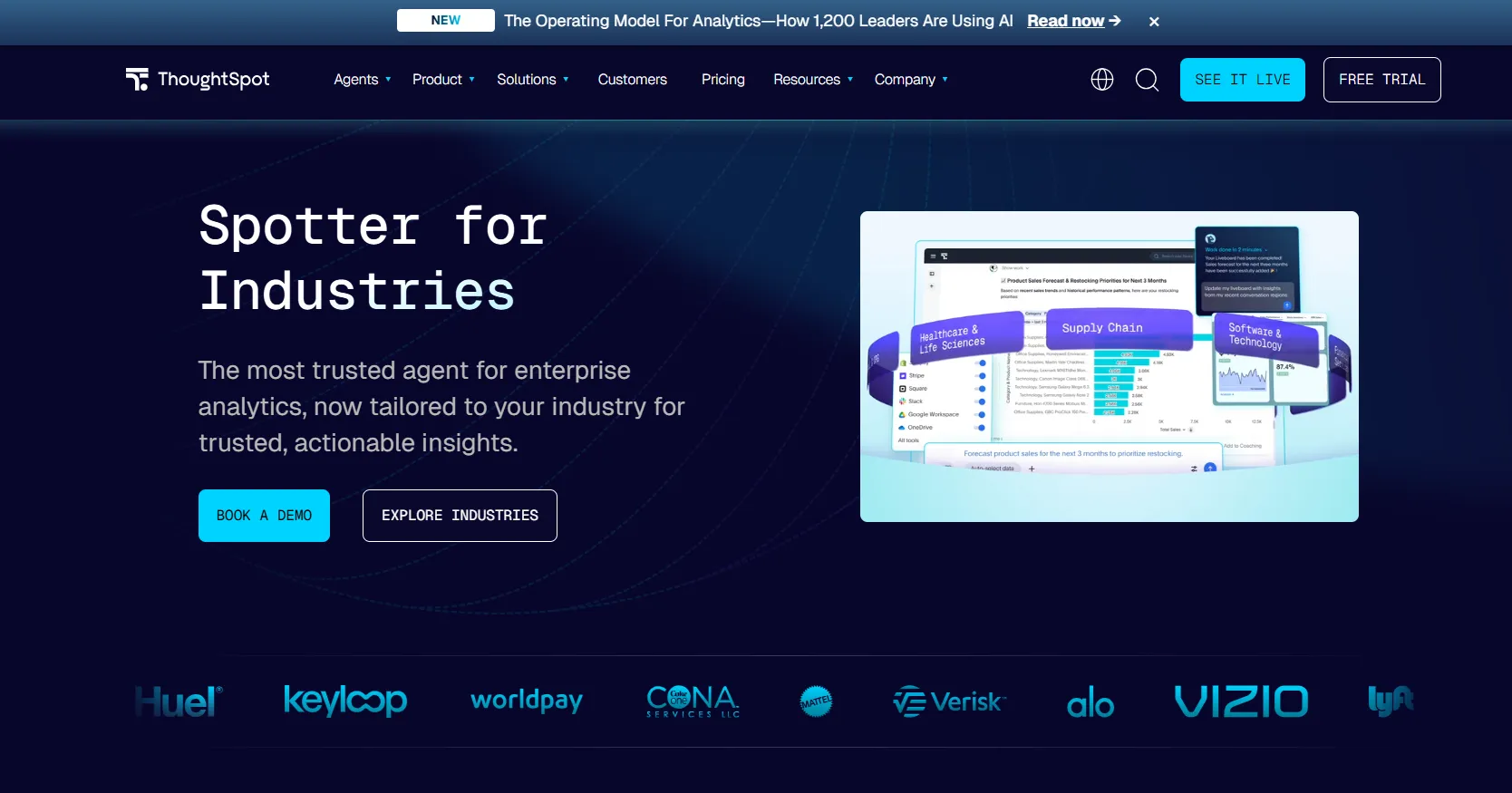
ThoughtSpot is an AI-driven analytics platform built to help users ask questions in plain language and get governed answers from live data.
It's designed for teams that want faster self-service access to insight, without requiring technical users to build and maintain dashboards for everyone else.
ThoughtSpot's Top Features
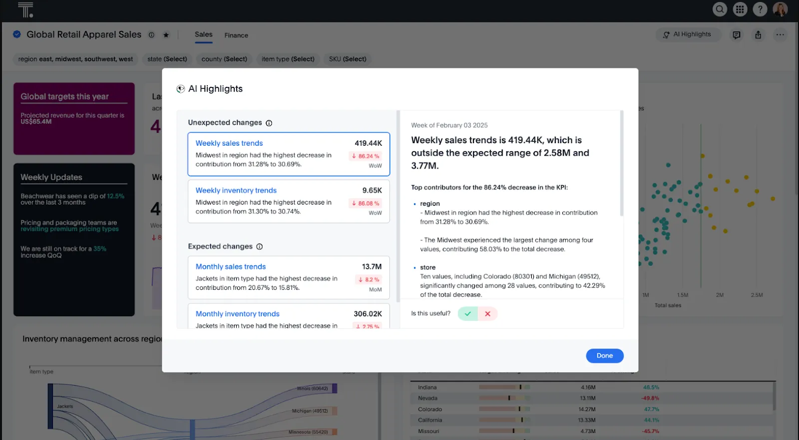
- Natural language analytics: Ask questions in plain English and get instant, governed answers from live data, without building or navigating dashboards.
- AI agents for analytics workflows: Agentic tools like Spotter automatically generate analyses, dashboards, and insights from structured and unstructured data.
- Automated dashboards with SpotterViz: Turn data into complete, styled dashboards that tell a story, without manual layout or chart configuration.
ThoughtSpot's Pricing
ThoughtSpot offers two separate products - ThoughtSpot Analytics for internal BI and ThoughtSpot Embedded for building analytics into applications - each with flexible pricing depending on scale and usage:
- ThoughtSpot Analytics:
- Essentials: From $25 per user per month (billed annually), for teams of 5-50 users, includes dynamic interactive dashboards and AI-powered insights and supports up to 25M rows of data.
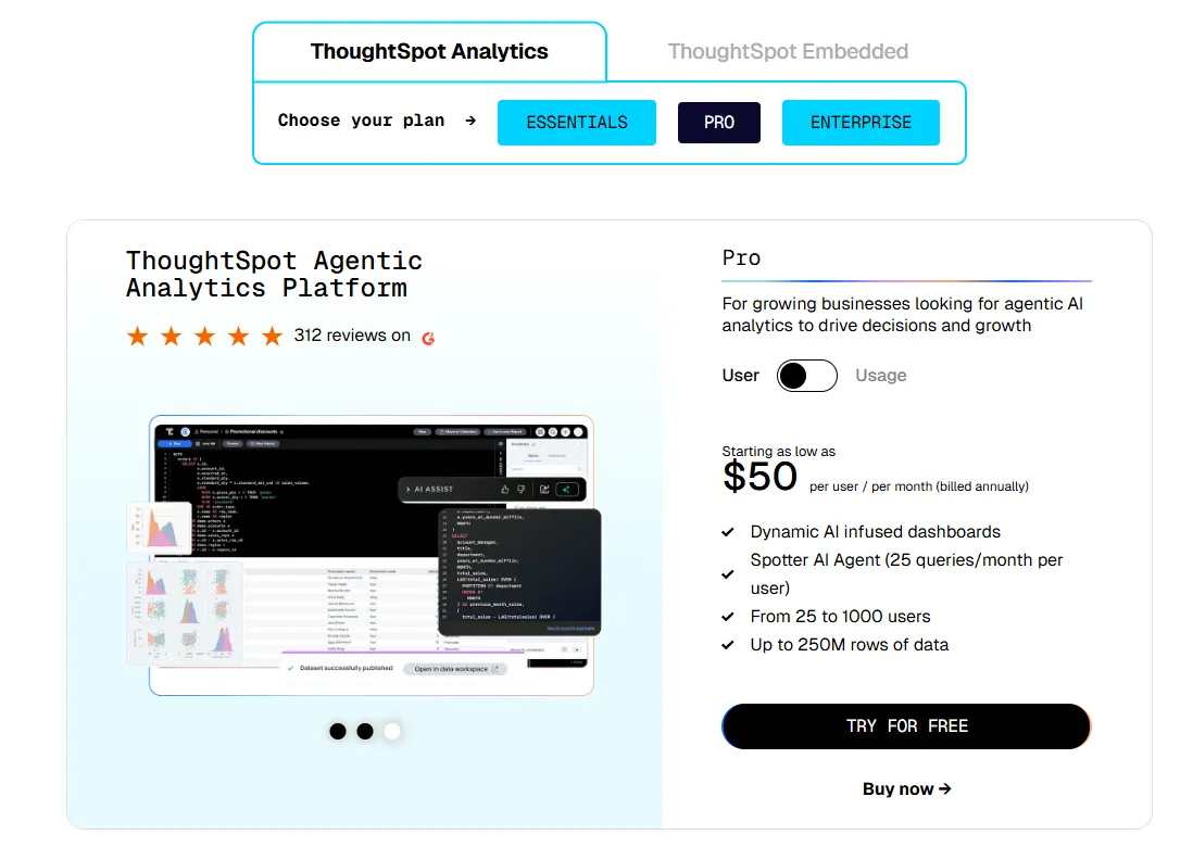
- Pro (per user pricing): From $50 per user per month (billed annually), for 25–1,000 users, includes everything in Essentials, plus AI-infused dashboards and Spotter AI Agent (25 queries per user/month), and supports up to 250M rows of data.
- Pro (usage-based): From $0.10 per query, includes everything in Pro per user, and adds Analyst Studio.
- Enterprise (user or usage-based): Custom pricing, includes everything in Pro, plus unlimited users and data.
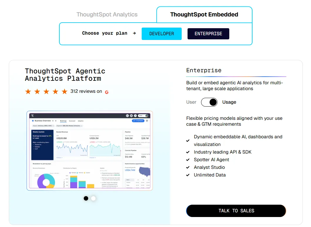
- ThoughtSpot Embedded:
- Developer: Free for 1 year, includes embeddable AI analytics, dashboards, and visualizations, APIs and SDKs, up to 10 users and 25M rows of data.
- Enterprise (user-based): Custom pricing, includes everything in Developer, plus unlimited data.
- Enterprise (usage-based): Custom pricing, everything in Enterprise, plus Spotter AI Agent and Analyst Studio.
ThoughtSpot's Pros and Cons
✅ Natural language search makes analytics genuinely accessible to non-technical stakeholders across the organization.
✅ Built-in AI surfaces patterns, trends, and explanations faster than traditional dashboard-browsing workflows.
❌ Usage-based pricing makes total costs harder to predict, especially for teams with high query volumes.
❌ Getting accurate, trusted AI results requires significant onboarding and data preparation work upfront.
#5: Domo
Best for: Mid-to-large teams that want an all-in-one cloud BI platform combining data integration, dashboards, automation, and AI-driven actions in a single product.
Similar to: ThoughtSpot, Power BI.
Domo is an end-to-end analytics platform that connects data from virtually any source and turns it into real-time, interactive dashboards.
It goes beyond standard BI by combining data ingestion, workflow automation, and built-in AI in one cloud-based platform.
Domo's Top Features
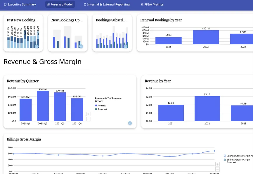
- Interactive dashboards and sharing: Build real-time dashboards that are easy to explore, share, and embed across teams, portals, or customer-facing applications.
- No-code analytics apps: Create custom, data-driven apps and reports tailored to specific business workflows - no code required.
- AI-powered insights and chat: Ask questions in natural language, surface hidden trends, and use AI agents to generate insights and automate actions directly from dashboards.
Domo's Pricing
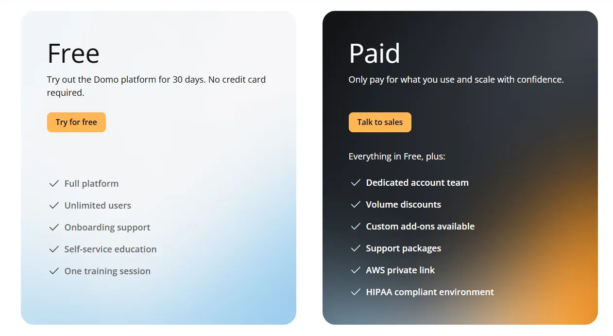
Domo has one paid plan and a free trial:
- Free trial: 30 days, no credit card required, includes unlimited users, full platform access, onboarding support, self-service education, and one guided training session.
- Paid plan: Usage-based pricing designed to scale as your analytics needs grow, includes everything in the trial and adds a dedicated account team, volume discounts, custom add-ons, and support packages.
Domo's Pros and Cons
✅ Very easy to use for non-technical teams, with a clean interface and intuitive dashboard builder.
✅ Broad connector library makes it straightforward to centralize data from many different source systems in one place.
❌ AI features can feel uneven in practice, and are sometimes pushed to users before they're fully reliable in real workflows.
❌ Pricing complexity tends to increase at scale, which is part of why some organizations start looking atDomo AI alternatives.
#6: Metabase
Best for: Teams that need a lightweight, fast-to-deploy BI tool for self-service dashboards without heavy governance requirements or significant technical setup.
Similar to: Mode, Holistics.
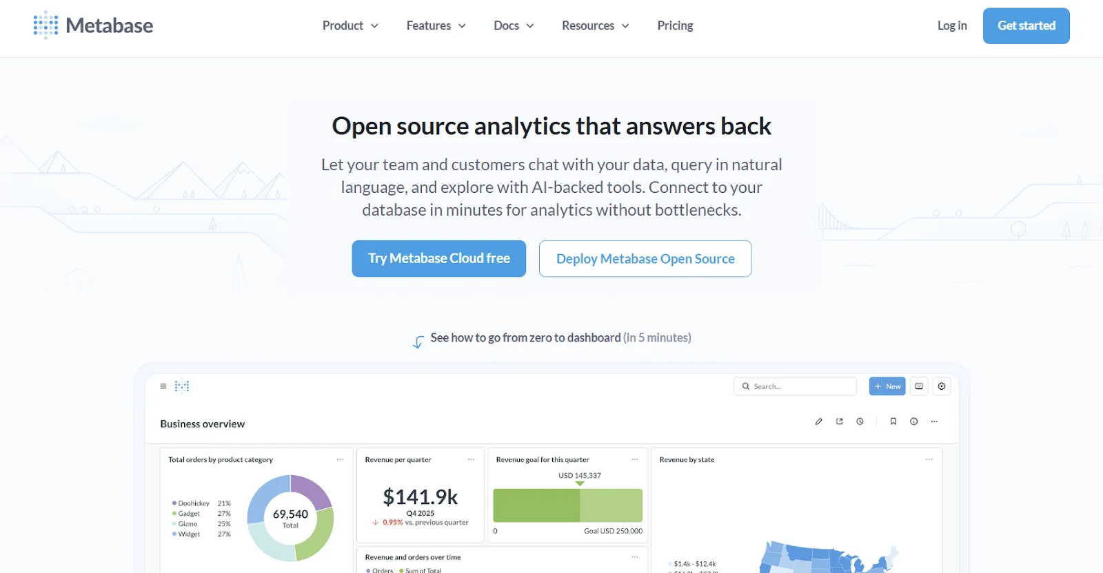
Metabase is an open-source business intelligence platform designed for quick deployment and simple self-service analytics.
It's popular with smaller data teams that need dashboards running fast, without a large upfront engineering investment.
Metabase's Top Features
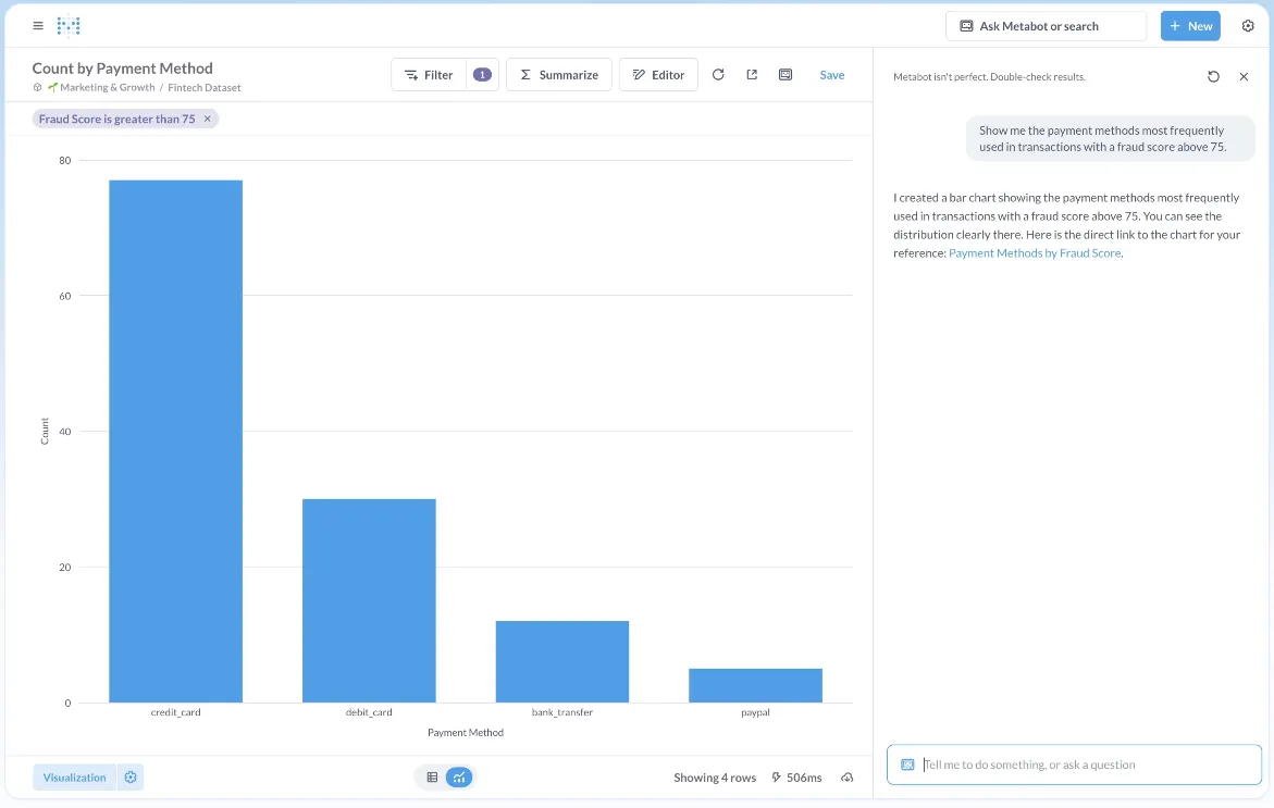
- Visual question builder: Business users can answer data questions through a guided, no-code interface without writing SQL, making basic reports accessible to non-technical team members.
- SQL editor for analysts: Analysts can write and run SQL directly, then turn results into shareable dashboards and reports inside the same environment.
- Drill-through and filtering: Strong filtering and drill-through capabilities let users explore metrics across dimensions without needing a new report built every time a question changes.
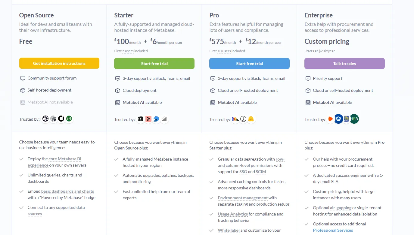
Metabase's Pricing
Metabase offers two pricing options depending on how you use the product: internal business intelligence or customer-facing embedded analytics.
- Business Intelligence:
- Open Source (Self-hosted): Free, self-hosted deployment, includes unlimited queries, charts, and dashboards, connects to all supported data sources, basic embedding with “Powered by Metabase” branding, community support only.
- Starter (Cloud-hosted): $100/month + $6/user/month, first 5 users included, includes everything in Open Source, plus option to include Metabot AI (charged extra), automatic upgrades, backups, and monitoring, support via Slack, Teams, and email (3-day SLA).
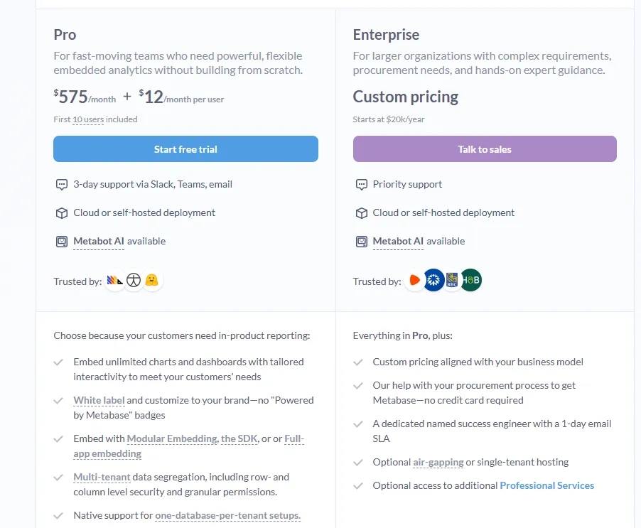
- Pro: $575/month + $12/user/month, first 10 users included, cloud or self-hosted deployment, includes everything in Starter, plus row- and column-level permissions, SSO and SCIM support, advanced caching and performance controls, staging + production environments, usage analytics and audit visibility, white-labeling, and embedded analytics capabilities.
- Enterprise: Custom pricing (starts at $20k/year), includes everything in Pro, plus priority support, dedicated success engineer (1-day email SLA), optional single-tenant or air-gapped deployment, and optional professional services.
- Embedded Analytics pricing:
- Pro: $575/month + $12/user/month, first 10 users included, includes unlimited embedded dashboards and charts, full white-labeling, modular embedding, SDK, or full-app embedding, multi-tenant security (row- and column-level), one-database-per-tenant support, staging + production environments, usage analytics, internal BI for your team, and option to include Metabot AI (charged extra).
- Enterprise: Custom pricing (starts at $20k/year), includes everything in Pro, plus a dedicated success engineer, priority support, optional single-tenant or air-gapped hosting, and optional professional services.
Metabase's Pros and Cons
✅ Fast to deploy and lightweight, particularly with common databases like PostgreSQL, MySQL, and Snowflake.
✅ Strong drill-through and filtering for exploring metrics without rebuilding reports from scratch each time.
❌ Limited for advanced analytics - complex calculations, deep data modeling, and large-scale governance are well outside its core scope.
❌ Built-in governance is weaker compared to warehouse-native platforms, which can create metric consistency issues as the team and dataset complexity grow.
#7: Qlik Sense
Best for: Organizations that want powerful, flexible analytics for exploring complex data relationships - particularly enterprise teams in governed industries that prefer on-premise deployment options.
Similar to: Tableau, Power BI.
Qlik Sense is a modern analytics platform built around a unique associative analytics engine that lets users explore data in any direction, without being constrained by predefined queries or hierarchical structures.
It's designed for enterprise teams that need fast, interactive data exploration combined with built-in AI and strong governance.
Qlik Sense's Top Features
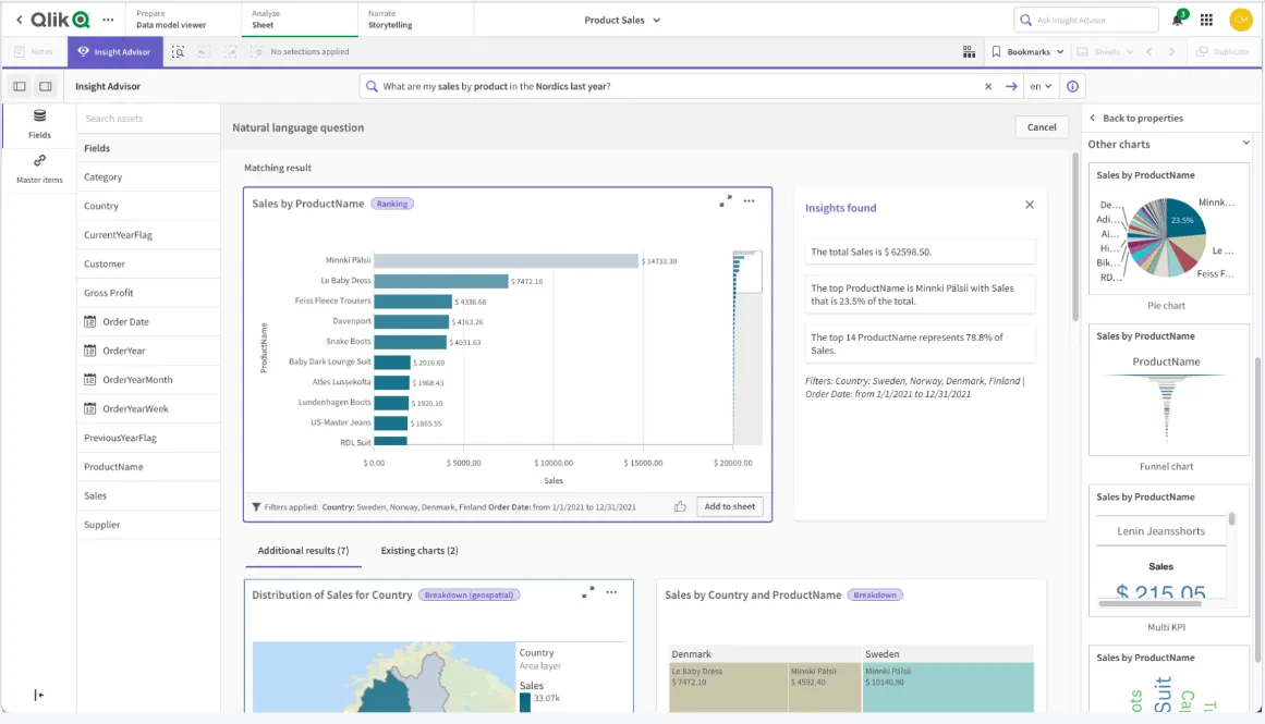
- Associative analytics engine: Select values across charts and tables and watch everything recalculate instantly, making it possible to uncover data relationships that traditional query-based BI tools often miss entirely.
- AI-powered augmented analytics: Built-in AI and machine learning automatically generate insights, support natural language search, and enable predictive analytics without a dedicated data science team.
- Real-time alerts and automation: Monitor data changes with intelligent alerts and trigger automated actions when thresholds or events occur across your datasets.
Qlik Sense's Pricing
Qlik Sense doesn't publish pricing on its website. You'll need to contact Qlik's sales team directly for a custom quote.

Qlik Sense's Pros and Cons
✅ Highly flexible and customizable for teams with complex, multi-dimensional analytical needs.
✅ Scales reliably for enterprise deployments with large data volumes and demanding query requirements.
❌ Pricing is expensive, particularly when expanding access to a broader internal user base beyond a core analyst team.
❌ Initial setup and configuration require more technical investment than lighter BI tools, which can slow early adoption and time-to-value.
#8: Omni
Best for: Analytics engineers and modern data teams that want governed, metrics-first BI without the rigid structure of traditional LookML workflows.
Similar to: Looker, Holistics.
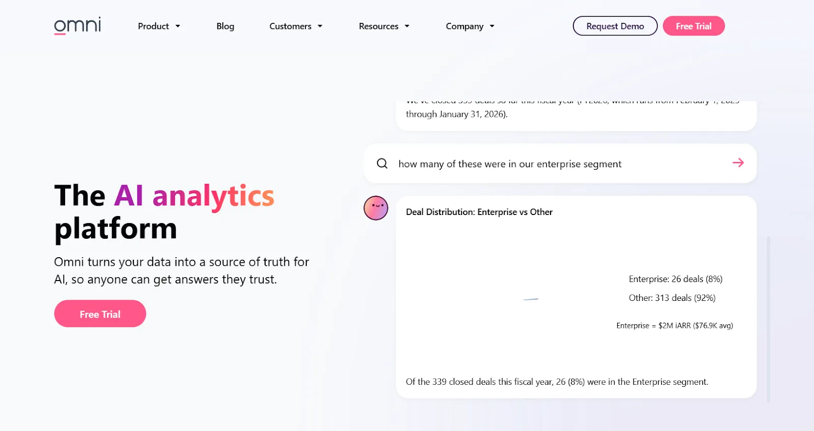
Omni is a modern BI platform built around a centralized semantic model that keeps metrics consistent while enabling fast, self-service data exploration.
It's designed for teams that want warehouse-native governance without the heavy BI engineering overhead that typically comes with it.
Omni's Top Features
- Metrics-first modeling: Define metrics once in a centralized model that supports governed, reusable calculations without the structural constraints of traditional LookML.
- AI in dashboards and workbooks: Use AI directly inside dashboards and workbooks to summarize charts, generate queries, explain trends, and suggest next steps for analysis.
- Spreadsheet-like exploration: Analyze live warehouse data in a familiar spreadsheet interface while maintaining governed metric definitions and real-time warehouse connections.
Omni's Pricing
Omni doesn't publish its subscription pricing publicly.
You can request a free trial on its website and contact the sales team for pricing details.
Omni's Pros and Cons
✅ Intuitive drag-and-drop interface that stays accessible without sacrificing semantic governance across the data model.
✅ Strong dbt integration and direct warehouse querying built for modern, warehouse-centric data stacks.
❌ Still an evolving product, with occasional rough edges and missing features reported by early users.
❌ The semantic layer setup requires upfront technical work that can slow initial deployment for smaller or less engineering-heavy teams.
#9: Holistics
Best for: Data teams that want governed self-service analytics with a code-based semantic layer, Git version control, and strong collaboration between analysts and business users.
Similar to: Looker, Omni.
Holistics is a cloud-native BI platform that centralizes metric definitions and data modeling while giving non-technical users the ability to build their own reports and dashboards.
It combines SQL-based modeling, automated reporting, and natural language AI to extend analytics access across the whole organization.
Holistics's Top Features
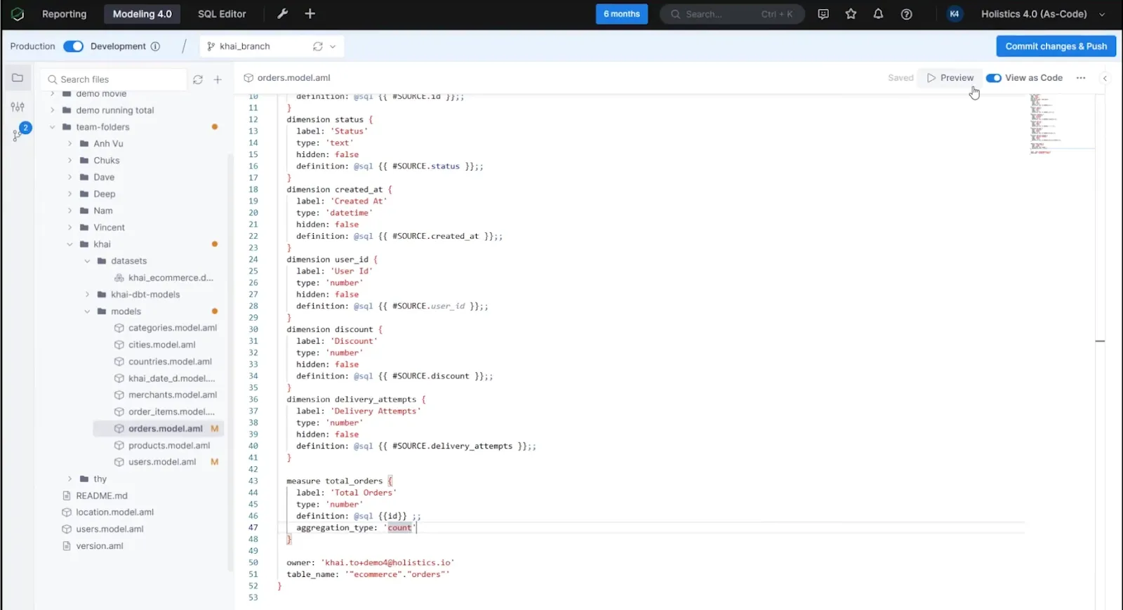
- Analytics-As-Code: Define business logic, datasets, and metrics using Holistics' declarative language or SQL, commit everything to Git, and manage your BI layer with full version control, branching, and code reviews.
- Self-service exploration for business users: Let non-technical teams build their own reports through a visual, drag-and-drop interface using pre-defined metrics pulled from the governed data model.
- Centralized data modeling: Define metrics, joins, derived tables, and transformations once in Holistics' model layer to enforce consistency across all reports and dashboards.
Holistics's Pricing
Holistics prices by reports and users, with add-ons for advanced security:
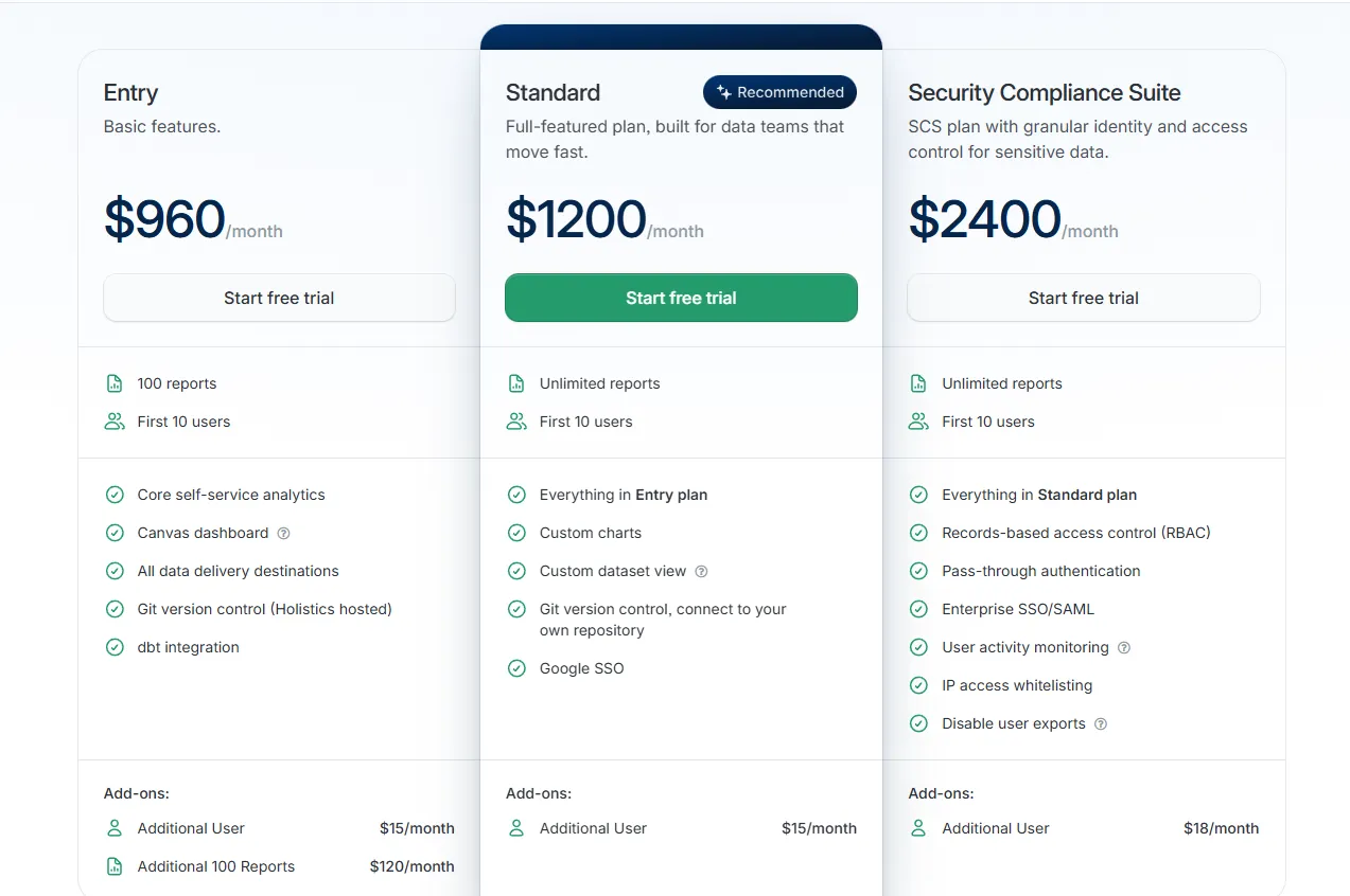
- Entry: $960/month for 100 reports and 10 users, covering core self-service analytics, Canvas dashboards, all delivery destinations, hosted Git version control, and dbt integration. Extra users run $15/month, and each additional 100-report block costs $120/month.
- Standard: $1,200/month for unlimited reports and 10 users, adding custom charts, custom dataset views, your own Git repository connection, and Google SSO. Extra users at $15/month.
- Security Compliance Suite: $2,400/month, layering on RBAC, pass-through authentication, enterprise SSO with SAML, activity monitoring, IP whitelisting, and export controls. Extra users at $18/month.
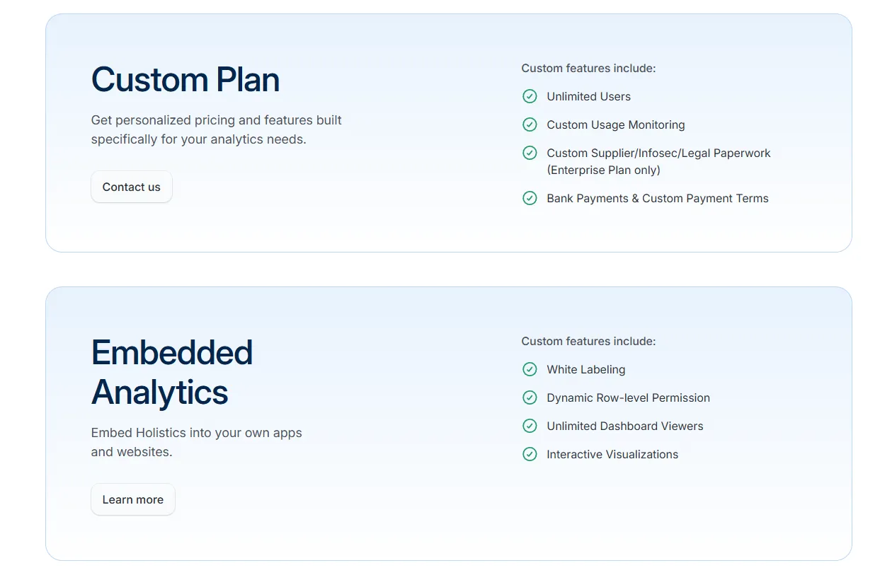
- Custom Plan: Tailored pricing for organizations that need unlimited users, custom monitoring, or advanced compliance configurations.
- Embedded Analytics: Custom pricing for white-labeled dashboards, dynamic row-level permissions, and unlimited viewer access.
Holistics's Pros and Cons
✅ Analytics-As-Code gives data teams full reproducibility and version control over the entire BI layer.
✅ Strong dbt integration and semantic modeling for teams that want Looker-style governance at a more accessible price point.
❌ Higher starting price compared to lighter self-service tools, which can be harder to justify for smaller teams with simpler reporting needs.
❌ Business users need some onboarding time to work effectively with the modeled data layer before they can self-serve confidently.
#10: Mode
Best for: Data teams and business teams that want to collaborate in one workspace.
Similar to: Metabase, Holistics.
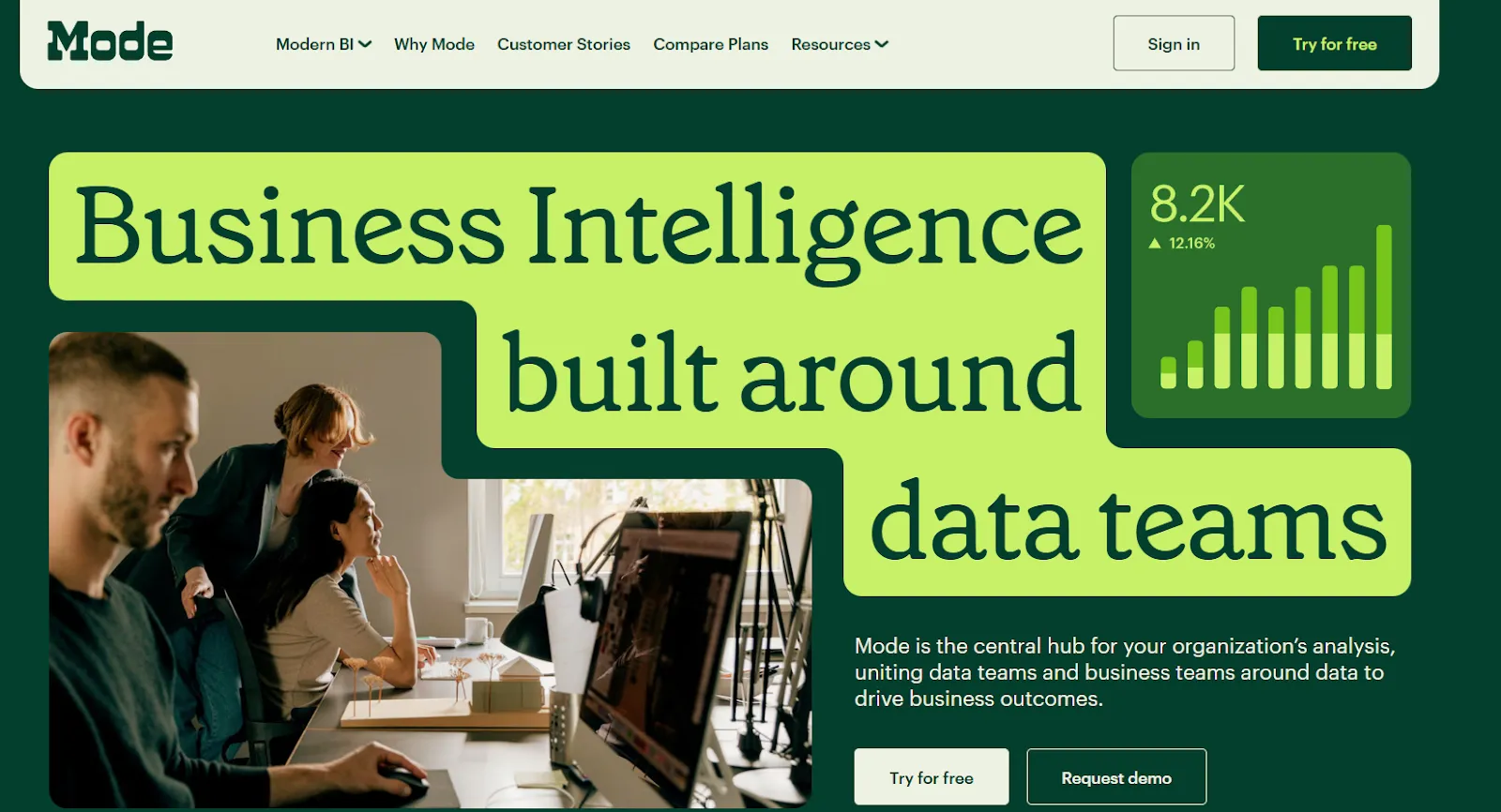
Mode is a modern analytics platform built to support both ad hoc analysis and self-serve reporting in a single workflow.
It's designed for teams that want to move from raw data to decisions faster, with SQL queries, notebook-based analysis, and dashboard outputs all connected in one environment.
Mode's Top Features
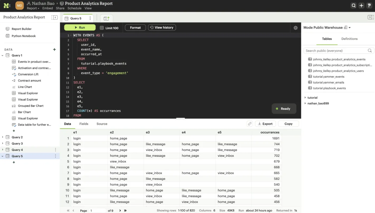
- SQL-first ad hoc analysis: Dive straight into data with SQL, iterate on queries quickly, and answer complex questions without switching between tools or platforms.
- Python and R notebooks: Pass SQL results directly into Python or R notebooks for deeper analysis, statistical modeling, or forecasting, all inside the same workspace.
- Interactive dashboards and visual exploration: Build interactive dashboards that help teams spot trends and patterns from large datasets directly in the browser.
Mode's Pricing
Mode has three pricing tiers:
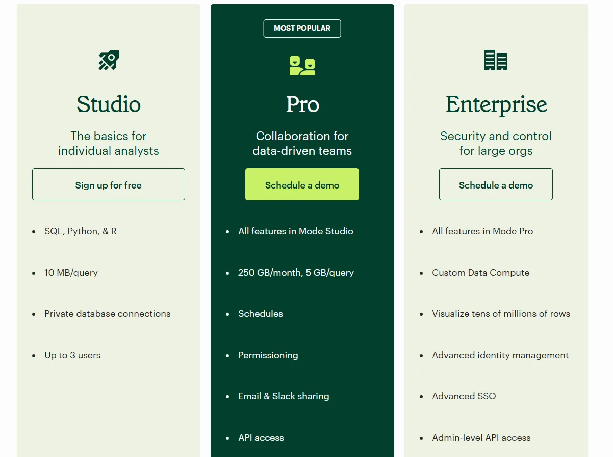
- Studio: Free plan, includes SQL, Python, and R, private database connections, up to 3 users, and 10 MB per query limit.
- Pro: Custom pricing, adds team collaboration, scheduled reports, permissions, email and Slack sharing, API access, and 250 GB per month data limits.
- Enterprise: Custom pricing, extends Pro with custom data compute, advanced identity management, SSO, admin API access, and premium support.
Mode's Pros and Cons
✅ Powerful combination of SQL, Python, R, and visualizations in one analyst-first workflow.
✅ Clean, role-based interface that makes it easy to track metrics, usage patterns, and feature performance across teams.
❌ Performance can degrade noticeably with very large datasets or particularly complex queries.
❌ The free Studio plan supports only 3 users, limiting its usefulness for broader team deployment without upgrading to a paid plan.
Get started with Dot for free today
Tableau is a well-established BI platform with strong visualization capabilities, deep integrations, and a large ecosystem built around it over many years.
If your team's needs go beyond visual dashboarding, faster time-to-insight, natural language analysis, automated reporting, or a tool that queries your warehouse without heavy data prep overhead, Dot is built for exactly that.
Unlike traditional BI tools that require dashboards to be built before questions can be answered, Dot connects to your warehouse and returns governed, traceable analysis the moment your team asks.
Here's what you get when you start with Dot:
- AI-powered analysis that answers business questions in plain English, with governed, auditable results every time.
- Automated business reviews delivered on a schedule via Slack, Teams, or email - no manual reporting cycles required.
- Context Agent that learns your business logic and metric definitions, keeping the whole organization aligned on the same numbers.
- Full audit trail on every insight, linking directly back to the underlying SQL and source datasets.
- 20+ data connectors including Snowflake, BigQuery, Redshift, Databricks, Postgres, dbt, and more.
- Free plan with no credit card required and 300 one-time credits to get started immediately.
Start for free or book a demo to talk to our team.
Theo Tortorici
Theo writes about AI-powered analytics, data tools, and the future of business intelligence at Dot.