
10 Best Microsoft Power BI Alternatives & Competitors In 2026
When people search for Microsoft Power BI alternatives, it’s usually not because Power BI can’t build dashboards.
It’s because dashboards alone aren’t driving better decisions.
I’ve seen this across enough teams to know the pattern: reports exist, numbers are there, but answers still take too long to surface.
That’s why in this article, I’ll break down the best Power BI alternatives in 2026, based on tools I’ve actually tested across real reporting, analysis, and executive workflows, covering what each one is good at, where Power BI hits its limits, and which option makes sense depending on how your team works.
Let’s dive in.
TL;DR
- Microsoft Power BI is strong for dashboards and standard reporting, especially inside the Microsoft ecosystem, but many teams hit limits as analytics scale - steep DAX learning curves, performance issues with large datasets, licensing friction, and growing dependence on a few power users to explain results.
- If your bottleneck is turning data into clear answers (not building more dashboards), Dot is the real alternative. It connects directly to your data warehouse, answers business questions with narrative insights and recommendations, automates executive business reviews, and delivers decision-ready analysis via Slack, Teams, or email.
- Most other Power BI alternatives fall into two groups: visual-first BI tools (Tableau, Qlik, Domo) for deeper exploration and storytelling, and governed or warehouse-native platforms (Looker, Sigma, Mode, Metabase) for consistent metrics and analyst-led workflows.
Why do some teams switch away from Power BI?
From experience, Microsoft Power BI does a lot right.
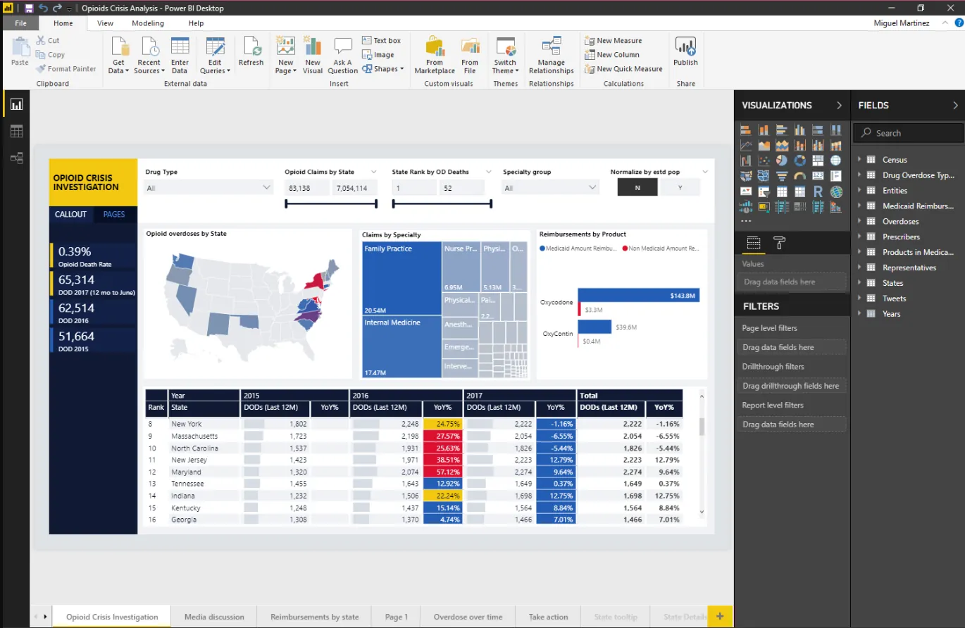
I particularly liked how easy it is to turn complex data into clear dashboards, its deep integration with Excel and the Microsoft ecosystem, and features like row-level security that work well at scale.
That said, once you move beyond basic reporting and dashboards, the same issues come up again and again - and they’re usually the reason people start looking for alternatives.
1. Steep learning curve beyond the basics
Power BI is approachable at first, but many users hit friction as soon as they move into data modeling, DAX, or more advanced analysis.
Writing and maintaining complex DAX logic isn’t intuitive, and even experienced users mention struggling with flexibility and customization.
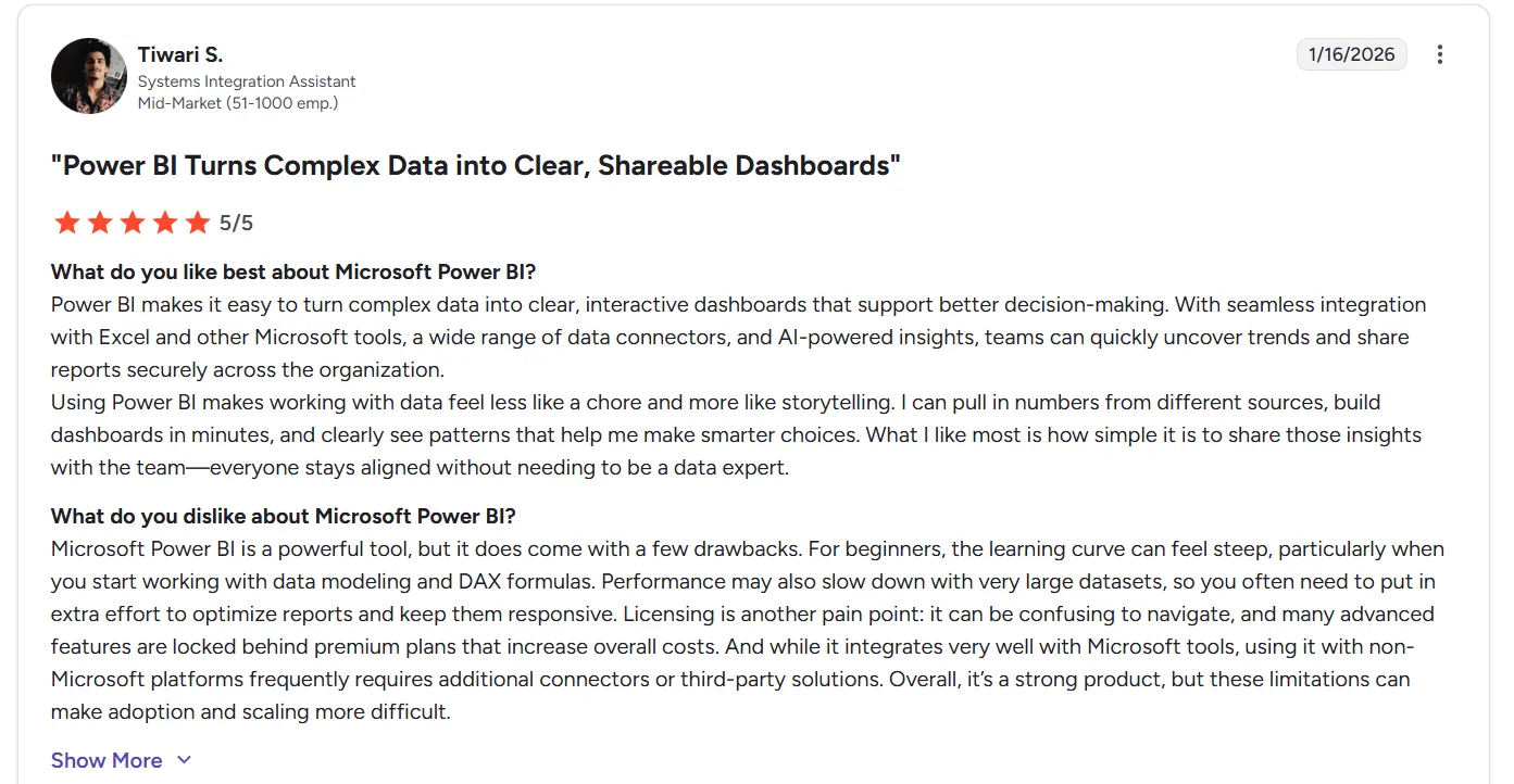
“Microsoft Power BI is a powerful tool, but it does come with a few drawbacks. For beginners, the learning curve can feel steep, particularly when you start working with data modeling and DAX formulas. Performance may also slow down with very large datasets, so you often need to put in extra effort to optimize reports and keep them responsive. Licensing is another pain point: it can be confusing to navigate, and many advanced features are locked behind premium plans that increase overall costs. And while it integrates very well with Microsoft tools, using it with non-Microsoft platforms frequently requires additional connectors or third-party solutions. Overall, it’s a strong product, but these limitations can make adoption and scaling more difficult.” - G2 Review
Over time, this turns “self-service analytics” into a dependency on a few Power BI power users.
2. Performance and reliability issues at scale
As dashboards grow larger or more complex, Microsoft Power BI’s performance can slow down - significantly so.
Heavy reports can become sluggish, take a long time to load, or even crash, especially with large datasets or complex visuals.
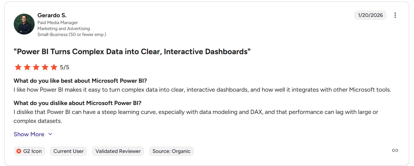
“I dislike that Power BI can have a steep learning curve, especially with data modeling and DAX, and that performance can lag with large or complex datasets.” - G2 Review
In practice, teams often spend significant time optimizing reports just to keep them usable.
3. Licensing, automation, and ecosystem limitations
Power BI’s licensing model frequently frustrates users, with key features like sharing and advanced capabilities locked behind Premium tiers.
Automation support is limited, with some workflows still requiring manual setup or workarounds.
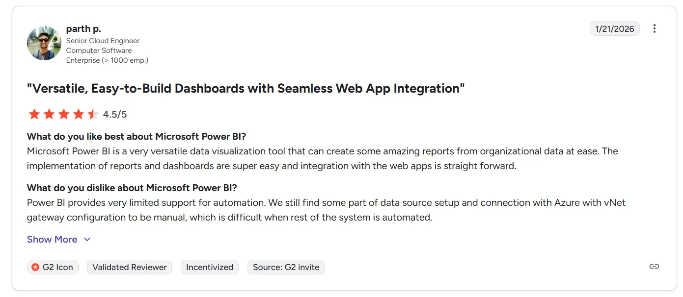
“Power BI provides very limited support for automation. We still find some part of data source setup and connection with Azure with vNet gateway configuration to be manual, which is difficult when the rest of the system is automated.” - G2 Review
And while Power BI works great inside the Microsoft ecosystem, connecting it cleanly to non-Microsoft tools often means extra connectors, added cost, or more maintenance overhead.
What are the 10 best Microsoft Power BI alternatives & competitors in 2026?
The best Microsoft Power BI alternatives in 2026 are Dot, Tableau, and Looker.
The rest are as follows:
| Tool | What it’s best at | Pricing |
|---|---|---|
| Dot | AI data analyst that connects directly to your warehouse and delivers narrative insights, recommendations, and automated executive-ready reports instead of dashboards. | Free plan; paid plans start at $799/month. |
| Tableau | Advanced visual analytics and exploratory data analysis for large, complex datasets and data storytelling. | $75/user/month. |
| Looker | Governed, warehouse-native BI with a semantic layer (LookML) for consistent metrics across teams. | Custom pricing (annual contract). |
| ThoughtSpot | AI-driven analytics with natural-language search for fast, self-service data exploration. | $25/user/month (annual contract). |
| Qlik Sense | Associative analytics engine for exploring complex data relationships beyond traditional queries. | Custom pricing. |
| Sigma | Spreadsheet-like analytics on live warehouse data, popular with finance and ops teams. | Custom pricing. |
| Metabase | Open-source BI for simple dashboards and self-service analytics with minimal setup. | Free (open source); Cloud from $100/month. |
| Mode | SQL-first analytics combining queries, Python/R notebooks, and reporting in one workflow. | Free (Studio plan); paid plans at custom pricing. |
| Domo | All-in-one cloud BI with data ingestion, dashboards, automation, and alerts. | Custom pricing (30-day free trial). |
| Zoho Analytics | Budget-friendly BI with dashboards, reporting, and basic AI, best for Zoho users. | $60/month (Standard plan). |
#1: Dot
Dot isn’t your traditional Power BI-style dashboarding tool.
It’s an AI data analyst that connects directly to your data warehouse and does the analysis for you.
So, instead of spending time building dashboards, writing DAX, or maintaining reports, I can ask Dot real business questions and get clear, narrative answers with recommendations in minutes.
Moreover, it automatically produces executive-ready business review reports, handles ad-hoc analysis in Slack or Teams, and maintains shared business context so insights stay consistent across teams.
In practice, Dot replaces a huge amount of manual reporting and analyst back-and-forth rather than adding yet another BI layer.
Here are some of the key features that make Dot a powerful Microsoft Power BI alternative.
1. Ad-hoc deep data analysis via Slack or Teams
Power BI works well when you know exactly which dashboard to open and which filters to apply.
But in real life, most questions aren’t that clean.
Someone asks, “Why did conversion drop last week?” or “What changed in EMEA compared to last month?” and the answer usually involves jumping between dashboards, tweaking filters, or asking an analyst to run a custom query.
Dot removes that back-and-forth by letting teams ask plain-English business questions directly in Slack or Microsoft Teams.
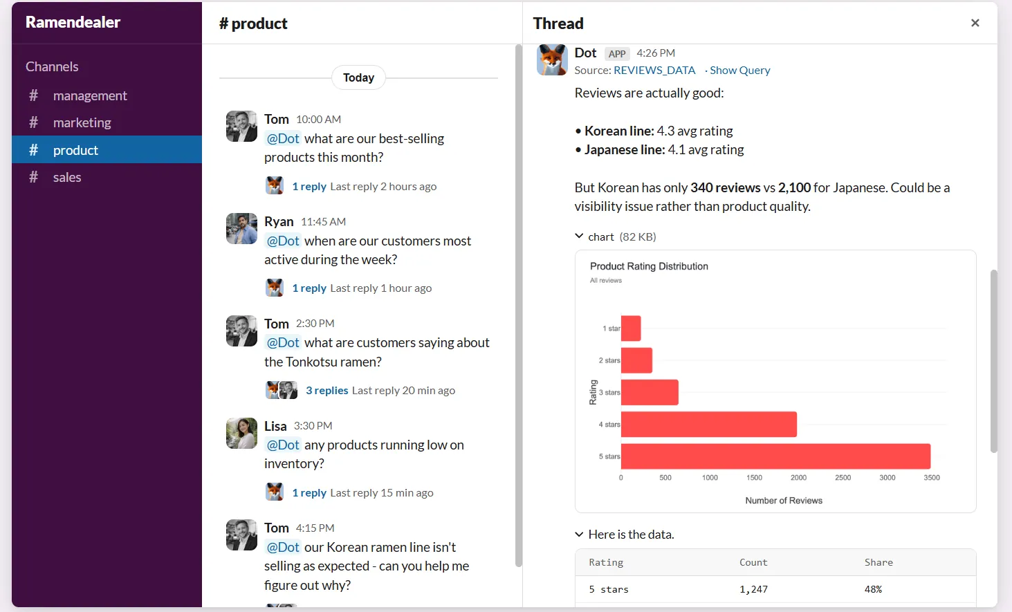
Instead of navigating dashboards or waiting in an analyst queue, stakeholders can ask a question and get a full analysis back in minutes.
The response doesn’t just show numbers: it explains what’s happening, why it’s likely happening, and which segments, regions, or metrics are driving the change.
This is especially useful for data teams because it absorbs a large volume of ad-hoc requests that would normally interrupt planned work.
Business users get faster answers without needing to learn Power BI, SQL, or data models, while analysts regain time to focus on deeper, higher-impact analysis instead of constantly pulling “one more chart.”
2. Persistent business context & shared definitions
One of the biggest issues with Power BI setups over time isn’t the dashboards themselves: it’s context drift.
Metrics get defined slightly differently across reports, dashboards multiply, and soon, teams are debating numbers instead of acting on them.
Even when everyone is using the same tool, there’s no guarantee they’re using the same logic.
Dot addresses this with a Context Agent that learns and maintains business definitions, metric logic, and documentation across your data environment.
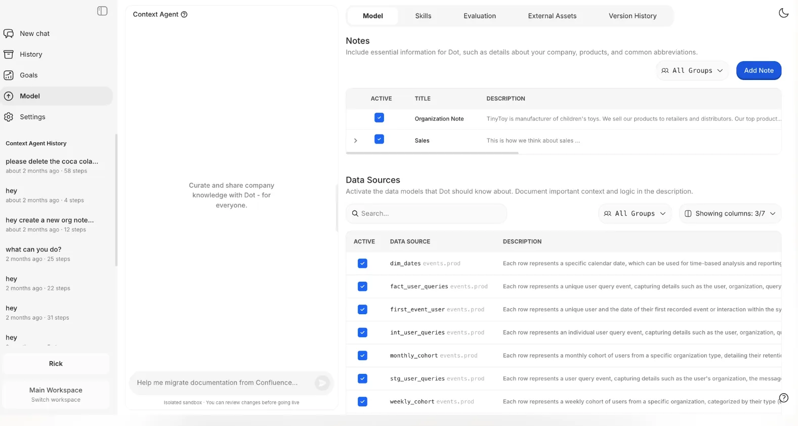
It keeps track of how key metrics are calculated, what tables should be used, and how different teams talk about the same concepts, then applies that context consistently whenever it generates an insight or report.
In practice, this means people stop asking “Which dashboard is right?” or “How is this metric defined here?”
Every answer Dot gives is grounded in the same shared understanding of the business, which reduces confusion, builds trust in the data, and prevents the slow erosion of confidence that often happens in large Power BI environments.
3. Automated business review reports
One of the main reasons teams use Power BI is to prepare weekly or monthly business reviews for leadership.
In practice, that usually means analysts spending hours refreshing dashboards, double-checking numbers, exporting slides, and then explaining what changed and why.
The dashboard shows the data, but the actual analysis still lives in someone’s head or in meeting notes.
Dot approaches this differently by automating the entire business review, not just the visuals.
It generates executive-ready reports on a set schedule (daily, weekly or monthly) directly from the data warehouse, and turns raw metrics into a written narrative that explains what happened, what changed compared to previous periods, and where attention is needed.
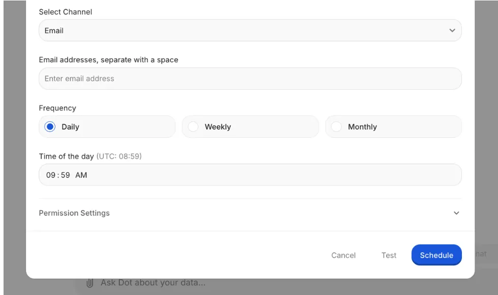
The result is a reporting process that’s easier to maintain and much easier to act on.
Leadership gets a consistent, easy-to-read business update without needing to interpret dashboards, and data teams stop spending a large portion of their time producing the same reports over and over again.
4. Full audit trail for every insight
One common frustration with traditional BI tools is that dashboards show what the numbers are, but not always how they were produced.
If a metric looks off, teams often have to dig through models, DAX formulas, refresh logs, or ask whoever built the report to explain it.
That slows things down and can quietly erode trust in the data.
Dot takes the opposite approach by attaching a full audit trail to every insight it produces.
Each answer or report links directly back to the underlying SQL queries, Python logic, and datasets used, making it clear exactly where the numbers came from and how they were calculated.
There’s no black box, as everything is inspectable.
This matters especially for data leaders and analysts who need to stand behind the numbers.
Instead of saying “the dashboard says so,” teams can trace insights back to the source of truth, validate them quickly, and move forward with confidence.
It turns analytics from something you hope is correct into something you can actually verify.
Dot’s integrations
Dot is designed to work on top of the tools teams already use, rather than forcing data into a new BI-specific model.
It connects directly to modern data warehouses like Snowflake, BigQuery, Redshift, Databricks, and even operational databases such as Postgres, MySQL, and SQL Server, so analysis happens where the data already lives.
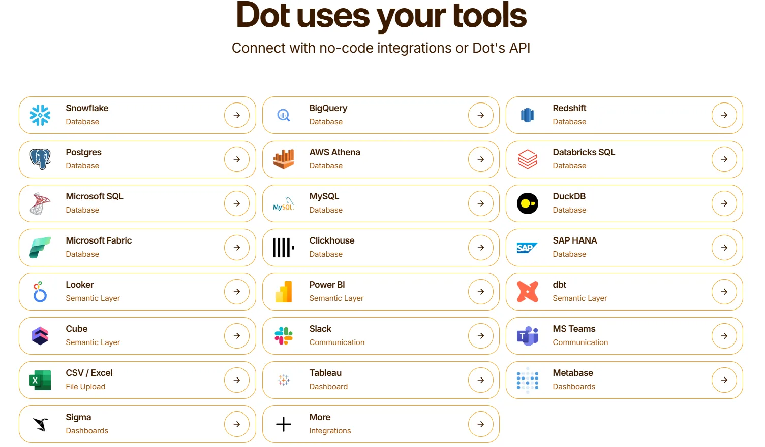
Beyond raw data access, Dot also integrates with semantic layers and transformation tools like dbt, Looker, Power BI models, and Cube.
That means it can reuse existing business logic and metric definitions instead of recreating them inside yet another analytics tool, which is a common pain point with traditional BI setups.
Dot also fits naturally into day-to-day workflows by delivering insights through Slack, Microsoft Teams, email, and the web app, rather than asking users to log into dashboards.
Moreover, it can sit alongside existing BI tools like Tableau, Metabase, or Sigma, complementing them rather than replacing everything overnight.
The end result is analytics that stay connected to the warehouse, respect existing data work, and show up where decisions actually happen.
Pricing
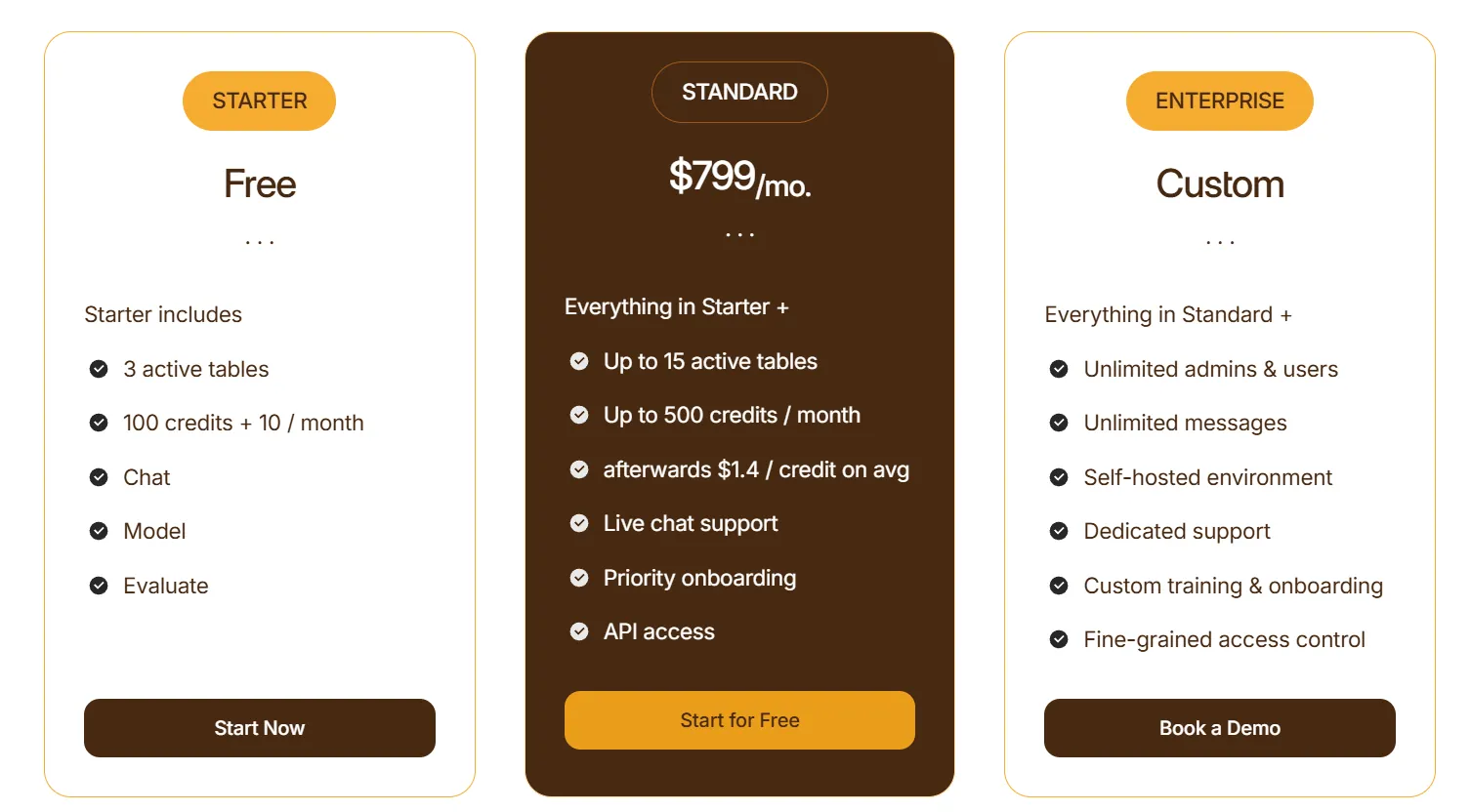
Dot uses a credit-based pricing model, with plans designed to scale from early experimentation to enterprise-wide usage:
- Starter: Free plan that lets you get started without committing, includes 3 active tables, 100 credits + 10 credits per month, chat-based analysis, and model & evaluation access.
- Standard: $799/month, includes everything in Starter, up to 15 active tables, up to 500 credits per month, additional credits at $1.40 per credit, live chat support, priority onboarding, and API access.
- Enterprise: Custom pricing, includes everything in Standard, unlimited users and admins, unlimited messages, self-hosted environment, dedicated support, custom onboarding and training, and fine-grained access controls.
How is Dot different from Microsoft Power BI?
The biggest difference between Dot and Microsoft Power BI isn’t features - it’s what the tool is actually designed to do.
Power BI is built to help teams visualize data.
You model datasets, build dashboards, apply filters, and then interpret the results yourself.
It works well for structured reporting, but it still relies heavily on manual setup, ongoing maintenance, and human interpretation to turn charts into decisions.
Dot, on the other hand, is built to do the analysis for you.
Instead of asking users to explore dashboards, Dot answers business questions directly, explains what changed and why, and produces decision-ready outputs like automated business review reports.
Where Power BI shows numbers, Dot provides context, narrative, and recommendations.
At a practical level, Power BI centralizes analytics inside dashboards.
Dot pushes insights into workflows - Slack, Teams, email - so teams don’t have to go looking for answers.
And while Power BI often struggles with metric drift, dashboard sprawl, and unclear ownership over logic, Dot maintains shared business context and attaches a full audit trail to every insight, making results easier to trust and validate.
In short:
- Power BI helps teams see data.
- Dot helps teams understand it and act on it, without relying on dashboards as the primary interface.
Pros & Cons
✅ Replaces recurring Power BI reports with automated, narrative business reviews.
✅ Delivers clear explanations and recommendations in minutes via Slack or Teams.
✅ Shared business context and definitions reduce metric drift and “which number is right?” debates across teams.
✅ Full audit trail on every insight, with transparent links to underlying SQL, logic, and datasets.
✅ Warehouse-native architecture that works directly on modern data stacks without copying or reshaping data.
✅ Flexible pricing model based on usage rather than per-seat licensing.
❌ Not a traditional BI or dashboarding tool, which may be a drawback for teams that rely heavily on custom visuals.
#2: Tableau
Best for: Data teams and enterprises that need advanced data visualization, exploratory analysis, and flexible deployment options across cloud and self-hosted environments.
Tableau is a well-established business intelligence platform best known for its advanced data visualization and interactive dashboarding capabilities.
It’s commonly used by analysts and data teams that want to explore large, complex datasets visually and uncover patterns through hands-on analysis.
Features
- Advanced visual analytics & exploration: Build highly interactive dashboards using drag-and-drop analysis (VizQL), rich visualizations, and drill-downs to explore patterns and trends in complex data.
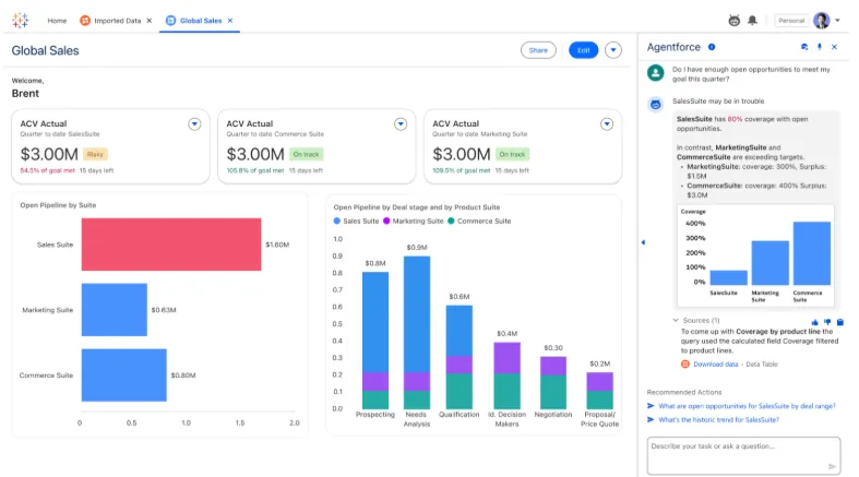
- Agentic analytics with Tableau Next: Tableau Next introduces AI-powered, agent-based analytics that deliver personalized and contextual insights, allow users to ask natural-language questions, surface proactive insights, and even trigger actions directly within tools like Slack and Salesforce workflows.
- Strong security and governance: Supports centralized data governance, security controls, and reusable metrics through features like Tableau Pulse and Data Management, making it easier to scale analytics across teams.
Pricing
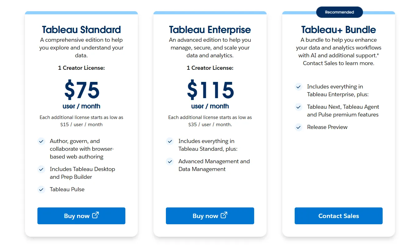
Tableau uses per-user, per-month pricing, with separate plans depending on whether you deploy Tableau in the cloud, on your own servers, or as part of its newer AI-driven offering:
- Tableau Cloud has three pricing plans:
- Tableau Standard: $75 per 1 creator per month, with each additional license from $15 per user/month, includes browser-based authoring and collaboration, Tableau Desktop and Prep Builder, Tableau Pulse for metrics and insights.
- Tableau Enterprise: $115 per 1 creator per month, with each additional license from $35 per user/month, includes everything in Standard, plus Advanced Management and Data Management for governance and scale.
- Tableau+ Bundle (Cloud + AI): Custom pricing, includes everything in Tableau Enterprise, plus Tableau Next, Tableau Agent, and Pulse premium features, with access to release previews and early AI capabilities.
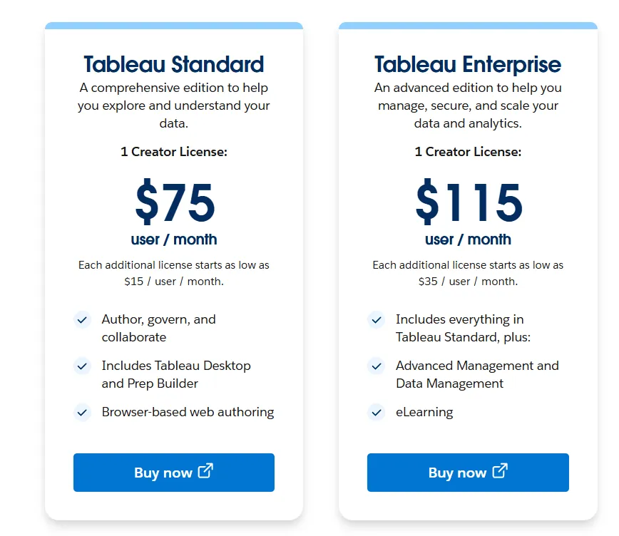
- Tableau Server has two pricing plans:
- Tableau Standard: $75 per 1 creator per month, with each additional license from $15 per user/month, includes authoring, governance, and collaboration and Tableau Desktop and Prep Builder.
- Tableau Enterprise: $115 per 1 creator per month, with each additional license from $35 per user/month, includes everything in Standard, plus Advanced Management, Data Management, and eLearning.
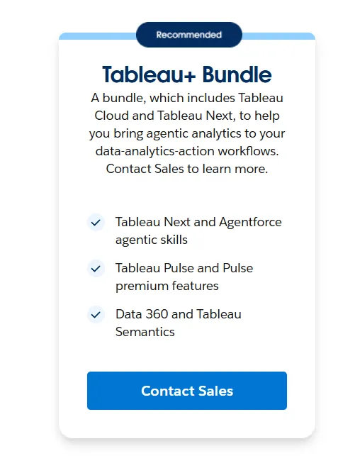
- Tableau Next (agentic analytics): Requires an annual contract, includes agentic analytics via Agentforce, Tableau Semantics, Tableau Pulse (including premium), and Data 360.
Pros & Cons
✅ Excellent data visualization and storytelling.
✅ Intuitive drag-and-drop analysis, allowing users to explore data, build dashboards, and iterate quickly without writing heavy code.
❌ Steep learning curve for advanced features.
#3: Looker
Best for: Data teams and organizations that want a governed, warehouse-native BI platform with consistent metrics, strong data modeling, and tight integration with Google Cloud.
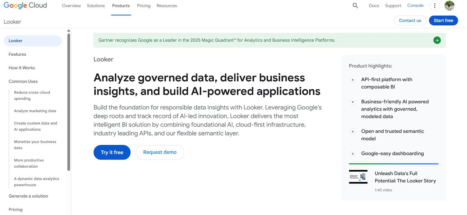
Looker is a business intelligence platform built around a centralized semantic modeling layer rather than standalone dashboards.
It’s commonly used by data teams that prioritize consistent metrics, reusable business logic, and analytics that scale across many teams and tools.
Features
- Centralized semantic modeling with LookML: Define metrics and business rules once, so everyone across the company sees the same numbers in every report and dashboard.
- Conversational analytics powered by Gemini: Users can ask questions about their data in natural language and get answers without navigating dashboards, making analytics more accessible beyond technical teams.
- Real-time, governed dashboards: Dashboards pull data live from the warehouse, letting users explore, filter, and drill into trusted metrics without relying on outdated extracts.
Pricing
Looker uses a custom, contract-based pricing model made up of two parts: platform pricing (the cost of running a Looker instance) and user licensing (the cost per user type).
Pricing is annual for all plans.
- Platform editions:
- Standard: Designed for small teams or organizations with fewer than 50 users, includes 1 production instance, 10 standard users + 2 developer users, up to 1,000 query-based API calls/month, and up to 1,000 admin API calls/month.
- Enterprise: Built for larger internal BI and analytics use cases, includes everything in Standard, plus enhanced security features, up to 100,000 query-based API calls/month, and up to 10,000 admin API calls/month.
- Embed: Designed for embedding analytics into external products or applications, includes everything in Standard, plus up to 500,000 query-based API calls/month and up to 100,000 admin API calls/month.
- User licensing:
- Developer users: Full access to Looker, including LookML development, administration, APIs, and advanced tooling.
- Standard users: Can explore data, build dashboards and reports, run SQL, and schedule content.
- Viewer users: Read-only access to dashboards and reports, with filtering and drill-down.
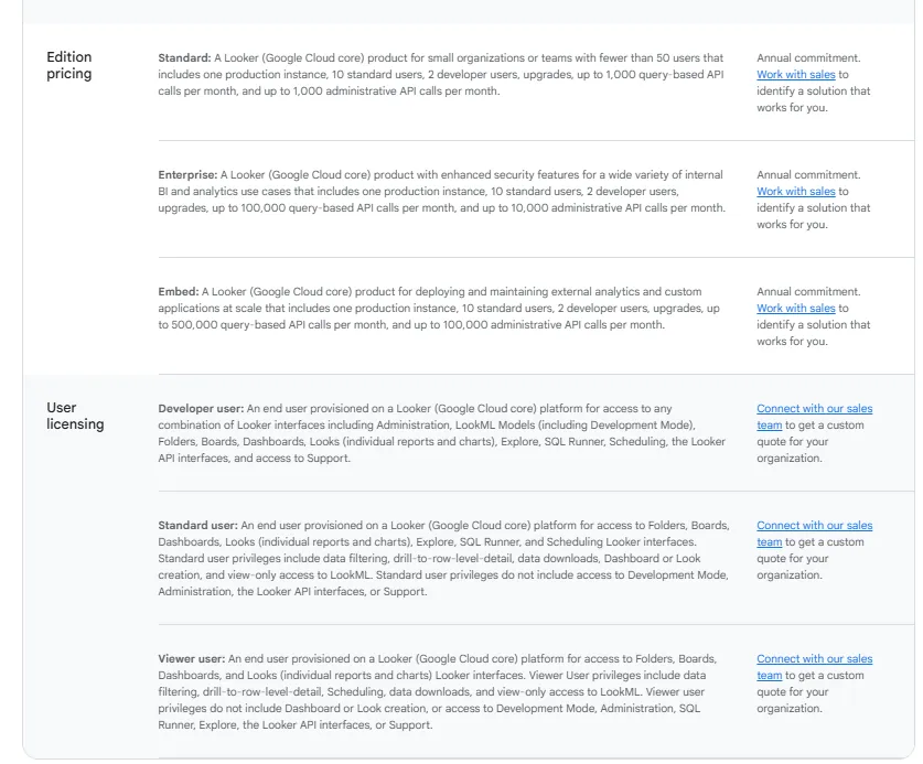
Pricing is custom on all plans and varies based on scale, permissions, and usage.
Pros & Cons
✅ Keeps metrics consistent, meaning you define metrics once and everyone sees the same numbers across dashboards and reports.
✅ Makes it easy to embed reports and dashboards into internal tools or customer-facing products.
❌ Steep learning curve.
#4: ThoughtSpot
Best for: Organizations that want AI-powered, self-service analytics with natural language querying and automated dashboards, without relying on traditional BI workflows.
ThoughtSpot is an AI-driven analytics platform built to help users ask questions in plain language and get instant answers from live data.
It’s designed for teams that want faster insights, less manual dashboard work, and analytics that show up directly in business workflows.
Features
- Natural language analytics: Ask questions in plain English and get instant, governed answers from live data, without building or navigating dashboards.
- AI agents for analytics workflows: Agentic tools like Spotter automatically generate analyses, dashboards, and insights even from unstructured data, reducing manual reporting and exploration work.
- Automated dashboards with SpotterViz: Instantly turn data into complete, styled dashboards that tell a story, without manual layout, formatting, or chart configuration.
Pricing
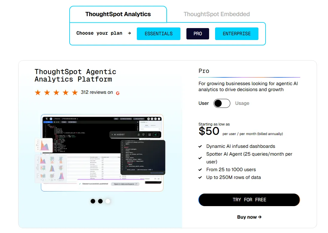
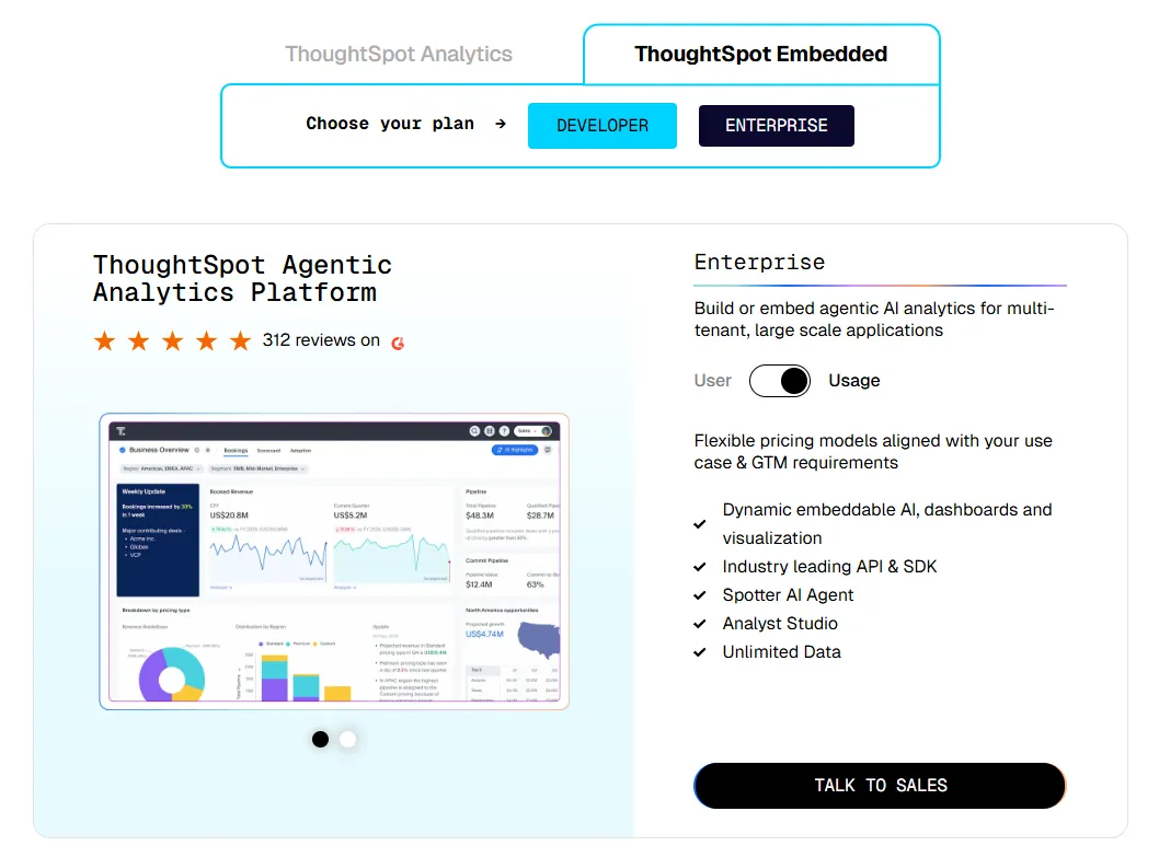
ThoughtSpot offers two separate products - ThoughtSpot Analytics for internal BI and ThoughtSpot Embedded for building analytics into applications - each with flexible pricing depending on scale and usage:
- ThoughtSpot Analytics:
- Essentials: From $25 per user per month (billed annually), for teams of 5-50 users, includes dynamic interactive dashboards and AI-powered insights and supports up to 25M rows of data.
- Pro (per user pricing): From $50 per user per month (billed annually), for 25–1,000 users, includes everything in Essentials, plus AI-infused dashboards and Spotter AI Agent (25 queries per user/month), and supports up to 250M rows of data.
- Pro (usage-based): From $0.10 per query, includes everything in Pro per user, and adds Analyst Studio.
- Enterprise (user or usage-based): Custom pricing, includes everything in Pro, plus unlimited users and data.
- ThoughtSpot Embedded:
- Developer: Free for 1 year, includes embeddable AI analytics, dashboards, and visualizations, APIs and SDKs, up to 10 users and 25M rows of data.
- Enterprise (user-based): Custom pricing, includes everything in Developer, plus unlimited data.
- Enterprise (usage-based): Custom pricing, everything in Enterprise, plus Spotter AI Agent and Analyst Studio.
Pros & Cons
✅ Easy to use for non-technical users thanks to natural language search and guided analytics.
✅ Built-in AI helps surface patterns, trends, and explanations faster than traditional dashboards.
❌ Custom and usage-based pricing makes costs harder to predict, especially at scale.
#5: Qlik Sense
Best for: Organizations that want powerful, interactive analytics for exploring complex data, especially teams in highly governed industries that prefer on-prem deployments over fully cloud-only BI tools.
Qlik Sense (part of the Qlik platform) is a modern analytics platform known for its unique associative analytics engine, which lets users explore data freely without being locked into predefined queries or dashboards.
It’s built for teams that want fast, interactive data exploration combined with AI-assisted insights and strong governance.
Features
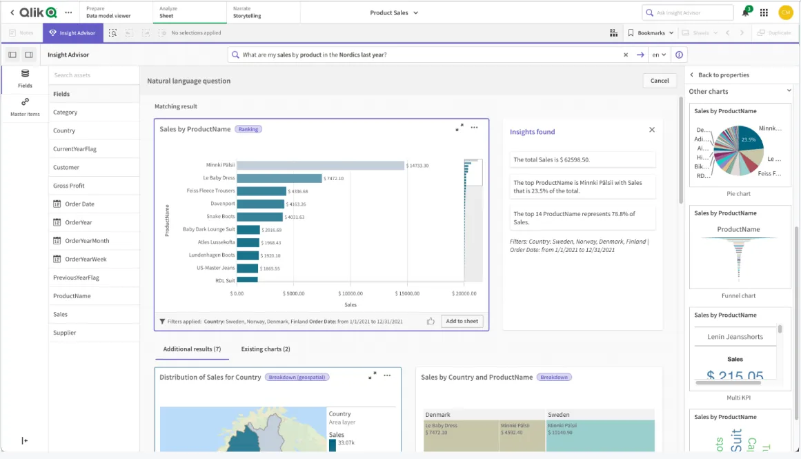
- Associative analytics engine: Explore data in any direction by selecting values across charts and tables, with instant recalculations that keep everything in context.
- AI-powered augmented analytics: Built-in AI and machine learning help generate insights automatically, support natural language search, and enable predictive analytics without heavy data science work.
- Real-time alerts and automation: Monitor data changes with intelligent alerts and trigger automated actions when thresholds or events occur.
Pricing
Qlik doesn’t publish pricing for its Qliq Sense product.
Its website states that you must contact sales for a custom quote.

Pros & Cons
✅ Highly flexible and customizable.
✅ Scales well for enterprise use, as it performs reliably with large volumes of data and complex analytics needs.
❌ Expensive, especially when it comes to broader use.
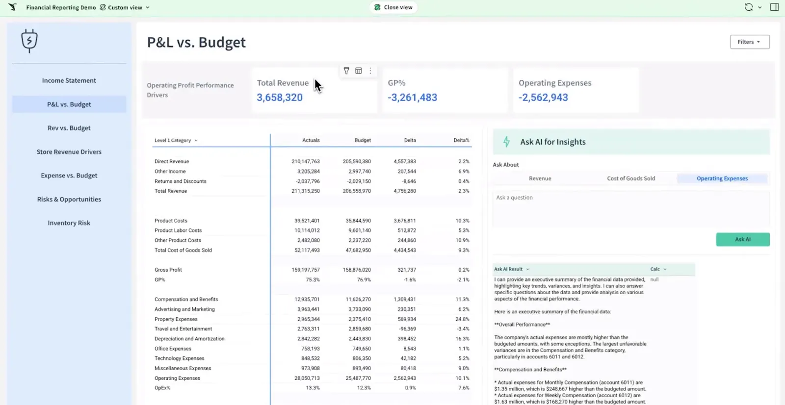
#6: Sigma
Best for: Teams that want spreadsheet-like analytics and AI-powered workflows on live warehouse data, without complex BI setup.
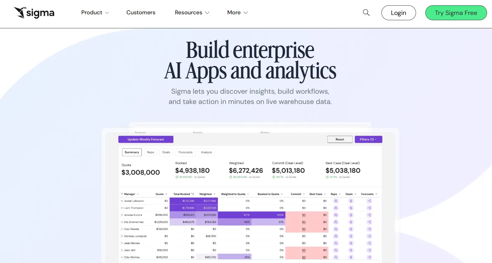
Sigma is a cloud-native analytics and AI apps platform that works directly on your data warehouse, combining the familiarity of spreadsheets with modern BI and embedded AI.
It’s designed for teams that want to explore data, build dashboards, and create operational analytics apps, all on live data.
Features
- Spreadsheet-style interface: Analyze data using formulas, tables, and logic that feel familiar to Excel users, making advanced analytics more accessible to business teams.
- AI-powered dashboards and apps: Use natural language and AI to build dashboards, reports, and full AI-powered data apps that support real business workflows.
- AI Apps for operations and planning: Build interactive apps for forecasting, capacity planning, sales pipelines, budgeting, and more without custom development.
Pricing
Sigma doesn’t publish its pricing.
You can contact its sales team directly to get a custom quote.
Pros & Cons
✅ Spreadsheet-like interface makes it easy for anyone used to Excel.
✅ Queries data directly from the cloud warehouse, so insights are always up to date.
❌ Limited visual customization with fewer chart types and design controls compared to some visual-first BI tools.
#7: Metabase
Best for: Startups, product teams, and data-lean organizations that want fast, self-serve analytics, natural language querying, and flexible embedding without enterprise BI complexity.
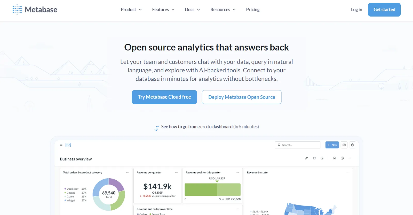
Metabase is an open-source analytics platform designed to help teams explore data, ask questions in plain English, and share insights without bottlenecks.
It’s especially popular with startups and SaaS companies that want simple, production-ready analytics without heavy setup.
Features
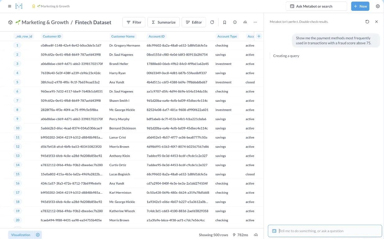
- Natural language analytics with Metabot AI: Ask questions in plain English and let AI generate queries and visualizations on top of live database data.
- No-code and SQL querying: Non-technical users can explore data visually, while analysts can write SQL and turn queries into reusable reports.
- Drill-through exploration: Click directly on charts to zoom in, filter, break out data, view underlying records, or auto-generate follow-up reports, so users can explore why something changed without writing a new query or asking a question.
Pricing
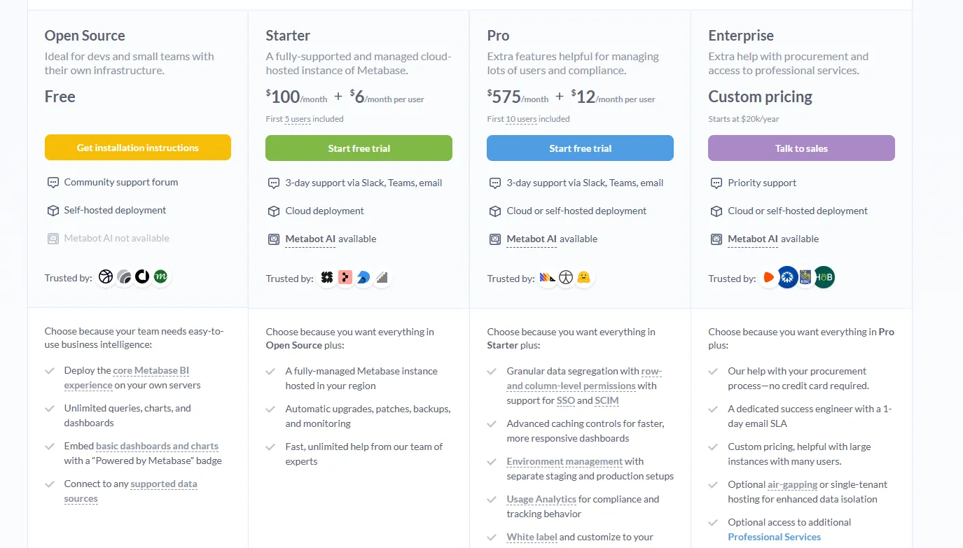
Metabase offers two pricing tracks depending on how you use the product: internal business intelligence or customer-facing embedded analytics.
- Business Intelligence:
- Open Source (Self-hosted): Free, self-hosted deployment, includes unlimited queries, charts, and dashboards, connects to all supported data sources, basic embedding with “Powered by Metabase” branding, community support only.
- Starter (Cloud-hosted): $100/month + $6/user/month, first 5 users included, includes everything in Open Source, plus option to include Metabot AI (charged extra), automatic upgrades, backups, and monitoring, support via Slack, Teams, and email (3-day SLA).
- Pro: $575/month + $12/user/month, first 10 users included, cloud or self-hosted deployment, includes everything in Starter, plus row- and column-level permissions, SSO and SCIM support, advanced caching and performance controls, staging + production environments, usage analytics and audit visibility, white-labeling, and embedded analytics capabilities.
- Enterprise: Custom pricing (starts at $20k/year), includes everything in Pro, plus priority support, dedicated success engineer (1-day email SLA), optional single-tenant or air-gapped deployment, and optional professional services.
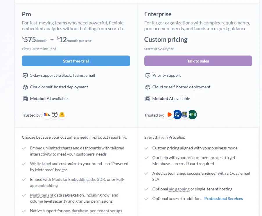
- Embedded Analytics pricing:
- Pro: $575/month + $12/user/month, first 10 users included, includes unlimited embedded dashboards and charts, full white-labeling, modular embedding, SDK, or full-app embedding, multi-tenant security (row- and column-level), one-database-per-tenant support, staging + production environments, usage analytics, internal BI for your team, and option to include Metabot AI (charged extra).
- Enterprise: Custom pricing (starts at $20k/year), includes everything in Pro, plus a dedicated success engineer, priority support, optional single-tenant or air-gapped hosting, and optional professional services.
Pros & Cons
✅ Strong drill-through and filtering for exploring data without starting from scratch.
✅ Fast to set up and lightweight, especially with common databases like PostgreSQL, MySQL, and Snowflake.
❌ Weaker for advanced analytics (complex calculations, deep modeling, large-scale governance).
#8: Mode
Best for: Data teams and business teams that want to work together in one place, combining SQL analysis, advanced analytics, and self-serve reporting without juggling multiple tools.
Mode is a modern business intelligence platform built to support both ad hoc analysis and self-serve reporting in a single workflow.
It helps teams move from raw data to decisions faster, without losing context or trust along the way.
Features
- SQL-first ad hoc analysis: Mode lets analysts dive straight into data using SQL, making it easy to explore, iterate, and answer complex questions quickly.
- Python & R notebooks for advanced analytics: You can send SQL results directly into Python or R notebooks to run deeper analysis, forecasting, or statistical models, all inside the same workspace.
- Interactive dashboards and visual exploration: Mode supports interactive dashboards and visual exploration of large datasets, helping teams spot trends and patterns directly in the browser.
Pricing
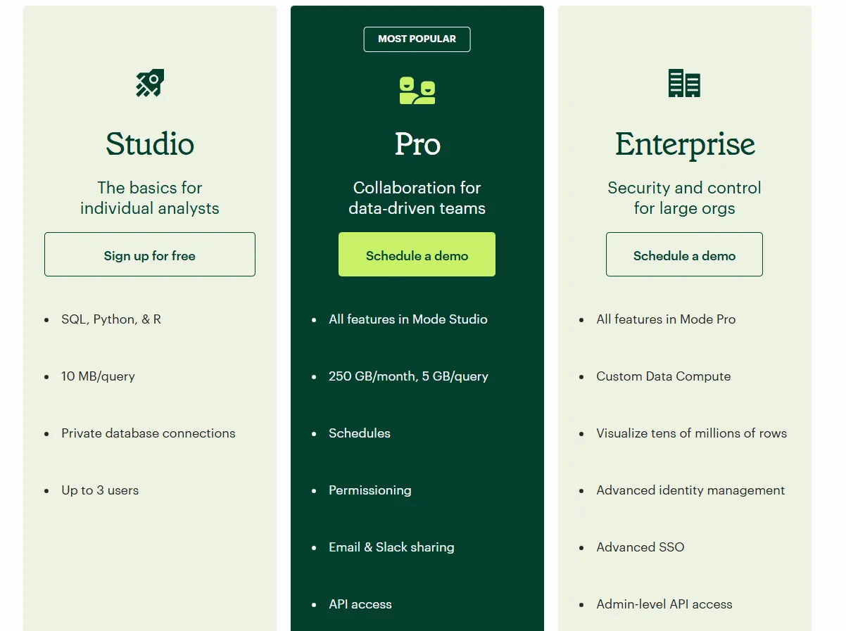
Mode offers three pricing tiers, starting with a free plan for individual analysts and scaling up to enterprise-grade analytics for large organizations:
- Studio: Free plan, includes SQL, Python, and R, private database connections, support for up to 3 users, and query limits of 10 MB per query.
- Pro: Custom price, includes everything in Studio and adds team collaboration features like scheduled reports, permissions, Email and Slack sharing, API access, higher data limits (250 GB per month, 5 GB per query), and standard support.
- Enterprise: Custom price, extends Pro with custom data compute, support for very large datasets, advanced identity management and SSO, admin-level API access, and premium support.
Pros & Cons
✅ Clean, role-based interface that makes it easy to track metrics, usage, and feature performance.
✅ Powerful combination of SQL, Python, R, and visualizations in one workflow.
❌ Performance can slow down noticeably with large datasets or complex queries.
#9: Domo
Best for: Mid-to-large teams that want an all-in-one BI platform combining data integration, dashboards, automation, and AI-driven actions.
Domo is an end-to-end analytics platform that connects data from virtually any source and turns it into interactive, real-time dashboards.
It goes beyond reporting by combining automation and built-in AI to help teams act on insights, not just analyze them.
Features
- Interactive dashboards & sharing: Build real-time, interactive dashboards that are easy to explore, share, and embed across teams, portals, or customer-facing apps.
- No-code analytics apps: Create custom, data-driven apps and reports tailored to business workflows without writing code or relying on developers.
- AI-powered insights & chat: Ask questions in natural language, surface hidden trends, and use AI agents to generate insights and automate decisions directly from dashboards.
Pricing
Domo essentially has one paid plan and a free trial.
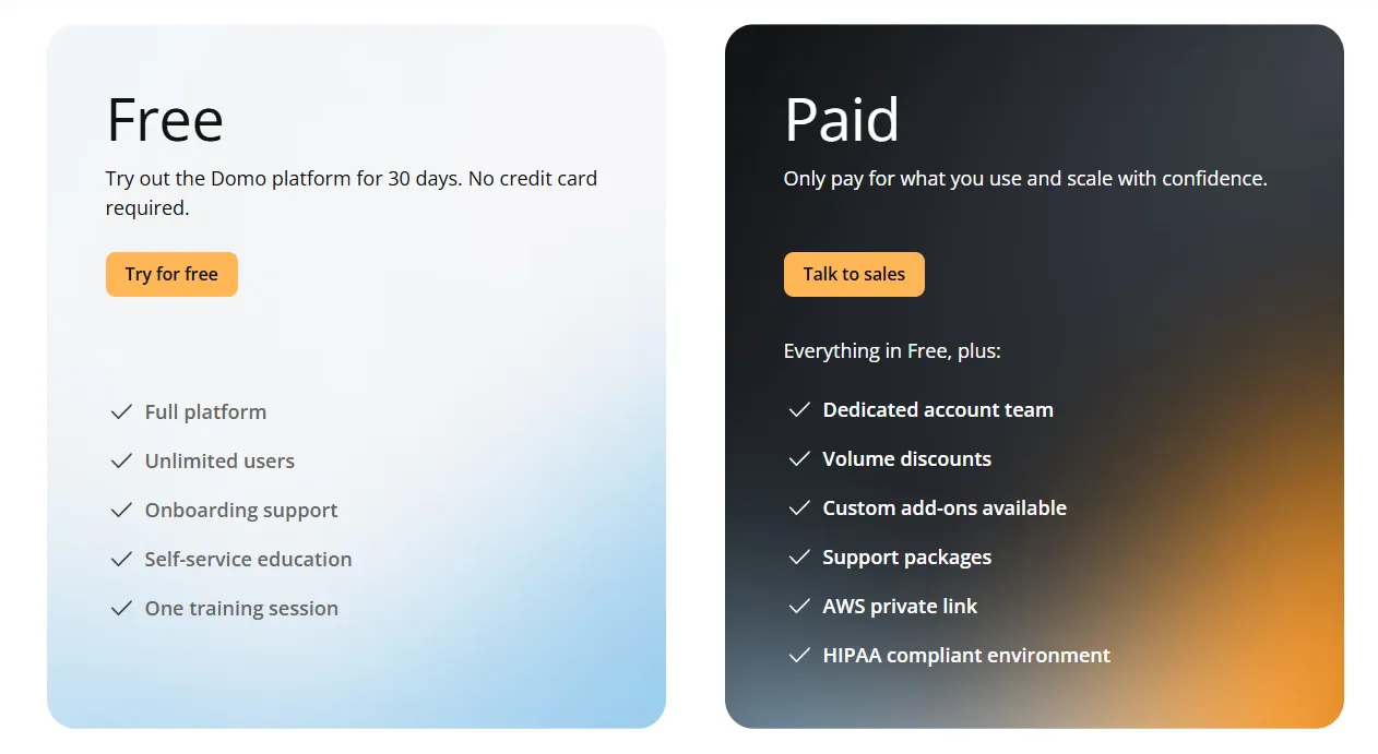
On the trial, you can try the full Domo platform for 30 days with no credit card required.
It includes unlimited users, full platform access, onboarding support, self-service education, and one guided training session.
The paid tier is a usage-based plan designed to scale as your analytics needs grow.
It includes everything in Free, plus a dedicated account team, volume discounts, custom add-ons, support packages, AWS PrivateLink, and a HIPAA-compliant environment.
For pricing details, you have to contact sales.
Pros & Cons
✅ Very easy to use for non-technical teams, with a clean interface and intuitive dashboards.
✅ Strong connector library makes it easy to centralize data from many tools in one place.
❌ AI features feel uneven and are sometimes pushed before they’re fully useful in real workflows.
#10: Zoho Analytics
Best for: Teams that want a powerful BI platform with strong AI features, lots of connectors, and an interface that both analysts and business users can work in comfortably - especially if they already use Zoho apps.
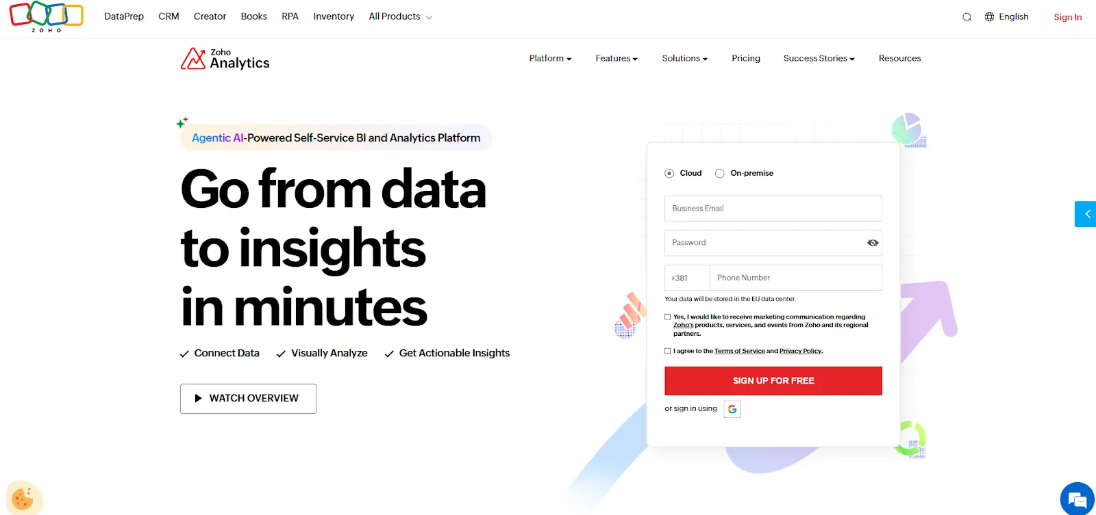
Zoho Analytics is an AI-powered business intelligence solution built on the Zoho platform that helps teams integrate data, prepare it, and turn it into interactive dashboards and insights.
It balances self-service reporting with advanced analytics, predictive AI, and embedded BI in one unified platform.
Features
- Ask Zia: Use natural language to analyze data, build reports, get insights, predictions, and recommendations through Zoho’s conversational AI agent.
- Data preparation & metrics layer: Clean, transform, enrich, and model data with 250+ no-code transformations while managing all business metrics centrally for consistency.
- Flexible dashboards & embedded BI: Create interactive dashboards with 50+ visualizations and embed analytics or AI assistants into apps, portals, or customer-facing products.
Pricing
Zoho Analytics has three pricing plans:
- Standard: $60/month, includes up to 5 users, 1M rows, unlimited workspaces, reports and dashboards, basic AI features, etc.
- Premium: $145/month, includes up to 15 users, everything in Standard, plus 5M rows, more advanced data integration options, all AI features (apart from AI studio).
- Enterprise: $575/month, includes up to 50 users, everything in Premium, plus 50M rows, advanced governance and security, and AI studio.

Pros & Cons
✅ Seamless integration with Zoho apps and popular third-party tools makes setup fast and reporting easy without heavy technical work.
✅ Intuitive dashboards, strong visualizations, and good value for money make it accessible for both business users and analysts.
❌ Data syncing isn’t always real-time, and exports (especially to Excel) can feel clunky for presentation-ready reporting.
Which Power BI alternative actually fits how your team works?
Microsoft Power BI is great at showing data, but many teams outgrow it once they need faster answers, less manual work, and fewer “can someone explain this chart?” moments.
Most Power BI alternatives still revolve around the same idea:
Better dashboards, better visuals, better governance, but the same manual interpretation.
Dot is different.
Instead of asking teams to build and maintain dashboards, Dot does the analysis for you.
You ask a business question, and Dot:
- Investigates the data.
- Explains what changed and why.
- Delivers a clear narrative with recommendations.
- And shows its work with a full audit trail.
No DAX. No dashboard hunting. No analyst bottlenecks.
So, if your reporting still eats hours every week or decisions slow down because insights don’t, Dot is worth a look.
Sign up for Dot’s free trial or book a demo to see how teams replace recurring Power BI reports with automated, decision-ready insights.
Related reading:
Theo Tortorici
Theo writes about AI-powered analytics, data tools, and the future of business intelligence at Dot.