
10 Best Domo AI Alternatives & Competitors In 2026
If you’re researching Domo AI alternatives, chances are you’ve realized dashboards alone don’t answer the deeper “why” behind your numbers.
I’ve worked with enough data teams to know that adding AI on top of BI doesn’t automatically remove bottlenecks, speed up analysis, or turn insights into action.
So, in this guide, I’ll break down the best Domo AI alternatives in 2026, including what they’re actually good at, where they fall short, and which type of team they truly fit.
TL;DR
- Domo AI helps teams move faster inside dashboards, but many organizations start looking elsewhere when they realize AI summaries don’t replace real analysis. As data grows and decisions become more complex, gaps around governance, pricing clarity, and truly decision-ready insights become harder to ignore.
- If what you actually need is fewer dashboards and clearer answers, Dot is the strongest Domo AI alternative in 2026. It connects directly to your warehouse, explains what changed and why in plain language, runs deeper investigations automatically, and delivers structured business reports where your team already works.
- Other alternatives typically fall into two groups: enterprise BI platforms focused on governance and scale (Looker, Strategy, SAP Analytics Cloud) and visualization-driven tools with AI add-ons (Power BI, Tableau, ThoughtSpot, Qlik, Sigma, Sisense). The difference comes down to this: do you want better dashboards, or do you want analysis done for you?
Why do some teams look for Domo AI alternatives?
Domo is a powerful, all-in-one BI platform.
Across reviews, teams consistently praise its Magic ETL and the fact that ingestion, transformation, and visualization live in one place.
But once use scales, governance becomes critical, and the need for AI features expands, a few recurring concerns show up.
Here are the most common reasons teams start exploring alternatives.
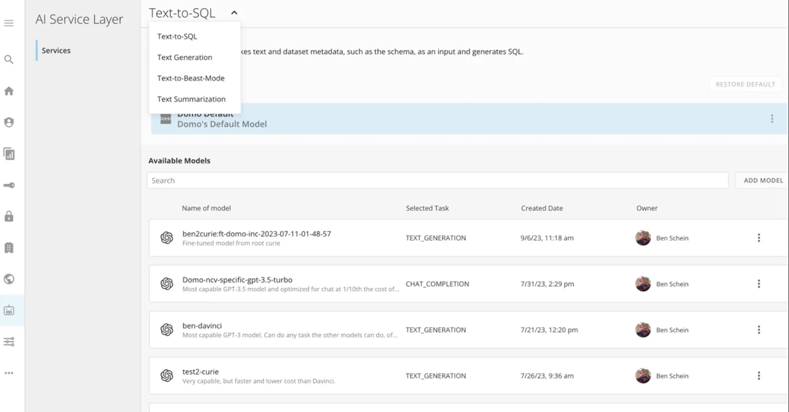
1. AI features feel underdeveloped for real-world workflows
While Domo promotes AI-powered capabilities, those features can feel early-stage or not fully thought through for complex, real-world use cases.
Namely, some reviewers note that newer features, especially Domo Apps and AI tools, sometimes feel rolled out before they’re fully refined.
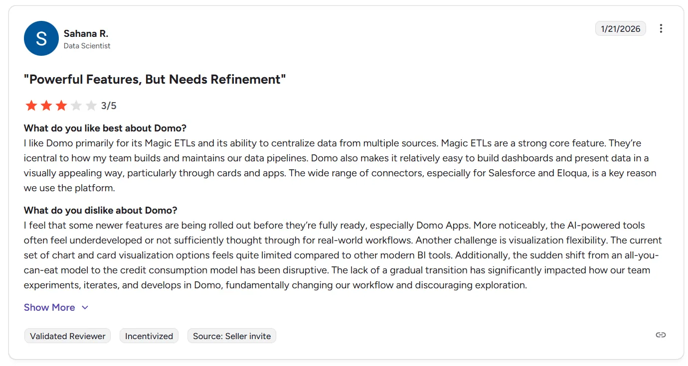
“I feel that some newer features are being rolled out before they’re fully ready, especially Domo Apps. More noticeably, the AI-powered tools often feel underdeveloped or not sufficiently thought through for real-world workflows.” - G2 Review
And I’ve noticed it myself when testing Domo AI Assistants: instead of deeply analyzing business questions, the AI layer can feel more like an add-on than a true analytical engine.
For teams expecting AI to actually reduce analyst bottlenecks and not just assist with dashboards, this quickly becomes a turning point.
2. Pricing and credit model complexity
Pricing is another issue with Domo AI.
Not only is its pricing opaque, making budgeting beforehand practically impossible, but teams that have already subscribed frequently report that:
- Pricing feels high as usage scales.
- Licensing can be confusing.
- Storage and user costs are hard to forecast.
- Cost visibility for admins could be better.
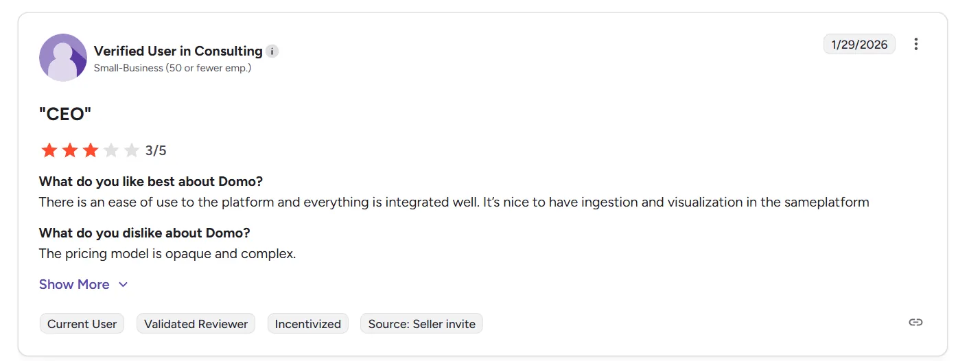
“The pricing model is opaque and complex.” - G2 Review
3. Governance and metric consistency can get messy
Domo makes ETL and dashboard building relatively easy, but several users point out that complex data modeling and centralized metric governance are weaker areas.
There’s no strong semantic layer, which can make it harder to enforce consistent metric definitions across larger organizations.
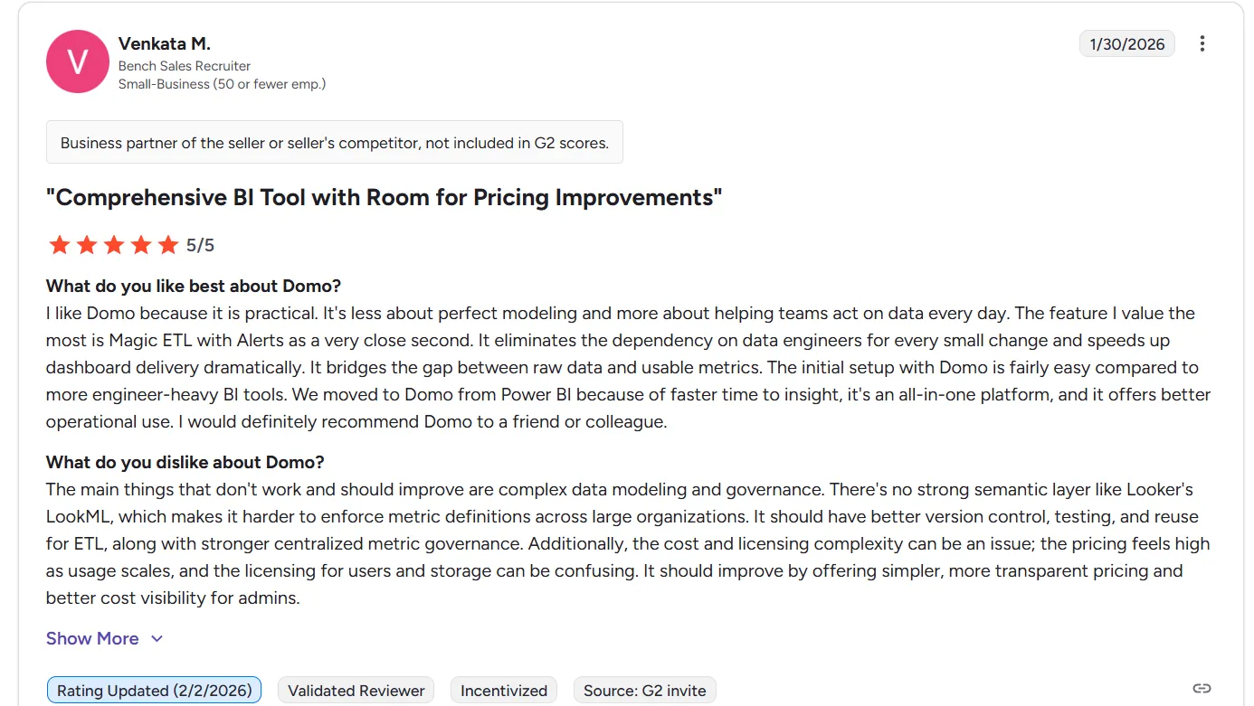
“The main things that don't work and should improve are complex data modeling and governance. There's no strong semantic layer like Looker's LookML, which makes it harder to enforce metric definitions across large organizations. It should have better version control, testing, and reuse for ETL, along with stronger centralized metric governance. Additionally, the cost and licensing complexity can be an issue; the pricing feels high as usage scales, and the licensing for users and storage can be confusing. It should improve by offering simpler, more transparent pricing and better cost visibility for admins.” - G2 Review
As a result, as companies grow:
- Version control becomes important.
- Testing and reuse of ETL logic matter more.
- Centralized metric governance becomes critical.
Without those guardrails, dashboard sprawl and metric inconsistency can creep in.
What are the 10 best Domo AI alternatives & competitors in 2026?
The top 3 Domo AI alternatives are Dot, Looker, and Microsoft Power BI.
And here are the top 10 platforms teams consider when evaluating alternatives to Domo AI:
| Tool | What It’s Best At | Entry Pricing |
|---|---|---|
| Dot | AI-native analytics agent that delivers full business analysis, explanations, and executive-ready reports directly from your warehouse (no dashboards required). | Free plan available; Paid plans start at $799/month |
| Looker | Governed BI with a centralized semantic layer (LookML) to enforce consistent metrics across teams. | Custom pricing (annual contract) |
| Microsoft Power BI | Widely adopted BI platform for dashboards, reporting, and modeling across the Microsoft ecosystem. | Free plan; $14/user/month (Pro) |
| Tableau | Advanced visual analytics with highly interactive dashboards and deep data exploration. | From $75/user/month (Creator – Cloud) |
| ThoughtSpot | Search-driven analytics with AI-powered exploration and instant insight generation. | From $25/user/month (Essentials) |
| Qlik Sense | Associative analytics engine for exploring complex relationships across datasets. | Custom pricing |
| Sigma | Spreadsheet-style analytics directly on live cloud warehouse data. | Custom pricing |
| Sisense | Embedded analytics platform for integrating dashboards into applications and products. | Custom pricing |
| SAP Analytics Cloud | Enterprise BI plus financial planning and predictive analytics in one unified SAP-native platform. | Custom pricing (via SAP BTP, 3–12 month contracts) |
| Strategy | Enterprise-grade governed analytics with semantic modeling and AI capabilities. | From $13/user/month (Standard, 50+ users) |
#1: Dot
When it comes to Domo AI alternatives, Dot stands out immediately because it doesn’t start with dashboards - it starts with answers.
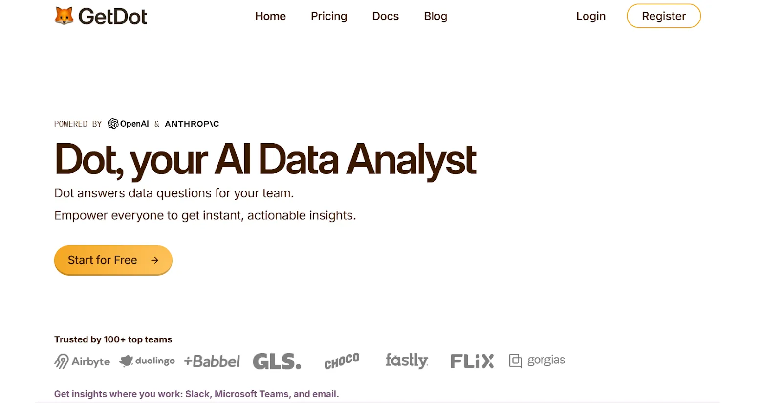
Dot is an AI analytics agent that connects directly to your data warehouse and delivers full business analysis, clear explanations, and concrete recommendations, and not just charts or visual summaries.
Instead of asking your team to build dashboards and then interpret them, Dot works like an AI analyst embedded in your company that understands your business context, investigates your data, and tells you what changed, why it changed, and what to do next.
Let’s dive into some of the features that make Dot a favorite Domo AI alternative for teams looking to actually understand their data.
1. Get instant answers to data-related questions directly where your team works
Most BI tools require users to navigate dashboards, filters, and models.
That works, but only for people who already understand the system.
Dot removes that friction.
Instead of creating Jira tickets or waiting days for a data team response, anyone can simply ask a question in Slack or Microsoft Teams and get a clear, contextual answer back in minutes.
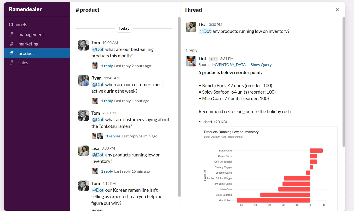
For example, you can ask “What was our revenue in Germany last month?”, or “How many active premium users did we have in March?”.
And since Dot understands business terminology and connects directly to your warehouse, it instantly retrieves data, visualizations, and explanations, all grounded in your actual data model.
This alone removes a major bottleneck, as non-technical stakeholders stop waiting and data teams stop fielding repetitive questions.
But chat is just the starting point.
2. Deep Analysis for autonomous multi-step investigations
Most AI layers in BI tools are built for faster exploration. They help you summarize dashboards, generate charts, or surface patterns.
Dot’s Deep Analysis goes further.
Instead of returning a quick answer, Dot switches into research mode, running multiple queries, checking different angles, comparing time periods, validating anomalies, and building a structured investigation on autopilot.
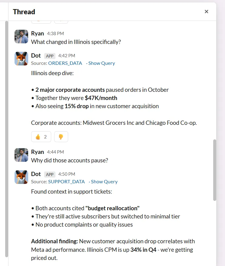
This is especially powerful for more complex, “why” questions, such as “Why did revenue drop in Q3?” or “What’s driving the increase in churn?”.
And instead of pointing you to a dashboard and expecting you to interpret it, Dot identifies the core drivers behind a change, quantifies the impact of each factor, highlights trends and outliers, and presents the findings in clear, plain language alongside the relevant charts and tables.
The result isn’t just a number or a visual, but a structured report with clear insights, supporting analysis, an executive summary, and concrete next steps you can actually act on.
The best part?
Every Dot insight includes a complete audit trail linking back to the exact SQL queries, logic, and datasets used.
So, if someone asks, “Where did this number come from?”, you can just click and see the source.
3. Context Agent that keeps metrics consistent
As companies grow, one of the biggest risks isn’t a lack of data, but inconsistent definitions.
Revenue means one thing in one dashboard, something slightly different in another, and suddenly, teams are debating numbers instead of making decisions.
Dot’s Context Agent, Root, is designed to prevent that.
Namely, Root automatically builds and maintains your company’s shared data knowledge by:
- Pulling business logic from existing dashboards.
- Creating clear metric definitions.
- Checking documentation against live data for inconsistencies.
- Keeping everything aligned as your data evolves.
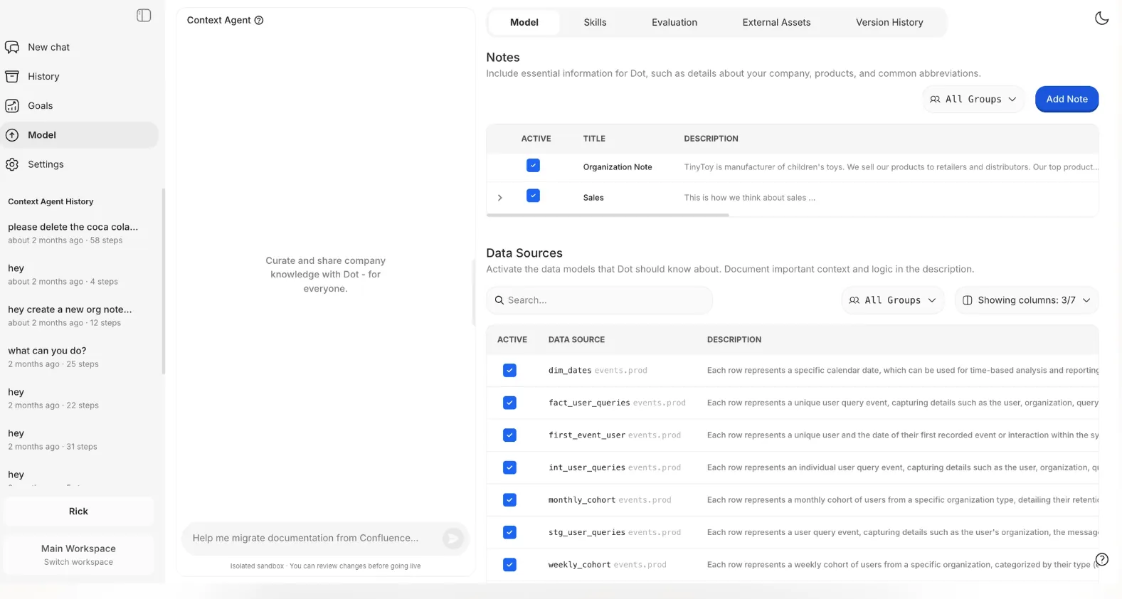
So instead of your team manually documenting hundreds of tables and hoping they stay accurate, Root does all the heavy lifting for you by continuously strengthening the foundation behind your analytics.
And since changes are version-controlled and reviewed before going live, governance stays controlled and transparent at all times.
4. Automated executive-ready business reports
Manual reporting is where a huge amount of analyst time disappears.
In many organizations, weekly and monthly business reviews require pulling numbers from dashboards, double-checking definitions, exporting charts into PowerPoint, writing explanations, and answering follow-up questions from leadership.
Dot removes that entire layer of manual work.
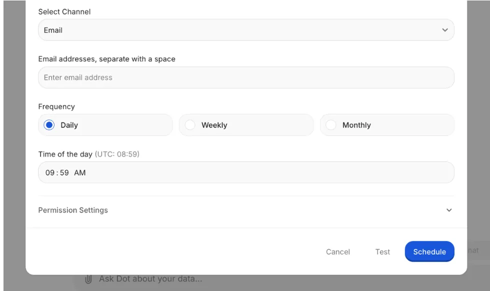
With automated business reports, Dot generates executive-ready reports on a recurring schedule - daily, weekly, or monthly - using live warehouse data.
These reports go beyond just numbers, as they explain what changed, why it changed, and what actions should be taken next.
Trends, anomalies, and performance shifts are highlighted automatically, so leaders don’t have to piece the story together themselves.
Reports can be delivered directly to Slack, Microsoft Teams, or email, so insights reach decision-makers where they already work.
That way, instead of asking analysts to prepare decks before every meeting, teams receive a structured business narrative that’s ready to review and discuss.
Dot’s integrations
Dot is built to work with the stack you already have, not replace it.
It connects directly to modern data warehouses like Snowflake, BigQuery, Redshift, and Databricks, as well as operational databases such as Postgres, MySQL, and SQL Server.
That means analysis happens directly where your data lives, with no exporting or copying into separate BI environments.
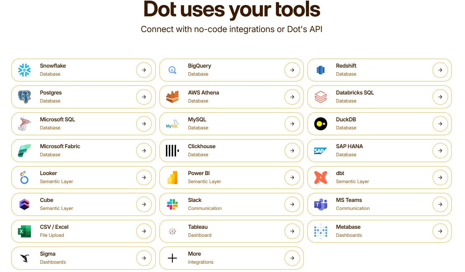
Dot also integrates with semantic and transformation layers like dbt, Looker models, Power BI models, and Cube, so it can reuse your existing business logic and metric definitions instead of forcing you to rebuild them from scratch.
Additionally, Dot fits naturally into daily workflows by sending insights into Slack, Microsoft Teams, email, or its web app. It can also run alongside tools like Tableau, Metabase, or Sigma, complementing existing dashboards rather than replacing them overnight.
The result is analytics that stay connected to your warehouse, respect the work your data team has already done, and surface insights exactly where decisions are made.
Pricing
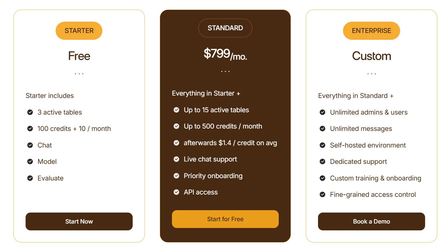
Dot uses a credit-based pricing model, with plans designed to scale from early experimentation to enterprise-wide usage:
- Starter: Free plan that lets you get started without committing, includes 3 active tables, 100 credits + 10 credits per month, chat-based analysis, and model & evaluation access.
- Standard: $799/month, includes everything in Starter, up to 15 active tables, up to 500 credits per month, additional credits at $1.40 per credit, live chat support, priority onboarding, and API access.
- Enterprise: Custom pricing, includes everything in Standard, unlimited users and admins, unlimited messages, self-hosted environment, dedicated support, custom onboarding and training, and fine-grained access controls.
How is Dot different from Domo AI?
Domo AI is built on top of a traditional BI platform. It helps you explore dashboards faster, generate summaries, and interact with reports using AI.
Dot takes a different approach.
Instead of layering AI onto dashboards, Dot replaces the need to interpret dashboards in the first place.
Here’s the difference in practical terms:
- Dashboards vs. direct answers: Domo still revolves around dashboards and visual exploration. Dot lets you ask questions in plain language and delivers clear answers with context, so there’s no dashboard navigation required.
- AI assistant vs. autonomous analysis: Domo is BI with AI layered on top. Dot is built as an AI-native system from the ground up that doesn’t layer intelligence onto dashboards, but automates analytical thinking itself.
- Visualization-first vs. governance-first: Domo focuses on connecting and visualizing data. Dot strengthens the layer underneath with consistent metric definitions and built-in governance.
- Manual reporting vs. automated business reviews: Domo shows the numbers. Dot automatically generates executive-ready reports explaining what changed and what to do next.
So, most simply put:
If Domo helps teams visualize performance, Dot helps them understand and act on it without adding more dashboards to manage.
Pros & Cons
✅ Very easy to use, as questions can be asked in plain language directly in Slack or Microsoft Teams with no dashboards or SQL required.
✅ Goes beyond charts by explaining what changed, why it changed, and what actions to consider.
✅ Capable of running deeper investigations, instead of just summarizing existing dashboards.
✅ Helps keep metric definitions consistent as companies scale, reducing dashboard sprawl and confusion.
✅ Automates recurring reports, removing the need for manual dashboards.
✅ Provides full query transparency, so every insight can be verified by the data team.
✅ Works on top of your existing warehouse.
✅ Flexible, transparent pricing.
❌ It’s not designed as a traditional dashboard builder, so it’s not the best choice for teams looking to create pixel-perfect dashboards.
#2: Looker
Best for: Data teams and enterprises that need a governed, scalable BI platform with strong data modeling and consistent metric definitions.
Looker is a cloud-based business intelligence platform from Google Cloud that helps organizations explore, analyze, and share real-time insights through interactive dashboards and reports, backed by a central semantic layer that ensures consistency across teams.
It connects directly to your data warehouse and lets data teams define metrics and logic centrally so business users can reliably access trusted analytics without writing SQL themselves.
Features
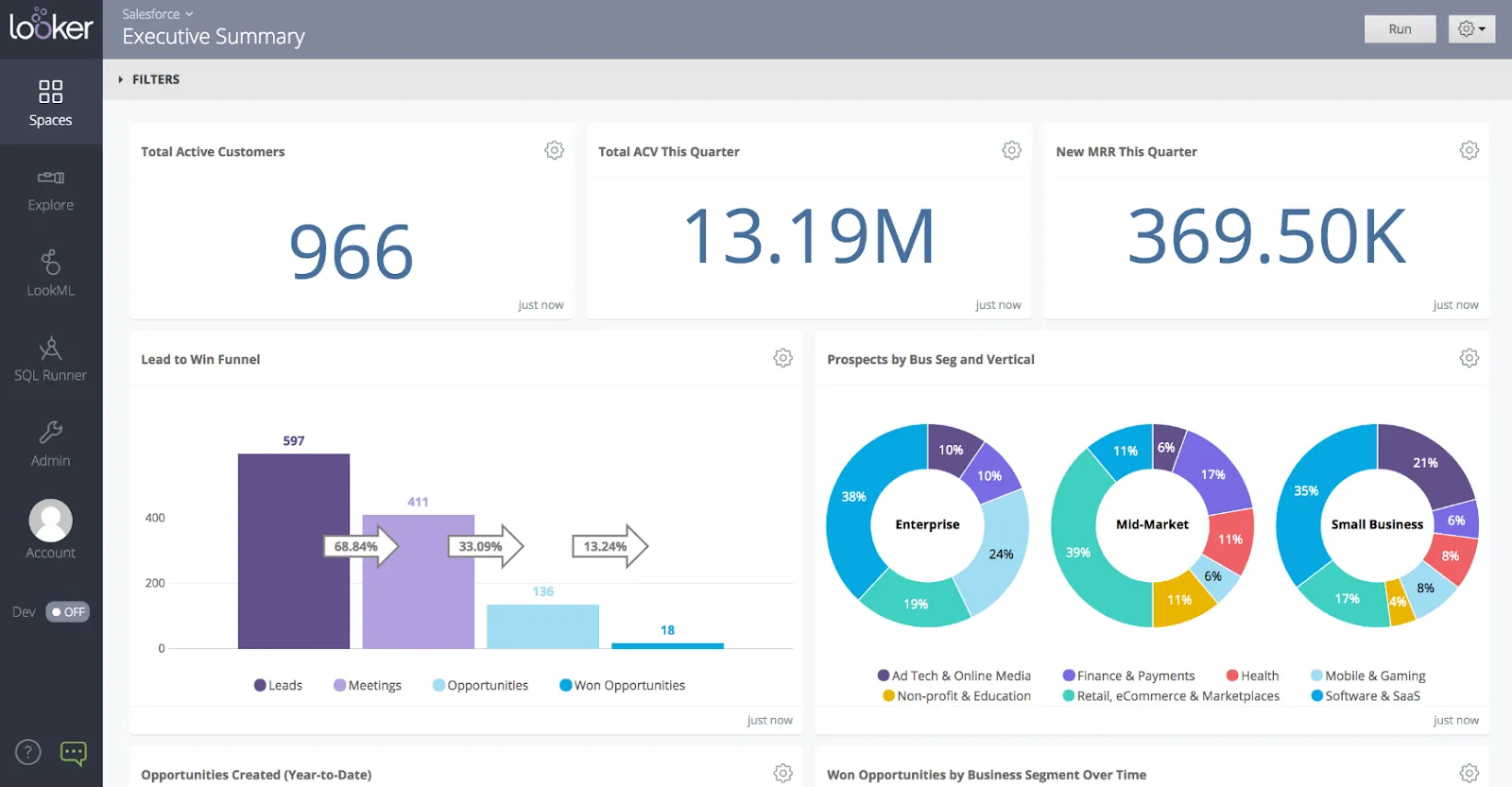
- Governed semantic layer (LookML): Define metrics, dimensions, and business logic centrally so every team works from the same consistent definitions across reports and dashboards.
- Interactive dashboards & data exploration: Build customizable dashboards and explore data through filters, drill-downs, and real-time queries powered by the semantic model.
- Gemini-powered conversational analytics: Ask questions in natural language and generate charts, summaries, and insights automatically, grounded in Looker’s governed data model.
Pricing
Looker uses a custom, contract-based pricing model made up of two parts: platform pricing (the cost of running a Looker instance) and user licensing (the cost per user type).
Pricing is annual for all plans.
- Platform editions:
- Standard: Designed for small teams or organizations with fewer than 50 users, includes 1 production instance, 10 standard users + 2 developer users, up to 1,000 query-based API calls/month, and up to 1,000 admin API calls/month.
- Enterprise: Built for larger internal BI and analytics use cases, includes everything in Standard, plus enhanced security features, up to 100,000 query-based API calls/month, and up to 10,000 admin API calls/month.
- Embed: Designed for embedding analytics into external products or applications, includes everything in Standard, plus up to 500,000 query-based API calls/month and up to 100,000 admin API calls/month.
- User licensing:
- Developer users: Full access to Looker, including LookML development, administration, APIs, and advanced tooling.
- Standard users: Can explore data, build dashboards and reports, run SQL, and schedule content.
- Viewer users: Read-only access to dashboards and reports, with filtering and drill-down.
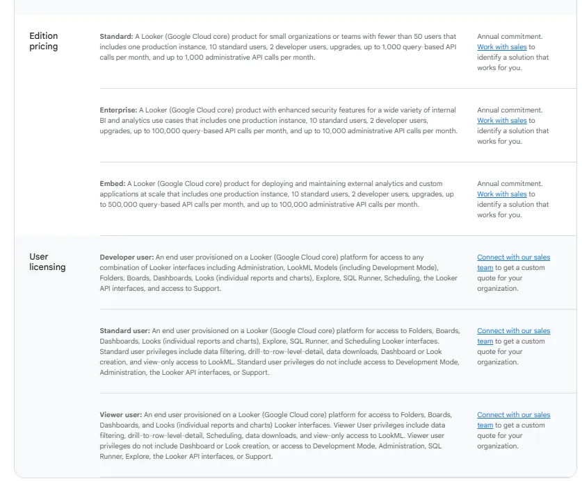
Pricing is custom on all plans and varies based on scale, permissions, and usage.
Pros & Cons
✅ Strong governance through LookML, ensuring company-wide metric consistency and reducing reporting errors.
✅ Flexible report customization with themes, comparisons, and downloadable PDF reports.
❌ Steep learning curve for LookML, often requiring SQL knowledge and data modeling expertise.
#3: Microsoft Power BI
Best for: Teams that want a widely adopted, scalable business intelligence platform to build interactive dashboards, reports, and visual analytics across the Microsoft ecosystem.
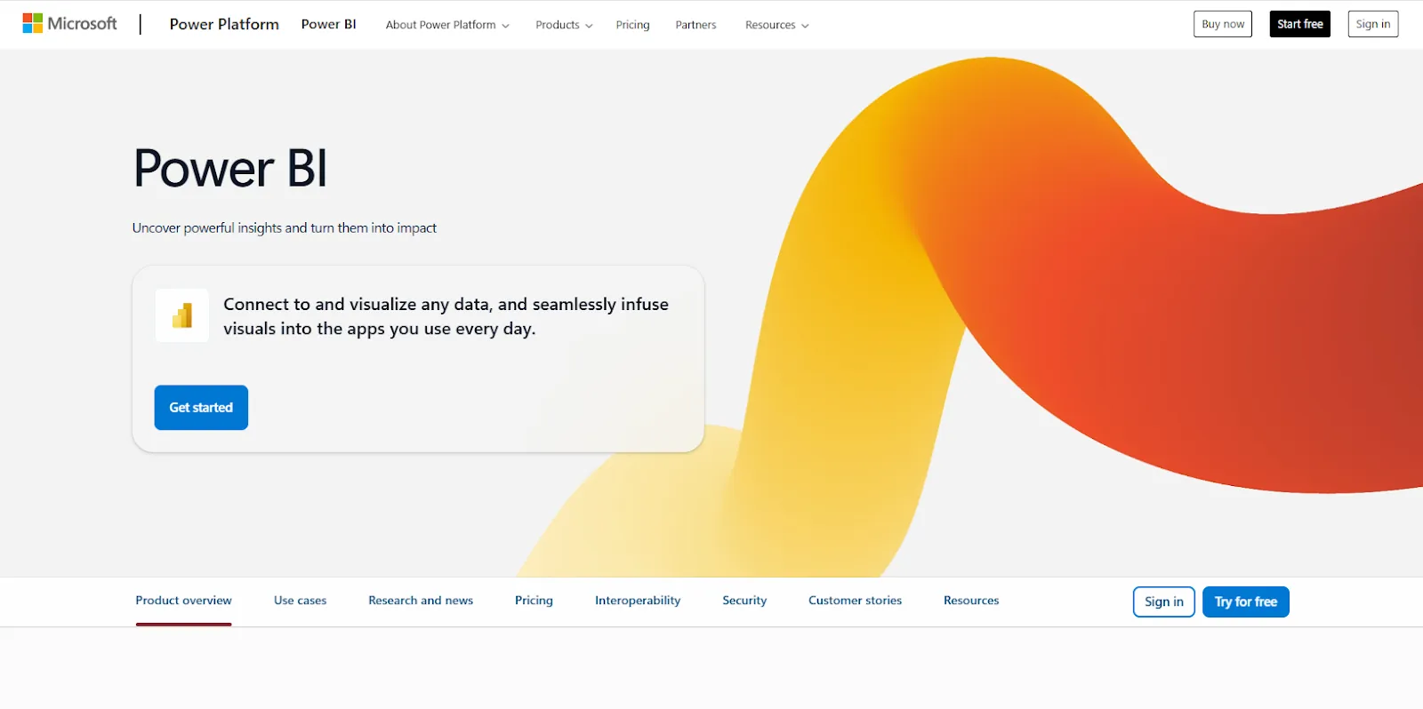
Microsoft Power BI is a business intelligence and data visualization platform that helps organizations connect to multiple data sources, transform raw data into insightful reports, and share interactive dashboards across teams.
It’s part of the Microsoft Power Platform and is designed to turn data into actionable insights for decision-making at all levels of the organization.
Features
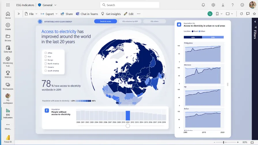
- Interactive dashboards & rich visualizations: Build dynamic reports using drag-and-drop visuals, custom charts, drill-downs, and real-time filtering to explore trends and performance metrics.
- Power Query data transformation: Clean, shape, and transform data from multiple sources using a built-in no-code/low-code data preparation engine.
- Copilot integration: Use Microsoft Copilot to generate report summaries, create visuals from natural language prompts, and surface automated insights directly within reports.
Pricing
Power BI uses a per-user and capacity-based pricing model, with different tiers depending on how reports are created, shared, and scaled across the organization.
There’s a Free plan, best for individual users exploring data on their own that includes building reports and dashboards for personal use, but no sharing or collaboration features.
The paid options include the following:
- Power BI Pro: $14/user/month, includes report publishing, sharing dashboards, collaboration in workspaces, and embedding in Microsoft Teams and SharePoint.
- Power BI Premium Per User: $24/user/month, includes everything in Pro, plus larger model sizes, more frequent refreshes, paginated reports, and advanced AI features.
- Power BI Embedded: Custom pricing, lets you create customer-facing reports, dashboards, and analytics in your own applications.
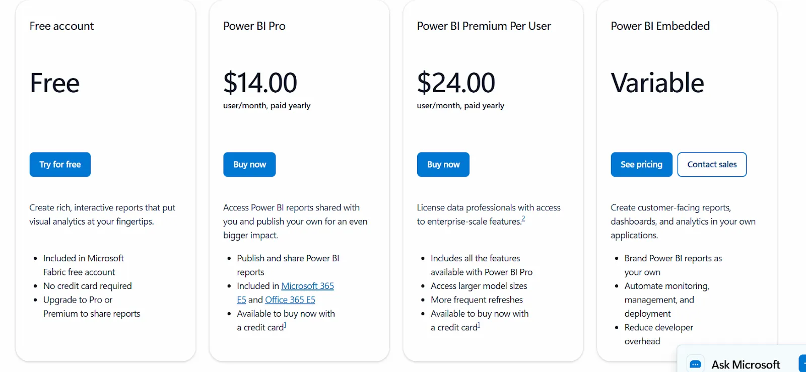
All plans are annual.
Pros & Cons
✅ Strong integration with Excel, Azure, SQL Server, Teams, and other Microsoft tools, making it a natural fit for Microsoft-based organizations.
✅ Reliable automation and refresh scheduling for recurring reporting.
❌ Performance can slow down with large or complex datasets, especially when data models aren’t optimized.
#4: Tableau
Best for: Organizations that prioritize advanced, highly customizable data visualization and interactive dashboards to explore and present insights visually.
Tableau is a leading business intelligence and visual analytics platform that helps users connect to data, explore trends, and create interactive dashboards without requiring coding knowledge, putting visual data exploration front and center.
Its tools are designed to make complex data easier to understand and communicate through rich visuals and intuitive interactions.
Features
- Advanced visual analytics & exploration: Build highly interactive dashboards using drag-and-drop visuals, rich charts, and drill-downs to explore data patterns.
- AI-powered analytics with Tableau Next: Agentic AI delivers insights in natural language, automates visualization tasks, and provides contextual recommendations throughout the workflow.
- Embedded analytics & sharing: Share dashboards across the organization or embed analytics into applications for broader access.
Pricing
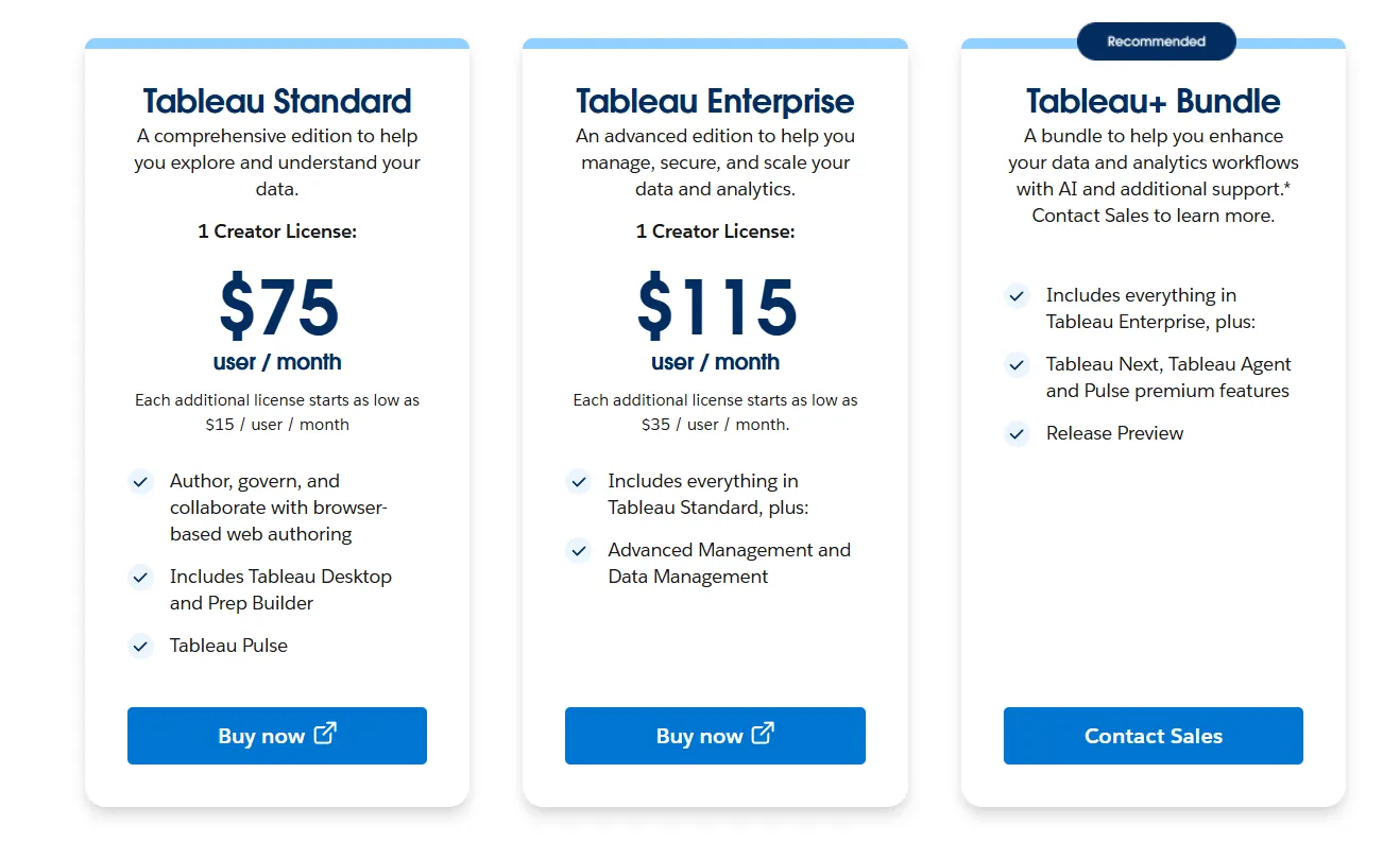
Tableau uses per-user, per-month pricing, with separate plans depending on whether you deploy Tableau in the cloud, on your own servers, or as part of its newer AI-driven offering:
- Tableau Cloud has three pricing plans:
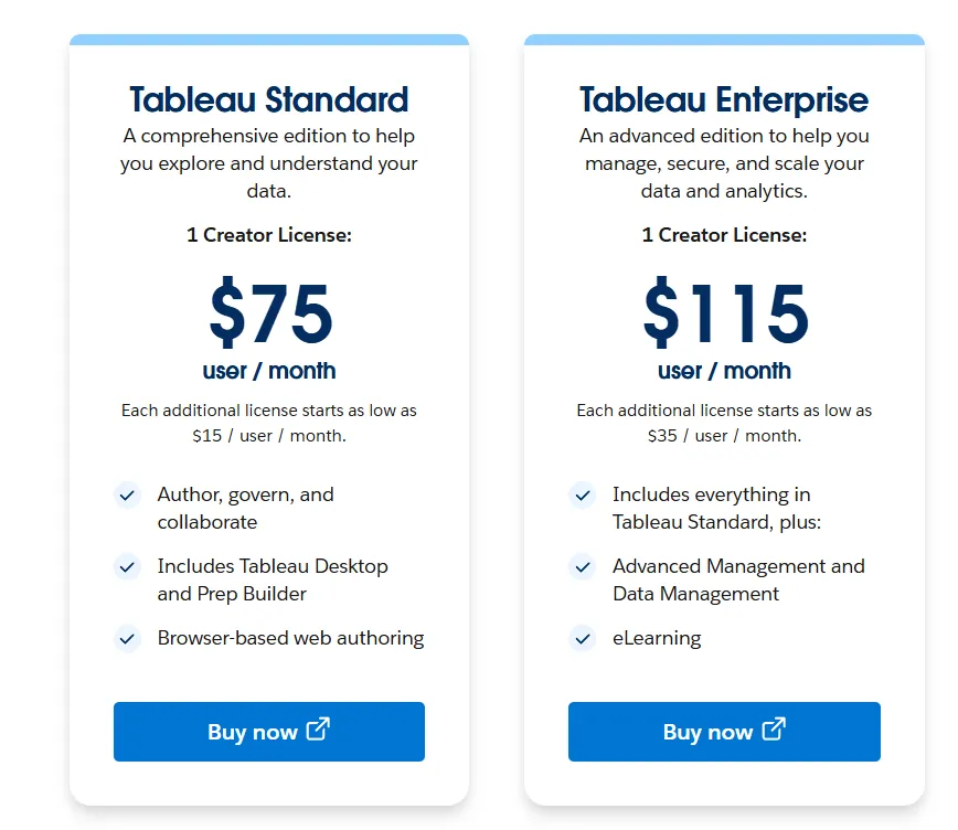
- Tableau Standard: $75 per 1 creator per month, with each additional license from $15 per user/month, includes browser-based authoring and collaboration, Tableau Desktop and Prep Builder, Tableau Pulse for metrics and insights.
- Tableau Enterprise: $115 per 1 creator per month, with each additional license from $35 per user/month, includes everything in Standard, plus Advanced Management and Data Management for governance and scale.
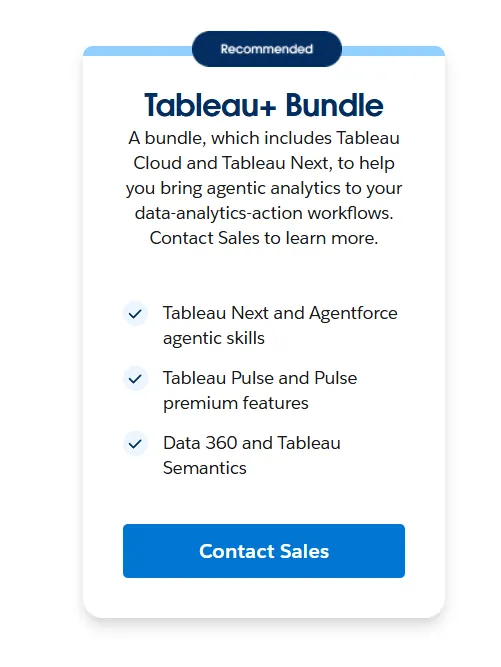
- Tableau+ Bundle (Cloud + AI): Custom pricing, includes everything in Tableau Enterprise, plus Tableau Next, Tableau Agent, and Pulse premium features, with access to release previews and early AI capabilities.
- Tableau Server has two pricing plans:
- Tableau Standard: $75 per 1 creator per month, with each additional license from $15 per user/month, includes authoring, governance, and collaboration and Tableau Desktop and Prep Builder.
- Tableau Enterprise: $115 per 1 creator per month, with each additional license from $35 per user/month, includes everything in Standard, plus Advanced Management, Data Management, and eLearning.
- Tableau Next (agentic analytics): Requires an annual contract, includes agentic analytics via Agentforce, Tableau Semantics, Tableau Pulse (including premium), and Data 360.
Pros & Cons
✅ Intuitive drag-and-drop interface that makes building dashboards easy, even without deep technical skills.
✅ Powerful data visualization capabilities with a wide range of chart types and advanced mapping features.
❌ Advanced features and complex calculations come with a steep learning curve.
#5: ThoughtSpot
Best for: Teams that want search-driven analytics that lets business users ask questions in natural language and provides instant insights without requiring deep technical skills.
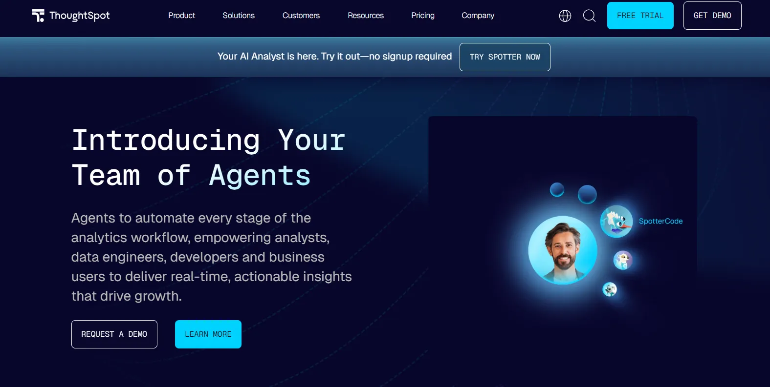
ThoughtSpot is an AI-powered analytics and business intelligence platform built around a search interface that lets anyone ask questions of their data and get answers, visualizations, and insights in seconds.
It’s designed to bring powerful analytics to a broad range of users, from frontline teams to executives, by combining enterprise-grade scale with intuitive natural language search.
Features
- Auto-analysis & trend detection: Automatically analyzes large datasets to surface hidden patterns, trends, anomalies, and correlations that might be missed in manual exploration.
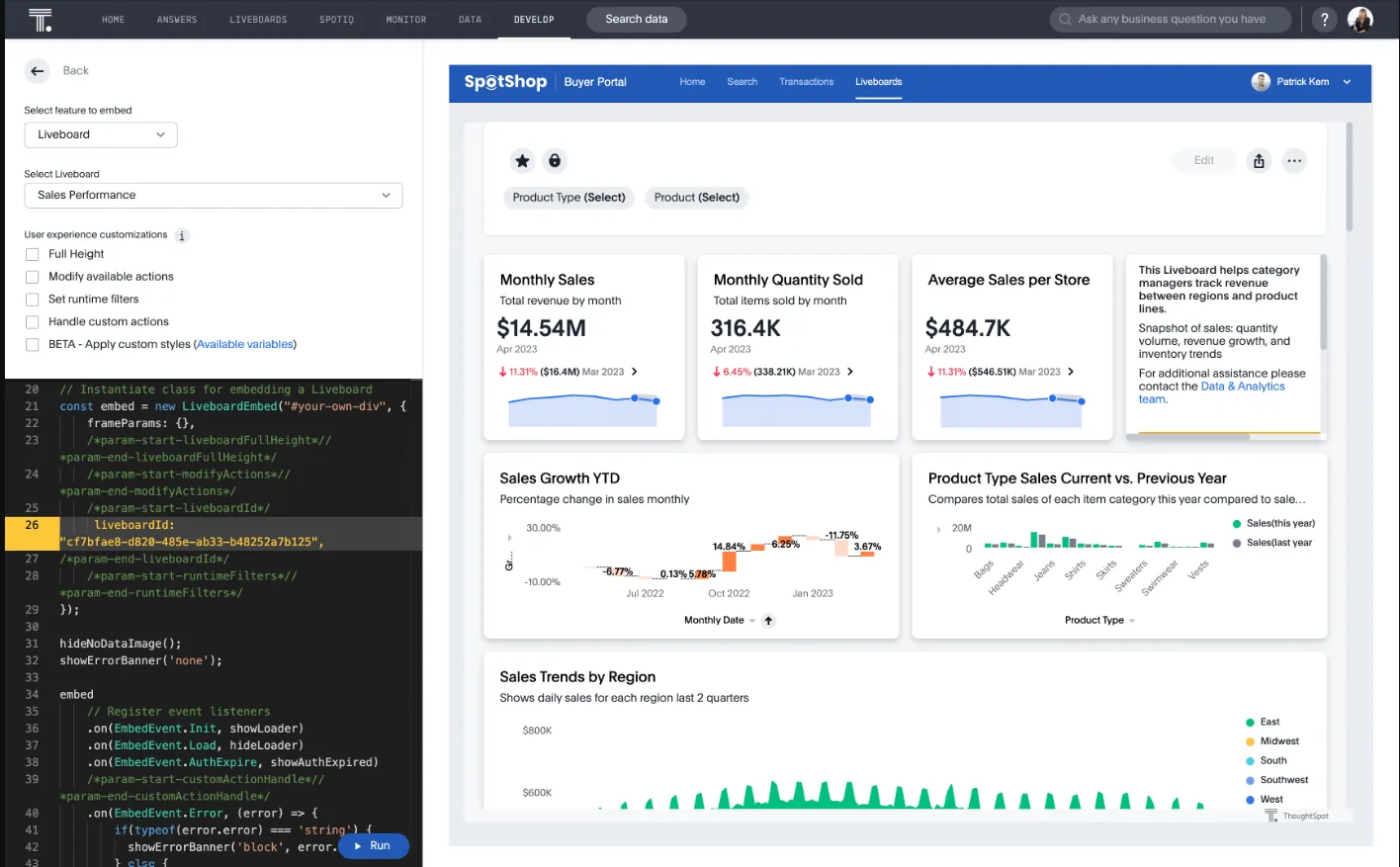
- SpotterViz: Turns raw data into a fully structured Liveboard in minutes, with AI planning the story, generating insights, and building the dashboard layout, styling, and visuals.
- SpotterModel: Turns raw data into governed semantic models by mapping relationships, measures, and dimensions to ensure consistent metric definitions.
Pricing
ThoughtSpot offers two separate products - ThoughtSpot Analytics for internal BI and ThoughtSpot Embedded for building analytics into applications - each with flexible pricing depending on scale and usage:
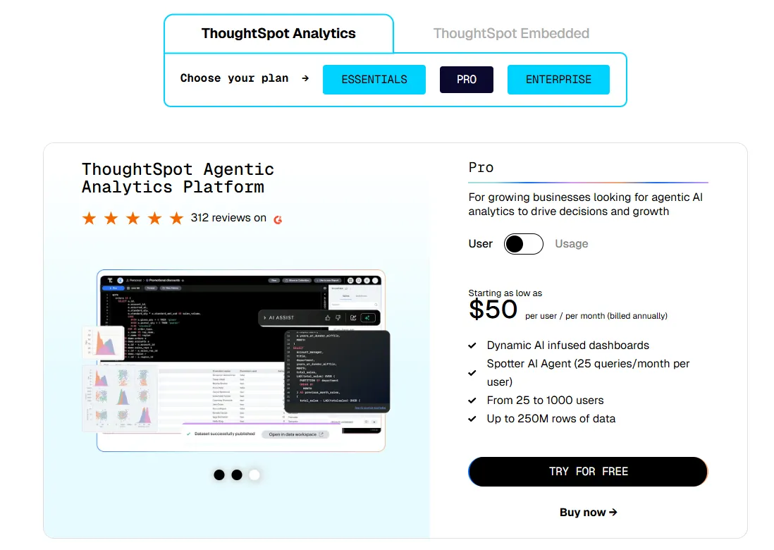
- ThoughtSpot Analytics:
- Essentials: From $25 per user per month (billed annually), for teams of 5-50 users, includes dynamic interactive dashboards and AI-powered insights and supports up to 25M rows of data.
- Pro (per user pricing): From $50 per user per month (billed annually), for 25–1,000 users, includes everything in Essentials, plus AI-infused dashboards and Spotter AI Agent (25 queries per user/month), and supports up to 250M rows of data.
- Pro (usage-based): From $0.10 per query, includes everything in Pro per user, and adds Analyst Studio.
- Enterprise (user or usage-based): Custom pricing, includes everything in Pro, plus unlimited users and data.
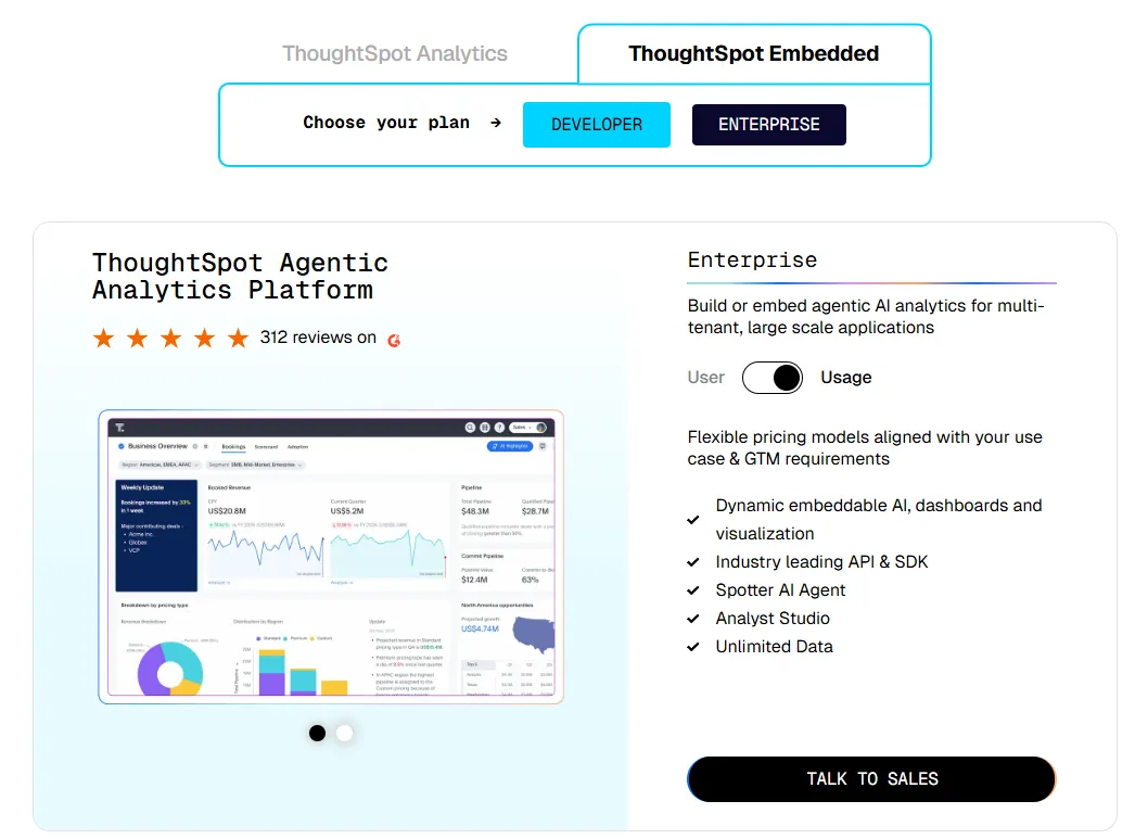
- ThoughtSpot Embedded:
- Developer: Free for 1 year, includes embeddable AI analytics, dashboards, and visualizations, APIs and SDKs, up to 10 users and 25M rows of data.
- Enterprise (user-based): Custom pricing, includes everything in Developer, plus unlimited data.
- Enterprise (usage-based): Custom pricing, everything in Enterprise, plus Spotter AI Agent and Analyst Studio.
Pros & Cons
✅ Very strong self-service experience, allowing non-technical users to search data in plain English like a web search.
✅ Live connection to cloud warehouses supports real-time querying at large scale.
❌ Steep learning curve despite the “search-first” interface, especially when building models or advanced reports.
#6: Qlik Sense
Best for: Teams that want a self-service BI and analytics platform that combines flexible visual exploration with AI-augmented insights in on-premise environments.
Qlik Sense is a modern business intelligence and analytics platform built on the Qlik platform that empowers users across all skill levels to explore data, build interactive dashboards, and uncover insights in real time.
It brings analytics to life with a unique associative engine and AI-powered augmented analytics that help teams find answers faster and act more confidently.
Features
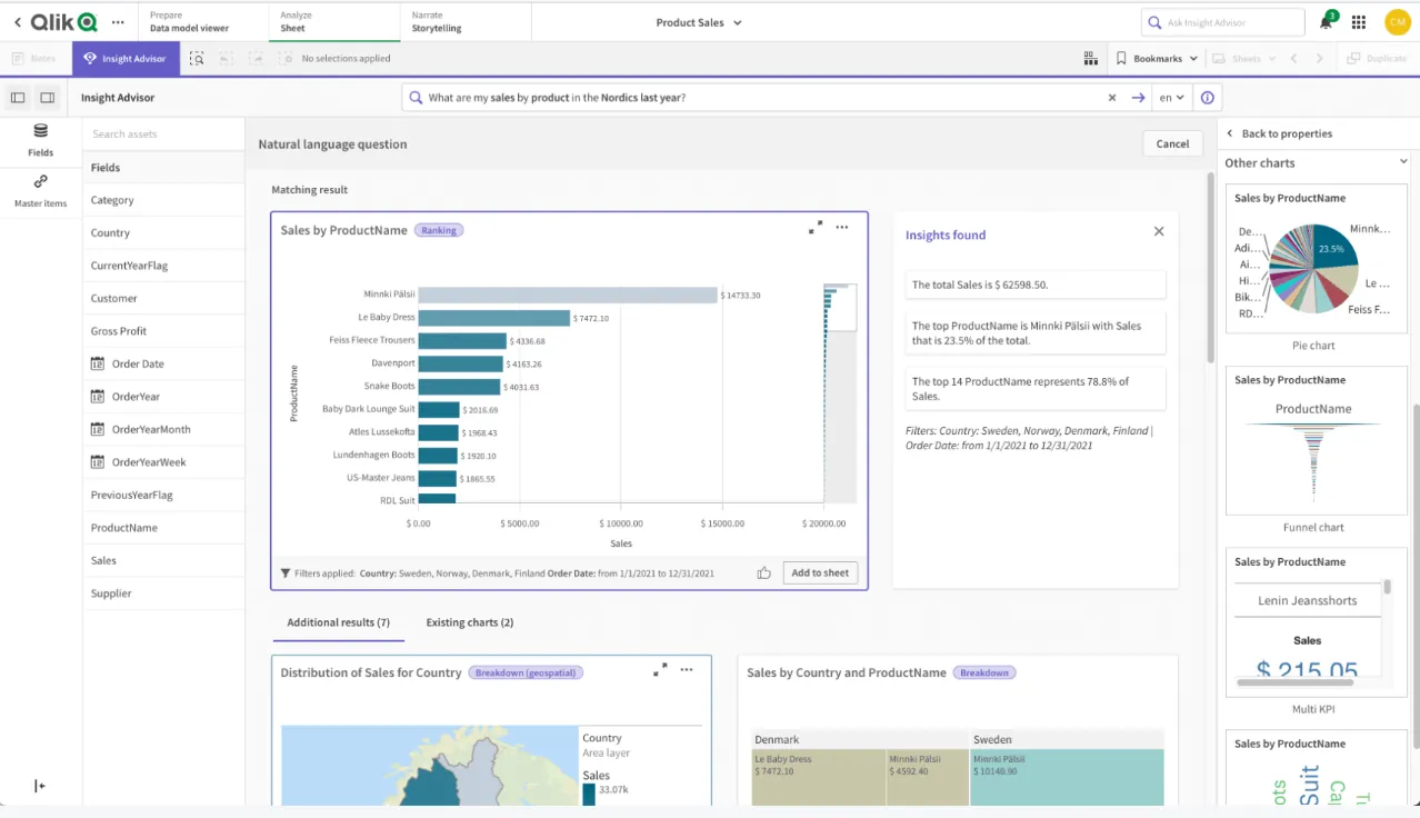
- Associative analytics engine: Explore data freely without predefined drill paths, as Qlik’s associative engine automatically reveals relationships and hidden connections across datasets.
- AI-powered analytics: Use AI to generate insights, visualizations, and suggestions automatically based on your data and natural language queries.
- Augmented analytics & AutoML: Leverage built-in machine learning capabilities to create predictive models and uncover trends without needing deep data science expertise.
Pricing
Qlik doesn’t publish pricing for its Qliq Sense product.
Its website states that you must contact sales for a custom quote.

Pros & Cons
✅ Connects to multiple data sources with solid integration capabilities.
✅ Powerful data transformation and scripting capabilities for advanced users.
❌ Pricing can be high, especially when scaling to many users.
#7: Sigma
Best for: Data teams and business users who want a spreadsheet-like analytics experience that works directly on live cloud warehouse data without moving or duplicating it.
Sigma is a cloud-native business intelligence platform that lets teams explore, model, and visualize data using a familiar spreadsheet-style interface while querying data directly in their warehouse.
It combines BI, data modeling, and analytics apps in one environment, allowing both technical and non-technical users to collaborate on live, governed data.
Features
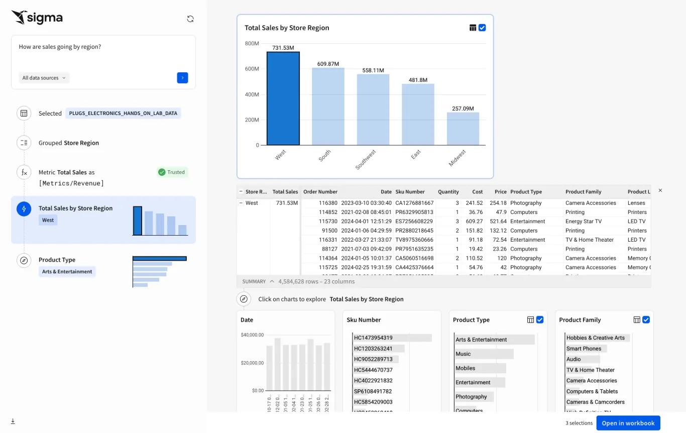
- Spreadsheet-style interface on live warehouse data: Analyze and manipulate cloud data using a familiar spreadsheet-like experience while querying directly in Snowflake, BigQuery, Databricks, or Redshift.
- Ask Sigma: Use natural language prompts to generate analyses, create visualizations, and accelerate data exploration with AI-assisted insights directly inside the platform.
- Embedded analytics & data apps: Create interactive analytics applications that can be embedded into internal tools or customer-facing products.
Pricing
Sigma doesn’t publish its pricing.
You can contact its sales team directly to get a custom quote.
Pros & Cons
✅ Familiar spreadsheet-style interface that makes analytics accessible to non-technical users.
✅ Easy initial setup and intuitive for business users.
❌ Performance can slow down with very large or complex workbooks.
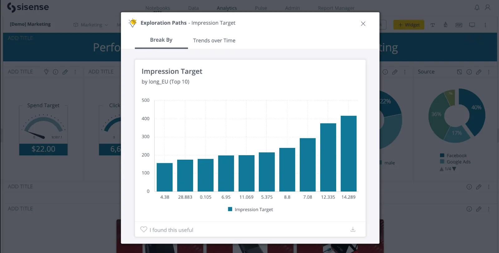
#8: Sisense
Best for: Teams and product builders who want a flexible, scalable analytics platform that combines BI, embedded analytics, and AI-powered insights across applications and workflows.
Sisense is an AI-driven analytics and business intelligence platform that helps organizations connect, model, visualize, and embed data insights into everyday workflows and applications without heavy engineering work.
Its comprehensive suite of tools is designed to bring data to users wherever they work and make insights actionable at scale.
Features
- Composable analytics: Build flexible analytics workflows by combining data modeling, visualization, and embedding capabilities into modular components tailored to your needs.
- Elastic data modeling: Connect and model data from multiple sources, blending cloud, on-prem, and third-party data into governed datasets.
- Sisense Intelligence: A conversational AI layer that helps users build dashboards, generate visualizations, create natural-language summaries, and query governed data models using their preferred LLM.
Pricing
Sisense didn’t make its pricing public.
You can contact its sales team directly and ask for a custom quote.
Pros & Cons
✅ Powerful customization options for advanced users (scripts, widgets, embedded use cases).
✅ Solid embedded analytics capabilities for product teams.
❌ Not the most user-friendly UI for non-technical users, especially when it comes to more advanced features.
#9: SAP Analytics Cloud
Best for: Enterprises that want to combine business intelligence, financial planning, and predictive analytics in one unified platform, especially within the SAP ecosystem.
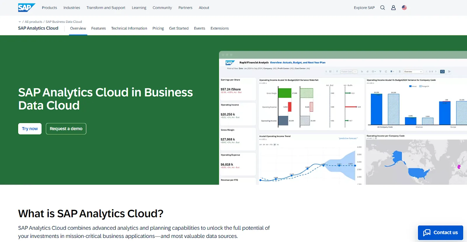
SAP Analytics Cloud is an all-in-one analytics and planning solution that brings together BI, augmented analytics, predictive forecasting, and enterprise planning in a single cloud platform.
Built to integrate deeply with SAP applications and data environments, it helps organizations connect operational data with financial and strategic decision-making.
Features
- Joule Copilot: A generative AI copilot that lets you automate reporting, generate insights, assist with planning tasks, create calculations, and simplify complex analytics workflows using natural language prompts.
- Unified BI & analytics: Deliver self-service dashboards and reports while preserving business process semantics across mission-critical SAP systems.
- Scenario simulation & risk modeling: Run complex simulations to evaluate best-case, worst-case, and realistic business outcomes across key drivers.
Pricing
SAP Analytics Cloud does not list fixed public pricing tiers.
To purchase SAP Analytics Cloud, you license it through SAP Business Technology Platform (SAP BTP), either via:
- Pay-As-You-Go for SAP BTP.
- SAP BTP Enterprise Agreement.
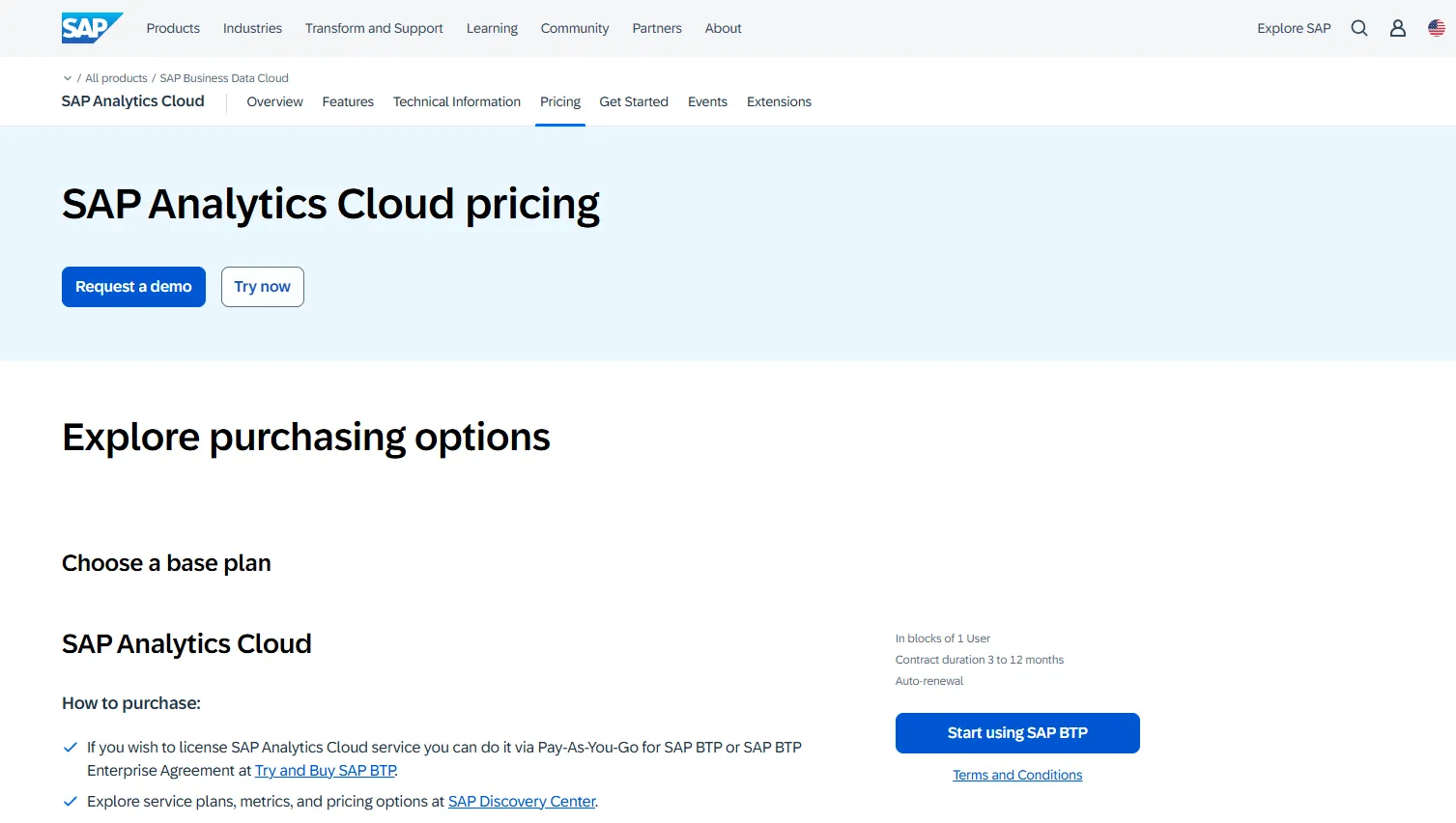
Contracts typically range from 3 to 12 months and include auto-renewal options.
Because pricing depends on usage, infrastructure, and enterprise agreements, you need to contact SAP directly or use the “Try and Buy SAP BTP” route to get a quote.
Pros & Cons
✅ Combines BI, analytics, and enterprise planning in one unified platform.
✅ Strong integration with SAP systems for real-time, trusted data.
❌ Pricing is high, particularly for smaller organizations.
#10: Strategy
Best for: Large enterprises that need highly governed, scalable analytics with strong AI capabilities across complex data environments.
Strategy is an enterprise analytics platform that combines business intelligence, AI-powered insights, and semantic governance into one unified environment.
It is designed to support large-scale deployments, centralized metric consistency, and advanced analytics across cloud and on-premise systems.
Features
- Semantic layer: Define centralized, governed metrics and business logic once and reuse them consistently across dashboards, reports, and applications.
- Comprehensive AI tools: Use conversational AI to pull quick answers from your data sources, build granular dashboards, and get instant insights.
- Embedded & API-driven analytics: Integrate analytics into applications and workflows through APIs and SDKs.
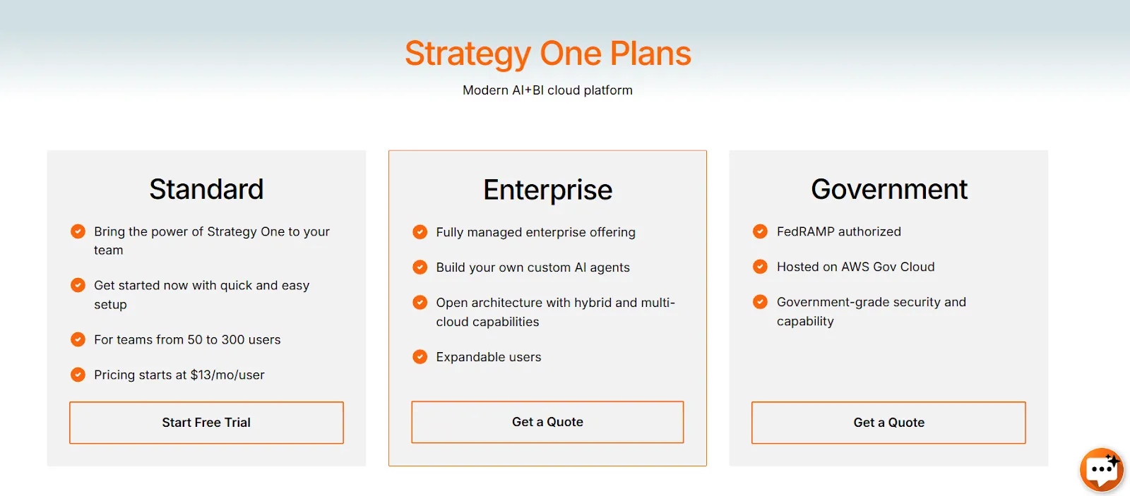
Pricing
Strategy offers three main pricing tiers:
- Standard: Starting from $13 per user per month, designed for teams of 50 to 300 users, includes the core capabilities of Strategy One with quick setup and onboarding.
- Enterprise: Custom pricing, includes everything in Standard, plus fully managed enterprise offering with support for custom AI agents, hybrid and multi-cloud deployments, and expandable user capacity.
- Government: Custom pricing, built for public sector organizations, FedRAMP authorized, hosted on AWS GovCloud, and designed with government-grade security standards.
Pros & Cons
✅ Highly flexible dashboards with drill-down and advanced formatting options.
✅ User-friendly interface.
❌ Metric logic and advanced configurations can feel complicated.
Choosing the right Domo AI alternative in 2026
If you’re evaluating Domo AI alternatives, it likely means you want more than dashboards with an AI layer on top.
You want faster answers, clearer explanations, stronger governance, and analytics that actually reduce bottlenecks instead of adding complexity.
While tools like Looker, Power BI, Tableau, ThoughtSpot, and others each have strengths, many still rely heavily on dashboard building and manual interpretation.
Dot takes a different approach. It acts like an AI analyst embedded in your company, answering questions in plain language, running deep multi-step investigations, generating executive-ready reports, and keeping your business logic consistent through its Context Agent.
If your goal is to move from dashboards to decision-ready analysis, Dot is the strongest Domo AI alternative in 2026.
Start with Dot’s free plan or book a demo to see how AI-native analytics should actually work.
Read more
- 10 Best MindsDB Alternatives & Competitors In 2026 - Explore the top MindsDB alternatives for teams that want more than embedded ML, including tools that turn raw warehouse data into clear, decision-ready insights.
- 10 Best Microsoft Power BI Alternatives & Competitors In 2026 - Looking beyond Power BI? Discover the best alternatives in 2026 for teams that need stronger governance, faster analysis, or AI-driven insights without dashboard overload.
Theo Tortorici
Theo writes about AI-powered analytics, data tools, and the future of business intelligence at Dot.