
10 Best Marketing Data Visualization Tools In 2026
I'll go over the 10 best marketing data visualization tools in 2026, what each one is actually built for, and what you'd pay for it.
TL;DR
- Dot is the best marketing data visualization tool in 2026 for teams whose campaign data has already landed in a warehouse, because it writes the analysis straight into Slack, Microsoft Teams, email, or the web app, keeps the query behind every figure one click away, and charges nothing per seat.
- Data Studio and Microsoft Power BI are general-purpose BI tools pointed at marketing data, and when you're already paying Google or Microsoft for everything else, either one is the cheapest route to a working report.
- Databox, AgencyAnalytics, Whatagraph, and Klipfolio are purpose-built marketing reporting platforms that ship with ad-platform connectors, client portals, white-label branding, and report templates in the box.
- Supermetrics, Funnel, and Improvado are the marketing data pipelines that collect campaign data and hand it to something else to draw, and for a lot of teams that layer is the piece actually missing.
What are the best marketing data visualization tools in 2026?
Dot ranks first for marketing and data teams who would sooner read the analysis than interpret another dashboard, with Data Studio and Databox close behind on cost and time to a working report.
Four things decided what made this shortlist:
- The tool reaches marketing data somehow, whether through native ad-platform connectors or through the warehouse that campaign data already flows into.
- The visualization or analysis layer comes with the product, not as a second purchase.
- Whatever it costs is publicly checkable, even where the top tier is quoted by sales.
- The capability is generally available today, never a roadmap item.
Here's the full shortlist.
Tool | Category | Use case | Price |
Dot | AI analysis over your warehouse | An AI data analyst that explains what moved in a channel and drafts the recurring campaign review. | Free plan; Pro from $180/month. |
Data Studio | General-purpose BI | Free reporting over Google Ads, GA4, Search Console, and BigQuery, with a large partner connector gallery. | Free; Pro at $9/user/month per Google Cloud project. |
Microsoft Power BI | General-purpose BI | Marketing dashboards governed by semantic models, distributed through Teams, Excel, and PowerPoint. | Free account; Pro at $14/user/month. |
Databox | Marketing reporting platform | KPI dashboards, goals, and an AI analyst for teams with no warehouse and no analyst. | Free plan; Analyst from $64/month. |
AgencyAnalytics | Marketing reporting platform | White-labeled client reporting for agencies, billed by how many clients you actually have. | $20 per client per month, billed annually. |
Whatagraph | Marketing reporting platform | One governed metric definition feeding reports, dashboards, and AI tools at portfolio scale. | Max from €699/month, billed annually. |
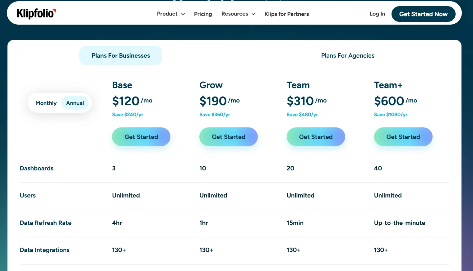
Klipfolio | Marketing reporting platform | Custom dashboards built spreadsheet-style, including from REST APIs with no native connector. | Klips from $120/month, billed annually. |
Supermetrics | Marketing data pipeline | Marketing data delivered into the destination you already report in, including AI chat tools. | Starter from €39/month, billed yearly. |
Funnel | Marketing data pipeline | A governed marketing dataset feeding BI, your warehouse, and marketing mix modeling. | Starter from €280/month, billed annually. |
Improvado | Marketing data pipeline | Enterprise marketing data with an AI agent, governance rules, and compliance controls. | Free tier; MCP Only at $100/month. |
#1: Dot
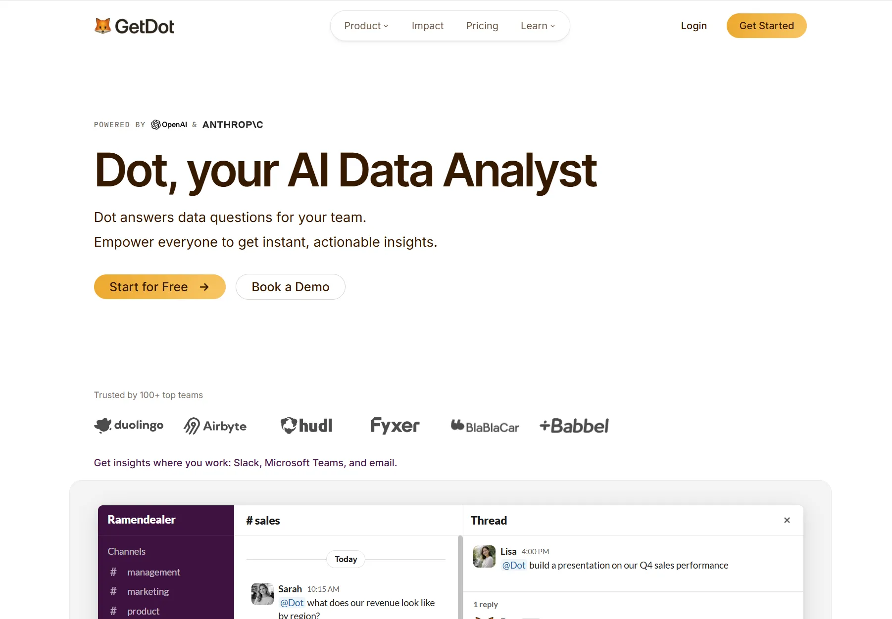
Dot is the best marketing data visualization tool in 2026 for marketing and data teams whose campaign data lands in a warehouse and who need that data explained, not just displayed.
Disclaimer: Dot is our own product, so weigh this section accordingly. I'll still put the argument for our AI data analyst taking the top spot as the best marketing data visualization tool in 2026.
Dot is an AI data analyst, not a charting tool.
Our decision intelligence software connects to the warehouse or semantic layer your marketing data flows into, then answers questions about that data in writing, in whichever channel the question was asked.
Five things do most of the work here: 👇
Campaign questions get answered in the channel where marketing already works
Dot takes marketing questions in Slack, Microsoft Teams, email, and the web app, then answers back in the same thread with the figures and a read on what they mean.
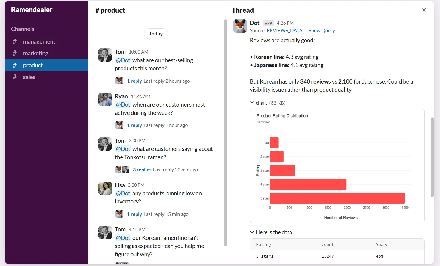
Your paid social lead notices spend pacing ahead of plan, and wants to know whether blended cost per acquisition moved with it.
She types the question into the growth channel her team uses all day.
The answer comes back in that thread, with the numbers and a note on which campaigns account for the shift against last month.
No dashboard opened, and nobody had to write SQL.
There's a governor on cost as well, called Energy Mode, which decides how much processing power a given question gets.
Economy handles routine lookups and Balanced is the standing default. Frontier is there for questions that actually warrant it.
➡️ Admins hold the company default, and any question sent through Slack, Microsoft Teams, or email accepts an !economy or !frontier prefix to override it once.
For a marketing team, the practical effect is that the channel owner who wants a number stops queuing behind the analyst, and the analyst stops rebuilding the same breakdown every Monday.
Deep Analysis investigates why a channel moved
Deep Analysis returns a written investigation, with charts and a recommendation, in response to a question no single query can settle.
A question like why return on ad spend slipped in DACH last month comes back as a report that names the channels, campaigns, audiences, and creative formats that moved, sizes each against the comparable period, and lands on the likeliest cause with figures attached.
What separates that from a chatbot summary is the method underneath.
💡 Dot plans an investigation, runs a sequence of queries, checks what each one returns, follows whichever thread is actually moving, and only then writes.
Runtime lands between two and ten minutes depending on how tangled the question is.
That covers the gap every marketing team knows: the dashboard tells you ROAS fell, and nobody has a spare afternoon to find out why.
Your campaign review method gets written down once and reused
Playbooks in Dot are written records of how your team analyses something, kept alongside the data model.
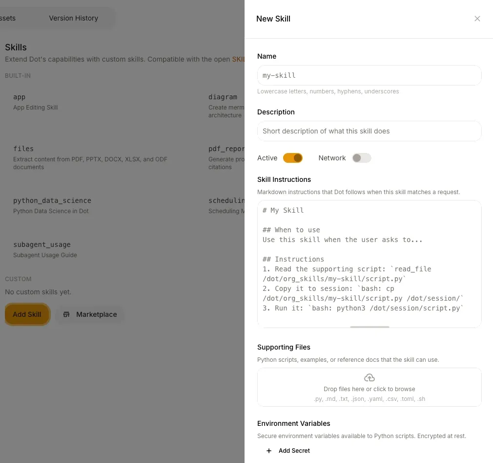
The agent then follows that same method on every run.
Most marketing teams already carry this knowledge around, just nowhere written down.
Which sources you trust, how you group channels, which campaigns you throw out before you start, and what counts as a fair comparison period.
A campaign review playbook can specify that Google Ads campaigns roll up into Paid Search and Meta campaigns into Paid Social, that audiences split into Prospecting and Retargeting, that UTM parameters are the tracking source of record, and that anything with "test" or "internal" in the campaign name gets excluded before a single number is calculated.
It can pin the definition too. Return on ad spend stays conversion value over spend, and always renders as a ratio.
Two people asking the same question in different weeks then get the same segmentation and the same arithmetic.
Recurring channel reviews arrive already written
Dot writes recurring reviews against live warehouse data on whatever cadence you report on, delivered as prose or as a PowerPoint you can present as-is.
Each edition covers which channels and campaigns moved, how far off the comparable period they landed, the most probable driver, and the items a human should look at again.
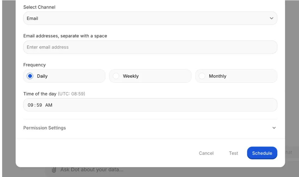
If a recipient wants to push on something in a scheduled report, they reply to the email and Dot picks the question up right there.
The Slack version arrives as one tidy message, not a wall of blocks.
Building the monthly marketing pack by hand usually eats the better part of a day, and most of that day goes into rebuilding exhibits that existed last cycle.
Definitions and lineage for when two teams disagree about a number
Dot keeps metric definitions in one governed place through its Context Agent, and draws a lineage map under any figure it reports.
Marketing counts 400 signups from the campaign.
Product counts 340.
Usually that's an attribution window, or a filter one side applies and the other doesn't, and it costs a meeting to find out.
The Context Agent stores those definitions and enforces them on every answer.
It reads them out of the places your team already writes things down: the dbt project, the warehouse itself, your data catalog, and pages in tools like Confluence.
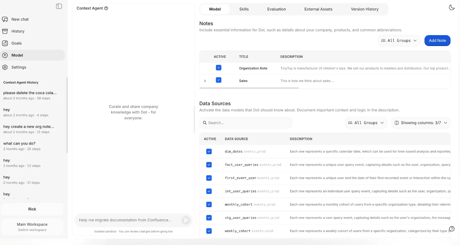
The dbt side re-syncs every day without anyone scheduling it.
A correction typed into a chat doesn't quietly go company-wide. It queues as a proposal for an admin to look at first.
Redefining a metric properly runs through an isolated environment: you fork the production model, try your questions against the new definition while the rest of the team carries on, then review the diff and merge it back.
The lineage side settles the other half of the argument.

Every answer carries a Full logs panel. Inside it, Lineage maps the route from warehouse tables through the exact SQL and any dbt models involved, up to the figure on screen.

Where a note from your team shaped the query, that note appears in the graph too.
Each query Dot fires at your warehouse gets signed too, tagged with who asked, which workspace, what triggered it, and a route back to the conversation.
On BigQuery those tags arrive as job labels, so they show up in your billing export.
What makes Dot different from the other marketing data visualization tools?
Nearly every other tool on this list ends at a chart or a formatted report, and a person still has to work out what it means.
Dot ends at the written explanation.
A second difference cuts against us as often as for us, so I'll say it outright: Dot has no native Facebook Ads or Google Ads connector.
Pulling campaign data out of ad platforms is the job Supermetrics, Funnel, and Improvado exist to do, and Dot works downstream of whichever one you run, reading from the warehouse they fill.
So if your marketing data hasn't landed anywhere central yet, one of those three is the purchase you need first, and Dot is the layer that makes the result readable.
The commercial model diverges too.
Among the priced tools here, the bill tracks people or clients, either per seat or per client account.
Paid plans on Dot don't count people at all.
The meter runs on analysis work, so the twentieth channel owner who wants a weekly number costs nothing extra.
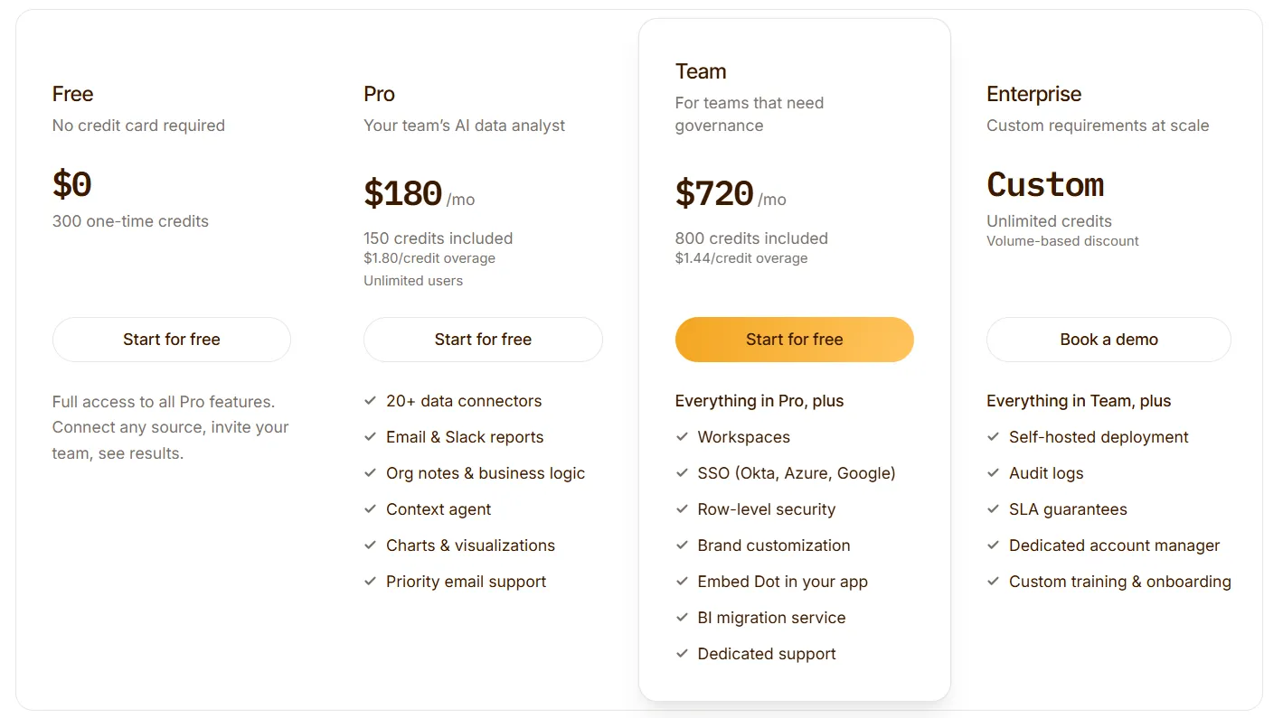
Dot pricing
Credits are the unit Dot bills on, drawn down whenever Dot performs analysis, and headcount never enters the calculation on a paid plan.
Paying annually knocks 10% off.
- Free: $0. You get 300 credits once and everything Pro includes. That's enough to put real campaign questions through it before spending anything.
- Pro: $180/month. That buys 150 credits, extras run $1.80 each, and headcount has no ceiling.
- Team: $720/month for 800 credits, overage at $1.44. This tier brings single sign-on, row-level security, embedding, a dedicated support line, and help moving your existing reports off whichever BI tool you're on.
- Enterprise: priced case by case. The credit cap comes off and volume rates apply, alongside audit logging, self-hosting, an SLA, and an account manager by name.
Dot pros and cons
✅ You get the written explanation and a suggested next step, not a chart somebody still has to read for meaning.
✅ Any figure opens to reveal its query and the dbt models feeding it.
✅ No per-seat charge on any paid plan, so read-only stakeholders never turn into line items.
✅ Your campaign review method gets written down once and repeated the same way.
❌ No native ad-platform connectors, so campaign data needs to reach a warehouse first.
❌ No white-label client portal.
#2: Data Studio (Looker Studio)
Best for: Marketing teams whose data comes mostly from Google Ads, GA4, Search Console, and BigQuery.
Similar to: Microsoft Power BI, Klipfolio.
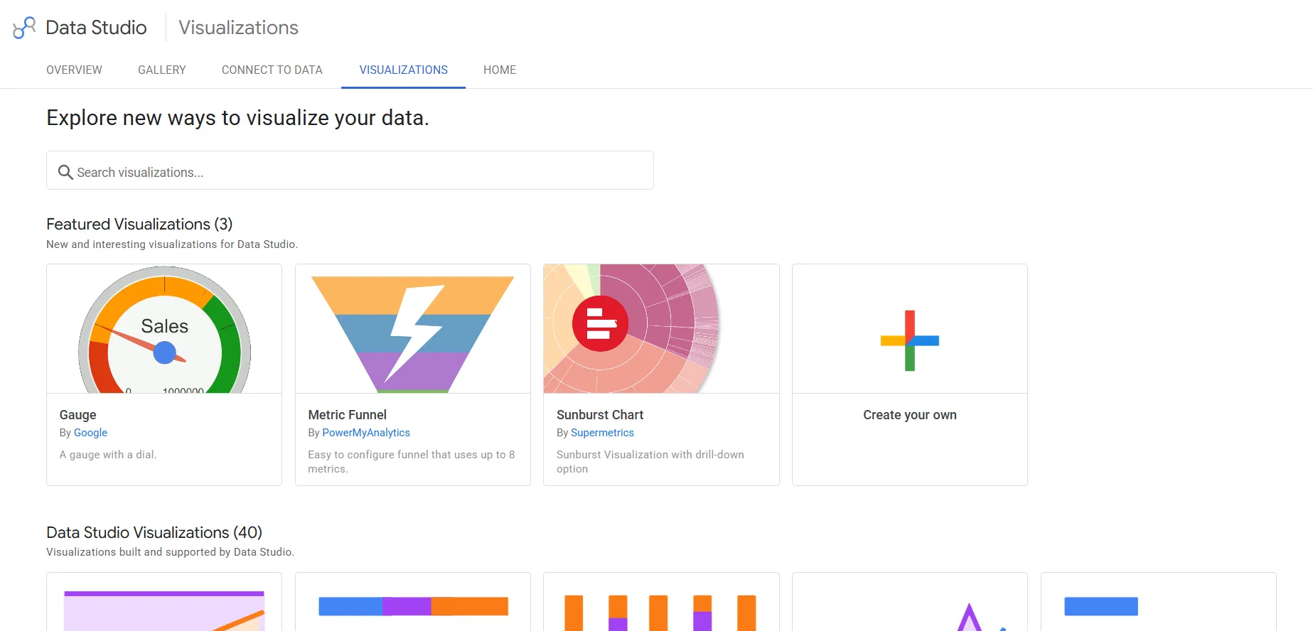
Data Studio turns Google marketing data into shareable dashboards and reports, and the core product carries no licence fee.
Teams that want a working report today, with no procurement conversation attached, tend to start here.
Data Studio's top features
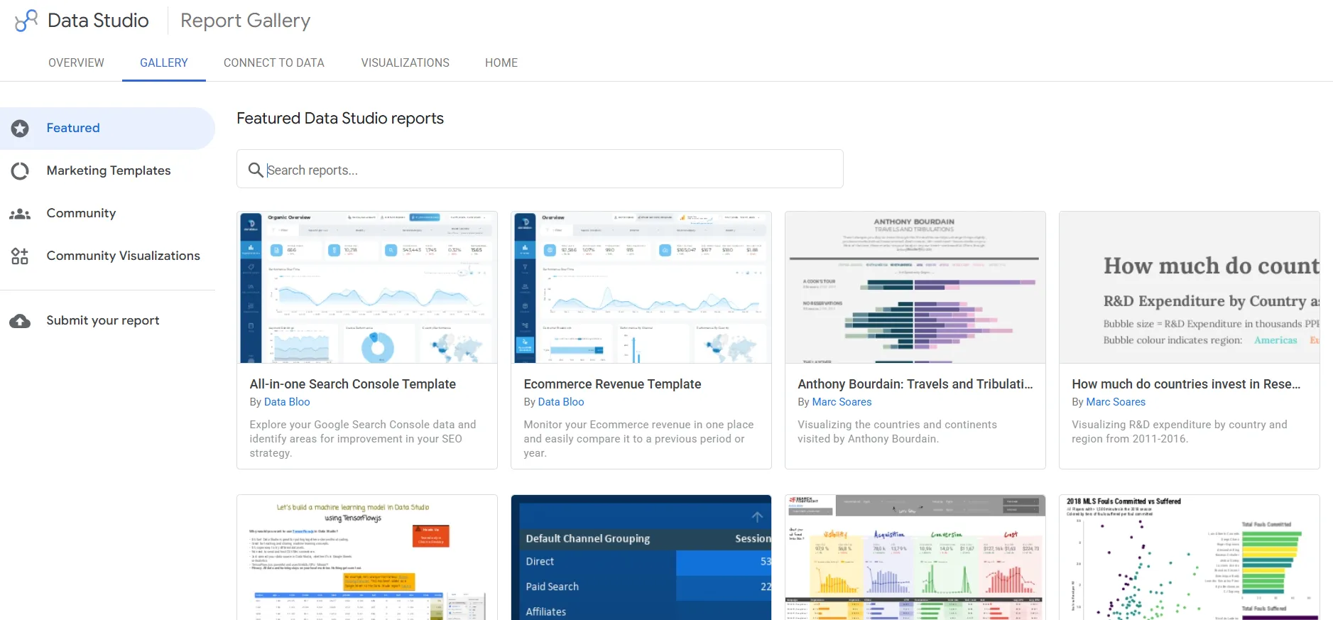
- Google-built connectors: Twenty-one connectors maintained by Google cover Google Analytics, Google Ads, Search Console, YouTube Analytics, Campaign Manager 360, Display and Video 360, Search Ads 360, BigQuery, and Google Sheets.
- Partner connector gallery: Roughly 1,390 partner-built connectors reach everything outside Google, including Facebook Ads, LinkedIn Ads, TikTok Ads, Shopify, HubSpot, and Semrush, supplied by vendors like Supermetrics, Funnel, Windsor.ai, and Power My Analytics.
- Forty chart types: Waterfall, treemap, candlestick, bullet, geo chart, filled and bubble maps, pivot tables with heatmap, and the full run of stacked and 100% stacked variants.
- Community visualizations: Another thirty-two partner-built chart types extend the set with Sankey diagrams, hexbin maps, Gantt charts, sunburst charts, and range sliders.
Data Studio pricing
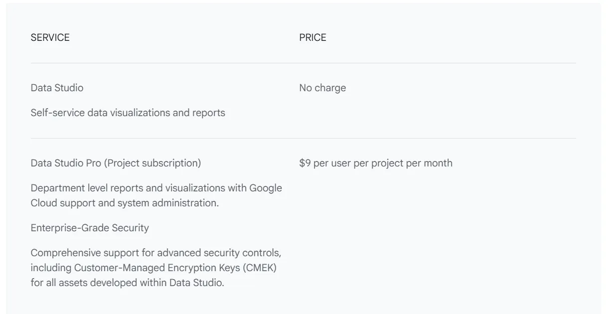
Data Studio has a free tier at $0 with unlimited reports, and one paid tier.
- Free: $0. Build and share reports across every Google-built connector.
- Data Studio Pro: $9/user/month, billed per Google Cloud project. Report ownership shifts from the individual to your organization, and you pick up team workspaces, expanded scheduled delivery, Gemini features, and SLA-backed support.
Data Studio pros and cons
✅ Nothing to pay for the core product.
✅ Native Google marketing connectors are included at both tiers.
✅ The partner gallery reaches nearly any marketing source you'd name.
✅ Around forty native chart types before you touch the community gallery.
❌ Non-Google data means paid third-party connectors, and those add up fast across a multi-channel setup.
❌ Pro bills per Google Cloud project, so agencies running a project per client multiply the seat count.
#3: Microsoft Power BI
Best for: Marketing departments inside organizations already licensed through Microsoft 365.
Similar to: Data Studio, Databox.
Most Microsoft shops have Power BI paid for and deployed before anyone opens a feature comparison.
Microsoft Power BI builds marketing dashboards on governed semantic models and pushes them out through the apps the rest of the business opens every day.
Power BI's top features
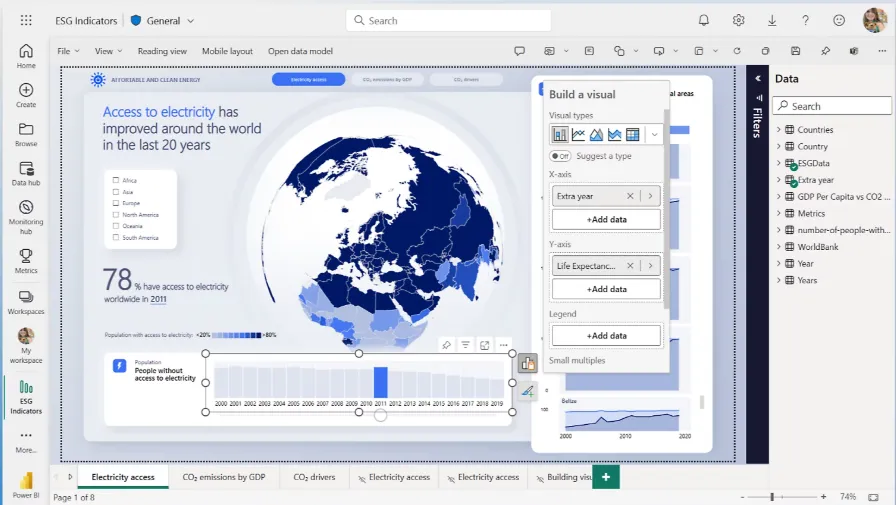
- Semantic models: Campaign metrics and business logic get defined once in a model, and every report plus every Copilot answer reads from that definition, not from a calculation somebody wrote into one report.
- Copilot in Microsoft Fabric: Questions asked in ordinary English get answered against your semantic model, and Copilot will explore and explain a movement as well as answer it.
- Distribution through Microsoft 365: Reports embed into Teams, PowerPoint, SharePoint, and Outlook, which counts for a lot when the audience for a campaign report is a leadership team that never leaves Outlook.
- Power BI Embedded: Marketing dashboards can be built into your own product or a client-facing portal, so the audience never has to open the Power BI service.
Power BI pricing
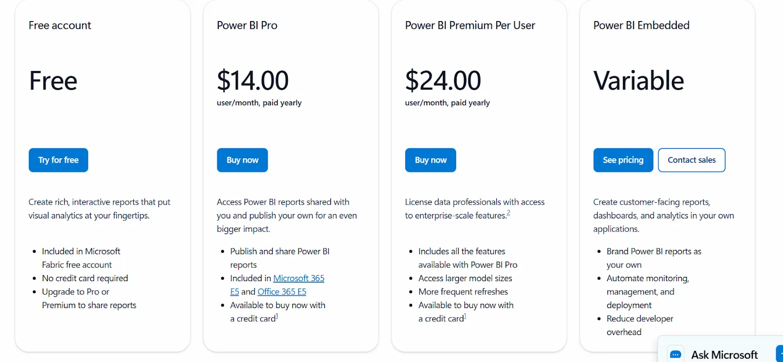
Pricing here runs per user, with a free account for personal work and a variable capacity option layered on top.
- Free account: $0, for building reports and visual analytics without sharing them.
- Power BI Pro: $14/user/month paid yearly. This licence covers publishing your own reports and opening the ones colleagues have shared with you.
- Power BI Premium Per User: $24/user/month paid yearly, for enterprise-scale features on individually licensed users.
- Power BI in Microsoft Fabric: capacity pricing, listed by Microsoft as variable. Buying capacity lets you share reports with people who hold no paid licence.
➡️ We break the per-viewer math down properly in our Power BI pricing guide.
Power BI pros and cons
✅ Often paid for already through a Microsoft 365 licence.
✅ Semantic models keep campaign definitions consistent across every report.
✅ Excel and Teams integration is hard for any other vendor to match.
✅ Power BI Embedded covers client-facing or in-product reporting.
❌ Every viewer needs a paid licence unless the workspace runs on Fabric capacity.
#4: Databox
Best for: Small marketing teams and agencies wanting KPI dashboards and an AI analyst without standing up a warehouse.
Similar to: Klipfolio, AgencyAnalytics.
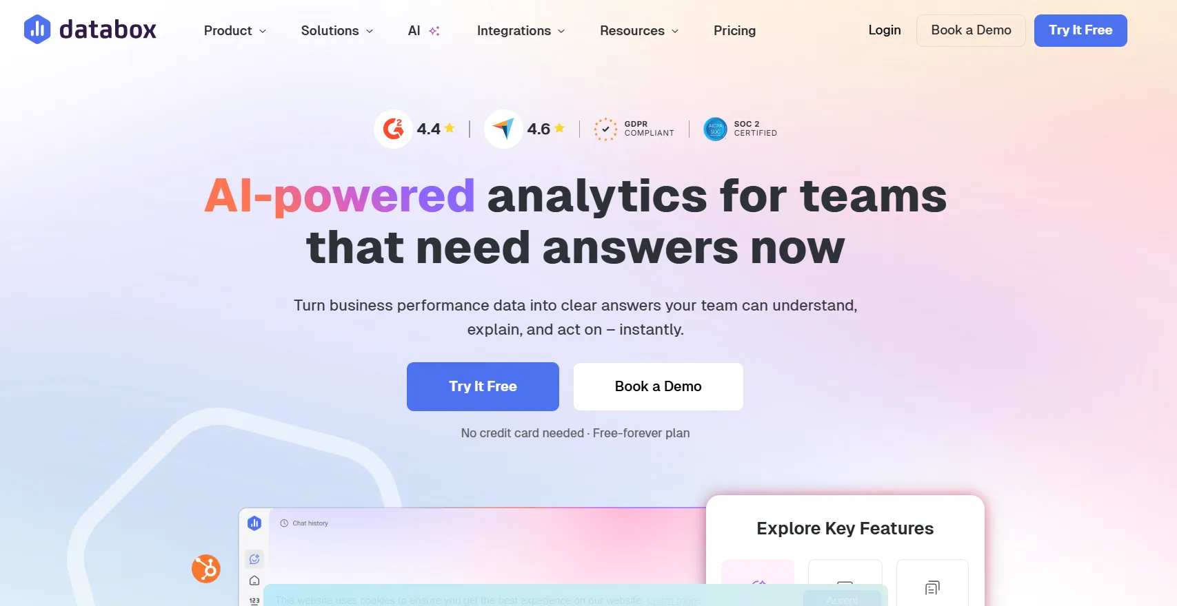
Databox handles campaign questions through Genie, an AI analyst that answers conversationally and will build the metric or dashboard to match.
Teams with no data engineer, and no appetite for hiring one, are the fit.
Databox's top features
- Genie, the AI analyst: Performance questions get answered conversationally, grounded in your connected data and whatever business context you've given it, and Genie can create metrics and assemble dashboards from a prompt.
- Over 130 integrations: Ad platforms, CRM records, warehouses, databases, spreadsheets, and custom APIs all arrive in one account, with no ETL layer needed in between.
- Over 300 dashboard templates: Prebuilt boards for Facebook Ads, Google Ads, Google Analytics, Instagram, LinkedIn Pages, and Search Console cut setup down to connecting sources.
- Databox MCP: An MCP server exposes your live campaign data to AI clients like Claude and ChatGPT. Analysis then happens in the chat tool your team already uses.
Databox pricing
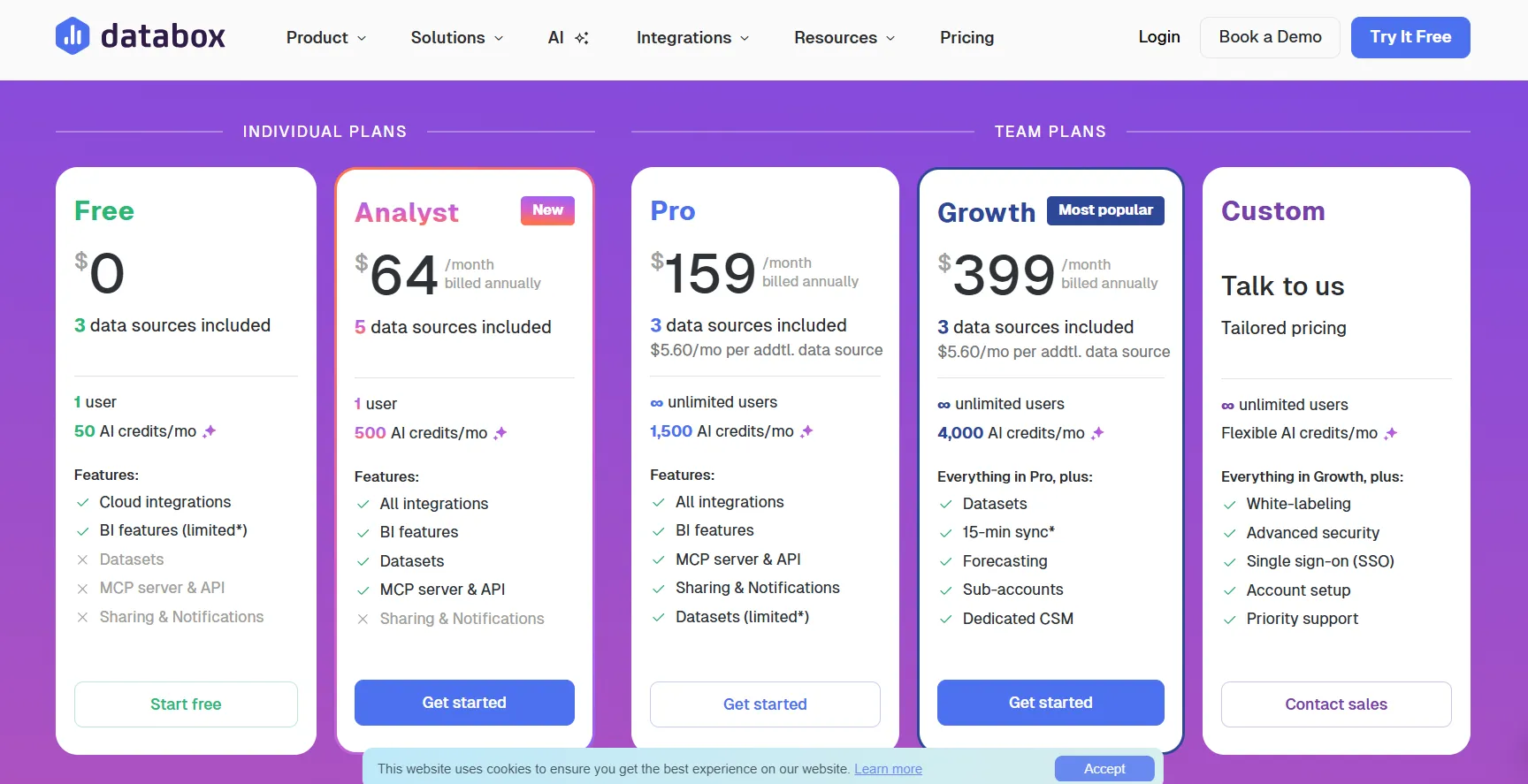
Databox runs two separate pricing tracks, one for analytics teams and one for agencies, both billed annually with a 20% saving and a 14-day trial of the Growth plan.
On the analytics side:
- Free: $0. Three data sources, one user, 50 AI credits a month.
- Analyst: $64/month. Five data sources, one user, 500 AI credits.
- Pro: $159/month. Three data sources to start, $5.60/month for each one after that, unlimited users, 1,500 AI credits.
- Growth: $399/month. The credit pool jumps to 4,000 and forecasting, sub-accounts, 15-minute sync, and a dedicated customer success manager come with it.
- Custom: quoted. White-labeling, single sign-on, advanced security controls, and hands-on account setup come in at this level.
- Agency plans start at $79/month for Agency Starter with 5 client accounts, run through Agency Pro at $159/month and Agency Growth at $399/month with unlimited client accounts, and top out at Agency Premium at $799/month with 50 data sources and 10,000 AI credits.
Databox pros and cons
✅ A free-forever plan that connects three real data sources.
✅ Headcount stops mattering from the Pro plan upward.
✅ No warehouse or pipeline needed before you start.
✅ Over 300 dashboard templates, which reduces setup to connecting sources.
❌ AI features draw from a monthly credit pool that varies by plan.
❌ White-labeling costs extra unless you're on the top tier.
#5: AgencyAnalytics
Best for: Marketing agencies that want client reporting priced by client count instead of seat count.
Similar to: Whatagraph, Databox.
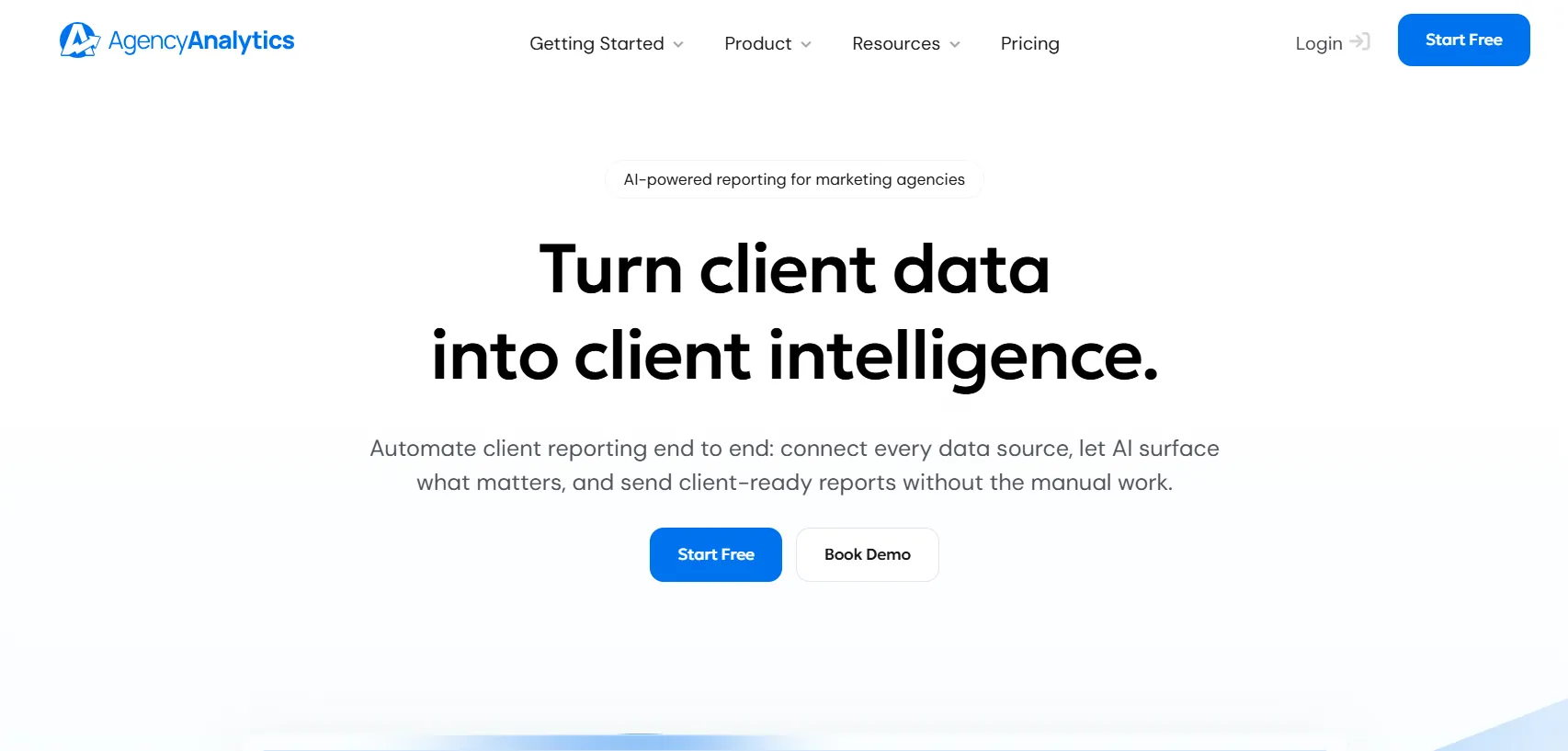
Client reporting is the entire job here.
AgencyAnalytics automates the reporting cycle for marketing agencies, from connecting client data sources through to delivering a branded report, and prices itself around how many clients an agency actually has.
AgencyAnalytics' top features
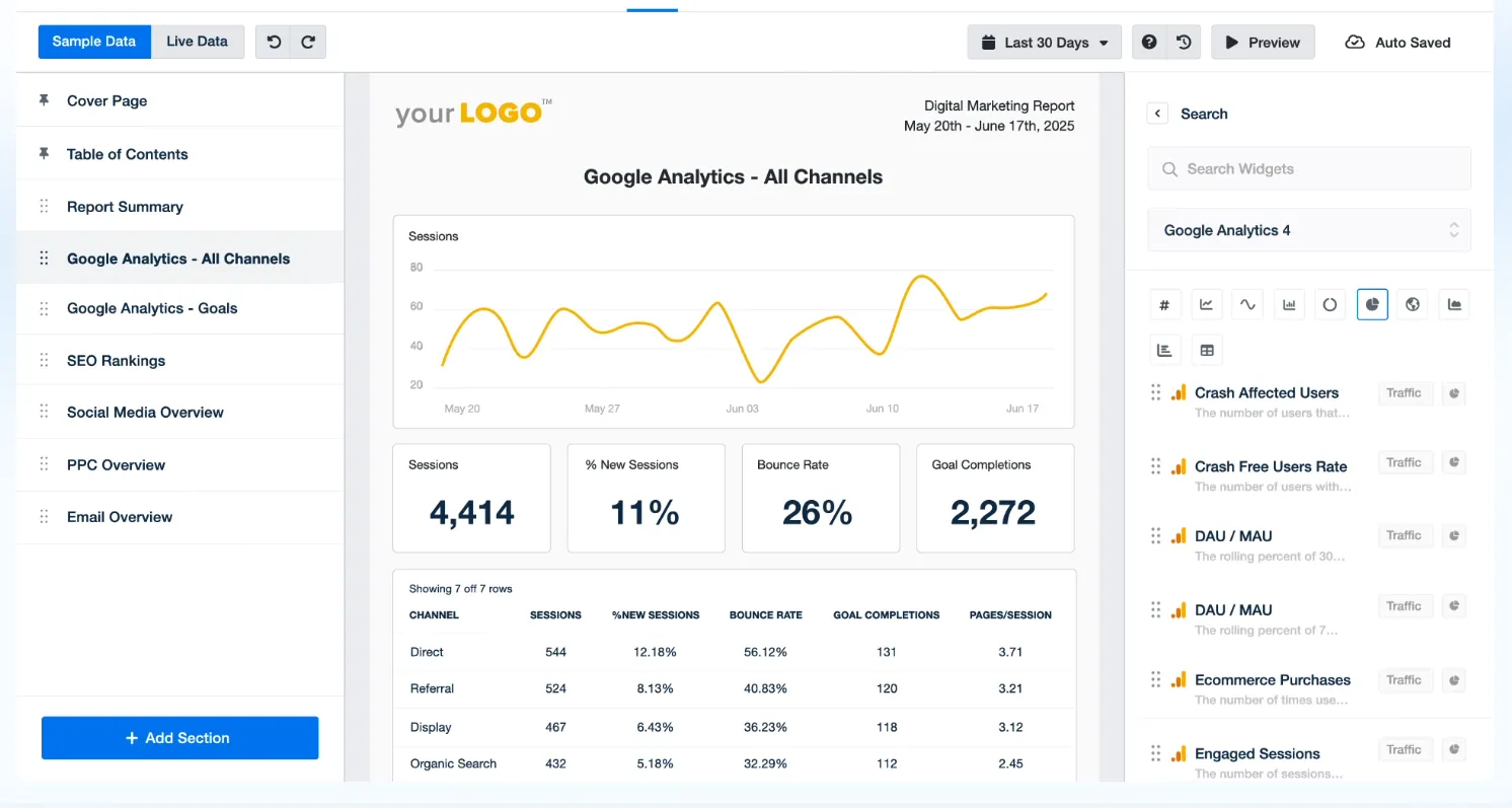
- Over 85 marketing integrations: Google Ads, Google Analytics, Search Console, Facebook, Instagram, LinkedIn, Amazon, Shopify, Semrush, Ahrefs, and Google Business Profile connect without setup work per client.
- White-labeled client portal: Clients log in under your branding on your own domain and pull up their reporting whenever they want, which kills off a decent share of the check-in calls.
- Ask AI with anomaly detection: Every client account gets scanned for performance dips and metric shifts, and anything unusual is flagged before the client spots it.
- Report templates built for agencies: Template sets for search, paid media, and social work get customized once and reused across the roster, alongside roll-up reports spanning multiple accounts.
AgencyAnalytics pricing
AgencyAnalytics runs a single plan at $20 per client per month billed annually, with every feature unlocked and no per-seat charge.
That covers automated reporting, the client portal, white-label branding on your own domain, goals and alerts, benchmarks and forecasting, API and MCP access, and no cap on data sources, reports, dashboards, or logins.
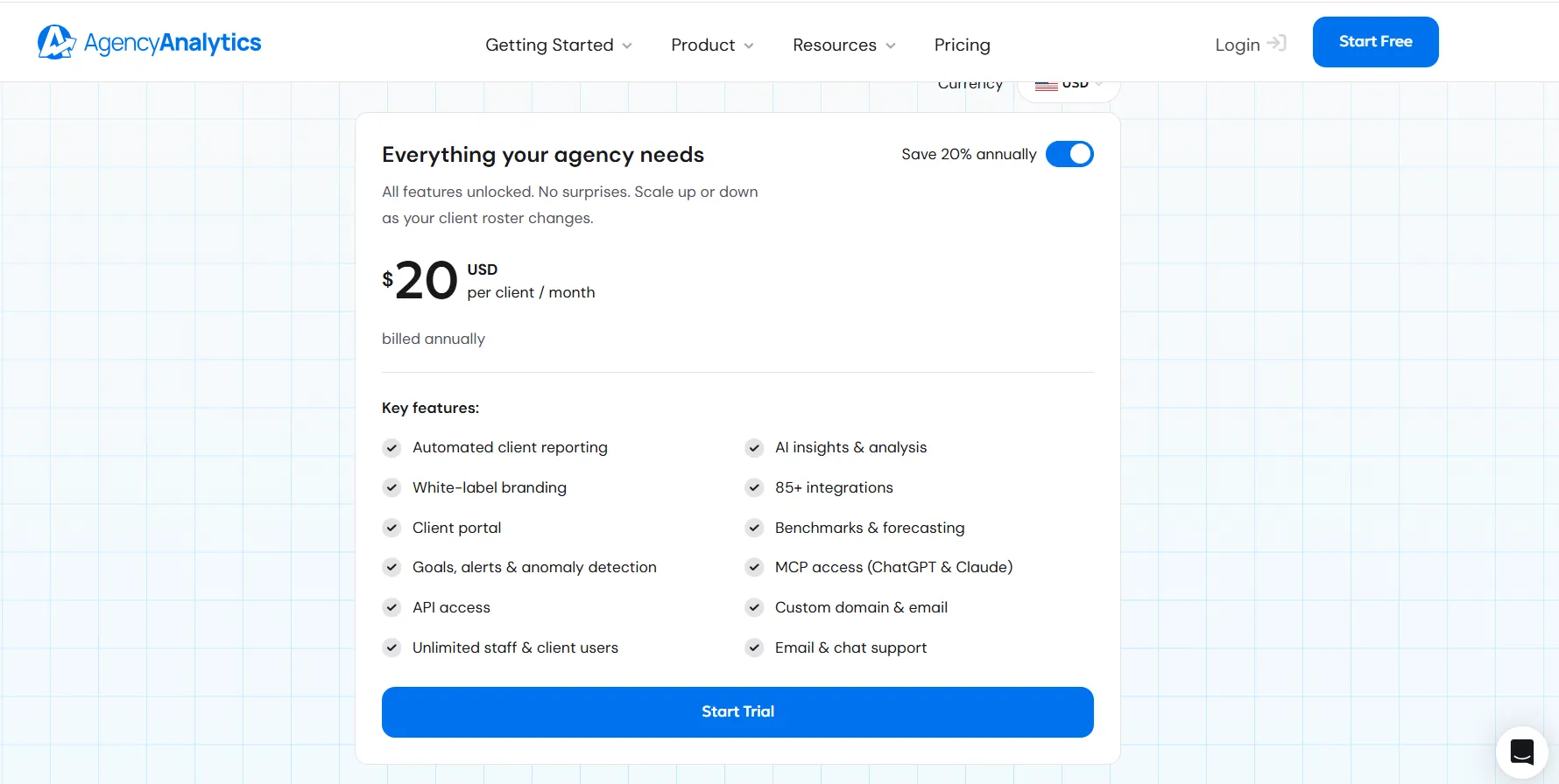
Annual billing saves 20%, and the 14-day trial needs no credit card.
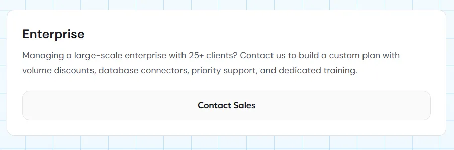
Agencies carrying 25 clients or more move onto a custom Enterprise arrangement, which brings volume rates, database connectors, a priority support line, and training run for your team.
AgencyAnalytics pros and cons
✅ Pricing tracks client count, so a growing team costs nothing extra.
✅ Every feature is included in the one plan, with nothing gated behind a higher tier.
✅ Staff and client logins are uncapped.
✅ Anomaly detection covers the whole roster at once.
❌ Rank tracking and AI visibility tracking are separately priced add-ons.
❌ Database connectors come as a paid add-on, not part of the plan.
#6: Whatagraph
Best for: Agencies and multi-brand teams that need one metric definition holding across dozens of accounts.
Similar to: AgencyAnalytics, Funnel.
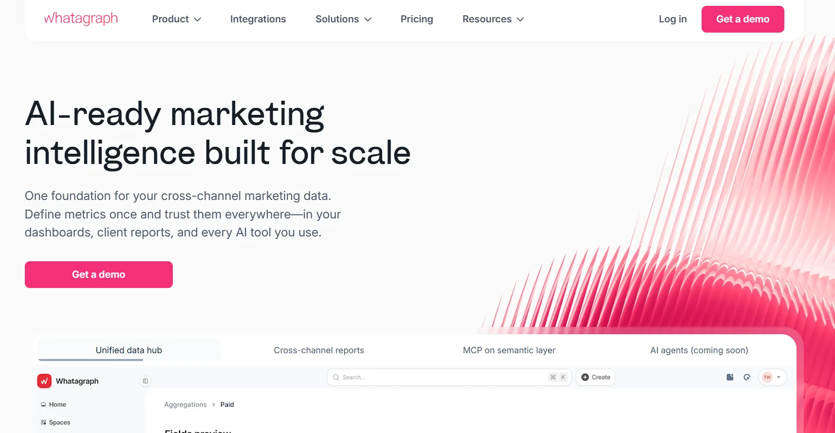
Whatagraph asks you to define each metric once, then serves that same number to every report, dashboard, client deck, and connected AI tool, so nobody spends Friday reconciling versions of it.
Teams reporting at scale are the target, whether that means fifty client accounts or two hundred locations.
Whatagraph's top features
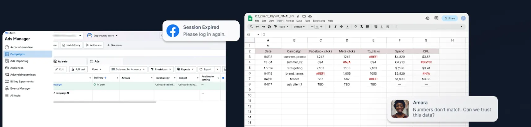
- Data Hub: Custom metrics and dimensions, source groups and blends, currency conversion, and both pre-made and custom transformations get defined in one place, and everything downstream reads from it.
- Whatagraph IQ: Included on every plan, IQ covers one-click report creation, automatic theming, performance summaries written in ordinary English, and a chat interface for ad hoc questions.
- MCP on the semantic layer: Whatagraph exposes its governed layer through MCP, so an AI tool queries the same definitions the reports use, not a raw platform export.
- Linked report templates: Adding the tenth client or a new market means reusing an existing template, with scalable themes, source tags, white-labeling, and branded client folders carried across.
Whatagraph pricing
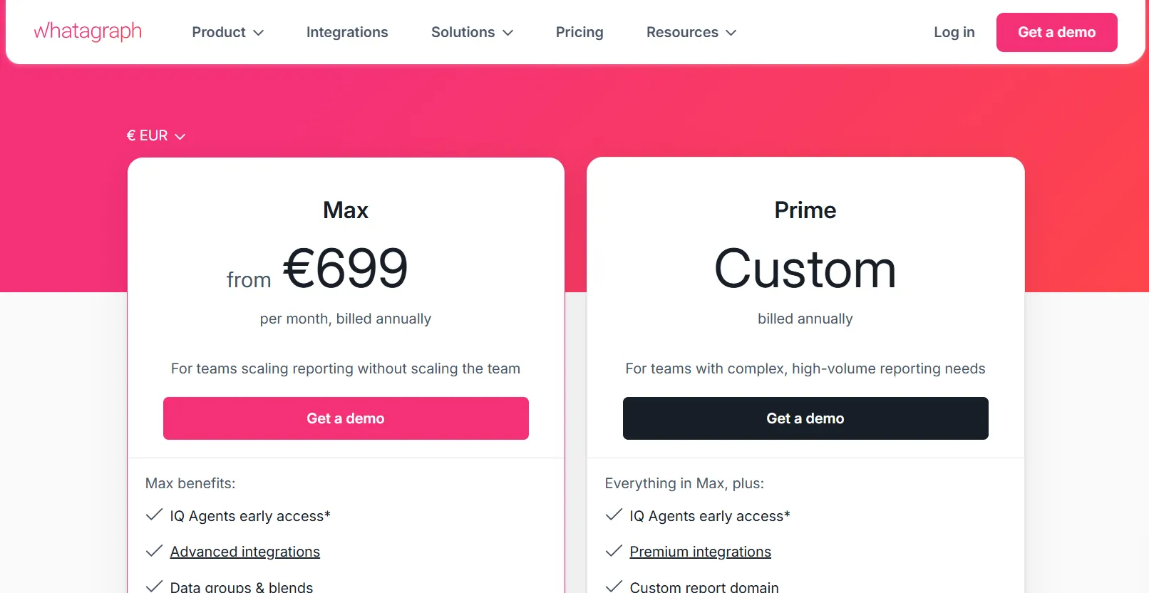
Whatagraph publishes two plans, both billed annually, with a figure on the first and a quote on the second.
- Max: from €699/month, starting at 50 credits. The plan covers advanced integrations, data groups and blends, white-label reports, KPI overviews with alerts, Whatagraph IQ, and a dedicated success manager.
- Prime: custom pricing. It opens the premium integrations, transfer to Data Studio, an upgraded IQ tier, tailored onboarding, priority support, and an enterprise SLA.
Whatagraph pros and cons
✅ One definition per metric, reused everywhere that metric appears.
✅ Neither plan caps users or reports.
✅ EU data hosting with ISO 27001 certification, which matters for European clients.
✅ Adding the next client or location is a template reuse, not a rebuild.
❌ The cheapest way in costs more than any other tool's entry plan here.
❌ Annual billing only.
#7: Klipfolio
Best for: Teams that want to build precisely the dashboard they have in mind, including from sources with no native connector.
Similar to: Data Studio, Databox.
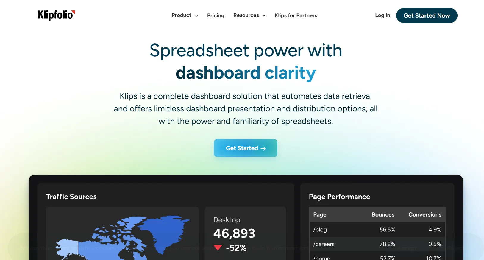
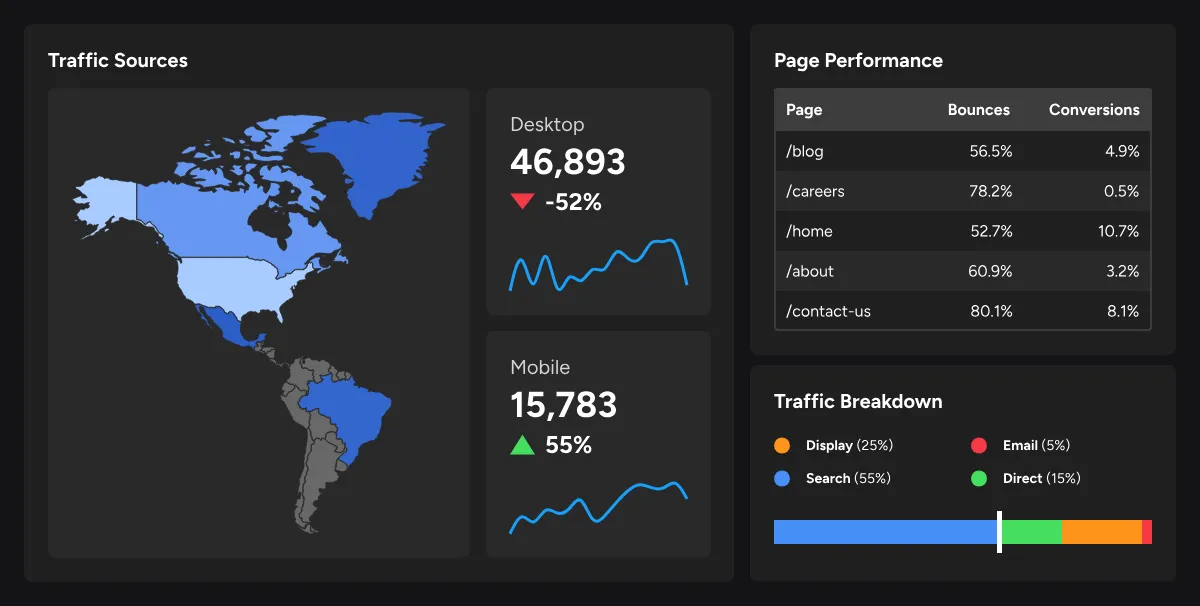
If you've ever built a reporting workbook in a spreadsheet and wished it would refresh itself, Klipfolio's Klips product is roughly that idea done properly.
Klips gives you spreadsheet-style formula building over live connected data. Analysts who want control over every element on a dashboard get on with it well.
Klipfolio's top features
- Over 130 integrations on every plan: Google Analytics, Google Ads, Facebook, X Ads, HubSpot, Salesforce, and Marketo connect directly, alongside SQL databases and spreadsheets.
- REST and URL connector: Anything without a native integration can still be reached through query connectors, which is how Klipfolio customers pull from sources no vendor has built for.
- Spreadsheet-style building: Formulas, filters, and pivot tables behave the way a spreadsheet power user expects, with data refresh and scheduling handled by the platform.
- Published links: Dashboards get shared view-only, either openly or behind a password, so recipients never need a Klipfolio account.
Klipfolio pricing
Klipfolio prices Klips by dashboard count and refresh rate, never by user. Figures below are USD on annual billing, after a 14-day trial that needs no card.
- Base: $120/month. Three dashboards, refreshed every four hours.
- Grow: $190/month. Ten dashboards, hourly refresh.
- Team: $310/month. Twenty dashboards, 15-minute refresh.
- Team+: $600/month. Forty dashboards, refreshed up to the minute.
- Add-ons are priced separately and include extra dashboards at $8/month, a custom domain at $90/month, a custom theme at $69/month, the white-label bundle at $299/month, single sign-on at $63/month, and priority support at $63/month.
Klipfolio also sells PowerMetrics, a separate metric-centric analytics product, which isn't covered by the Klips figures above.
Klipfolio pros and cons
✅ Users are uncapped even on the $120 entry tier.
✅ The REST connector reaches marketing sources no vendor has built an integration for.
✅ Works with or without a data warehouse behind it.
✅ Refresh rate is published against each tier, so you know what you're buying.
❌ Dashboards are the metered unit, so a wide reporting setup climbs tiers quickly.
❌ White-labeling costs more than the entry plan itself.
#8: Supermetrics
Best for: Teams that want marketing data delivered into the reporting tool they already use.
Similar to: Funnel, Improvado.
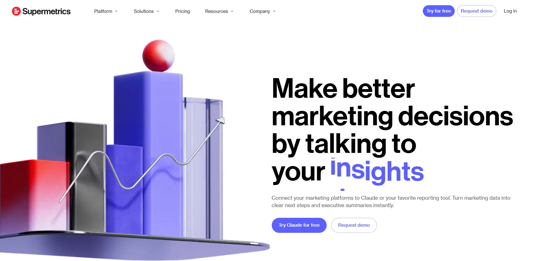
Supermetrics collects marketing data from ad platforms and delivers it into a destination you choose, whether that's Data Studio, a spreadsheet, Power BI, or an AI chat tool.
Marketing and data teams use it as the plumbing under whatever visualization layer they've settled on.
Supermetrics' top features
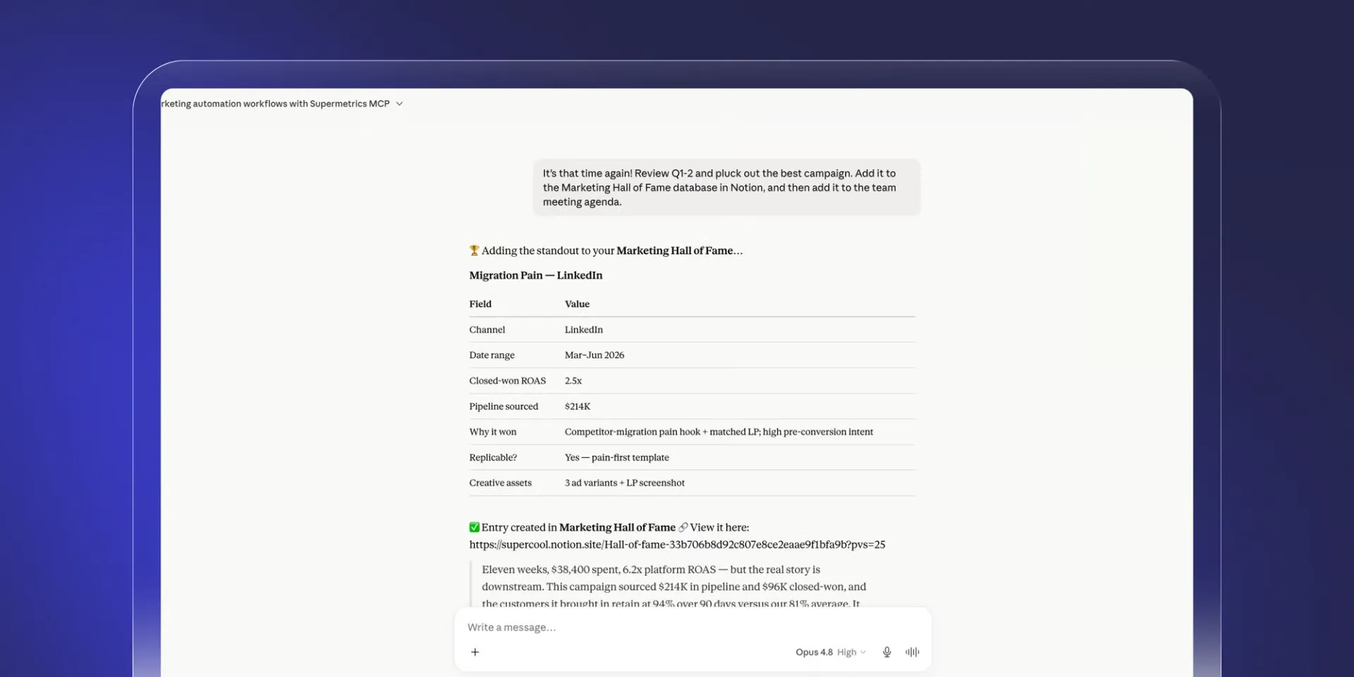
- Destination-led delivery: Data lands in Data Studio, Google Sheets, Microsoft Excel, Power BI, or Supermetrics Studio, with warehouse destinations opening at the Enterprise tier. Nobody has to migrate off the tool they know.
- AI tool connectivity: Marketing data connects into Claude, ChatGPT, and Microsoft Copilot, so a marketer can ask a question in chat without building a report first.
- Data management: Cleaning and standardization run automatically across sources, which is what makes cross-channel numbers comparable at all.
- Data activation: Cleaned data gets pushed back out to the platforms it came from, keeping reporting and campaign execution connected.
Supermetrics pricing
Supermetrics prices by destination, data sources, users, and ad accounts, billed yearly with a 20% saving and a 14-day free trial that needs no card.
- Starter: from €39/month, with 1 core destination, 3 data sources, 1 user, 3 accounts per source, and 4,000 monthly AI credits.
- Growth: from €159/month, with 7 data sources, 2 users, 7 accounts per source, daily Google Sheets refreshes, and 12,000 AI credits.
- Pro: from €399/month, with 10 data sources, 3 users, 10 accounts per source, hourly Google Sheets refreshes, and 18,000 AI credits.
- Enterprise: quoted. Snowflake and BigQuery become available as destinations, alongside custom user and account limits, on-demand refreshes, SAML single sign-on, data residency controls, and a customer success manager.
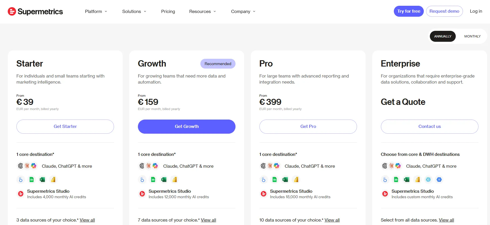
Extra destinations, users, data sources, and ad accounts are all purchasable on top of any plan.
Supermetrics pros and cons
✅ The cheapest paid entry point of the three pipelines here.
✅ Delivers into the reporting tool your team already uses, including AI chat clients.
✅ No data volume fees on any tier.
✅ Cleaned data can be pushed back out to ad and email platforms.
❌ Users, destinations, data sources, and ad accounts are each metered and priced as extras.
#9: Funnel
Best for: Brands and agencies that want one governed marketing dataset behind both their reporting and their measurement work.
Similar to: Supermetrics, Improvado.
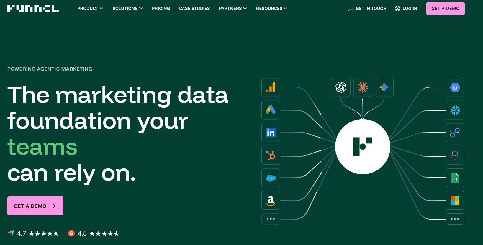
Funnel collects marketing data from over 600 sources, harmonizes it into a single governed dataset, and sends it wherever it needs to go.
The company pitches Funnel as the foundation under reporting and measurement work, not as a reporting tool in its own right.
Funnel's top features
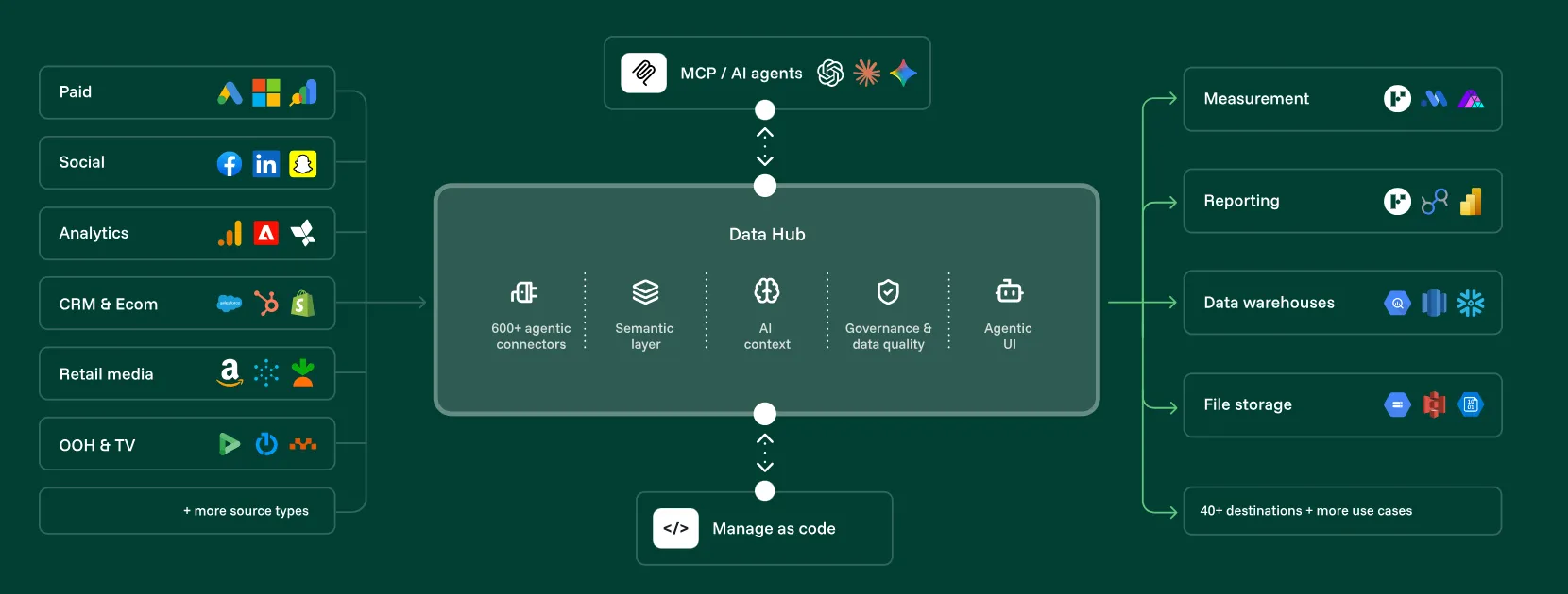
- Data Hub: Connectors, harmonization, currency conversion, storage, semantics, and business context like budgets and targets all belong to one layer that everything downstream reads from.
- Broad destination support: Data exports to Data Studio, Power BI, Tableau, Google Sheets, BigQuery, Amazon S3, Azure, Snowflake, and conversion APIs, depending on tier.
- Funnel MCP: Claude, ChatGPT, Cursor, and other MCP-compatible tools query your marketing data directly, with no export step and no context switching.
- Funnel Measure: A paid add-on running marketing mix modeling, multi-touch attribution, and incrementality testing together, then cross-checking each against the others.
Funnel pricing
Funnel publishes starting figures on most tiers, billed annually in euros, across a brand track and an agency track.
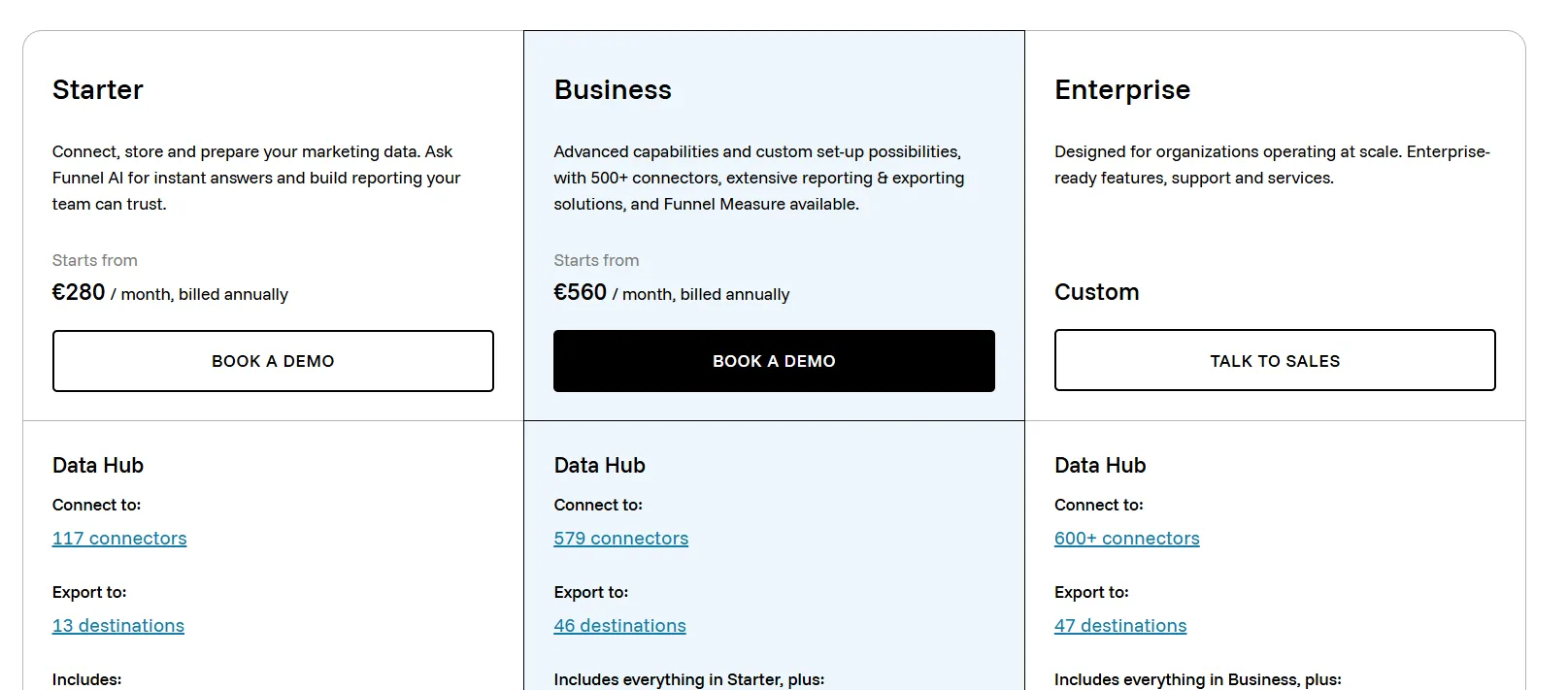
- Starter: from €280/month, with 117 connectors, 13 destinations, 5 users, 1 workspace, Funnel AI and MCP, and Funnel Dashboards.
- Business: from €560/month, with 579 connectors, 46 destinations, unlimited users and workspaces, Power BI and Tableau as destinations, and cloud destinations including BigQuery and Amazon S3.
- Enterprise: quoted. Snowflake joins the destination list, and you pick up SAML, OIDC and SCIM provisioning, advanced roles, audit logging, EU data centre availability, and an enterprise SLA.
- Agency Standard: from €280/month, with 117 connectors, 5 users, and unlimited workspaces for client separation.
- Agency Advanced: from €560/month. The full connector and destination library, plus custom integrations and white-label reporting through unlimited branded portals.
Funnel pros and cons
✅ Funnel commits to building a connector it doesn't already have.
✅ Users and workspaces stop being capped at the Business plan.
✅ Measurement work and data collection come from one vendor.
✅ Funnel MCP puts the governed dataset inside Claude, ChatGPT, or Cursor.
❌ Measurement is quoted separately on top of a Data Hub plan.
❌ The Starter tier caps you at 117 connectors and 5 users.
#10: Improvado
Best for: Enterprise marketing organizations that need an AI agent over governed marketing data with compliance controls attached.
Similar to: Funnel, Supermetrics.
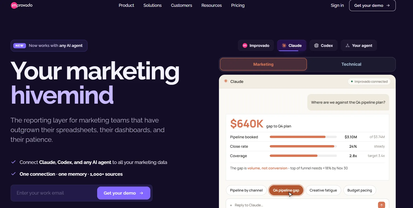
Enterprise marketing teams use Improvado to pull data from over 1,000 platforms into one shared model, then query the result through an AI agent.
Improvado leans harder on governance and compliance than the other pipelines here. In a regulated procurement process, that's usually what decides it.
Improvado's top features

- AI agent with MCP: Claude, Codex, ChatGPT, and other agents connect to your marketing data through one governed connection and answer questions with sources cited.
- Marketing data governance: Governance rules run against campaign data, capped at 50 on the Advanced tier and 100 on Enterprise, and the feature comes bundled at those tiers instead of being sold on its own.
- Advanced Intelligence modules: Creative analytics, multi-touch attribution, incrementality testing, and marketing mix modeling are available as separately priced add-ons depending on tier.
- Compliance posture: SOC 2 Type II across every tier, with HIPAA, SSO through Azure and Okta, role-based access, and full audit trails on the paid enterprise tiers.
Improvado pricing
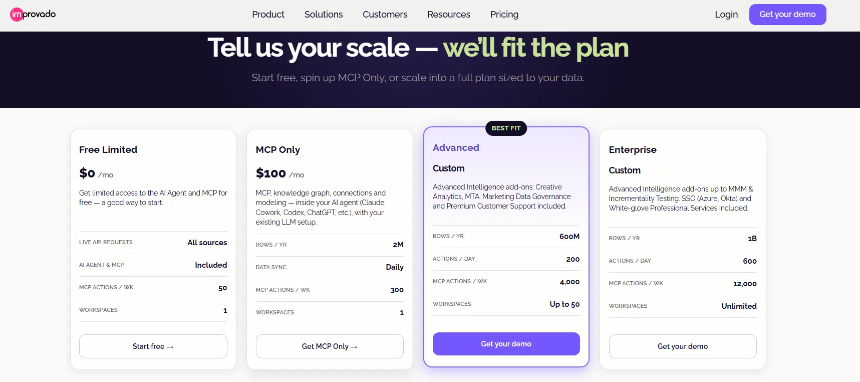
Improvado publishes figures for its two entry tiers and quotes the rest, with a sizing tool on the pricing page that matches you to a plan based on ad spend, tracked revenue, audience, and source count.
- Free Limited: $0/month. Live API requests, every source, the AI agent and MCP, 50 MCP actions a week, one workspace.
- MCP Only: $100/month. Two million rows a year, daily sync, 300 MCP actions a week, and the knowledge graph running inside whichever agent setup you already use.
- Advanced: quoted. 600M rows a year, 200 actions a day, 4,000 MCP actions a week, up to 50 workspaces, plus marketing data governance and premium support.
- Enterprise: quoted, with 1B rows per year, 600 actions per day, 12,000 MCP actions per week, unlimited workspaces, SSO, HIPAA, and access to incrementality testing and marketing mix modeling as add-ons.
Improvado pros and cons
✅ A free tier that really does include the AI agent and MCP access.
✅ Over 1,000 platform connectors, all mapped to one shared data model.
✅ Compliance coverage spanning SOC 2 Type II, HIPAA, GDPR, and CCPA.
✅ Marketing data governance is included on the paid enterprise tiers, not priced as a module.
❌ Attribution, incrementality, and mix modeling are separately priced modules.
❌ Governance features start at the Advanced tier, which is quote-only.
Try Dot for free
So those are the ten best marketing data visualization platforms, running from free Google reporting through agency client portals to the pipelines that make any of it possible.
Several of these will serve a marketing team well, and three of them do a job Dot deliberately doesn't touch.
Dot works at the far end of that chain.
Once campaign data has landed in your warehouse, the reading of it comes back written, in whatever channel your marketing team uses, off the models your data team maintains.
Here's what your marketing and data teams get:
- Answers to campaign, channel, spend, and attribution questions in the thread where somebody asked, whether that's Slack, Microsoft Teams, an inbox, or the web app.
- An investigation mode that takes "why did this move" and works the question from several angles before it writes anything.
- Channel and campaign reviews on your reporting rhythm, arriving as prose or as a deck.
- Playbooks holding your channel groupings, your attribution rules, your comparison periods, and your test-campaign exclusions steady across every run.
- Every figure backed by a lineage map and a signed query, the thing that lets a number survive comparison against finance's version.
- Connections into Snowflake, BigQuery, Redshift, Databricks, dbt, Looker, and Power BI, from a SOC 2 Type II certified platform, with no seat limit anywhere on the paid tiers.
➡️ Get started for free with Dot's free plan, or schedule a demo to see how it works with your data.
⚠️ Disclaimer: This article was last updated on August 26 2026. If you spot any inaccuracies, please do contact us, and we'll fact-check it.
Theo Tortorici
Theo writes about AI-powered analytics, data tools, and the future of business intelligence at Dot.