
AI Uncorks the Secret: Data Reveals What Really Makes Red Wine Great
AI Uncorks the Secret: Data Reveals What Really Makes Red Wine Great (It’s Simpler Than You Think)🍷📊
Ever stood in the wine aisle, paralyzed by choice, wondering what actually separates a $15 bottle from a $50 one? Is it the fancy label, the obscure grape, the poetic description about “sun-drenched terroir”? While romance and marketing play their part, the tech world knows there’s often a hidden algorithm, a set of parameters driving the outcome. So, we asked: Can we use data science and AI to crack the code of red wine quality?
We pointed our AI-powered data analysis tool, Dot, at a classic Kaggle dataset: the Portuguese Vinho Verde Red Wine Quality dataset. This dataset contains physicochemical measurements (think: acidity, alcohol, sugar levels) for nearly 1,600 wines, alongside a quality score (3–8) judged by experts.
Dot ingested the data, ran the numbers, and delivered insights faster than a sommelier can swirl and sniff. The results? Surprisingly clear, cutting through the mystique to reveal the core drivers of perceived quality.
Read the full Dot Analysis here.
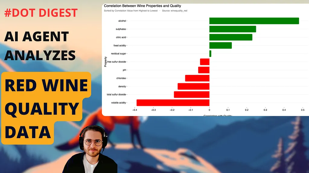
Correlation Between Wine Properties and Quality
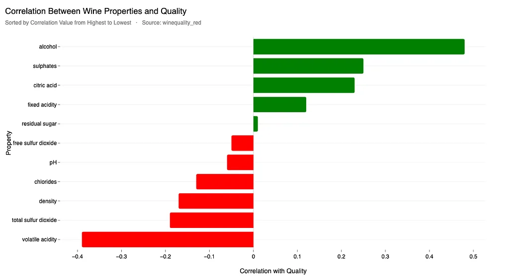
Forget subtle hints of oak or whispers of blackberry for a moment. According to the data, two factors stand head and shoulders above the rest.
The Big Two: Alcohol & Acidity Rule the Roost
Dot’s analysis, backed by correlation studies and regression models, zeroed in on two dominant players:
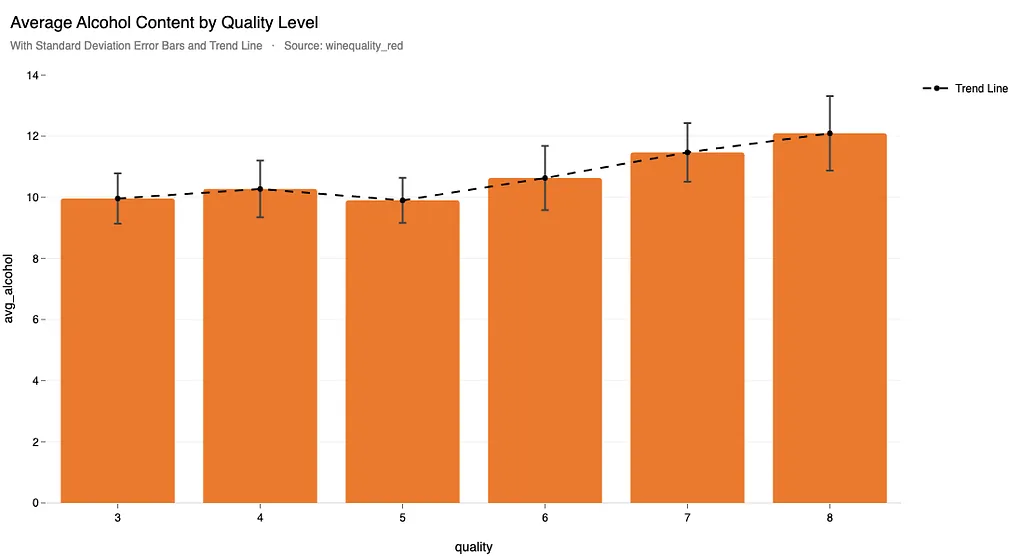
1. 🥂 Alcohol Content:
Turns out, higher alcohol content is strongly linked to higher quality scores. The correlation is the strongest positive one found (r=0.476). Looking deeper, Dot found that premium wines (rated 7–8) boast an average of 12.3% higher alcohol content than their mid-tier (rated 5–6) counterparts.
This matches insights from a Carnegie Mellon wine chemistry analysis, highlighting alcohol as “the single strongest predictor” of wine quality:
“Alcohol’s role in balancing flavor and body is key to sensory scoring. […] It shows the deepest red coloration in correlation heatmaps — indicating its significant role in enhancing wine’s perceived flavor quality.” — Carnegie Mellon Study (2024)
However, Dot also indicated diminishing returns above 12% alcohol — that’s precisely the line where adding more alcohol might upset balance. Thus, the pursuit should be elegantly precise, not overpowering — enhance complexity without inflaming taste buds. The sweet spot seems to be emerging around 11.5% to 12.1% ABV.
2. 🧪 Volatile Acidity (VA):
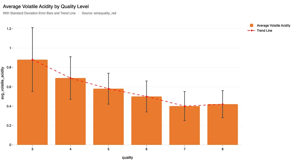
This is the stuff you don’t want much of. Think of that sharp, vinegar-like smell or taste. The data shows a strong negative correlation (r=-0.391) between VA and quality. High-quality wines have significantly less. Specifically, premium wines had 24.7% lower volatile acidity than medium-quality ones.
As Wine Enthusiast’s Alicia Towns Franken explains:
“Beyond 0.6 g/L, volatile acidity transforms wine from complex to a defective vinegar-like experience.” these “off-flavors [are] detectable at 0.6–0.9 g/L.” — Wine Enthusiast (2021)
This aligns perfectly with the boundaries Dot’s analysis identified (below 0.45 being ideal). It’s clear — AI backs the industry experts: Good wine walks a subtle line, managing volatility carefully rather than banishing it. Strict hygiene and maybe even tech like nitrogen flushing during fermentation become critical production parameters.
The Supporting Cast: Sulphates & Citric Acid Matter Too
While alcohol and VA steal the show other factors play statistically significant supporting roles:
3. 🍇 Sulphates:
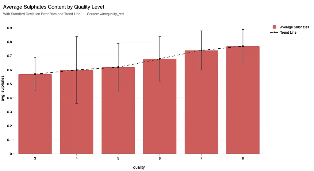
Often misunderstood, sulphates (like SO2) are preservatives and antioxidants. The data shows a moderate positive correlation (r=0.251) with quality. High-quality wines had 14.9% higher sulphates on average, likely hitting an optimal range (around 0.74–0.77 g/L that protects the wine without adding harshness.
As illustrated by a JMP community study from the Discovery Summit:
“Sulphates demonstrate a nonlinear relationship — requiring balanced optimization for sensory enhancement without overpowering bitterness.” — JMP Community (2025)
Dot’s numbers support exactly that — wine-quality correlations hit a sweet spot with balanced sulphate additions rather than heavy dose.
4. 🍋 Citric Acid
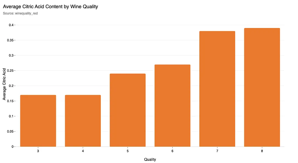
Citric Acidity contributes to freshness and tartness. It also shows a positive correlation (r=0.226). Higher quality wines tend to have slightly more, perhaps contributing to better balance. This is an interesting finding. Could adding citric acid transform wine’s palate?
According to wine industry resources, this is actually controversial despite Dot’s findings. Homebrewit explains the paradox:
“Citric acid additions above 0.3 g/L create detectable citrus notes in red wines — a risky technique that explains why winemakers often avoid it despite positive quality correlations.” — Homebrewit Acid Usage Guide
Dot reveals an intriguing gamble: a carefully calibrated citric acid addition might unlock fresh and vibrant flavor dimensions, yet vintners barely risk it. A real wine-tech dilemma worthy of experimentation.
Why Most Wine is Just… Average (According to the Data)
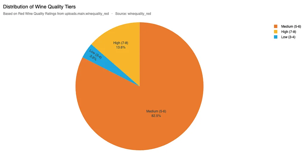
Ever feel like most wines you try are perfectly fine, but rarely amazing? The data reflects this. Dot’s analysis of the quality scores shows a classic bell curve heavily skewed towards the middle:
- A whopping 82.5% of the wines fall into the “Medium” quality tier (scores 5–6).
- Only 13.6% achieve “High” quality status (scores 7–8).
- A tiny fraction are rated “Low” (3–4).
This tells us that achieving basic drinkability is common, but hitting that high-quality mark requires getting the chemical balance just right. It’s not just about one factor, but the synergy between them, particularly nailing that high-alcohol, low-VA profile.
Visualizing the “Recipe” for High-Quality Wine
So, what does a “high-quality” chemical profile look like compared to an average one? Dot generated a radar chart comparing the normalized averages of key chemicals across quality tiers:
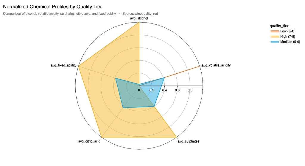
You can visually see the “shape” of quality. High-tier wines (the outer, larger shape in yellow/orange) stretch further out on the avg_alcohol, avg_sulphates, and avg_citric_acid axes, while pulling in sharply on the avg_volatile_acidity axis compared to the medium-tier wines (inner blue shape). It's a distinct chemical fingerprint.
From Data Points to Delicious Pours: Actionable Insights
While we, as tech folks, might not be crushing grapes, the analysis provides clear, data-driven targets for winemakers aiming for the top tier:
- Optimize Alcohol: Target ~12% ABV. This might involve decisions about harvest timing (later harvests = riper grapes = more sugar = potentially higher alcohol).
- Control Volatile Acidity: Keep VA below 0.5 g/L through rigorous hygiene and potentially oxygen management during fermentation. Debugging the fermentation process is key!
- Calibrate Sulphates: Aim for the 0.74–0.77 g/L sweet spot for preservation and flavor enhancement.
- Benchmark Relentlessly: Use the chemical profiles of high-quality wines as a target.
The Takeaway: Demystifying Complexity with Data
This exploration into wine quality is a fun example of a broader principle: data analysis, supercharged by AI tools like Dot, can cut through complexity and reveal the core drivers of success in almost any field.
Whether optimizing software performance, user engagement, or even the chemical balance of a beverage enjoyed for millennia, identifying the key parameters and their optimal ranges is crucial.
While the romance of wine — the terroir, the vintner’s touch, the story — will always matter, it’s fascinating to see how much of the perceived quality can be traced back to a few measurable chemical properties.
So next time you’re picking a bottle, maybe glance at the alcohol percentage. And if it tastes a bit too much like salad dressing? Now you know the likely culprit (and the data to back it up).
➡️ What do you think? Does this data-driven view take the fun out of wine, or add a fascinating new layer? Share your thoughts below!
Analysis Methodology Notes
Visualizations & statistical insights:
Generated via Dot our AI-data analyst engine. Analysis performed on the Red Wine Quality (Kaggle) dataset (Cortez et al., 2009) from Kaggle/UCI Machine Learning Repository. Quality tiers defined as Low (3–4), Medium (5–6), High (7–8). Correlation analysis used Pearson coefficients. Percentage differences calculated between High and Medium tier averages.
Insights validated against external enological research sources:
Related reading:
- “Capstone Research (2024)” Carnegie Mellon Study
- “Volatile Acidity Explained” by Wine Enthusiast
- “Wine Quality Analysis” JMP Community
- “Citric Acid in Winemaking” HomeBrewIt Guides
Curious to have Dot analyze your data? Test our agent here.
Theo Tortorici
Theo writes about AI-powered analytics, data tools, and the future of business intelligence at Dot.