
Root Cause Analysis: How to Uncover Key Drivers Behind Your Metrics
Conversion rates dropped 15% overnight or customer sign-ups suddenly spiked without an obvious reason. As the Head of Analytics at a growing company, you’re likely the first person people turn to and ask, “What’s going on?”
Getting to the bottom of these surprises is exactly what root cause analysis is all about. Instead of scrambling frantically or throwing out guesses, a structured approach helps you pinpoint why a metric changed and what to do about it.
Root Cause Analysis (RCA) in an analytics context means playing detective with data. You’re looking beyond the surface (“revenue is down”) to find the underlying reasons (“revenue is down because sales in the West region plunged after a competitor launched a promo”). The goal is to understand the key drivers behind a metric change. So you can address the real issue not just treat the symptoms. For example, if a ride-sharing app sees a drop in weekly active users, a root cause analysis might reveal it was mainly due to a new app update causing crashes on Android devices, rather than a broad customer dissatisfaction.
Why does this matter? Because focusing on root causes leads to real fixes and smarter decisions. Solving the core problem prevents repeat incidents, whereas just boosting a number temporarily (without knowing why it fell) is like putting a band-aid on a broken arm. In the words of one analytics expert, root cause analysis “dives deep into the core issues, helping you understand the key drivers behind metric changes,” enabling more strategic choices. In short, if you truly understand why something happened, you can fix it for good (or replicate the success if it’s a positive change) and avoid future surprises.
In this guide, we’ll walk through how to do root cause analysis well in the world of analytics. We’ll cover a step-by-step approach, from identifying a problem to leveraging advanced tools (including AI and LLMs) to speed up your detective work. Let’s dive in.
Step 1: Verify the Problem and Define It Clearly
When a metric moves unexpectedly, your first step is making sure the problem is real and well-defined. Not every blip is a crisis, and sometimes what looks like a huge change might be a data error or a false alarm.
Start by asking: What exactly changed? Which metric, over what time frame, and how big is the shift? Is revenue down 5% week-over-week, or did average order value jump by 20% this month? Quantify the change and pinpoint when it started. Did it drop suddenly on a particular day, or was it a gradual decline over a quarter? The timing and magnitude of a change give clues. For example, if a conversion rate plummets within a 5-minute window, it likely wasn’t caused by users slowly changing behavior it could be a backend error or deployment issue (an app update wouldn’t affect everyone instantly, whereas a server outage might). On the other hand, a slow slide over weeks might hint at seasonality or a slow-burning user experience problem.
Next, validate that the change is real. Data can be messy; dashboards can break. Ensure the data you’re looking at is accurate and up-to-date. Check if the data pipeline is intact and if there were any delays or bugs in logging. It’s good practice to verify the metric through an independent source if possible. For instance, if your internal BI tool shows web traffic dropping 30% yesterday, compare it with Google Analytics or another analytics platform. If one source shows a drop and another doesn’t, you might have a data collection issue rather than a real user behavior change. Many seasoned analysts have panicked over a “revenue crash” only to discover the nightly ETL job failed to run. Save yourself that heart attack by double-checking data integrity first.
Also, consider sample size and normal variability. Is this within normal range (like typical day-to-day variance or weekly seasonality), or truly an anomaly? Statistical anomaly detection or even a simple year-over-year comparison can help tell if the change is beyond expected fluctuations. Essentially, confirm that yes, we have a real problem/phenomenon here and have a clear initial description: e.g. “Mobile app orders in France dropped 25% on Saturday vs. typical levels.”
If it’s a customer-facing issue (like conversion or feature usage dropped), try to reproduce the problem yourself if possible. This is the “eat your own dog food” or “do it yourself” step. If orders on iOS are down, grab an iPhone and go through the purchase flow. Do things break or feel off? Sometimes you’ll find the root cause is immediately obvious (the checkout button is unresponsive on iOS 16 mystery solved!). Even if you don’t find a smoking gun, retracing the user journey will ground your analysis and might reveal clues early on. Plus, if it is a bug or UX issue, finding it by replicating saves you hours that you’d otherwise spend slicing data aimlessly.
Step 2: Get the Broader Context
With a confirmed issue (“Alright, something’s definitely up with our metric X since Tuesday”), the next step is zooming out and gathering context. Think of this as playing journalist: figure out what else was happening around the time of the change. Context is everything; it turns isolated numbers into a narrative.
Check internal changes first. Did anything change in your product or operations recently? This includes code releases, feature launches, UI redesigns, pricing changes, marketing campaigns, A/B experiments, and even infrastructure tweaks. It’s amazing how often a sudden metric movement can be traced to “oh yeah, we did roll out that new onboarding flow on Monday” or “the recommendation algorithm was updated.” Go through release notes, check with engineering about deployments, and see if any experiments went live. If you have a changelog or an internal announcements Slack channel, stalk it for anything that lines up with your timeline. Even a seemingly minor change (like updating the signup form) can have ripple effects on metrics.
Look at external factors too. Sometimes the world outside your company walls has big impacts on your numbers. For instance, if you’re in the ride-sharing business like Uber or BlaBlaCar, a major snowstorm or public transit strike could cause usage to drop in affected cities (or spike in unusual ways). In e-commerce or SaaS, things like holidays, market trends, or news events can drive customer behavior. Brainstorm what external events might plausibly affect your metric. If your subscription SaaS signups jumped, was there a press release or a viral tweet about your product? If churn spiked, did a competitor launch a tempting discount that month? Analysts often need to be creative here: currency fluctuations, weather changes, big news, or industry trends could be the culprit. (True story: one company discovered a decrease in site traffic was due to network issues in their most important region nothing to do with their site at all.)
Don’t forget the competition and customers. Check if competitors are doing something noteworthy. Did a rival just roll out a feature or promotion that’s drawing away your users? A sudden drop in your app usage might mean users are trying the new kid on the block. Conversely, if your traffic surged, maybe a competitor had downtime and their users flocked to you temporarily. Social media and industry news can be surprisingly useful for this intel. Meanwhile, consider the voice of the customer: have support tickets or customer complaints gone up? Your support or community team might already know about a problem (“Lots of users are reporting the latest update is logging them out repeatedly”). A quick sync with customer-facing teams can surface issues that haven’t hit your dashboards yet.
By collecting all this context, you’re effectively compiling a list of possible hypotheses for the change. Maybe you identified three things that changed internally (e.g. a new pricing tier, an app update, and a big ad campaign launched) plus an external event (a competitor’s promo or a holiday). Keep these in mind as you proceed they’re clues to test. In fact, many analysts keep a root cause checklist for their business that includes common internal and external factors to review when something goes off. Over time, you’ll refine this checklist as you encounter new kinds of issues.
> **Pro Tip:** Maintain a simple log of notable events (product releases, marketing pushes, infrastructure incidents, etc.) on a timeline. When an anomaly happens, this log is a goldmine for quick correlation. This practice can save hours of scraping through chat threads and wikis to find out what changed when. Some teams even automate changelog tracking. It’s all about bringing possible reasons to the surface fast, so you can zero in on the right one.
Step 3: Slice and Dice the Data
Now we have a grasp on what changed and a bunch of ideas about what might have caused it. The next move is to break the problem down with data segmentation. In analytics, this is often where the “aha” moments happen. By slicing your metric by different dimensions, you can often isolate where the change is coming from, which massively narrows your search for why.
Think of it this way: if overall revenue is down 10%, is it down evenly across all products and regions, or is it really one big drop hidden by averages? If you segment revenue by product category, you might find that electronics sales fell off a cliff (-30%) while other categories are flat. Boom now you know the issue is likely specific to that category (maybe a supply problem or pricing issue in electronics). Or a SaaS example: monthly recurring revenue is flat, but when you break it out by customer segment, you see enterprise plan revenue actually grew while SMB plan revenue shrank. That tells a story: perhaps smaller customers are churning or downgrading, even as big customers stick around.
Typical dimensions to consider: time, geography, product/service line, customer cohort, platform or device, acquisition channel, feature usage essentially any category that might reveal a pattern. The key is to find a dimension where the metric behavior differs significantly. If you find one segment where the change is extreme and others are unaffected, you’ve struck root cause gold.
For example, imagine you run a global ride-sharing app and total rides are down 8% overall this week. Breaking it down by city could show that almost the entire decline comes from one major city (say, Paris is down 30% while other cities are flat). Now you can focus on Paris: was there a local issue, strike, or competitor action there? Similarly, if a mobile app’s usage dropped, check platform: perhaps Android usage fell 20% while iOS stayed constant a strong hint that the issue is on the Android side. In one case, an analysis of revenue by platform revealed that iOS revenue dropped ~15% while web and Android were stable, immediately spotlighting iOS as the problem area.
When slicing, ensure you look at significant segments. If you have a dozen customer regions but one of them is tiny (like 1% of your business), a 50% drop there won’t move the overall metric much and could just be noise. You don’t want to get distracted by an irrelevant blip in a small segment. One pragmatic approach is to group small segments into an “Other” category or set a threshold (focus on segments that contribute, say, >5% of volume). This way, you’re focusing your detective work where it matters most.
As you slice and dice, you might find multiple contributing factors. Perhaps revenue is down primarily in one product line and one region. It could be both: maybe a specific product in Europe is tanking. That’s fine note all such insights. You’re building a picture of exactly what changed, where. This picture will either clearly suggest the cause or at least let you test targeted hypotheses. For instance, if the data shows the metric drop is isolated to new users and not affecting existing users, your hypotheses might revolve around the onboarding flow or acquisition channels for new users (since existing customers seem happy).
At this point, you should have a much narrower problem statement: e.g. “Conversion rate dropped 15%, mainly due to new mobile app users on Android in the US, starting last Wednesday.” That is way easier to investigate than “conversion is down, not sure why.” We’re getting closer!
Step 4: Drill Down into Metric Components (Understand the Why Behind the What)
By now, you know where the problem is concentrated. The next step is to dig into the metric itself (and related metrics) to figure out what’s driving the change at a mathematical level. This often means breaking the metric into parts or looking at its inputs.
Many business metrics are composite or can be derived from other metrics. For example:
- If sales revenue is down, it’s usually a function of (number of orders) × (average order value). Which one fell (or did both)? Is it fewer orders, or smaller order sizes, or both? If orders dropped, was it fewer customers purchasing or a lower purchase frequency per customer?
- If conversion rate (a ratio) changed, look at the numerator and denominator separately. Did the number of conversions go down, or did the number of opportunities (visitors, sign-ups, etc.) go up (thus diluting the rate), or both?
- If user engagement time plummeted, is it because users are visiting less often or because each session became shorter?
Breaking a metric into components can quickly illuminate the cause. Say your product usage (measured by total hours spent in-app) dropped. Decompose it: total hours = number of active users × average time per user. You might find active user count is steady but time per user fell sharply. That tells a different story (users still come, but spending less time maybe the content is less engaging or a new update changed their behavior) than if you found active users dropped (people outright leaving). In one real example, an analytics team saw total time on site drop because a feature that kept users hooked was removed; the user count was the same, but each user spent less time.
For ratio metrics like conversion rates, it’s crucial to evaluate both numerator and denominator. Imagine your signup-to-paid conversion rate fell from 5% to 3%. Check the raw numbers: perhaps the number of new paid subscriptions actually increased, but the number of sign-ups exploded (e.g. due to a new free trial campaign), causing the percentage to drop. In that scenario, the “drop” came from an influx of less-qualified leads, not necessarily a worse product conversion funnel. The fix there is different (improve lead quality or nurture those new users) than if you found the number of paid conversions plummeted due to a bug in the payment flow. In an example from one analytics guide, a conversion rate drop was explained by a surge of new users with lower conversion propensity (possibly from a less-targeted marketing channel). Both the numerator and denominator of the conversion metric increased, but the denominator (signups) grew more, so overall conversion % fell. The root cause in that case might be “the new marketing campaign X brought a lot of traffic that didn’t convert well.”
Sometimes you might need to bring in related metrics to tell the full story. If your main KPI is down, what about other supporting metrics? If orders are down, check website traffic and conversion rate separately. Is it fewer visitors or lower conversion causing the sales dip? If churn is up, what happened to customer satisfaction scores or support ticket volume around that time? A broader analytical view can connect the dots: “Ah, NPS dropped last quarter and churn increased this quarter those might be linked.” Or “marketing spend was cut in that region, and a month later sales there fell; likely cause and effect.”
This metric deep-dive often overlaps with the segmentation step: you might find, for example, that the drop in average order value is mainly due to a particular product category seeing more discounts (i.e. prices went down), or that conversion dropped only for users coming via a certain referral source. It’s all about breaking the problem into smaller pieces until the cause becomes clearer.
Step 5: Form and Test Hypotheses
By this stage, you should have a pretty clear picture of what changed, where, and how. Now comes the critical thinking part: why did those changes happen? This is where you make the analytical leap from observation to explanation. Based on the evidence gathered (context + segmented data + metric breakdown), you’ll form one or more hypotheses for the root cause and then test them if possible.
Let’s say your analysis so far tells you:
- Metric change: “Sign-ups fell 20% specifically among mobile users starting March 10th.”
- Context clues: “We released a new mobile app update on March 9th.”
- Segmentation: “The drop is only on Android; iOS sign-ups are steady.”
- Metric components: “App download counts are the same, but the activation (install→sign-up) conversion rate on Android fell off a cliff.”
All arrows point to the hypothesis: “The March 9 Android app update introduced some issue that’s preventing users from signing up.” Now, test it. Check app analytics or logs to see if errors spiked after the release. Or roll back that app version for a subset of users to see if sign-ups rebound. In root cause analysis, whenever you can, run an experiment or find additional data to prove/disprove your theory.
If the hypothesis involves a specific internal change (feature launch, experiment, etc.), one straightforward test is to reverse that change (or isolate users who didn’t get the change) and see if the metric returns to normal. For example, if you suspect a new checkout flow caused conversion to drop, enable the old flow for a subset of users (if you have that capability) or temporarily disable the new feature. If conversions for that subset go back up, you have pretty solid evidence the new flow was at fault. This “revert and observe” strategy can save your customers pain while you continue diagnosing the exact issue.
Not every hypothesis is easily testable with a live experiment (especially after the fact), but you can often find supporting data. If you think a marketing campaign brought low-quality traffic, check those users’ on-site behavior (high bounce rate? low time on site?) compared to other traffic. If you suspect a bug in a specific app version, see if users on that version have abnormal funnel metrics compared to users on other versions.
Another powerful technique is to model what the metric would look like without the suspected factor, to see if it explains the gap. For instance, analysts might filter out or exclude the impact of a suspected root cause and see what’s left. An example: suppose you discover a fraud attack where bots created a bunch of fake accounts, and you know these fakes never convert. If you remove those fraudulent sign-ups from the data, does the conversion rate go back up near its old baseline? If it only recovers, say, 70% of the way, then fraud was a big factor but didn’t account for the entire drop, implying there might be other causes to find. This approach can quantify how much of the change each factor contributes.
Keep in mind there might be multiple root causes. It’s not always one smoking gun. Especially for complex metrics (like revenue, which could drop due to a combination of lower traffic and lower conversion and smaller basket sizes), you might identify a few factors each contributing to the change. Aim to account for the majority of the movement with your findings. If something still doesn’t add up, continue the search there might be a secondary issue coinciding.
Throughout this process, document what you checked and what you found. It’s good practice to keep notes on each hypothesis: e.g. “Tested if new user tutorial caused drop data shows no difference between users who saw tutorial vs those who skipped, so probably not the cause.” Logging these ensures you and your team don’t retread the same paths and you have a clear narrative for the next step, which is communicating the results.
A Note on RCA in Software Engineering and IT Incidents: The SRE Perspective
While the principles of RCA in business analytics focus on metrics like revenue and user engagement, the world of Software Engineering and Site Reliability Engineering (SRE) applies a similar structured approach to technical incidents like system outages, performance degradation, or service failures. The goal, however, shifts from understanding business drivers to ensuring system stability, reliability, and resilience.
An SRE’s perspective on RCA is heavily influenced by the principle of blameless postmortems. The primary objective is not to find who is at fault, but to understand the systemic reasons that allowed an incident to occur and to prevent its recurrence.
Key aspects of RCA in this context include:
- Timeline Construction: The first step after an incident is stabilized is to build a precise, timestamped timeline of events. This includes everything from the first alert, system changes (like code deployments or configuration updates), automated actions, and human interventions.
- The “5 Whys” Technique: This is a classic and powerful method used in technical RCAs. Starting with the problem (e.g., “The API was returning 500 errors”), engineers repeatedly ask “Why?” to peel back layers of symptoms and uncover the technical root cause.
1. Why? Because the database connection pool was exhausted.
2. Why? Because a recent code change introduced a query that was much slower than expected.
3. Why? Because the query was missing a critical index.
4. Why? Because the pre-deployment review process didn’t catch the inefficient query.
5. Why? Because our automated testing suite doesn’t include performance regression tests for database queries.
The final “why” often reveals a process or systemic failure, which is the true root cause to address. - Focus on Contributing Factors: Modern SRE culture recognizes that there is rarely a single “root cause.” Instead, major incidents are typically the result of multiple contributing factors aligning in an unforeseen way. A good RCA will identify all of these, including latent conditions in the system (like unmonitored resource limits) that were not a problem until a specific trigger occurred.
- Actionable Remediation Items: The output of a technical RCA is a list of concrete, prioritized action items. These are not just about fixing the immediate bug but also about improving the system’s overall resilience. Actions might include adding better monitoring and alerting, improving automated failover mechanisms, enhancing testing procedures, or updating documentation.
In essence, while business RCA seeks to answer “Why did our numbers change?”, a technical RCA in software engineering seeks to answer “Why did our system fail, and how can we make it stronger for the future?”
Step 6: Take Action and Learn for the Future
Root cause analysis isn’t truly complete until you’ve turned insight into action. In a business setting, the end goal is not just to know why something happened, but to respond in a way that improves outcomes.
First, consolidate your findings into a clear story. By now you likely have a lot of detail; you’ll want to boil it down for stakeholders: “Metric X changed by Y% because of Z.” For example: “Our conversion rate dropped 15% last week primarily because a bug in the latest mobile release caused crashes at checkout for Android users, preventing many transactions. Additionally, an influx of traffic from an untargeted ad campaign brought in users who were less likely to convert, which further pulled down the overall rate.” That tells the team why it happened in plain English and sets up the next part: what are we doing about it.
Next, outline the corrective actions or recommendations. In the scenario above, the actions might be: fix the Android checkout bug ASAP (and maybe issue a hotfix or notification to affected users), and refine the marketing campaign targeting to improve lead quality. If the root cause was something like a price change that hurt conversion, maybe the action is to adjust pricing or improve the messaging around value. If it was an external factor you can’t control (e.g. a competitor’s promotion or a sudden market shift), the action might be a strategic response (like a counter-promo or a focus on customer retention tactics during that period).
The key is your analysis should lead to something actionable. Remember, analysis is only as good as what you do with it. If you discover a cause but do nothing, the value of the analysis is lost. Even if the action is “monitor the situation because it’s an external one-time event,” that’s a conscious decision based on knowing the cause. Often, root cause findings feed into product improvements, process changes, or at the very least lessons learned for future campaigns.
After addressing the immediate issue, it’s time to learn and prepare. Every root cause investigation is an opportunity to strengthen your analytics process. Add the new insights to your aforementioned checklist or knowledge base. If a particular analysis trick or data source was useful, note it for next time. In our example, if we hadn’t been monitoring app crashes, maybe setting up better alerting for app stability metrics would help catch such problems faster. Or if we only discovered the issue after an executive asked, maybe setting up an automated alert for when conversion or any key metric drops beyond a certain threshold could have given an earlier heads-up.
Some teams do a quick post-mortem for major metric changes: what was the cause, how was it found, and how can we detect or prevent this kind of issue sooner? Over time, this dramatically speeds up future analyses. You build intuition and a library of past causes (“Oh, we’ve seen a signup drop like this before last time it was due to a bot attack, let’s check that angle first.”).
Finally, share the knowledge. Communicate to relevant stakeholders what was learned and what is being done. Executives appreciate knowing why the business is experiencing a change (and that it’s under control), and other teams (product, engineering, marketing) appreciate the feedback loop (“our release caused X let’s not repeat that” or “that campaign brought low-quality traffic let’s tweak our targeting next time”). This transparency also builds confidence in the analytics team: you’re not just reporting numbers, you’re driving insight and action.
Leveraging AI and LLMs: The Future of Root Cause Analysis
Thus far, we’ve described a very hands-on, human-driven process. But it’s 2025, and you might be wondering: can all this be faster with the latest tools? The answer is increasingly yes. Modern analytics tools and AI (including Large Language Models) are stepping up to assist in root cause analysis, augmenting the analyst rather than replacing them.
Many BI and analytics platforms now offer automated insights or “explain why” features. For example, Tableau’s Explain Data feature uses statistical methods to automatically highlight factors that differ for a selected data point essentially suggesting possible explanations for an outlier or change. ThoughtSpot has its SpotIQ “why” analysis, and other platforms have similar assisted exploration. These tools can save time by pointing you toward likely drivers (e.g. “hey, did you notice that most of the drop is coming from users in California?” or “this customer segment’s behavior changed significantly compared to others”). They don’t give you the answer on a silver platter, but they provide a strong starting point for further analysis.
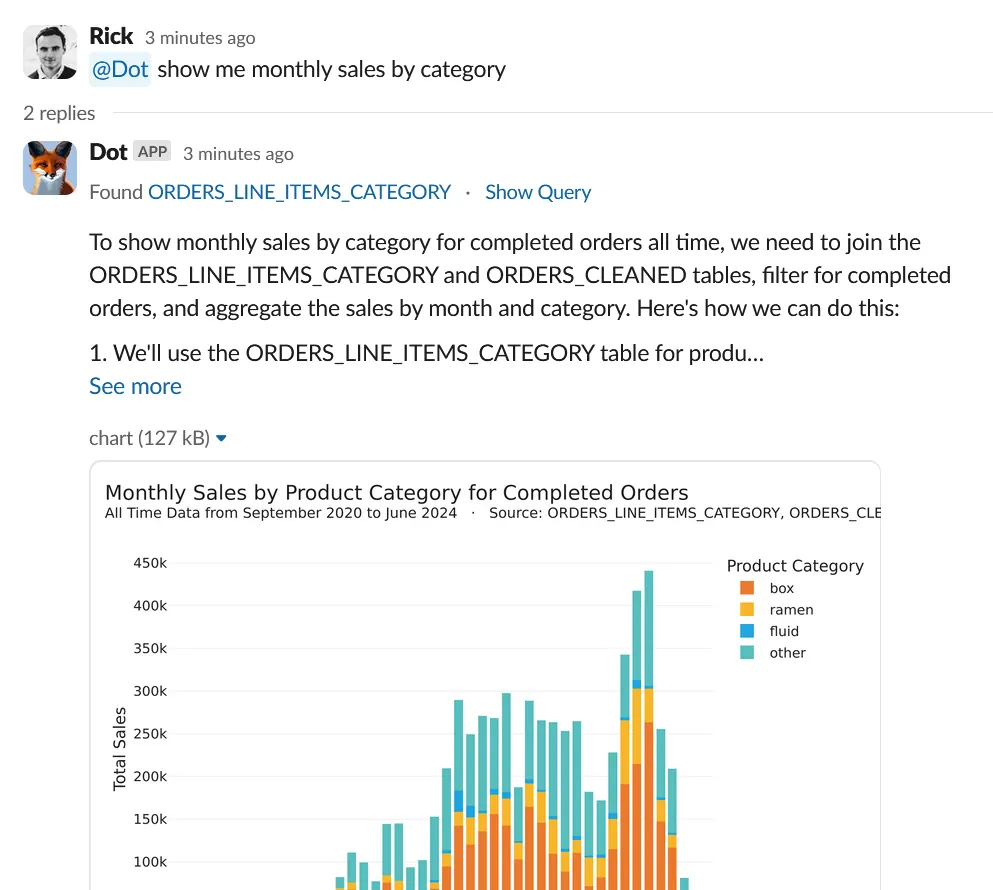
Even more cutting-edge are AI assistants like Dot (getdot.ai), which act as AI-powered data analysts. Dot can take a question like “Why is our weekly active user count down?” and actually do the deep analysis for you: it will dig into sub-metrics, find the key segments or factors driving the trend, and even generate a concise report of findings and recommendations. Essentially, it’s automating a lot of the steps we described earlier. According to the Dot team, their AI agent can “drill down into sub-metrics and find root causes of trends,” then go further to “generate recommendations based on the analysis,” just like a human analyst would. Importantly, it maintains alignment with your organization’s definitions and data governance (using your trusted data sources), so the insights are credible and not just random AI guesses. The benefit here is speed and breadth: an AI can crunch through every possible dimension combination much faster than a human, potentially surfacing non-obvious patterns or confirming which causes are most impactful.
Large Language Models (LLMs) are also changing the game by making these tools more conversational and accessible. Instead of you writing SQL and plotting graphs for each hypothesis, you might soon (or already) be chatting with an AI in plain English: “Give me the likely reasons why sign-ups dropped last week” and getting a coherent answer. With their capacity to understand natural language, LLMs offer unique advantages in RCA for example, they can detect subtle patterns, automatically suggest likely root-cause hypotheses, and synthesize insights from a variety of data sources. In plain terms, an LLM could comb through not just your numerical data but also unstructured information: imagine analyzing thousands of customer feedback comments and support tickets in minutes to flag common complaints or errors that spiked at the same time as the metric change. LLMs can also generate human-friendly narratives of what happened, which helps immensely in communicating findings to non-technical stakeholders.
That said, AI is an assistant, not a magic wand. It can surface correlations and patterns (e.g. “Metric X is down mainly in Segment Y”) and even propose possible causes, but you as the human still need to apply judgment. Not every correlation is causation, and business context is king. However, when used wisely, these AI tools drastically reduce the grunt work of slicing data and testing hypotheses, speeding up the journey to insight. As one expert put it, bringing together the power of LLMs with ML models purpose-built for root cause analysis gives your team the best of both worlds you get the speed and conversational convenience of AI plus the accuracy of domain-specific analytics, resulting in faster and more reliable answers.
For example, Dot’s AI agent not only finds root causes but even proactively identifies trends and anomalies in your data. It bridges the gap between raw data and decision-making by contextualizing insights and reducing the cognitive workload on you, the analyst. It’s like having a diligent junior analyst who works 24/7, combing through data and yelling out “Hey, look here, this might explain it!” and then you can take it from there.
Conclusion
Root cause analysis in analytics is both an art and a science. It’s detective work that requires curiosity, methodical thinking, and a solid grasp of your data and business context. Done well, it transforms you from just reporting what happened to explaining why it happened and that is where the real value of analytics lies. After all, anyone can notice a number went up or down, but the teams that can quickly figure out why are the ones that can react effectively and drive continuous improvement.
To recap, when a metric behaves unexpectedly, don’t panic. Define the problem clearly, verify it’s real, gather context, slice the data to pinpoint where the change is, dig into the metric’s components, and formulate explanations to test. This structured approach will lead you to the root cause more often than not. Along the way, remember to keep the big picture in mind (focus on the customer impact and business outcome) and not get lost in analysis for its own sake. The end goal is actionable insight: something you can do tomorrow that either fixes a problem or amplifies a success.
Lastly, take advantage of the tools and technology at your disposal. Modern analytics platforms and AI assistants can shoulder a lot of the heavy lifting, from automatically spotting anomalies to suggesting key drivers of a change. They won’t replace your critical thinking, but they can accelerate the process and surface patterns you might not spot on your own. For instance, automated root cause analysis features can quickly identify which dimension contributed the most to a metric’s fluctuation, giving you a head start. As Dot demonstrates, we’re entering an era where AI can not only retrieve data but also analyze it deeply and provide insights in plain language.
Related reading:
In a fast-moving scale-up environment, being proactive and swift in root cause analysis is a superpower. It means fewer nasty surprises and more opportunities seized. When you consistently explain the “why” behind the data, you build trust with your stakeholders (no more guessing or finger-pointing when something goes off) and you enable your company to learn and adapt faster. So embrace your inner data detective, use these strategies (and smart tools) to your advantage, and you’ll be well on your way to mastering root cause analysis in analytics.
Rick Radewagen
Rick is a co-founder of Dot, on a mission to make data accessible to everyone. When he's not building AI-powered analytics, you'll find him obsessing over well-arranged pixels and surprising himself by learning new languages.