
Sisense vs. Tableau vs. Dot: Which One Is Better?
Trying to compare Sisense vs. Tableau to work out which analytics platform gives your team more for the money?
I'll walk through what each tool does well, how they connect to your data, and what they cost, so you can land on the one that fits how your team actually works.
➡️ I’ll also introduce you to a third option: Dot (that's us), an AI data analyst that runs the analysis for you and delivers the answer straight into Slack, Teams, email, or the web app.
TL;DR
- Sisense is built for putting analytics inside other software, backed by an ElastiCube engine that models and caches your data and an AI layer called Sisense Intelligence.
It can run internal dashboards, but its real focus is developers shipping analytics into a product.
➡️ Choose Sisense if you're a product team that needs branded, customer-facing analytics and you have the engineers to build and maintain them.
- Tableau is the visualization specialist of the group, powered by its VizQL engine and the widest range of chart types on offer here.
It suits analysts who like to dig into data by hand and shape polished, interactive dashboards.
➡️ Choose Tableau if visual depth and data storytelling matter most to your team, and per-seat licensing fits your budget.
- Dot works from a different angle.
Our decision intelligence software connects to the warehouse you already run, does the analysis on its own, and sends back written answers with recommended next steps in the tools your team already uses.
➡️ Choose Dot if your data is in a warehouse already and your bottleneck is analyst capacity, not a shortage of dashboards.
Sisense vs. Tableau vs. Dot: features
Here is the short version of how the three stack up on features:
- Sisense pairs a modeling engine and embedding toolkit with an AI assistant.
- Tableau brings the strongest visual analytics of the three.
- Dot suits teams whose data is already in a warehouse, since it returns the answer itself and leaves nothing to build or decode first.
We'll take them in that order, starting with Sisense. 👇
Sisense's features
Sisense Intelligence and AI narratives
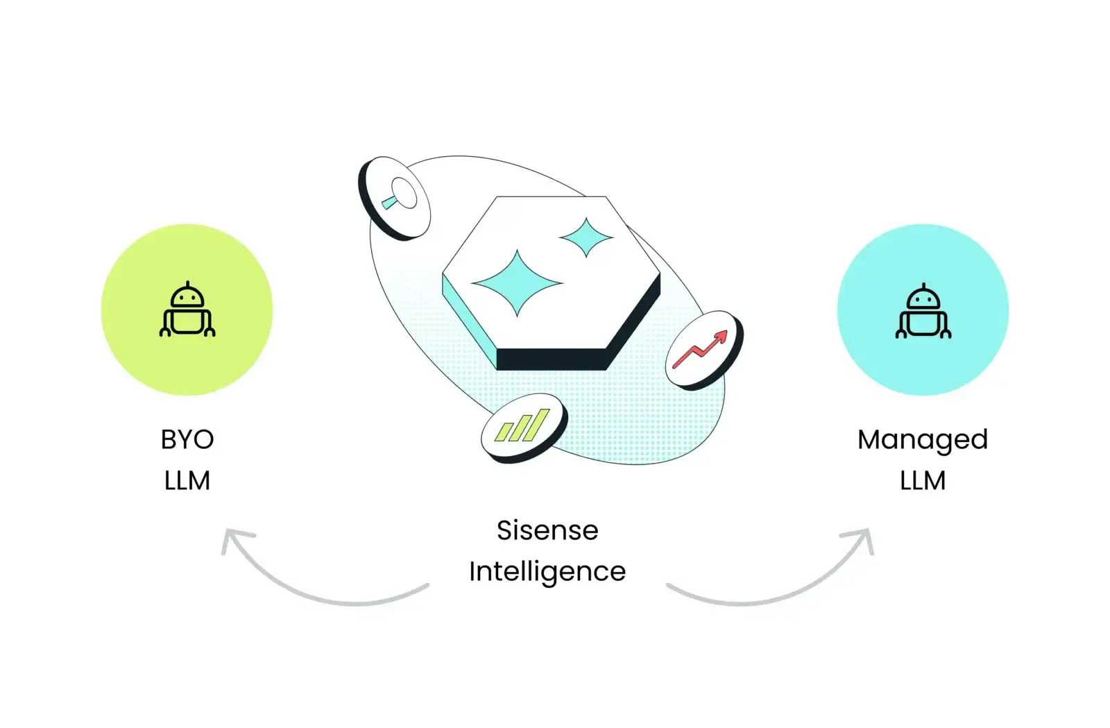
Sisense Intelligence is the AI layer that runs across the platform.
An assistant builds analytics from natural language, and a narrative feature turns a busy dashboard into a short written summary you can read at a glance.
The quality of those answers tracks closely with how well someone modeled the data underneath, so the AI is only as sharp as the groundwork.
The ElastiCube data engine
Under the hood, ElastiCube is Sisense's own analytical database.
It pulls from several sources at once and caches the result for quick queries, and you can also point Sisense at a live warehouse like Snowflake or BigQuery, or run a mix of the two.
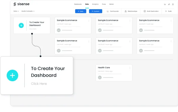
Teams with the skills to model data properly get genuine control over speed and structure, though that control comes with a fair bit of setup before the first dashboard appears.
Embedded analytics with the Compose SDK
Embedding is the area Sisense pours the most into.
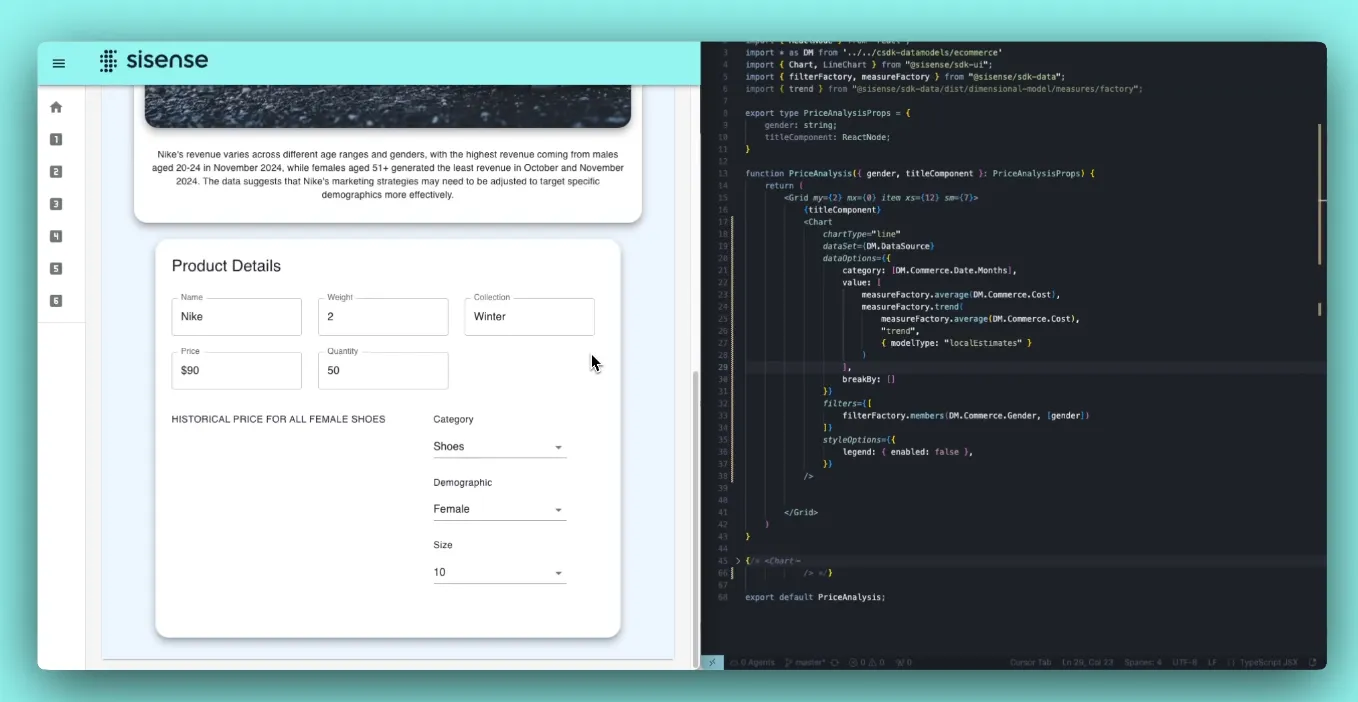
Using the Compose SDK and Sisense.JS, developers can slot dashboards and widgets into a React, Angular, or Vue app and style them to match the product.
For a faster start, an iframe option gets analytics running without custom code.
Low-code visualization
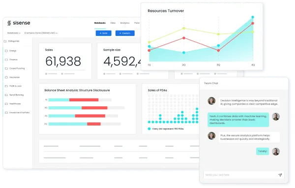
On visualization, Sisense ships a stocked library of chart types and map visuals that business users can assemble into dashboards without code.
The AI assistant can also spin up visuals from a prompt.
Sisense is best suited if:
✅ You're a product team embedding analytics into a customer-facing app.
✅ You have developers comfortable with an SDK and hands-on data modeling.
✅ You want data prep, modeling, visualization, and embedding handled in one platform.
✅ You need enterprise controls like multi-tenancy and row-level security.
Sisense may not be ideal if:
❌ You want a quick start.
❌ You have no engineering support to build and maintain it.
❌ Predictable pricing matters, as every quote runs through sales.
Tableau's features
VizQL and visual exploration
VizQL has been Tableau's backbone for years.
The engine converts each drag-and-drop move into a live chart, so an analyst can chase a question through the data and build layered, interactive dashboards with hardly any code.
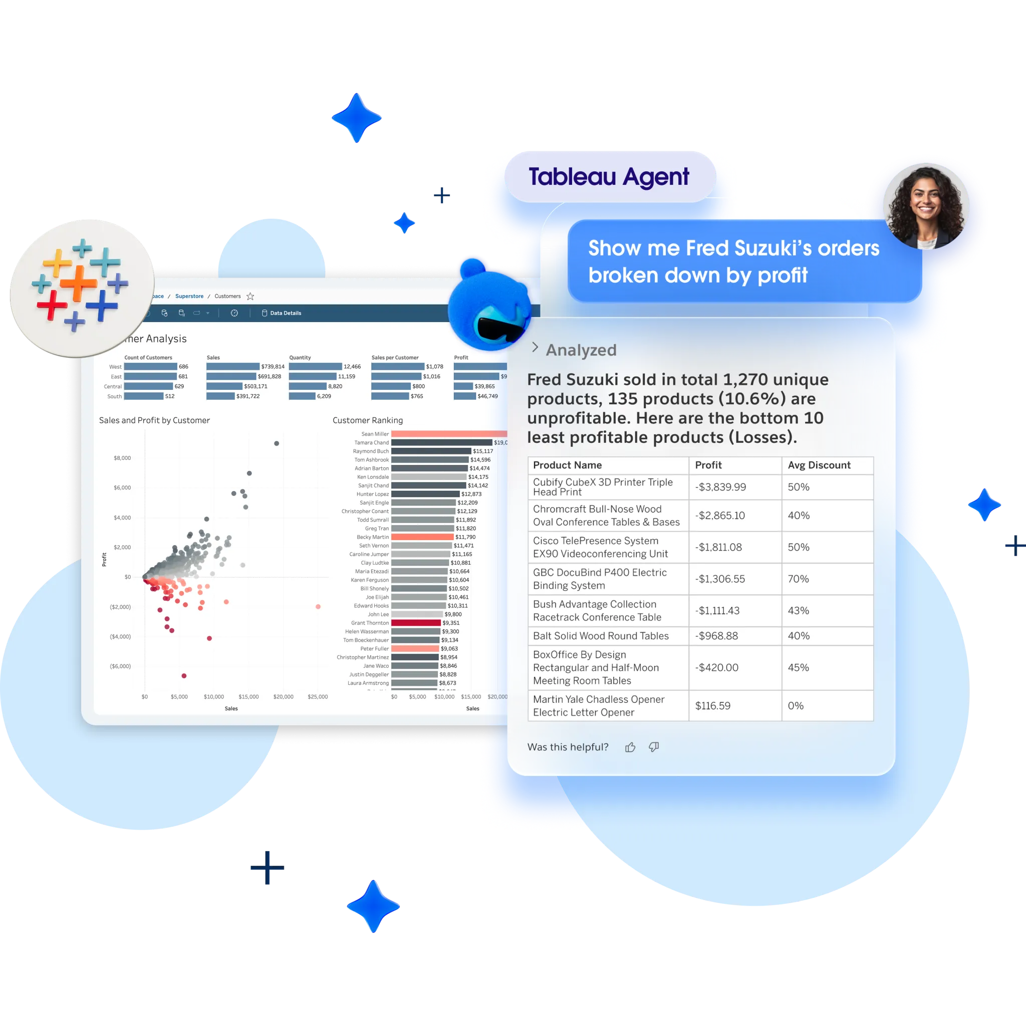
For sheer range of chart types and depth of hands-on exploration, Tableau still sets the bar the rest of the market chases.
Tableau Pulse
Tableau Pulse is the proactive piece.
Assign it a metric and it keeps watch, sending short AI-written recaps and flagging unusual movement the moment it happens, so a change reaches you well before you'd open a dashboard to check.
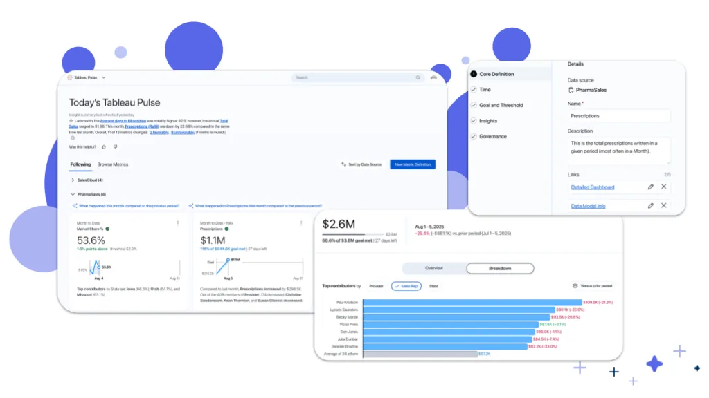
It's aimed squarely at the habit of dashboards going unopened for days at a time.
Tableau Next and agentic analytics
Tableau Next is the company's move into agent-based analytics.
People ask questions in everyday language, and the agent can take the extra step of triggering workflows in the tools Tableau connects to, Salesforce among them.
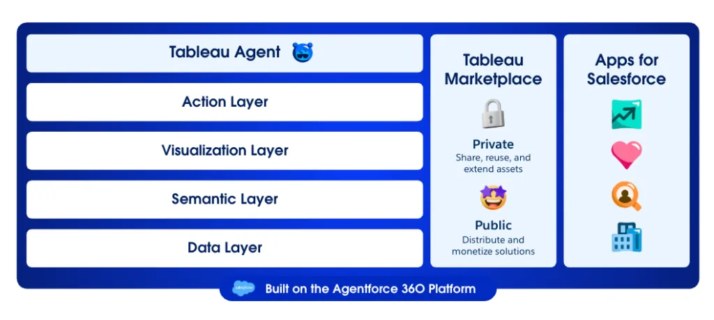
It's a real signal of where the product is headed, though the natural language layer is still maturing next to the rest of Tableau, and it only ships with the custom-priced Tableau+ bundle.
Data prep and governance
For getting data ready, Tableau Prep gives analysts a visual way to clean and reshape data before it reaches a dashboard.
Bigger rollouts lean on Data Management and the Enterprise tier for cataloging and lineage.
These keep analytics governed as it spreads across teams, though those governance tools stay locked to the pricier Enterprise edition.
Tableau is best suited if:
✅ You have analysts who want the deepest, most flexible visual exploration available.
✅ You run a mixed-hardware or broadly non-Microsoft setup where Tableau fits naturally.
✅ You're already inside the Salesforce ecosystem and want analytics wired into it.
✅ Data storytelling and presentation-ready dashboards drive how your team communicates.
Tableau may not be ideal if:
❌ Budgets are tight, since role-based seats climb fast at scale, and every viewer needs a paid one.
❌ Your team is new to data analytics, as some advanced features are not very easy to understand at first, according to a G2 review.
❌ You push very large or live datasets, where dashboards can slow without careful extract tuning.
❌ You want the newest AI features, locked behind the custom-priced Tableau+ bundle.
Dot's features
Sisense and Tableau are both, when you get down to it, tools for presenting data.
They connect to it, model it, and paint it onto a dashboard, and reading that dashboard is your job.
Dot approaches the problem backwards.
You put your question in words, and it hands back the answer already worked out, with the reasoning and a suggested next step attached.
This was never meant to be one more dashboard product in a saturated market.
The point is more specific: give warehouse-backed teams an analyst that pins down what changed and why, then tells you what to do about it.
Let’s take a closer look at the pieces. 👇
Natural language answers in Slack and Teams
Most data questions surface in a Slack thread, not a BI tool, and Dot answers them right there, alongside Microsoft Teams, email, and the web app.
Someone asks why trial-to-paid conversion slipped last month, or which markets are dragging on retention, and a full answer comes back inside a few minutes.
The reply is never just the figure.
Dot explains what moved and names the likeliest cause, down to the specific segments behind it.
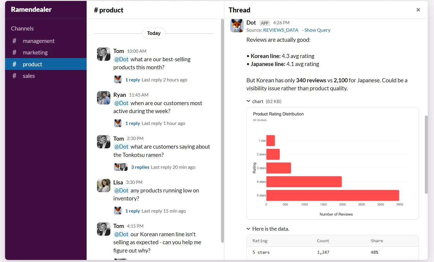
For the data team, the steady drip of small requests no longer hits the queue, which buys analysts back the hours they'd rather spend on harder problems.
Deep Analysis for the "why" questions
Some questions can't be settled with a single lookup, and Deep Analysis is the mode for those.
It behaves like an analyst you've handed a hard problem to, running one query after another and weighing each possible cause against the data before it commits to an explanation.
Picture revenue sliding with no obvious reason.
Dot works into the high-dimensional slices a quick check would skip and puts a confidence level on every driver it flags.
You watch the investigation unfold query by query, and what arrives at the end is a structured report: one hard number as the takeaway, a short executive summary, the charts behind it, and the concrete next steps.
Each figure carries a link to its source, and the finished report drops into a PowerPoint deck when you need to present it.
Business reviews that run on their own
The weekly or monthly leadership review usually eats a chunk of someone's time on the data team, between pulling the numbers and writing it all up.
Dot produces that review on its own.
It works off the warehouse directly, on whatever schedule you set, and writes the summary as a narrative that lays out what moved and the parts worth a closer look.
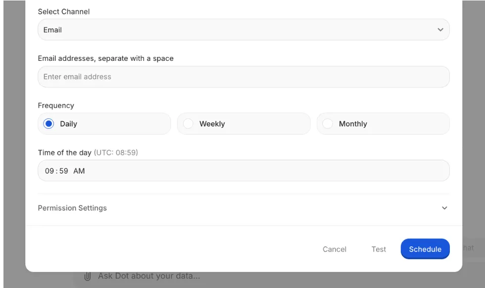
Those scheduled reviews now run as a background agent, and you can attach two kinds of conditions to it.
One decides whether the review runs at all, based on activity in the data, and the other decides whether it actually gets sent, based on whether the result is worth your attention.
The agent can stay quiet for weeks, then surface the moment something crosses the line you set.
A shared context layer for definitions
As a company scales, the same metric starts to mean different things in different rooms.
Finance calls an account active on one rule, product uses another, and the meeting slides into a debate over whose number to trust, not the decision on the table.
The Context Agent exists to shut that down.
It runs on the DotML semantic layer, keeps the agreed KPIs and definitions in one place, and holds every query to them, so two people asking the same question land on the same answer.
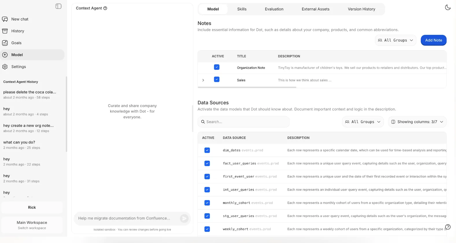
When you flag in chat that a definition has drifted or a table changed under it, Dot won't rewrite the model on its own.
It drafts the change and passes it to an admin, who reviews the full difference and decides whether it goes in.
Dashboards from a short brief
Sometimes a dashboard is exactly what you're after, and Dot can build one from a couple of sentences.
Tell it what the board should track, and it returns an interactive layout of charts, tables, KPI tiles, and filters that you can adjust before publishing and sending round a link.
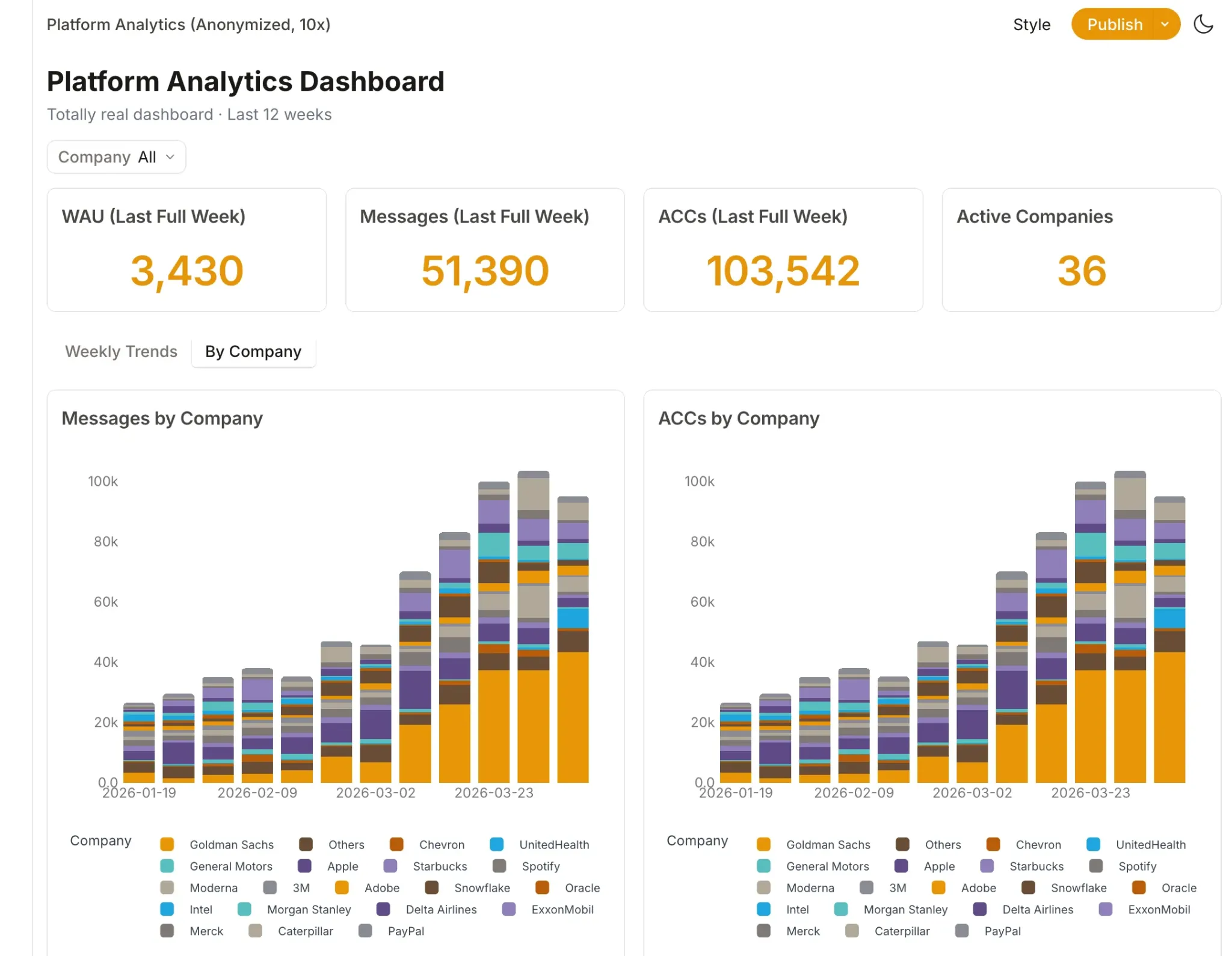
It pulls fresh data every time someone opens it and sorts out relative date ranges automatically, so the visual layer shows up without any manual wiring.
Dot is the right choice if you:
✅ Run a modern warehouse like Snowflake or BigQuery and want answers, not another dashboard to maintain.
✅ Keep fielding the same Slack questions week after week and want an analyst-grade reply in minutes.
✅ Lose hours every cycle hand-building executive business reviews.
✅ Need governed, auditable answers where every figure traces back to the SQL behind it.
Dot isn't the best option if you:
❌ Haven't stood up a cloud warehouse yet, since Dot connects to one and doesn't replace it.
❌ Want a heavy, pixel-perfect visualization suite as your main deliverable.
Integrations: Sisense vs. Tableau vs. Dot
Sisense integrations
Sisense reaches a wide set of sources, with over 200 connectors and a data engine that can query live or work from cached extracts.
It recently added Model Context Protocol support, which lets external AI tools like Claude and ChatGPT read its governed models.
A short list of notable connections:
- Snowflake and Redshift.
- BigQuery.
- PostgreSQL and MySQL.
- SQL Server and Oracle.
- Salesforce.
Tableau integrations
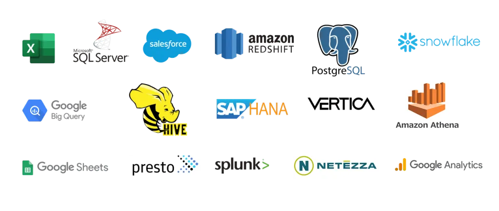
Tableau's connector library is wide, reaching from local files and databases out to cloud applications, and its links to Salesforce have grown closer since the acquisition.
A short list of notable connections:
- Excel and CSV files.
- SQL Server.
- Snowflake and BigQuery.
- Salesforce CRM.
- GA4.
Dot integrations
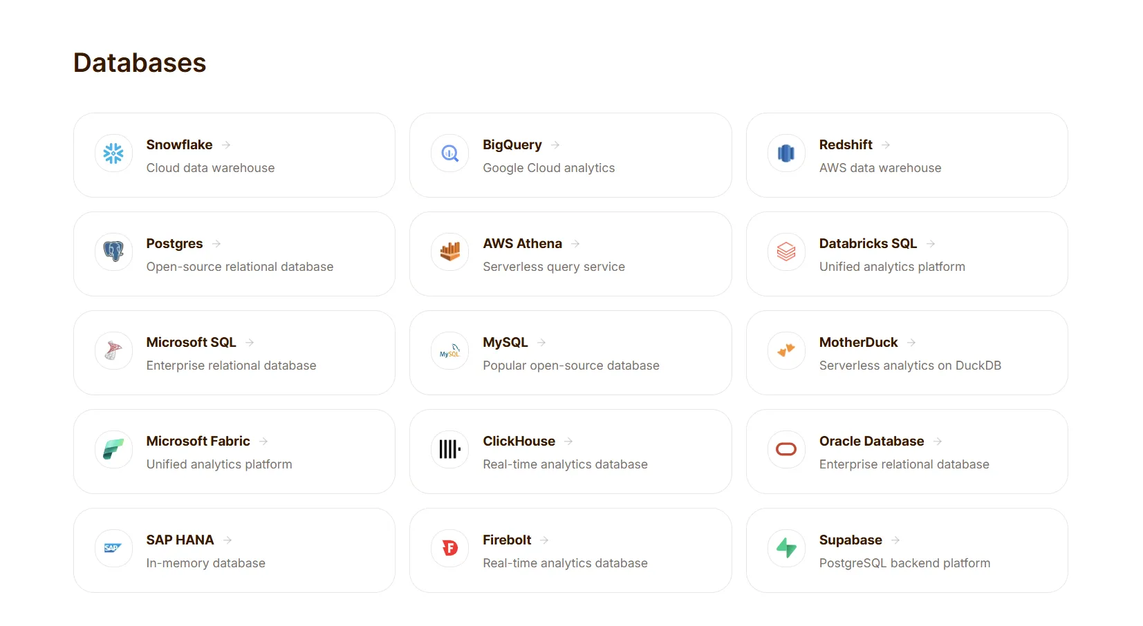
Dot plugs directly into your existing warehouse, and it reads the modeling you've already done in dbt and Looker, so there's nothing to rebuild.
Our platform also reaches into everyday work tools through MCP, which is how Dot connects to platforms like Claude and ChatGPT.
A short list of notable connections:
- Snowflake and BigQuery.
- Redshift and Databricks.
- Postgres and MySQL.
- dbt and Looker.
- Slack and Microsoft Teams.
Pricing: Sisense vs. Tableau vs. Dot
Sisense pricing
Sisense has not disclosed its pricing publicly, so you'd have to contact them to get a quote.
It runs two tracks: a self-serve plan for startups and growing teams and an Enterprise plan for regulated, high-stakes deployments, but neither one lists a number.
There's a 7-day free trial with guided sample data if you want to test it before committing.
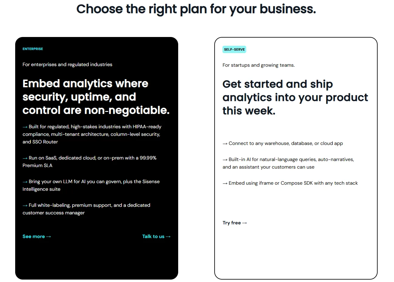
Tableau pricing
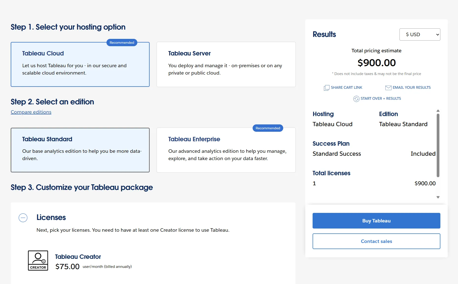
There's a free way in with Tableau Public and the free Tableau Desktop edition, after which pricing turns into annual, role-based seats.
You settle on an edition, either Standard or Enterprise, then buy licenses by what each person does, with at least one Creator required per deployment.
It comes hosted as Tableau Cloud or self-managed as Tableau Server, with the same seat pricing either way.
- Free: Tableau Public and the Tableau Desktop free edition, for local analysis with no sharing.
- Tableau Standard: seats run from $15/user/month for a Viewer up to $75/user/month for a Creator, with Explorer at $42 in between, covering the Tableau Desktop and Prep Builder apps, plus Pulse.
- Tableau Enterprise: seats run from $35/user/month for a Viewer up to $115/user/month for a Creator, with Explorer at $70 in between, adding Advanced Management and Data Management.
- Tableau+: AI-powered agentic analytics for the whole organization, at custom pricing (contact sales).
Dot pricing
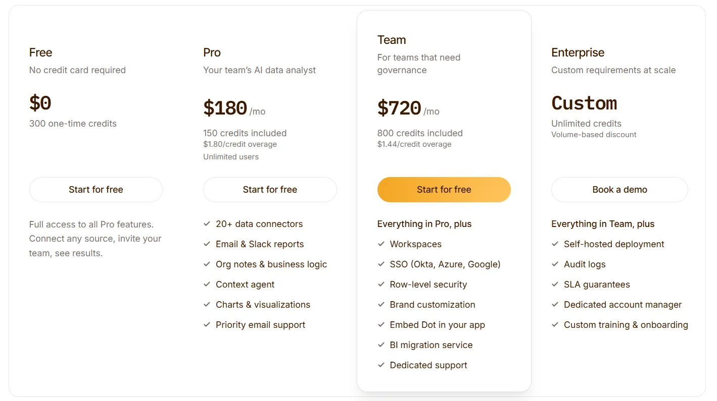
You can start on the free plan, which comes with 300 one-time credits and every Pro feature, so there's room to test Dot on real work before any spend.
From there, three paid tiers:
- Pro: $180/month, with 150 credits a month, $1.80 per extra credit, and unlimited users.
- Team: $720/month, with 800 credits a month, a $1.44 overage rate, and SSO, row-level security, embedding, BI migration, and dedicated support.
- Enterprise: custom pricing, with unlimited credits, volume discounts, self-hosted deployment, audit logs, an SLA, and a dedicated account manager.
Sisense, Tableau, or Dot: summary
Here’s a side-by-side view of the 3 tools:
Sisense | Tableau | Dot | |
Best for: | Product teams embedding customer-facing analytics into their own app | Analysts who want the deepest visual exploration and data storytelling | Warehouse teams that want answers, not another dashboard to interpret |
Standout feature | Embedded analytics with the Compose SDK | VizQL drag-and-drop visual analytics | Answers-first AI analysis delivered in Slack, Teams, email, and the web app |
Integrations | Over 200 connectors, live or cached | Wide connector library with tight Salesforce ties | Warehouse-native, reuses dbt and Looker models, MCP support |
Free tier? | No (7-day free trial) | Yes (Tableau Public and free Desktop edition) | Yes (300 credits, full Pro features) |
Starts from: | Custom (contact sales) | $15/user/month | $180/month, unlimited users |
Get started with Dot for free today
Dot's pitch is simpler than Tableau and Sisense.
Connect it to the warehouse you're already running, ask your question in ordinary language, and the answer turns up in Slack, Teams, email, or the web app, without anyone chasing it down.
What your team gets with Dot:
- A free plan with 300 credits and every Pro feature, on unlimited users.
- Answers across Slack, Microsoft Teams, email, and the web app.
- Deep Analysis that works out why a number moved and returns with clear recommendations.
- Executive business reviews written automatically on the schedule you choose.
- A Context Agent that keeps definitions consistent and flags conflicts early.
- An audit trail on every answer, traceable back to the SQL and source data underneath.
➡️ Get started for free with Dot's free plan, or schedule a demo to see how it works with your data.
⚠️ Disclaimer: This article was last updated on July 14, 2026. If you spot any inaccuracies, contact us, and we'll fact-check it.
Theo Tortorici
Theo writes about AI-powered analytics, data tools, and the future of business intelligence at Dot.