
Microsoft Power BI vs. Domo vs. Dot: Which One Is Better?
Looking to compare Microsoft Power BI vs. Domo to see which tool offers the better value-for-money?
Power BI and Domo are both well-known names when you are weighing up business intelligence tools in 2026, and each one takes its own route to the same goal.
In this buyer guide, I'll walk through each tool's features and integrations, then break down pricing so you can make a call that fits your team.
➡️ I'll also point you to a third option that covers the gap both tools leave open: the fact that you still have to build the dashboard and then work out what it means yourself: Dot (that's us), an AI data analyst that hands you the answer in Slack, Teams, email, or the web app.
TL;DR
- Power BI is built around interactive dashboards and reports that sit on top of a data model you define.
It works best when your stack is already Microsoft, since it plugs straight into Excel, Teams, SharePoint, and Azure.
➡️ Choose Power BI if your organization lives in the Microsoft ecosystem and you want standardized reporting at scale.
- Domo takes an all-in-one route, bundling data ingestion, transformation, dashboards, and automation into a single cloud platform.
Non-technical teams can stand up reporting fast thanks to its no-code builder and library of over a thousand connectors.
➡️ Choose Domo if you want one platform to handle the whole pipeline, from raw data through to shareable dashboards and alerts.
- Dot starts from a different place. It connects to your warehouse and does the analysis for you, then delivers written answers and recommendations where your team already talks.
There is no dashboard to hunt through, because the answer shows up as a narrative in Slack, Teams, email, or the web app.
➡️ Choose Dot if your data already lives in a warehouse and your real bottleneck is analyst time and the slow, manual work of turning charts into decisions.
Microsoft Power BI vs. Domo vs. Dot: features
Here is the short version of how the three stack up on features:
- Power BI gives you the deepest visualization toolkit of the three and unmatched Microsoft integration, but it asks a lot of you upfront through data modeling.
- Domo covers the widest surface area, from ingestion to automation in one place, though that breadth comes with a learning curve and pricing that is hard to forecast.
- Dot is the most well-rounded pick for teams whose data already sits in a warehouse, because it skips the dashboard-building step and returns the answer directly.
Let's go through each tool's features, starting with Power BI: 👇
Microsoft Power BI's features
Interactive dashboards and reports
Power BI is, at its core, a visualization engine.
You connect your sources and shape them into a model, then build dashboards that combine interactive visuals with drill-down filters.
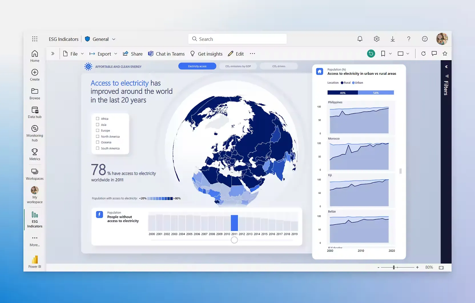
The result is genuinely strong reporting, and the drag-and-drop canvas means a business user can assemble a clean dashboard without touching code.
The Microsoft ecosystem and Fabric
This is Power BI's biggest advantage.
Reports publish straight into Teams and SharePoint, and the platform now sits inside Microsoft Fabric alongside OneLake and the wider Azure data estate.
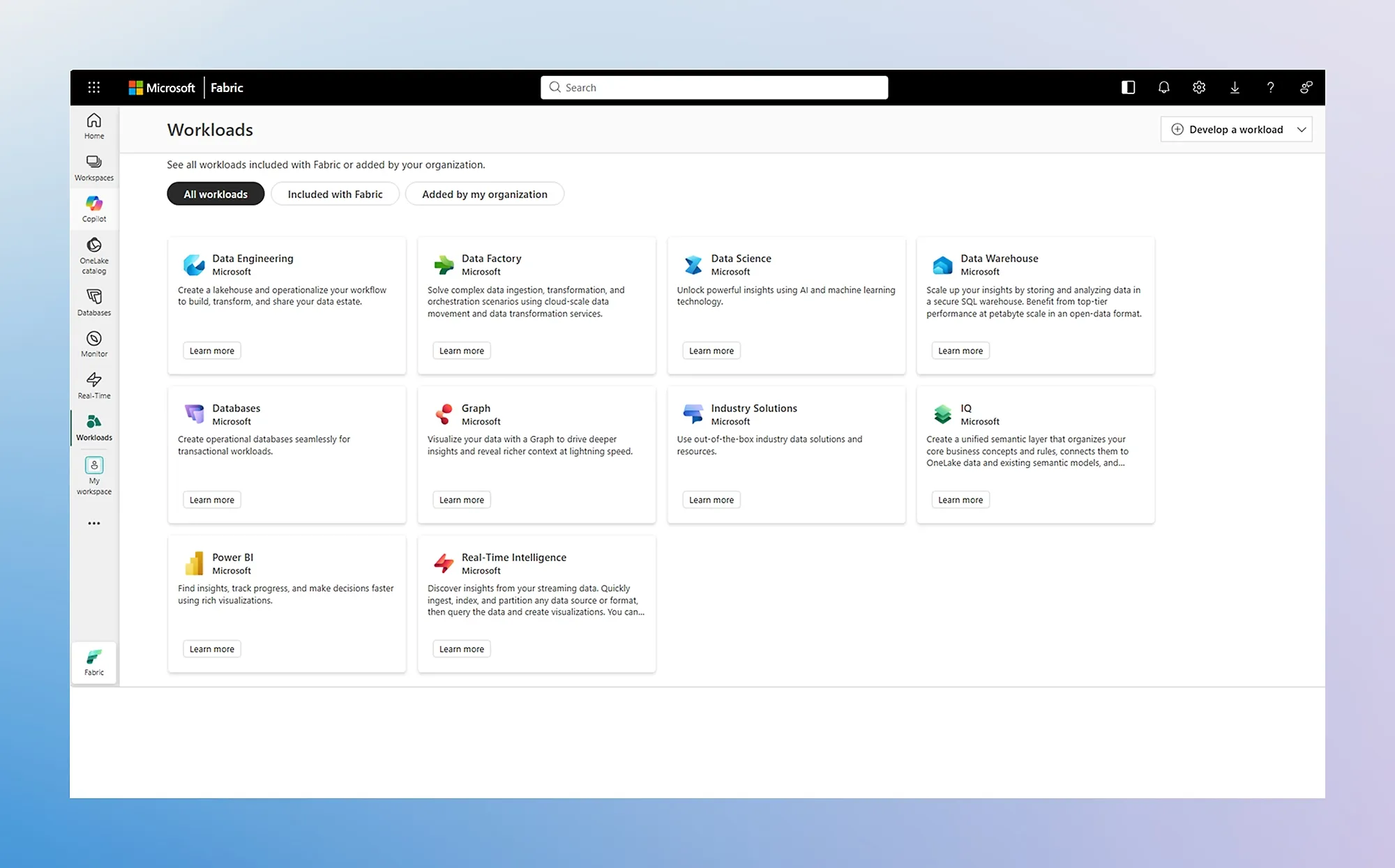
If your company already runs on Microsoft 365, the connectivity here is tough to match.
AI-assisted insights with Copilot
Copilot in Microsoft Fabric adds a conversational layer on top of your reports.
You can ask questions in words and get forecasting or anomaly detection without building a fresh visual each time.
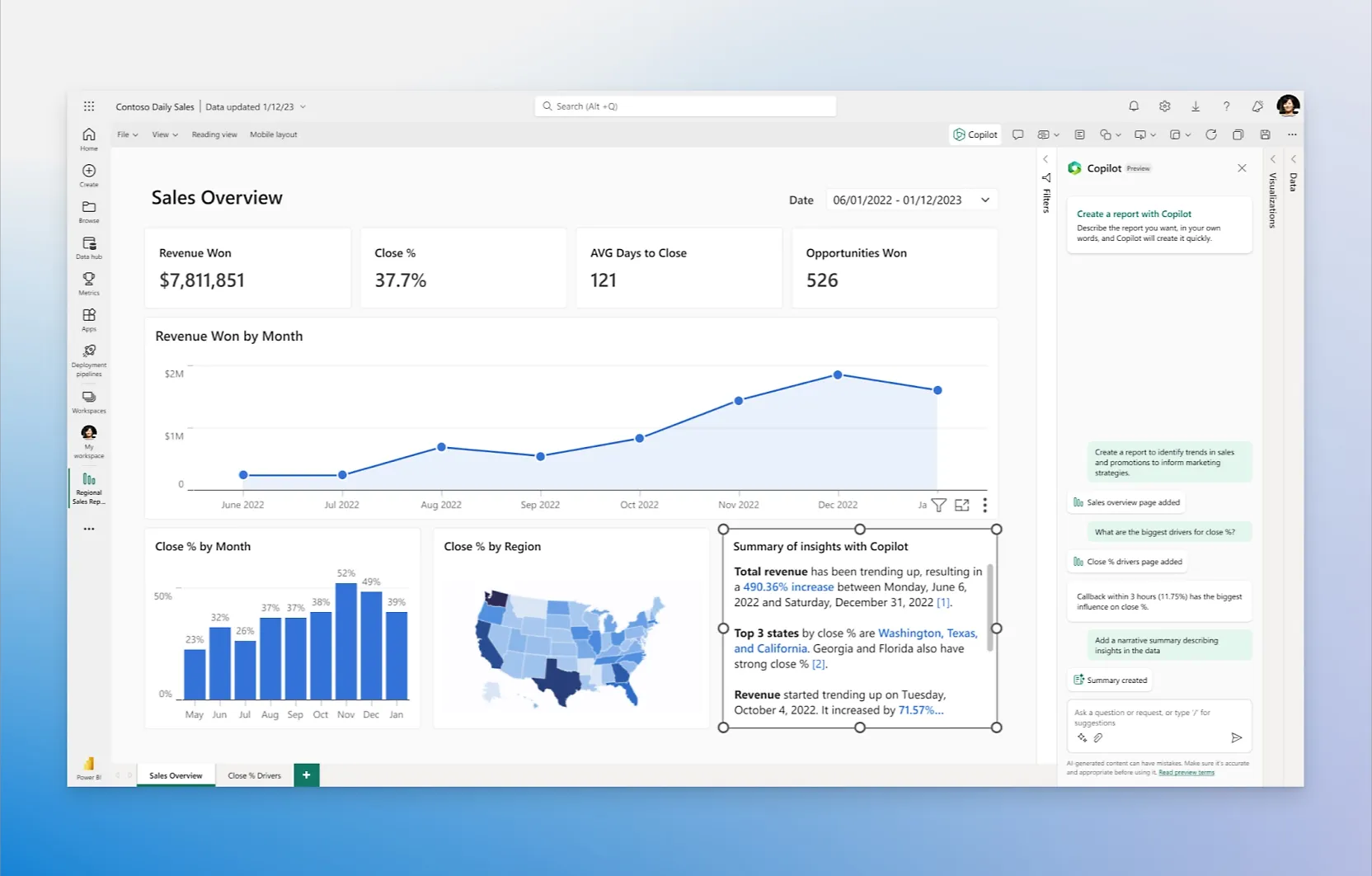
It helps, though the depth of what Copilot can explain is still tied to how well your underlying model is built.
Power BI is best suited if:
✅ Your organization is already invested in Microsoft 365 and Azure.
✅ You want standardized, governed dashboards rolled out across many teams.
✅ You have analysts comfortable with data modeling.
✅ You need enterprise controls like row-level security and sensitivity labels.
Power BI may not be ideal if:
❌ Your team needs to build the data models, not just view reports.
❌ You work with very large or complex datasets, where models can slow down or hit size and memory limits.
❌ You want simple, predictable licensing, since larger datasets and features like paginated reports, AI, and deployment pipelines sit behind Premium.
❌ You have Mac users who need to author reports, since Power BI Desktop runs on Windows only.
Domo's features
1,000+ data connectors
Domo's calling card is breadth of connectivity.
It ships with more than a thousand pre-built connectors covering Salesforce, Google Analytics, Snowflake, Databricks, and just about any cloud app or database you can name.
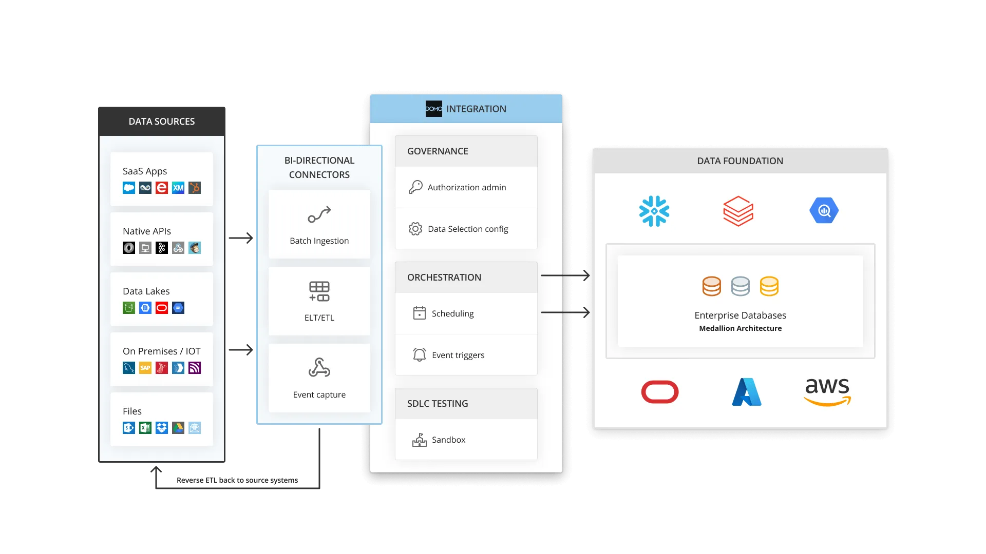
For teams pulling scattered data into one home, this is Domo's strongest aspect:
- Magic ETL for no-code data prep
- Magic ETL is Domo's visual pipeline builder.
You clean and reshape data through a drag-and-drop interface, with SQL or Python available when a job needs more muscle.
It is the piece that cuts a team's reliance on data engineers for every small change.
Real-time dashboards and cards
Once the data is in, Domo turns it into interactive, real-time dashboards built from reusable cards.
They are easy to share and embed, and they update live as new data lands, mobile included.
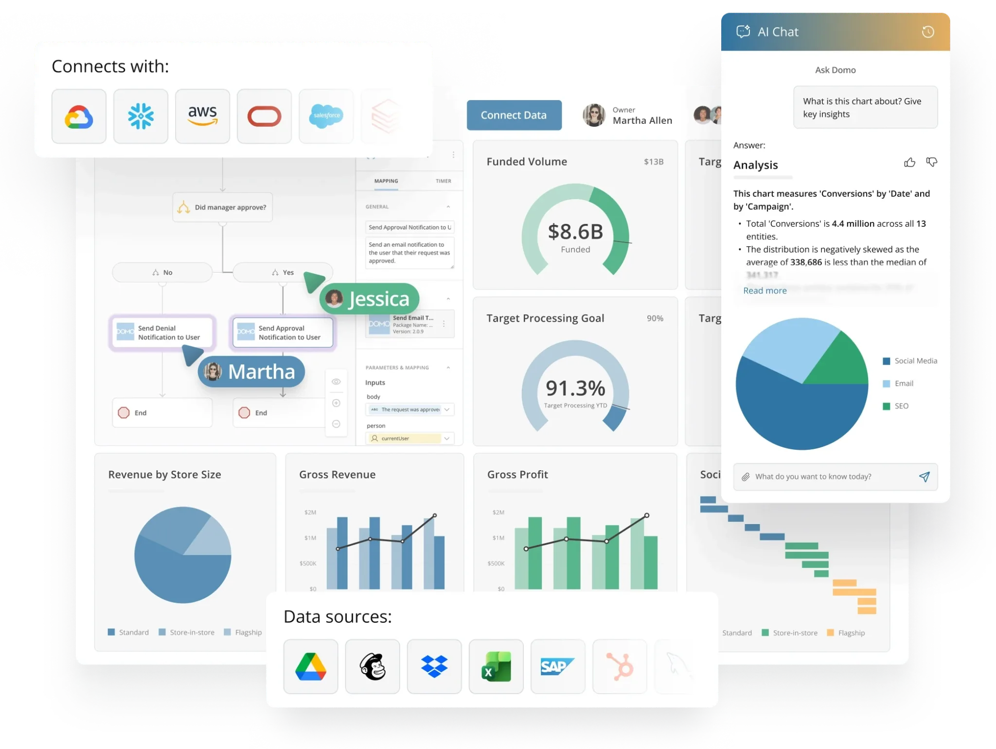
Collaboration features like in-context chat and annotations sit right alongside the numbers.
AI Chat and agents
Domo has layered an AI tier on top of the platform.
AI Chat lets people ask questions in words and get charts or recommendations back, while Agent Catalyst lets teams build and deploy custom AI agents against their data.
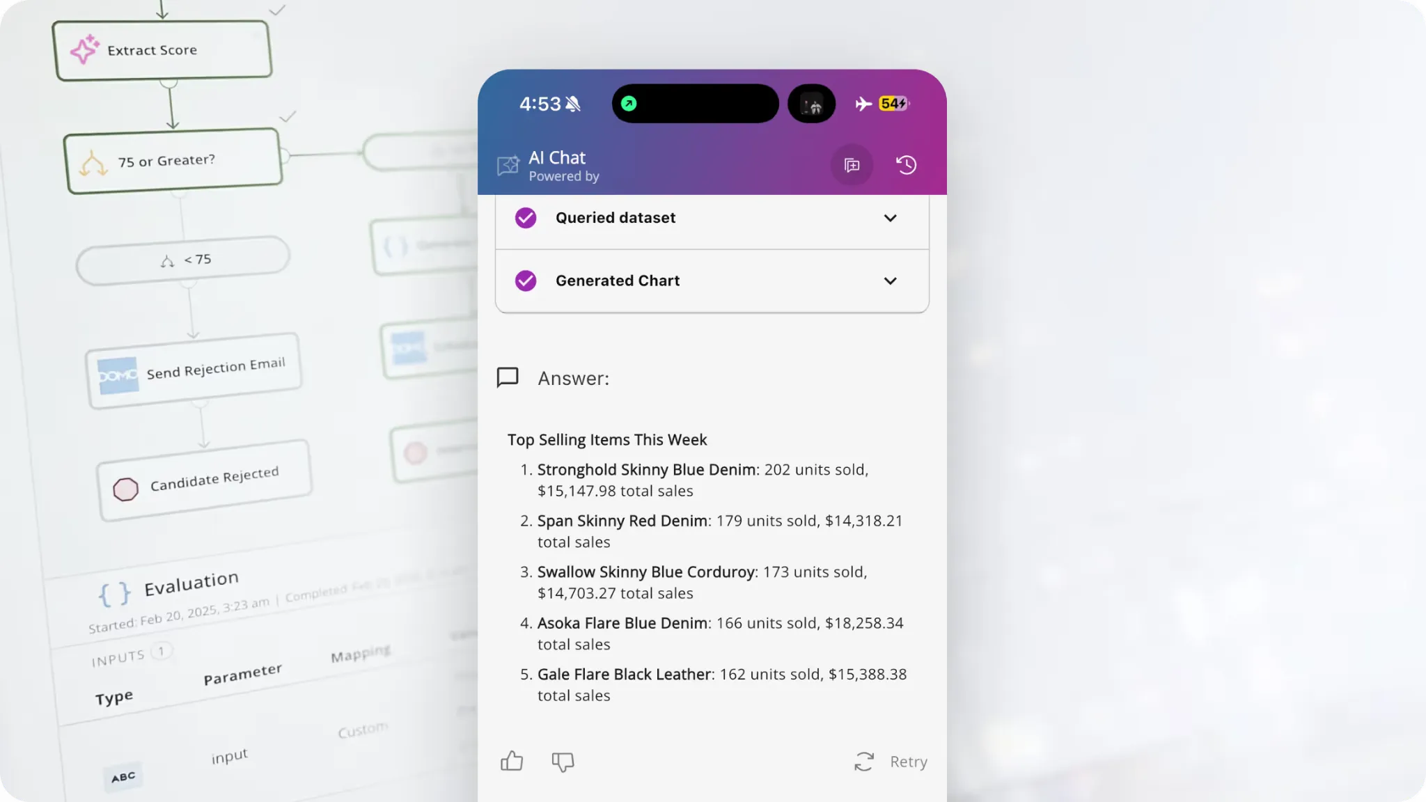
It is a capable addition, though it was added onto the dashboard workflow more recently than the rest of the stack.
Domo is best suited if:
✅ You want a single platform covering ingestion, prep, dashboards, and automation.
✅ Your team is non-technical and needs to get productive quickly.
✅ You rely on a lot of different data sources and value connector breadth.
✅ You want strong collaboration and mobile access baked in.
Domo may not be ideal if:
❌ You want transparent, predictable pricing, since the credit-based consumption model means no published rates and costs can spike with refreshes, storage, and renewals.
❌ You need tight metric governance, since Domo has no real semantic layer or LookML equivalent to keep definitions consistent across teams.
❌ You run heavy or complex dashboards, which can lag even though the platform handles raw data volume well.
❌ You want deep visualization customization, since Domo's cards offer fewer chart types and less design control than Tableau or Power BI.
Dot's features
Power BI and Domo are both excellent at showing you data.
They model it and chart it, then hand the interpretation back to you.
Dot was built around the opposite assumption: you type the question, and you read the answer.
We are not trying to add one more dashboard tool to a market that already has plenty.
Our aim is narrower: to give warehouse-backed teams a decision intelligence software that explains what happened and why, then points to the next move.
Here are the features that make that work: 👇
Natural language analysis in Slack and Teams
Most analytics questions are messy.
Someone asks why conversion dropped last week, or what changed in EMEA compared with last month, and answering it usually means jumping between dashboards or waiting in an analyst queue.
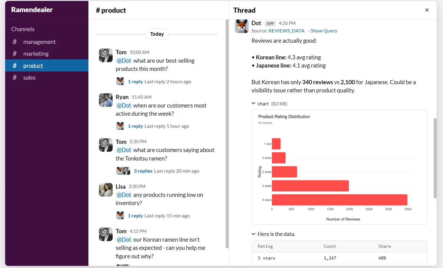
Dot takes the question in Slack, Microsoft Teams, email, or the web app and returns a full response in minutes.
The reply does not stop at a number.
It explains what is happening and why it is likely happening, down to the segments driving the move.
For data teams, that means the flood of one-off requests gets absorbed automatically, freeing analysts for deeper work.
Deep Analysis for the "why" questions
Quick lookups are one thing; investigations are another.
Deep Analysis is Dot's research mode, an autonomous analyst that runs multiple queries and validates its root-cause findings before it commits to an answer.
Recent updates pushed this further, so Dot now explores high-dimensional data it used to skim and backs each key driver with statistical confidence.
You watch the investigation happen query by query, then receive a structured report with a single quantified finding, an executive summary, supporting charts, and specific recommendations.
Every claim links back to the source data, and you can export the whole thing to PowerPoint in one click.
Automated business reviews that run themselves
Every week, someone on the data team burns hours pulling metrics and formatting slides into a summary for leadership.
Dot replaces that job.
It generates executive-ready business review reports on the schedule you set, straight from the warehouse, as written narrative that explains what changed and where attention is needed.
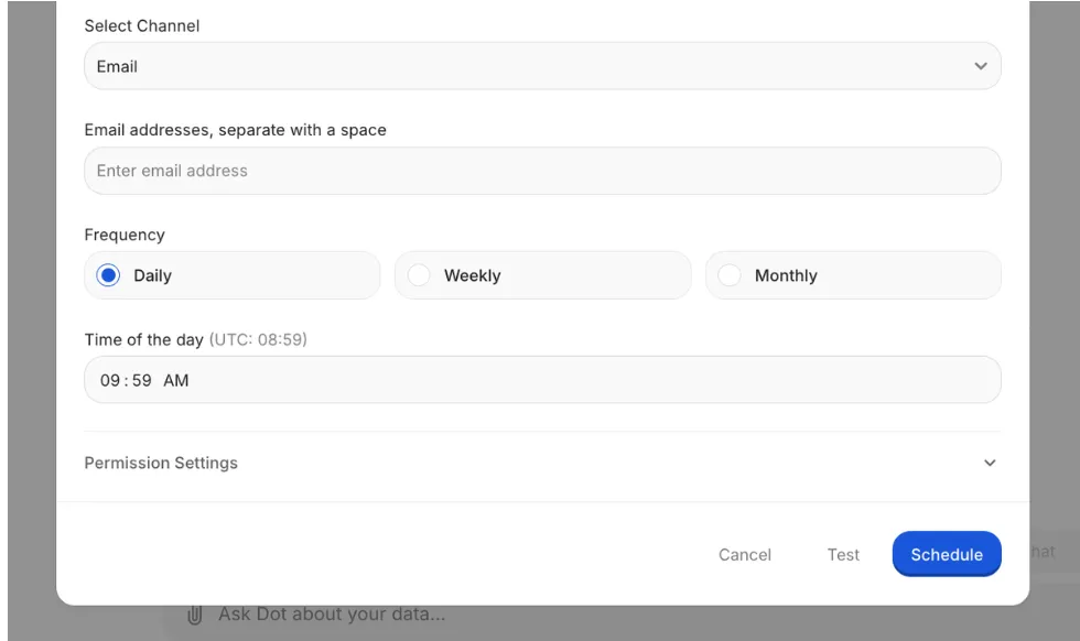
Scheduled reports have also grown into a background agent.
You can add a work gate ("only run if new orders arrived today") and a result gate ("only deliver if revenue dropped more than 5%"), so Dot watches quietly and pings you only when something actually matters.
The Context Agent and shared definitions
Dashboards drift.
Two teams define "active user" differently, and you land in the classic "which number is right" argument.
Dot's Context Agent, powered by its DotML semantic layer, learns your KPIs and metric definitions, then applies them on every query for consistent answers.
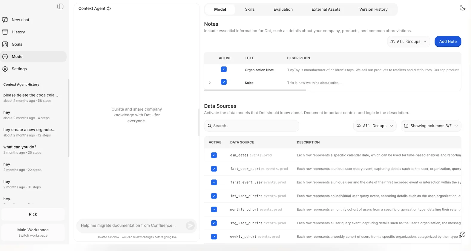
When someone tells Dot in chat that a table was renamed or a metric is wrong, it does not silently change things.
It queues a reviewable proposal, and an admin sees a full diff before merging or rejecting it, so governance stays intentional.
Dashboards built from a conversation
For the times you do want a dashboard, Dot builds one from a description.
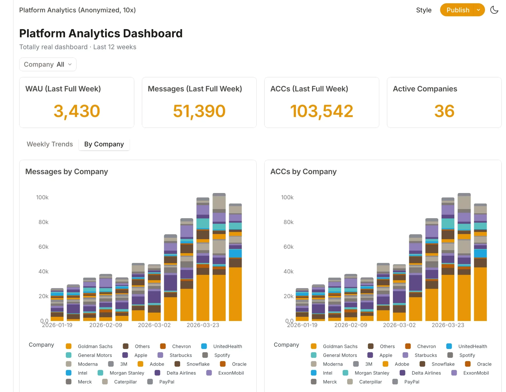
Tell it what you want to track, and it assembles an interactive dashboard with KPIs, charts, tables, and filters that you can tweak, then publish and share by link.
Dashboards pull fresh data on every load and support relative date presets and auto-refresh, so you get the visual layer without the manual assembly.
Dot is the right choice if you:
✅ Already run a modern warehouse like Snowflake or BigQuery and want answers without building another dashboard layer.
✅ Field the same ad-hoc questions in Slack every week and want an analyst-grade response in minutes.
✅ Spend hours each cycle assembling executive business reviews by hand.
✅ Want governed, auditable answers where every figure traces back to its underlying SQL.
Dot isn't the best option if you:
❌ Do not yet have a modern cloud warehouse, since Dot is built to connect to one, not to replace it.
❌ Need a heavy pixel-perfect visualization suite as your primary output, because Dot leads with answers and treats dashboards as the second step.
Integrations: Microsoft Power BI vs. Domo vs. Dot
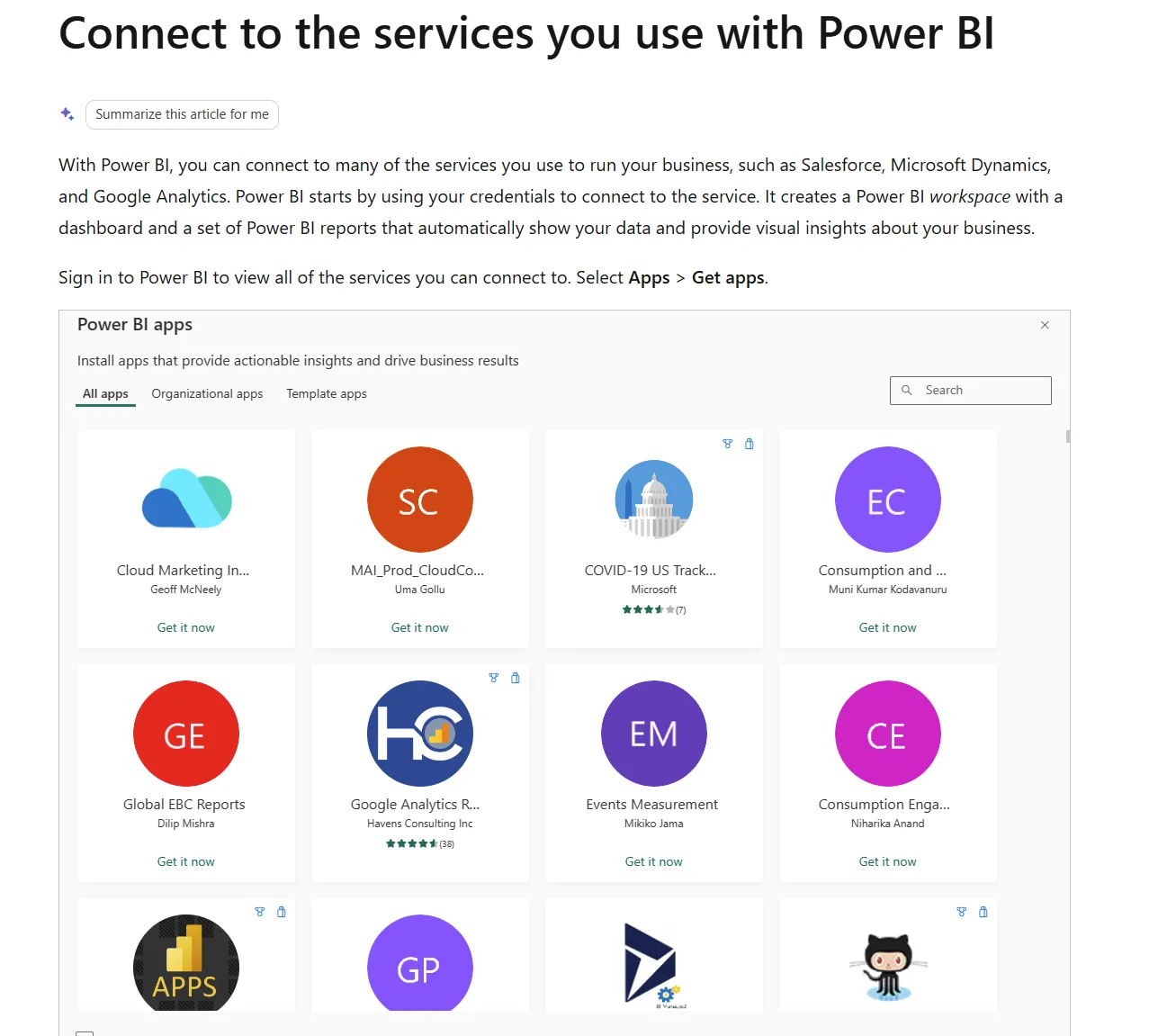
Microsoft Power BI integrations
Power BI's integration story is really the Microsoft story.
It connects natively to the Microsoft stack and is backed by hundreds of connectors to outside databases and services.
A short list of notable connections:
- Excel and Microsoft 365.
- Azure and OneLake.
- SQL Server.
- SharePoint and Teams.
- Dynamics 365.
- Snowflake.
Domo integrations
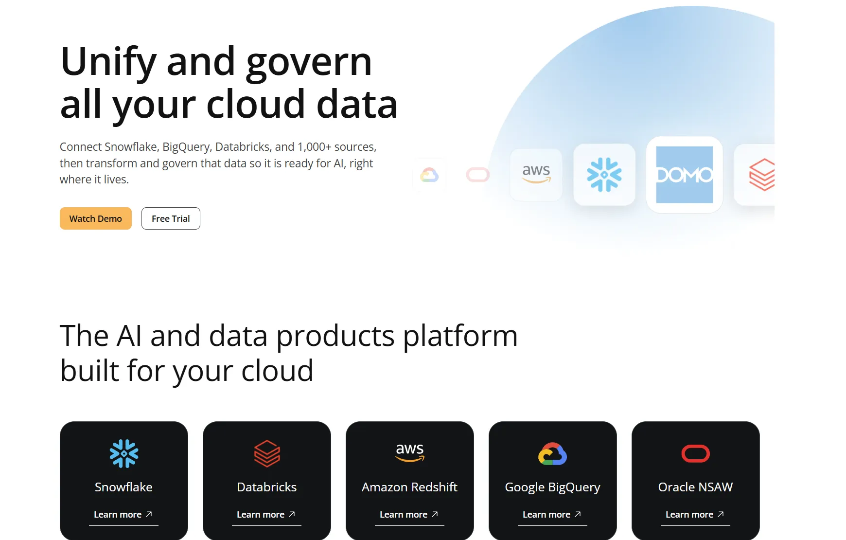
Domo leads all three on raw connector count, with more than a thousand pre-built integrations plus the Workbench connector and APIs for on-prem sources.
A short list of notable connections:
- Salesforce.
- Snowflake and Redshift.
- Google Analytics.
- Databricks.
- Amazon Web Services.
- Google BigQuery.
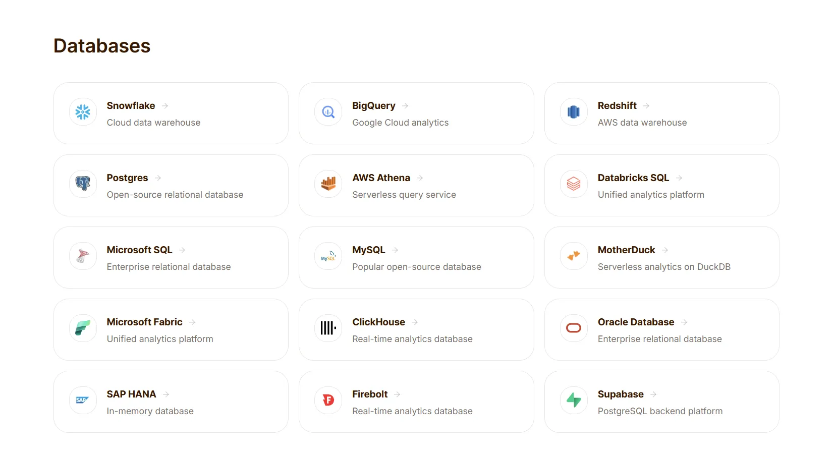
Dot integrations
Dot connects to the warehouse your data already lives in, then reuses the semantic logic you have already built in dbt and Looker so nothing gets rebuilt.
It also reaches into the tools where work happens through MCP, which links Dot to Claude, ChatGPT, Cursor, and Microsoft 365 Copilot.
A short list of notable connections:
- Snowflake and BigQuery.
- Redshift and Databricks.
- Postgres and MySQL.
- dbt and Looker.
- Slack and Microsoft Teams.
Pricing: Microsoft Power BI vs. Domo vs. Dot
Microsoft Power BI pricing
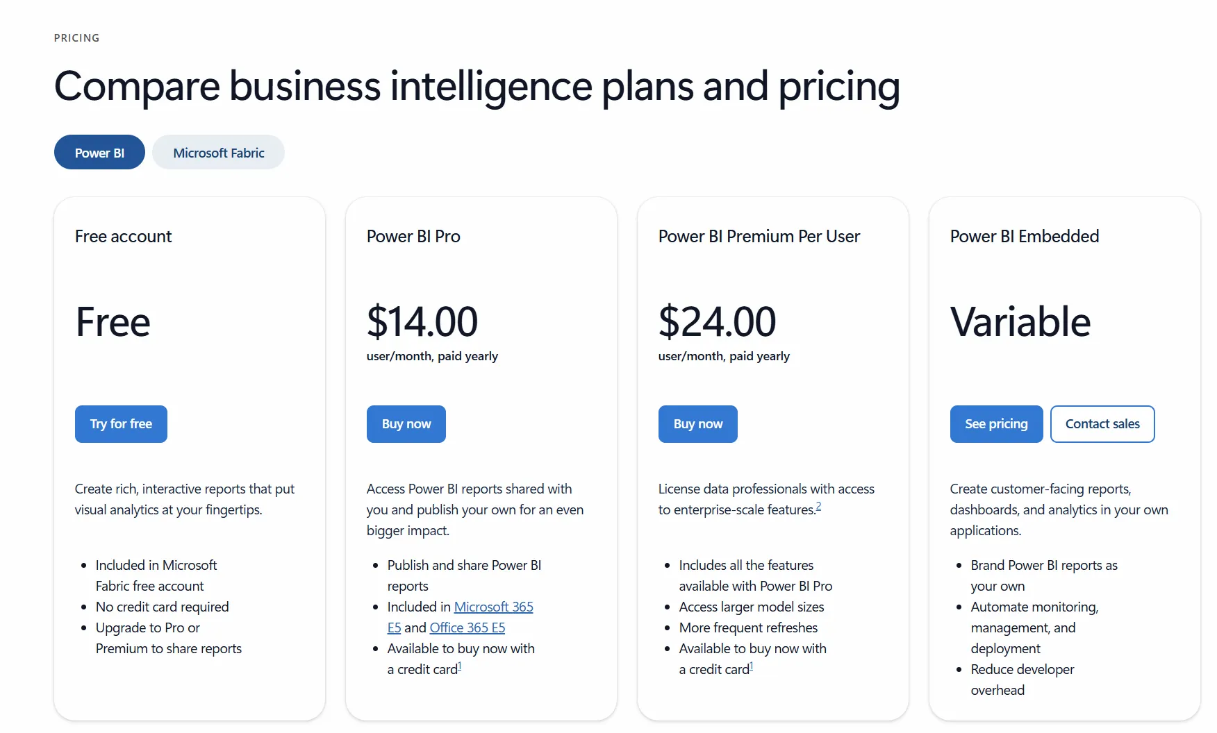
Power BI uses a per-user and capacity-based model, with a free tier for solo use that has no sharing or collaboration.
- Free: personal reports and dashboards, no sharing.
- Power BI Pro: $14/user/month (billed yearly), includes publishing, sharing, workspace collaboration, and Teams and SharePoint embedding.
- Power BI Premium Per User: $24/user/month (billed yearly), adds larger models, more frequent refreshes, paginated reports, and advanced AI.
- Power BI Embedded and Fabric: variable capacity pricing for embedding analytics and license-free viewing at scale.
Domo pricing
Domo runs a 30-day free trial of the full platform with unlimited users and no credit card, then moves to a usage-based, credit-consuming model.
- Free trial: full platform for 30 days, unlimited users, onboarding support, one training session.
- Custom paid plan: everything in the trial plus a dedicated account team, volume discounts, support packages, AWS PrivateLink, and a HIPAA-compliant environment.
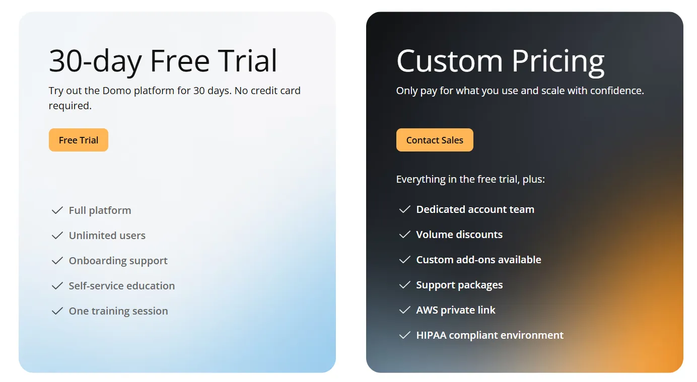
Domo does not publish its rates, so you would need to contact sales for a quote.
Dot pricing
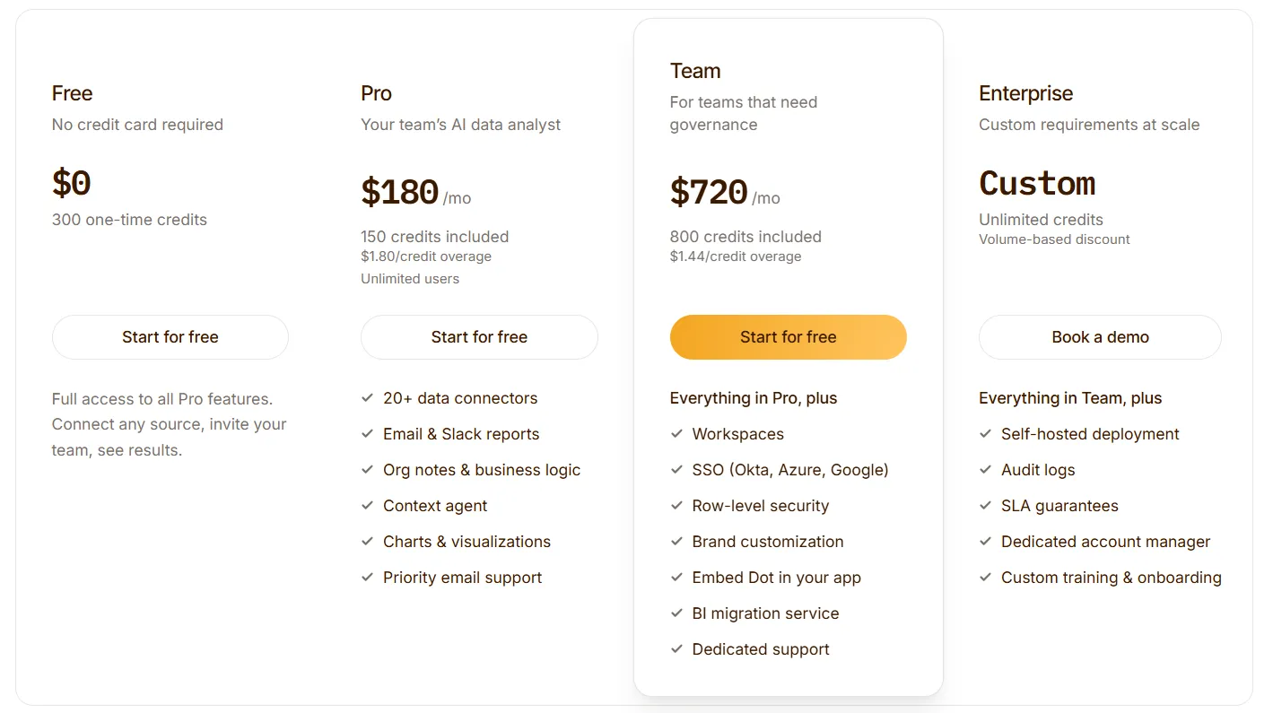
Dot's free plan includes 300 one-time credits and full access to Pro features, enough to evaluate the product on real work before any purchase.
There are three paid tiers that you can then choose from:
- Pro: $180/month, including 150 credits per month, $1.80 per additional credit, and unlimited users.
- Team: $720/month, including 800 credits per month, a $1.44 overage rate, and SSO, row-level security, embedding, BI migration, and dedicated support.
- Enterprise: custom pricing, with unlimited credits, volume discounts, self-hosted deployment, audit logs, an SLA, and a dedicated account manager.
Microsoft Power BI, Domo, or Dot: summary
Here’s how the 3 tools stack up:
Microsoft Power BI | Dot | Domo | |
Best for: | Microsoft-heavy orgs that want standardized dashboards at scale | Warehouse teams that want answers, not another dashboard to interpret | Teams that want the whole pipeline, ingestion to dashboards, in one platform |
Standout feature | Deep Microsoft and Excel integration | Answers-first AI analysis delivered in Slack, Teams, email, and the web app | Over a thousand connectors with no-code Magic ETL |
Integrations | Hundreds of connectors and the full Microsoft stack | Warehouse-native, reuses existing dbt and Looker models, MCP support | Over a thousand pre-built connectors |
Free tier? | Yes (personal use, no sharing) | Yes (300 credits, full Pro features) | No (30-day trial only) |
Starts from: | $14/user/month | $180/month, unlimited users | Custom (contact sales) |
Get started with Dot for free today
Dot connects to the warehouse you already have and answers the question in your own words, then ships the write-up to Slack, Teams, email, or the web app so nobody has to go looking for it.
Here's what's in it for your team when you try Dot:
- Access to a free plan with 300 credits and full Pro features, on unlimited users.
- Natural language analysis in Slack, Microsoft Teams, email, or the web app.
- Deep Analysis that investigates why a number moved and returns clear recommendations.
- Automated executive business reviews delivered on the schedule you set.
- A Context Agent that keeps metric definitions consistent and flags conflicts before they spread.
- Built-in audit trail linking every answer back to its SQL and source data.
➡️ Get started for free with Dot's free plan, or schedule a demo to see how it works with your data.
⚠️ Disclaimer: This article was last updated on July 8, 2026. If you spot any inaccuracies, contact us, and we'll fact-check it.
Theo Tortorici
Theo writes about AI-powered analytics, data tools, and the future of business intelligence at Dot.