DINDOT
Industrial roots.
Friendly by nature.
DIN was drawn for railway carriages, road signs and engineering drawings. DINDOT keeps that precision and rounds every corner and dot. Four weights with italics, 949 characters and tabular figures. Made for GetDot, free under the SIL Open Font License.
Type tester
Click the text to edit it.
Four weights
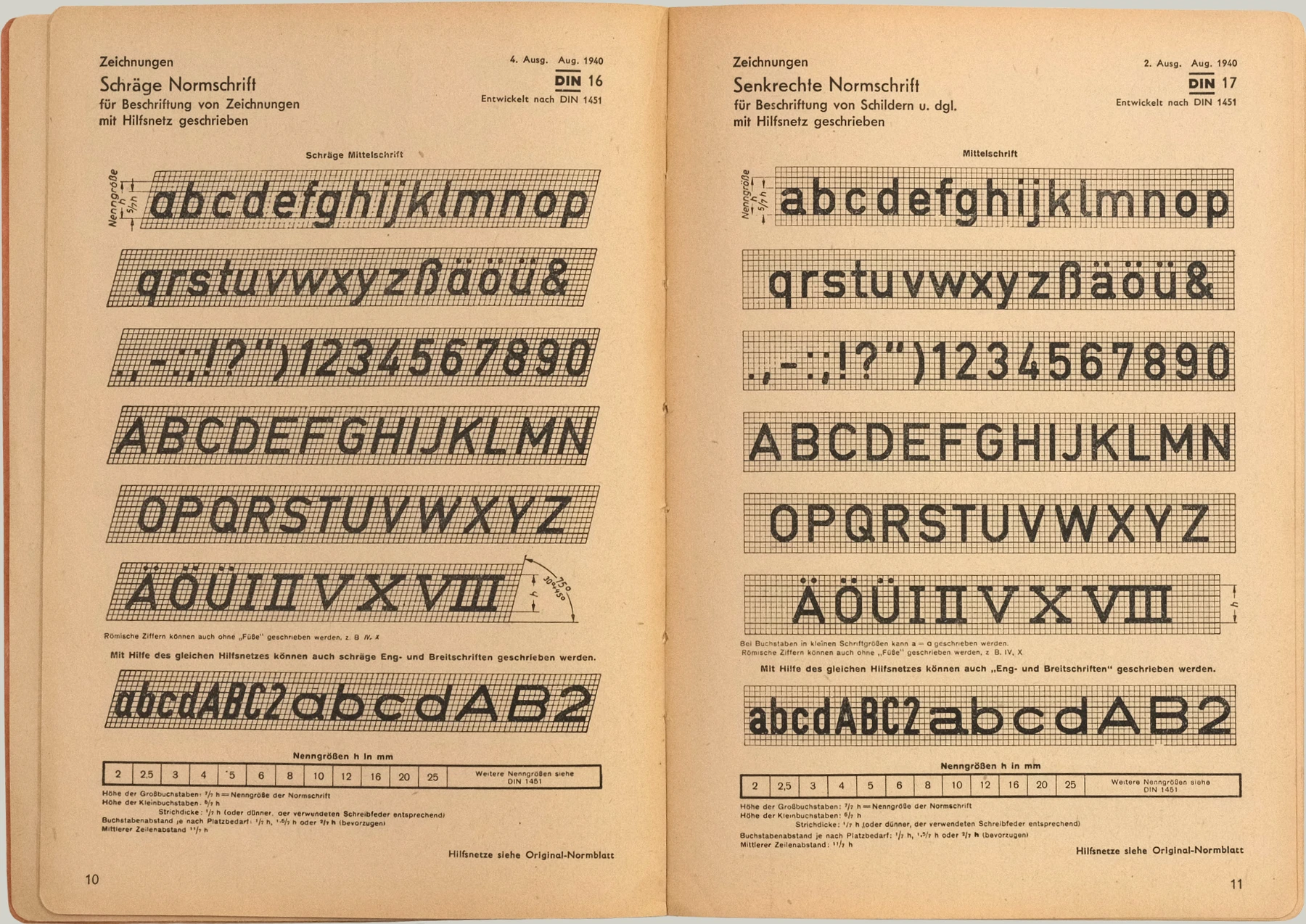
DIN 17 was the upright lettering for signs, DIN 16 the slanted one for drawings. Both set the stroke at a seventh of the capital height, as Medium does.
Regular: DIN 17
Medium: DIN 17
SemiBold: DIN 17
Bold: DIN 17
Regular Italic: DIN 16
Medium Italic: DIN 16
SemiBold Italic: DIN 16
Bold Italic: DIN 16
Zero
Characters
Every official language of the EU and of Central Asia. Text tagged Polish, Romanian or Bulgarian gets its own accents and letterforms.
In use
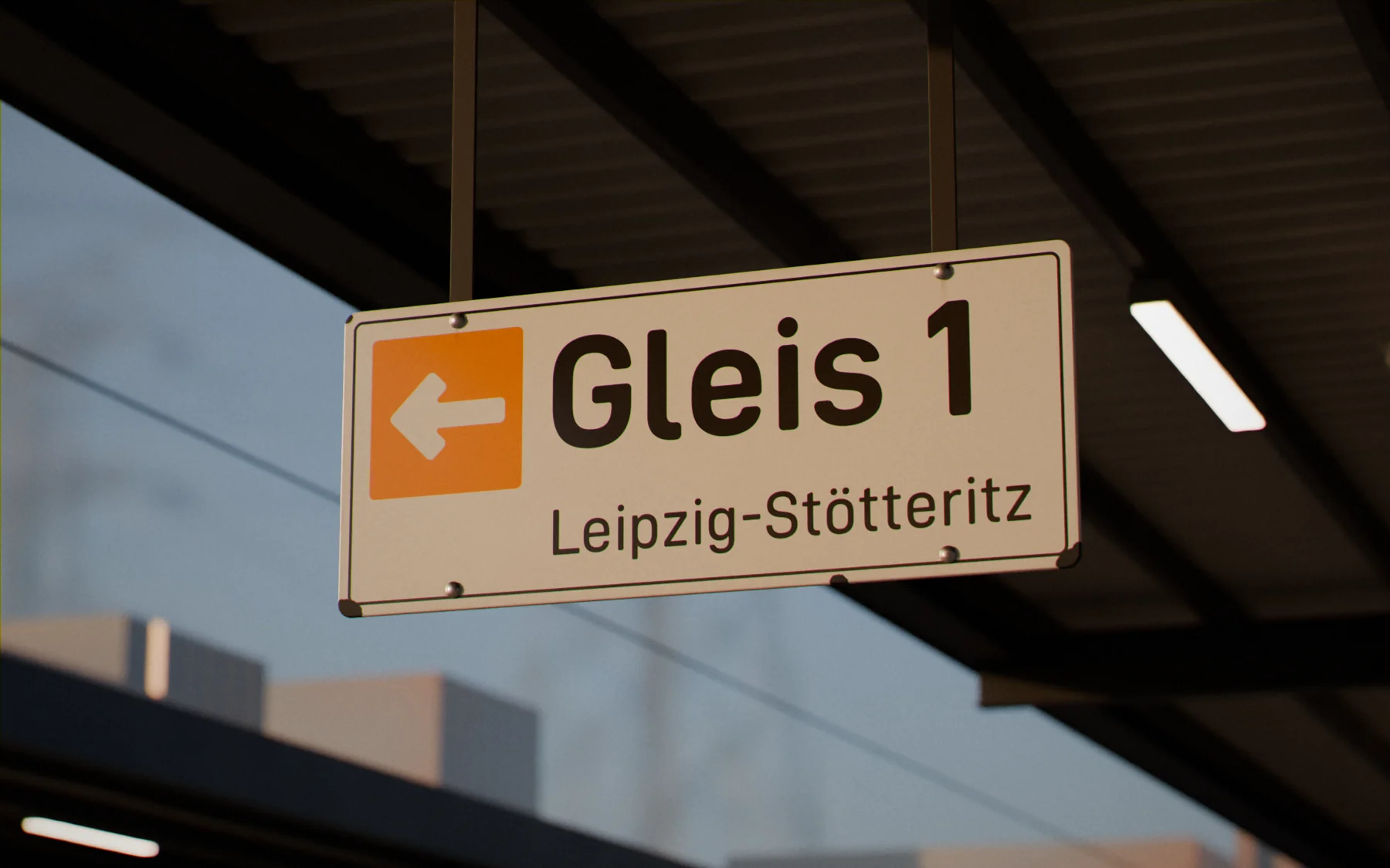
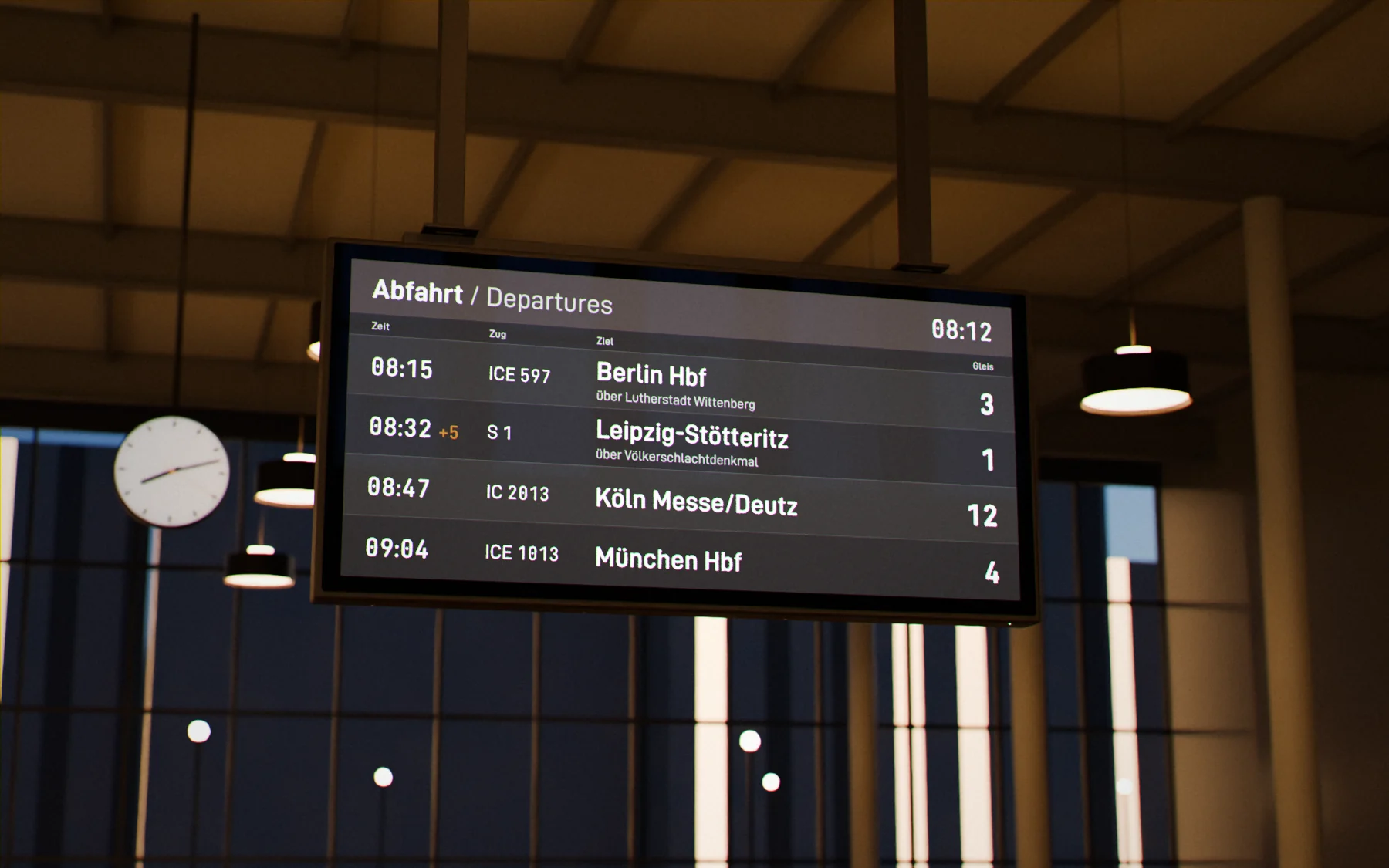
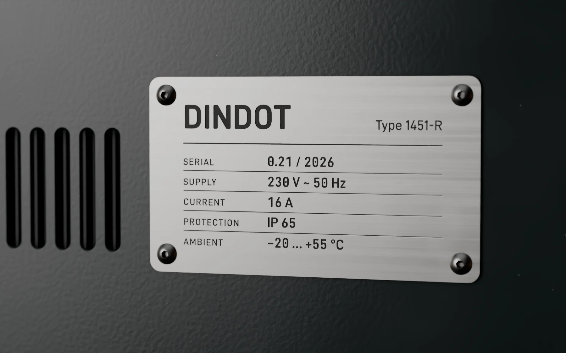
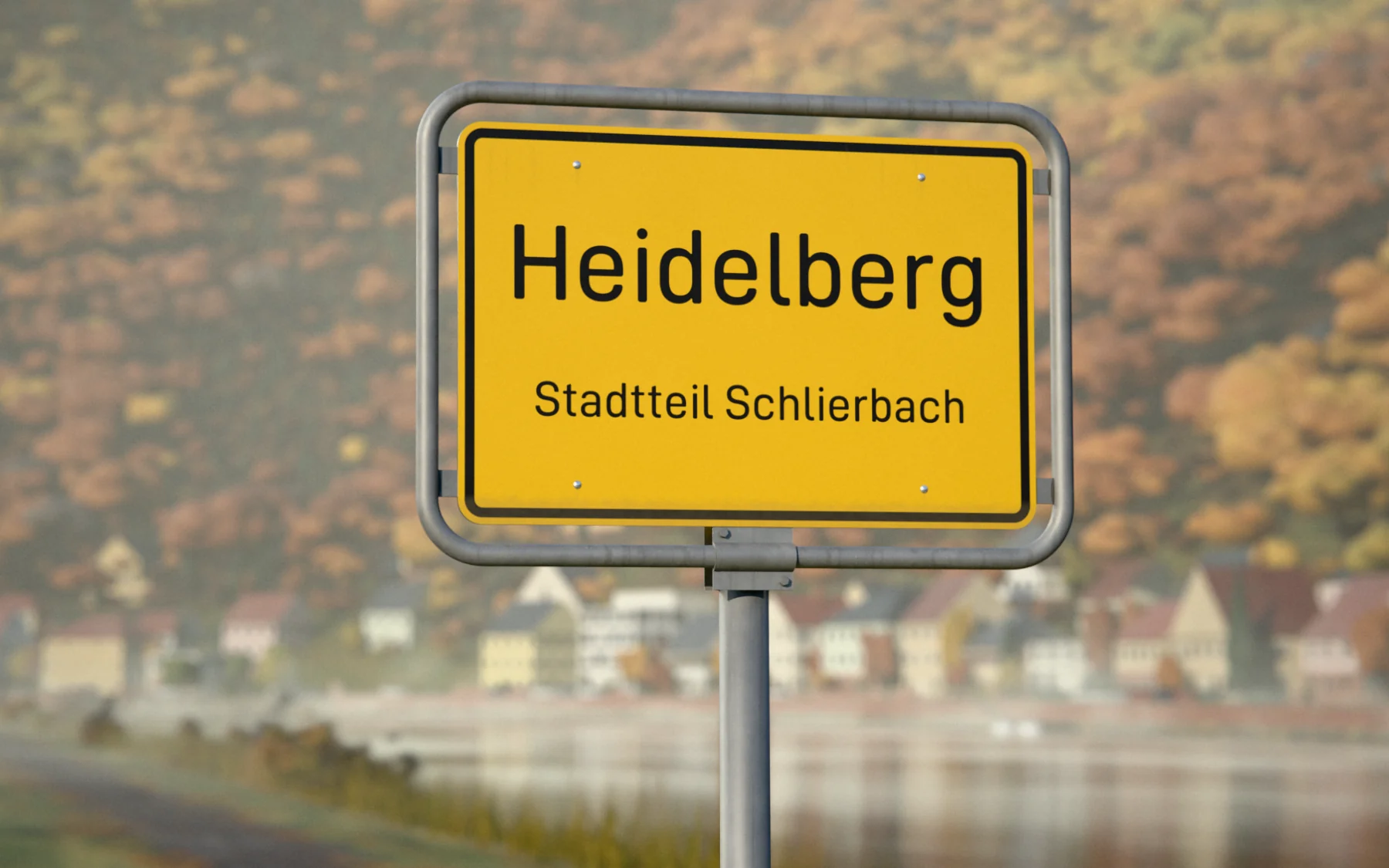
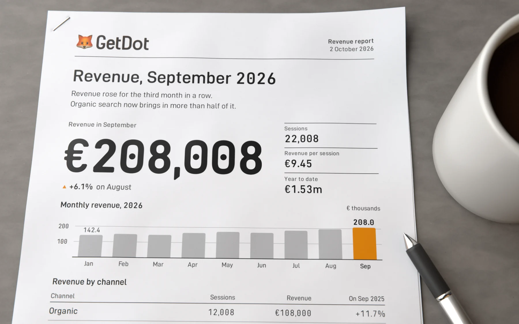
Rendered, not photographed. All the text in them is set in DINDOT.
History
Engineers drew DIN 1451, in a committee led by Ludwig Goller of Siemens.
- 1905–08
Railways
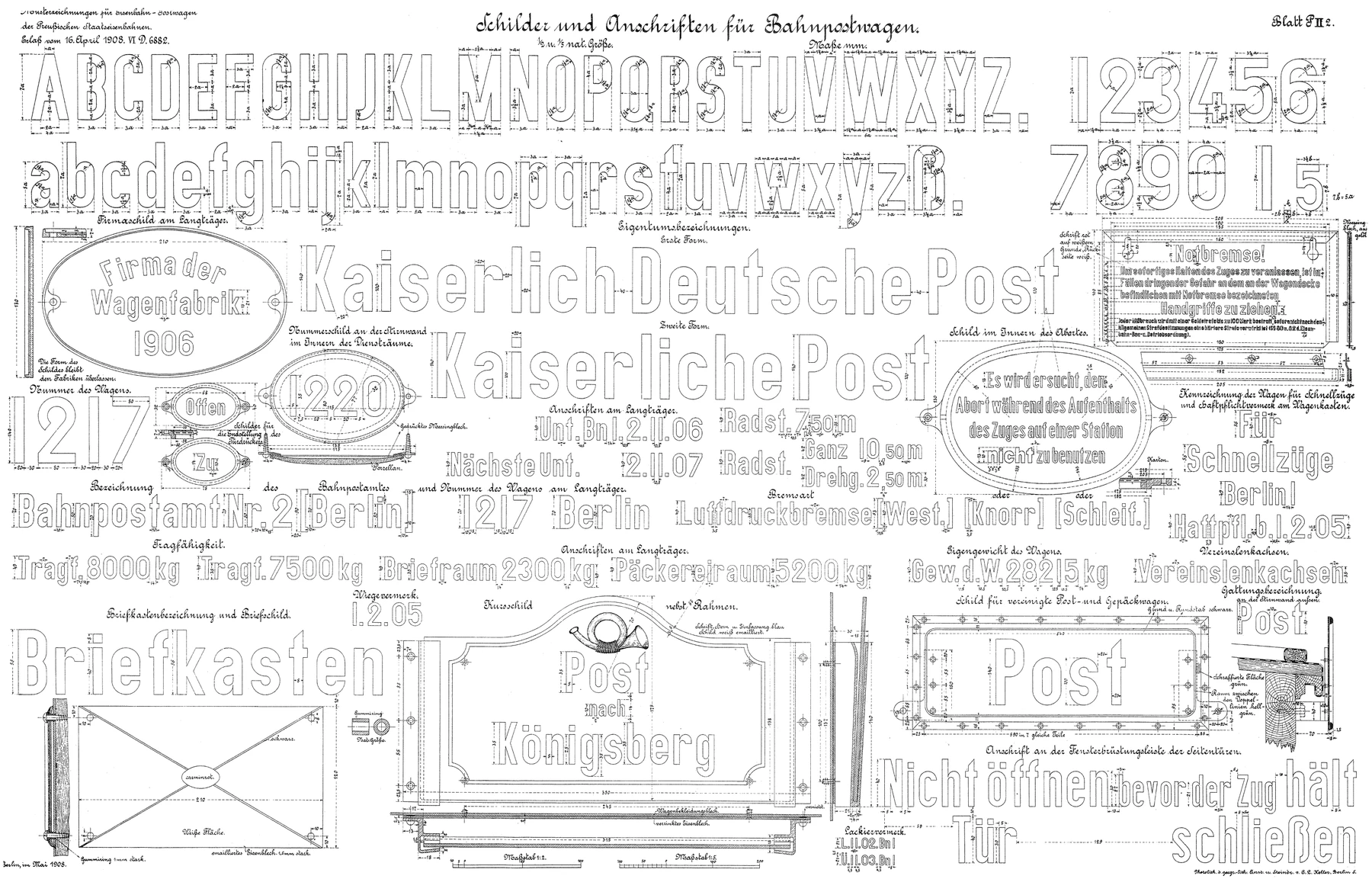
The Prussian state railways set one lettering for all their locomotives and wagons. In 1920 Germany’s railways merged into the Reichsbahn.
The 1908 drawing ↗ - 1919
DIN 16
DIN’s first lettering, written by hand on a grid.
DIN 16-1:1919-07 ↗ - 1931–36
DIN 1451
A draft in 1931, a standard in 1936. German road signs still use it.
DIN 1451:1931-08 ↗ - 1938
DIN 17
From 1940 its sheet, like DIN 16’s, says it was developed from DIN 1451.
DIN 17:1938-06 ↗ - 1976
ISO 3098
As DIN 6776, ISO’s lettering replaced DIN 16 and 17: a new design, its slant still 75°.
DIN EN ISO 3098-2 ↗ - 2017–21
DINish
Charles Nix drew D-DIN at Monotype for Datto, under the OFL. Altinn-DIN and then DINish built on it.
DINish on GitHub ↗ - 2026
DINDOT
Rick Radewagen made it at GetDot. Its round dots hold as much ink as DINish’s square ones.
Other famous DINs
DIN began in 1917, in the middle of the war. Its first standard, DIN 1, was the taper pin.
- DIN 476 / 1922
A4
Sides at 1:√2, and A0 is one square metre.
- DIN 2137
QWERTZ
German has far more z than y. Ä, Ö, Ü and ß have keys of their own.
- DIN 934
The hex nut
An M8 nut takes a 13 mm wrench. Stores still sell it as DIN 934, decades after ISO 4032 replaced it.
- DIN 75490
The car radio
The slot is 50 mm tall. Car stereos are still sold as single or double DIN.
DIN is historically associated with “Deutsche Industrie-Normen”. Today it stands for Deutsches Institut für Normung. DINDOT is an independent derivative, not an official DIN typeface.
Wear it.
DINDOT 0.22Sixteen font files and web CSS with presets for tables.